Matshona Dhliwayo
“There is a seed inside of every tree and a tree inside of every seed.”
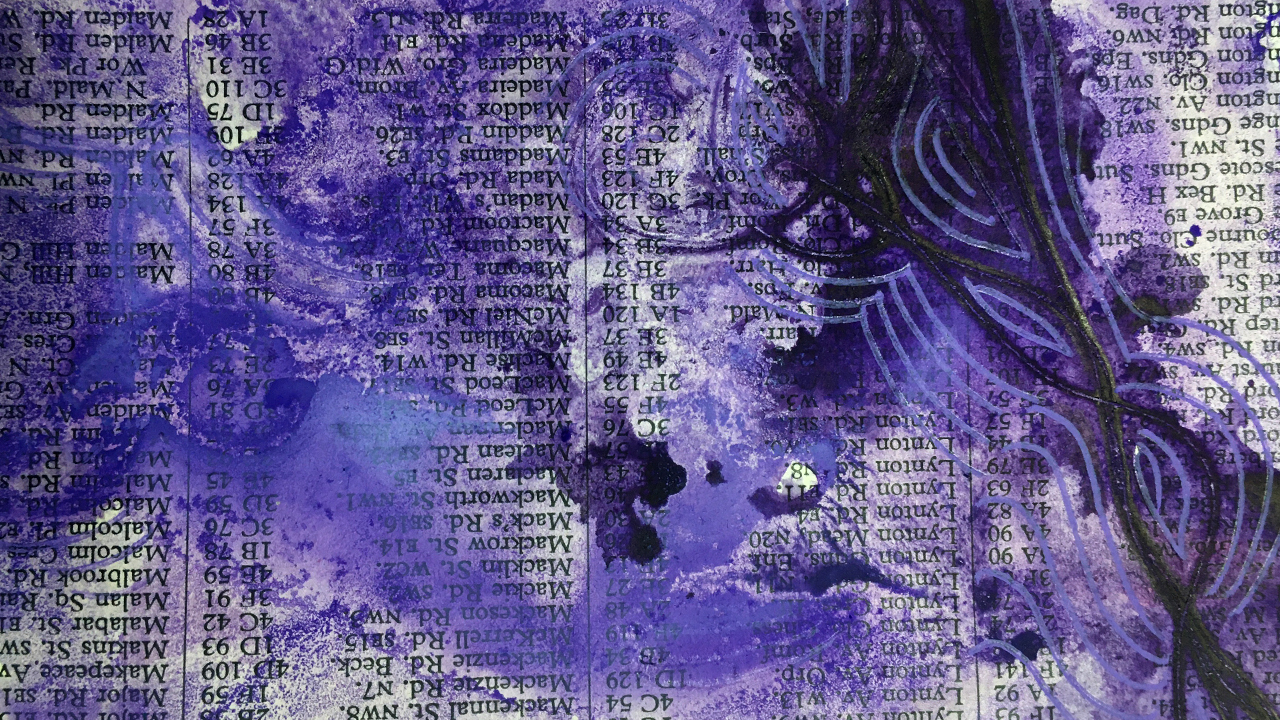
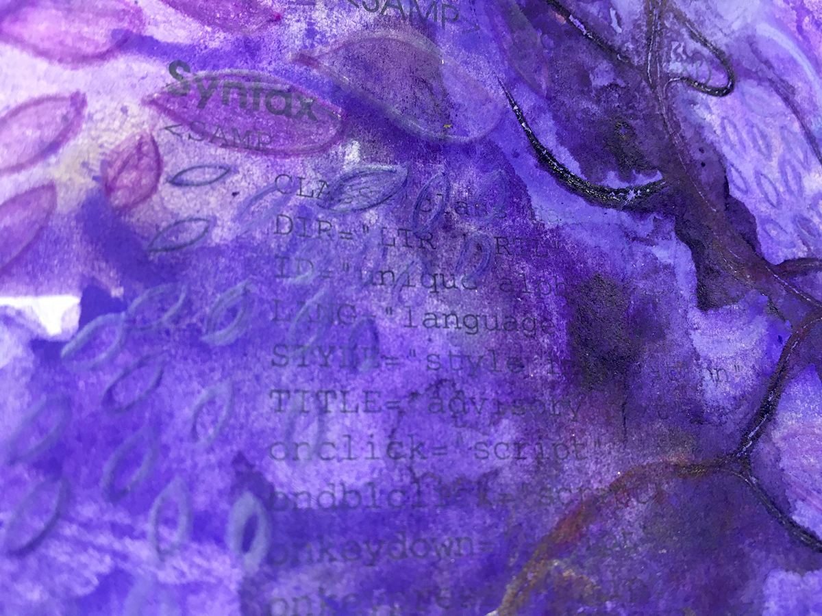
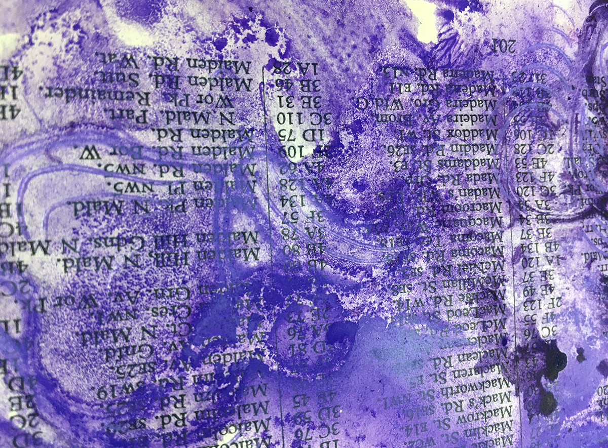
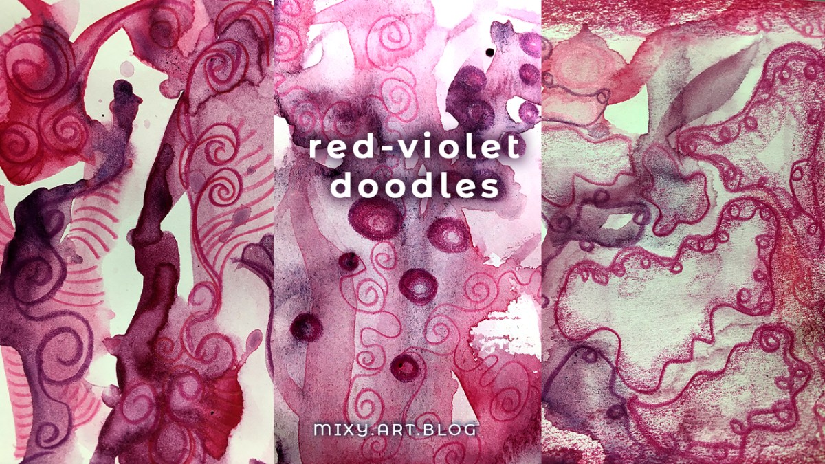
Much of the art I’ve shared with you in these single color posts have a common seed of an idea: a doodle.
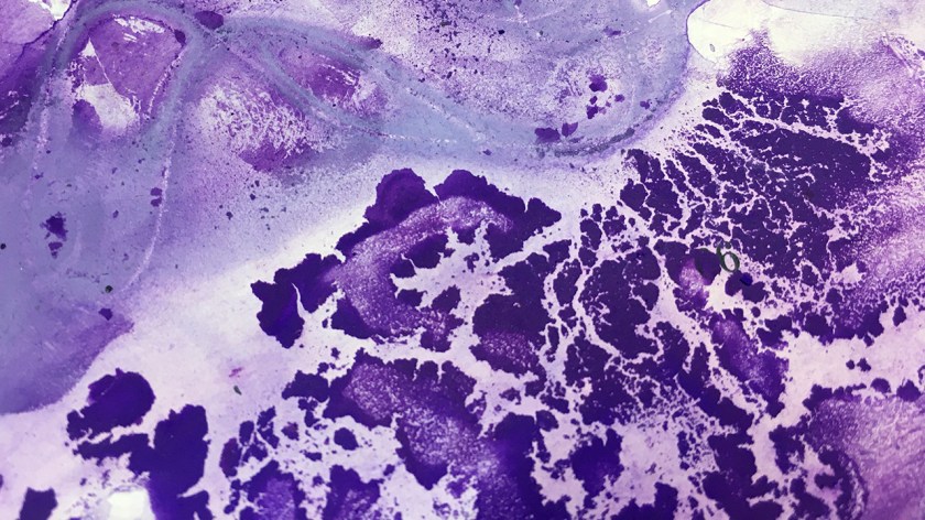
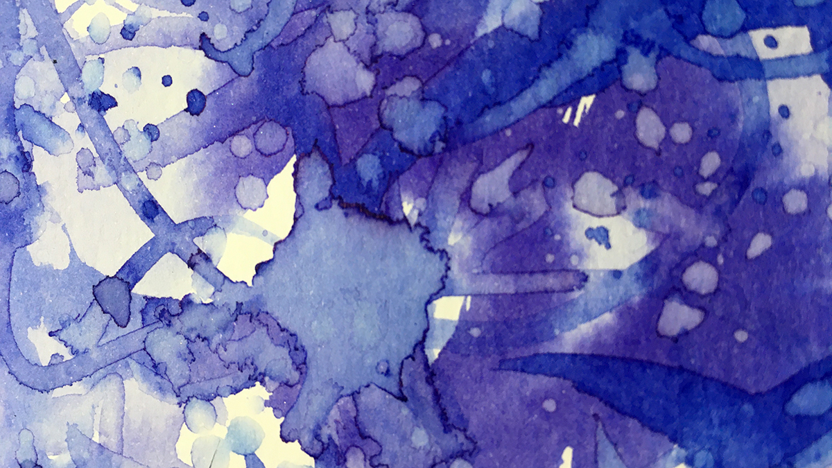
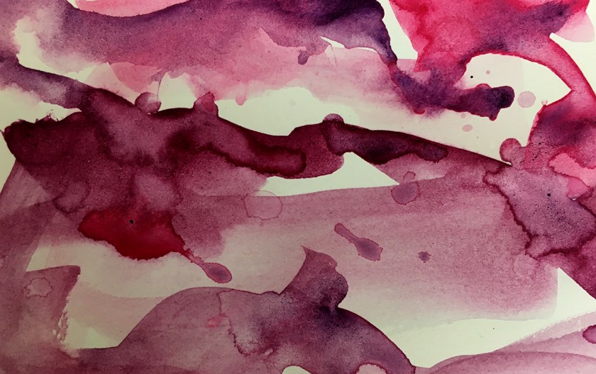
Often times it’s in messy watercolor or ink splashes, I get excited by the dynamism of moving water and pigments, the witnessing of art making itself. This never gets old to me!
Today I was interested in painting 3 pieces from a common seed to explore the directions they could take.
(I could come back and add more – this is just how the process begins)
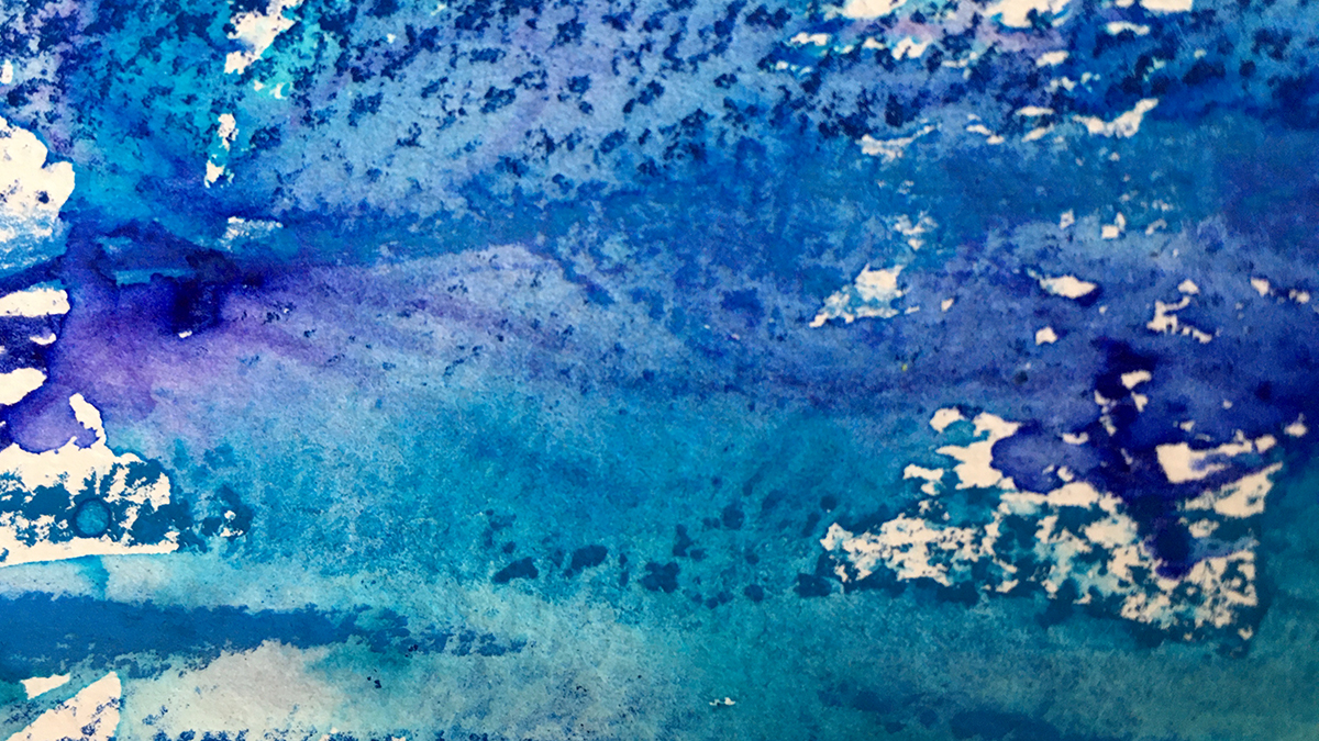
To keep the pieces similar to begin I dragged and splashed color across all three together.
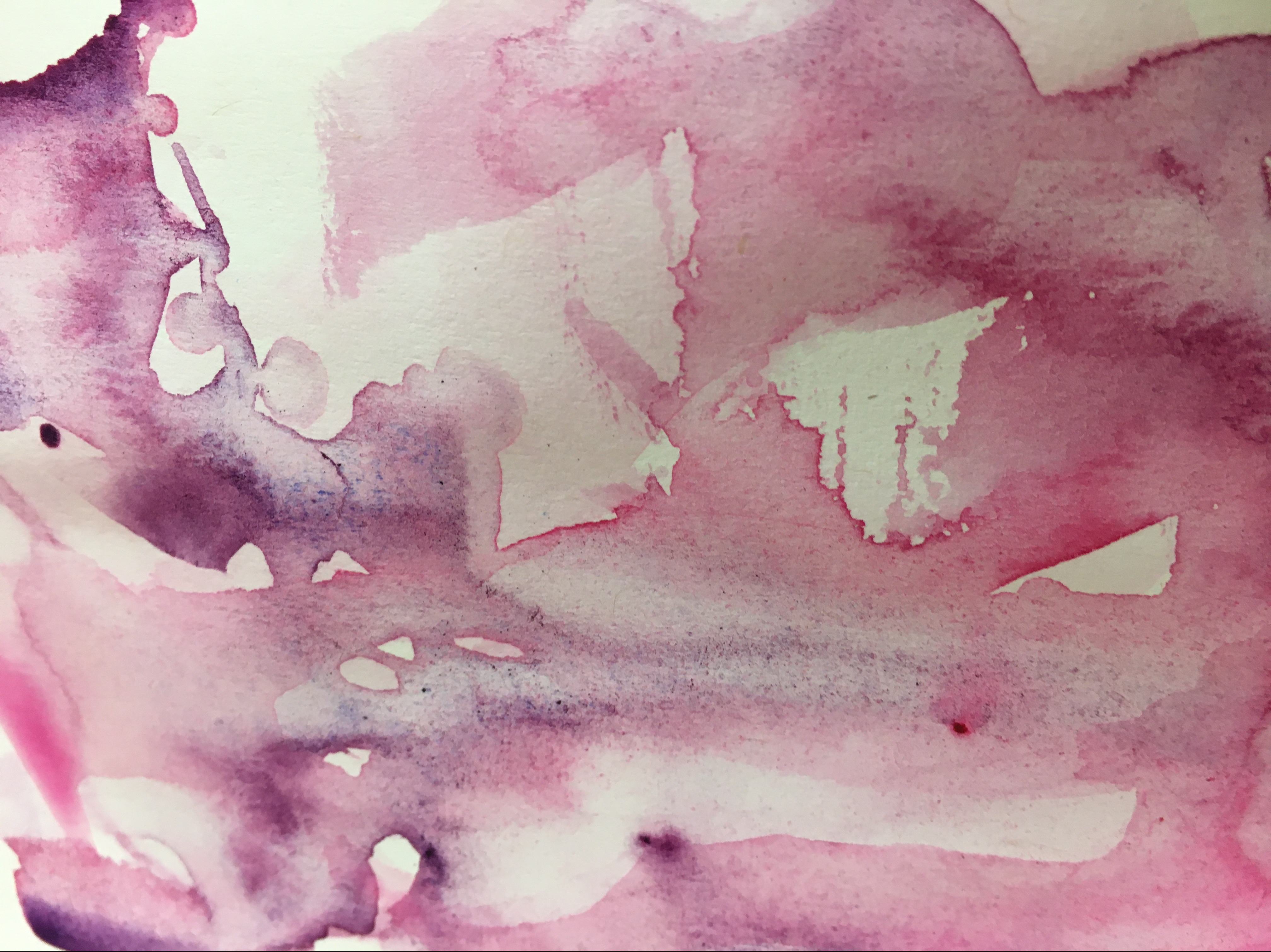
(I used Quin Violet & Rose of Ultraviolet from Daniel Smith+ an unnamed red-violet from the Kuretake Gansai Tambi Japanese Watercolour set)
Extra Idea Seeds…
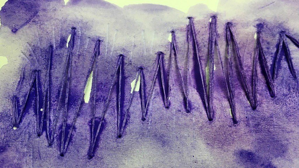
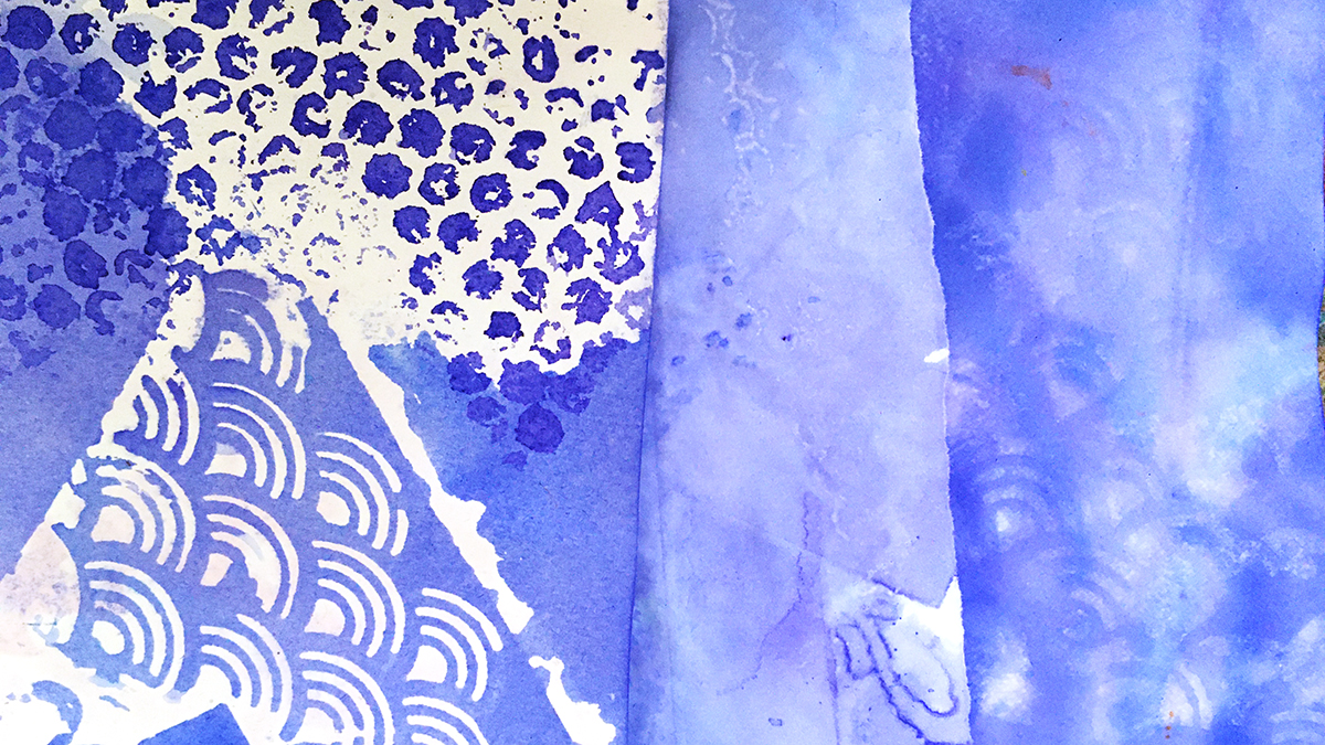
Here’s something I often do when I’m working small like this (these pieces are maybe 4 x 5 inches or so) – I use a blank page in a sketchbook or art journal as a drop sheet.
I can happily paint over the edges and let color spill around, when the paint is too watery and/or I’m too impatient to wait for it to fully dry, I can use the page underneath to blot the water, as well as to clean off my brush.
All this makes some beginning patterns for the first layer on that page into the bargain: More seeds for more ideas!
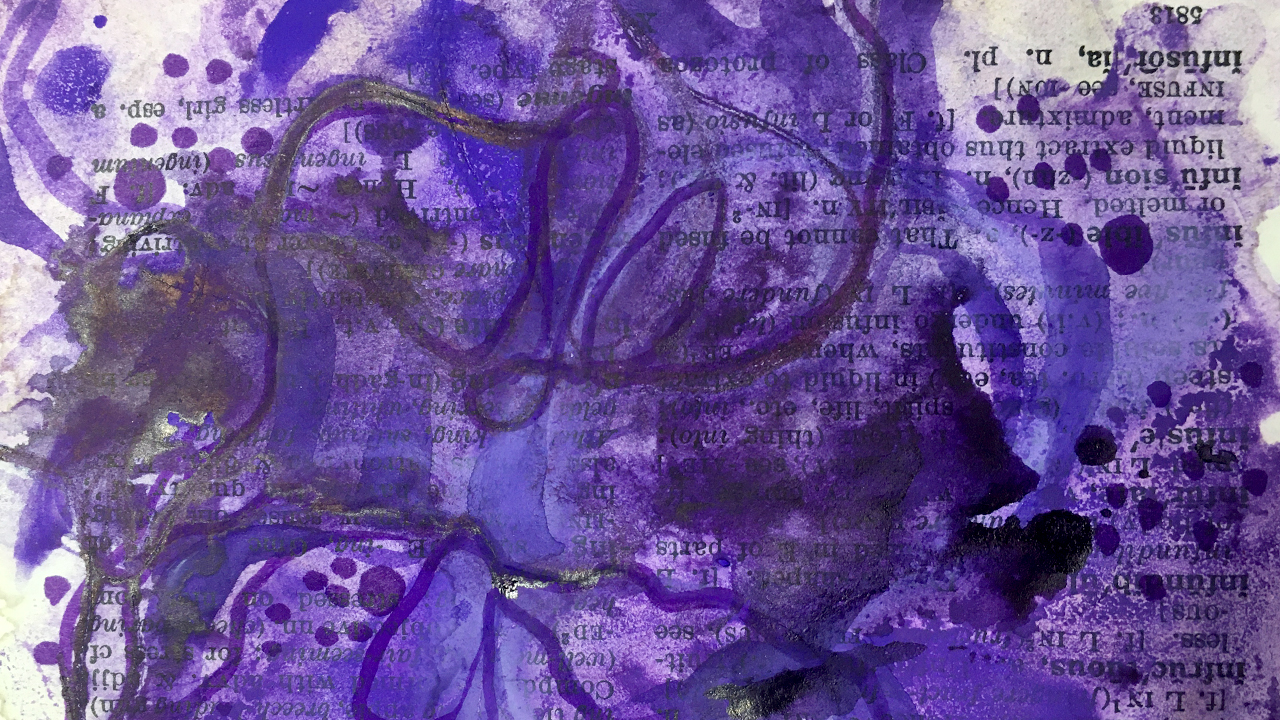
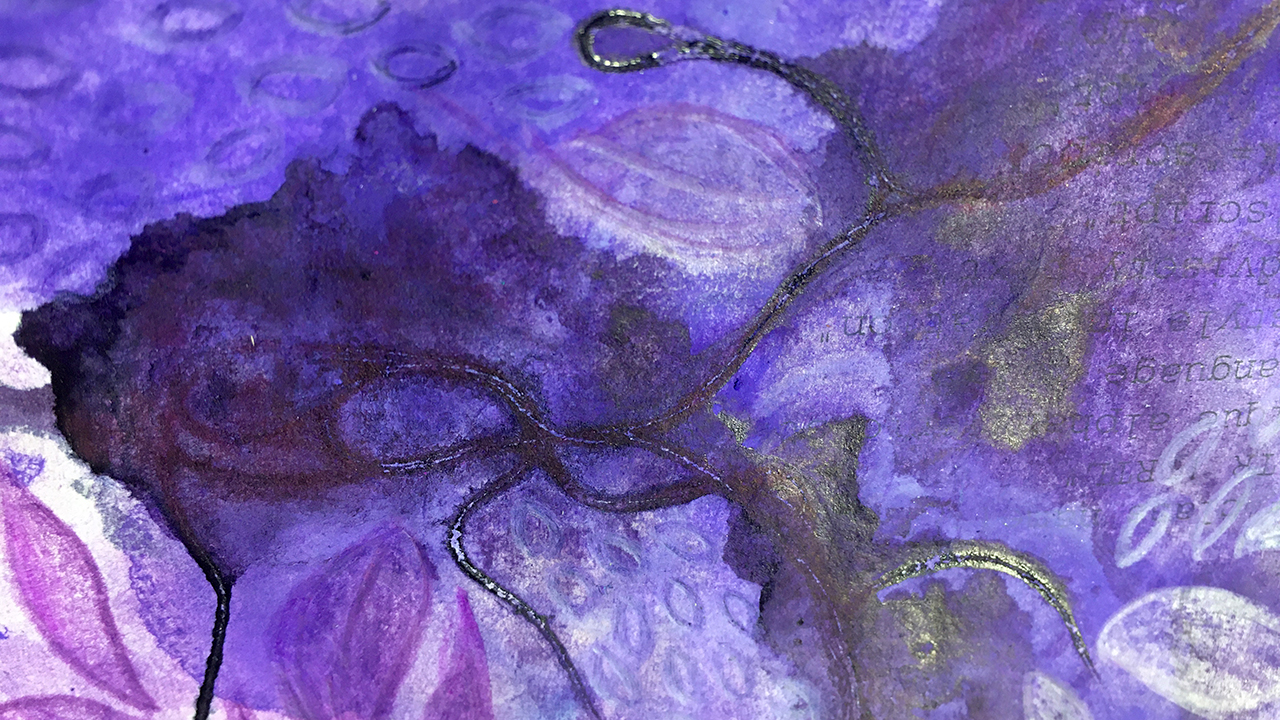
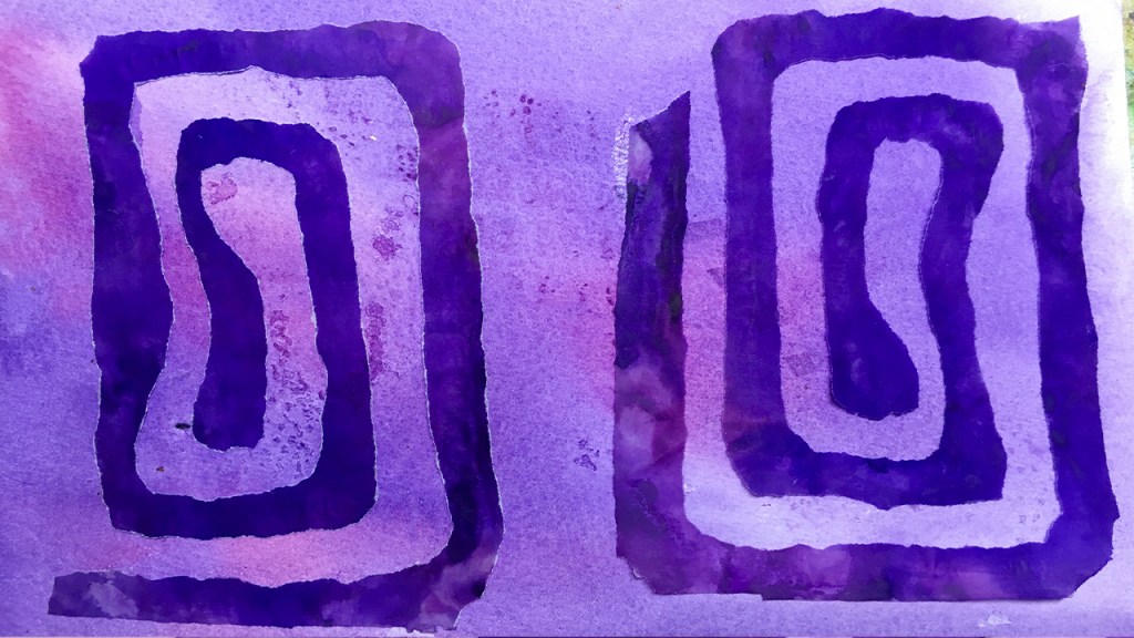
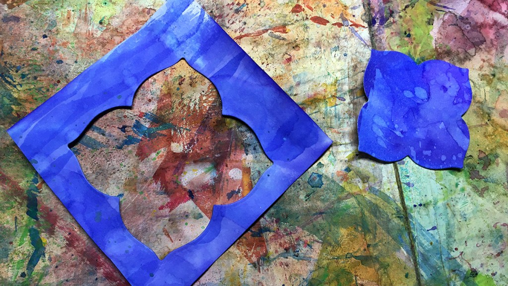
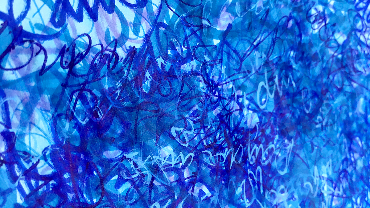
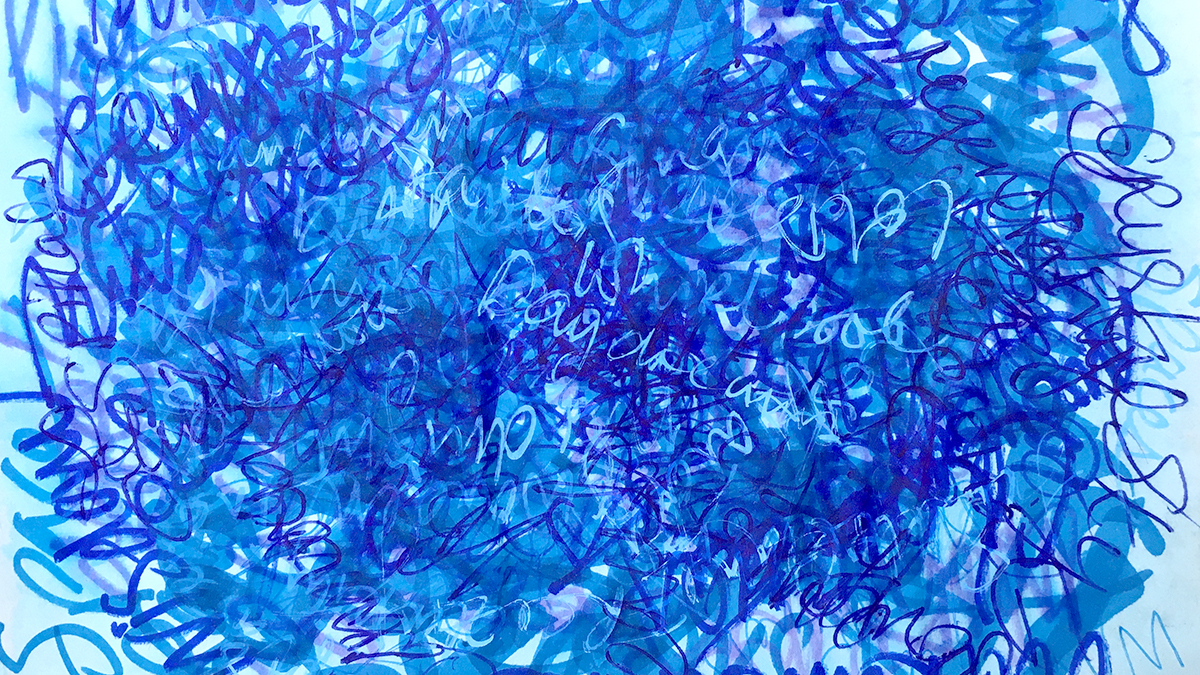
Once these had dried I moved on to the next step for today’s creating – a medium I didn’t use for a really long time – but was inspired to revisit: coloured pencils.
I recently picked up a couple of Derwent Procolour & Faber Castell Polychromos Pencils. Oh my days what a world apart these are from the ancient coloured pencils I’ve had kicking around since forever ago!
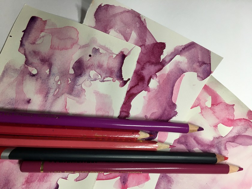
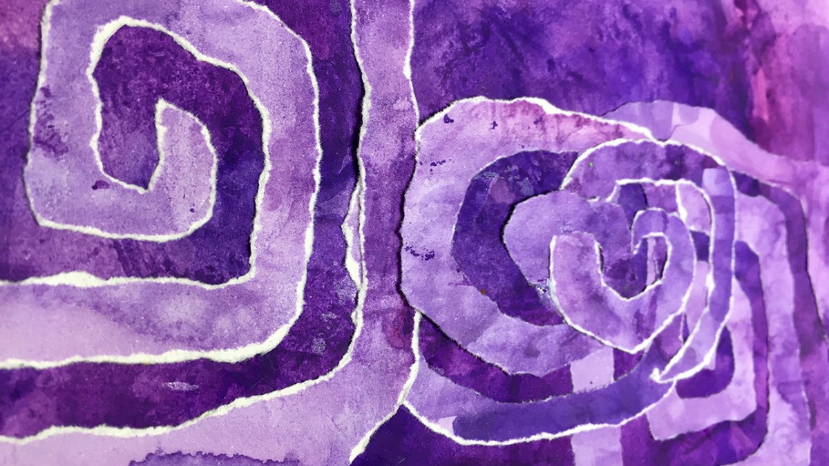
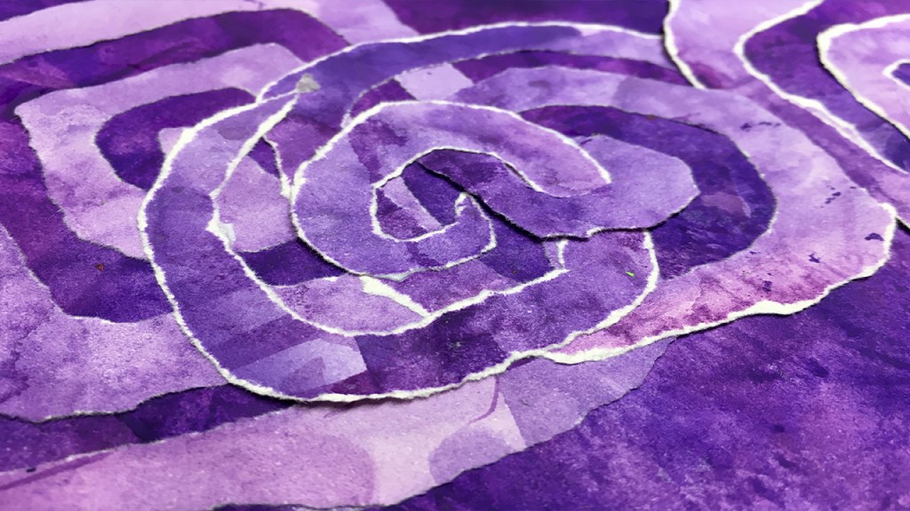
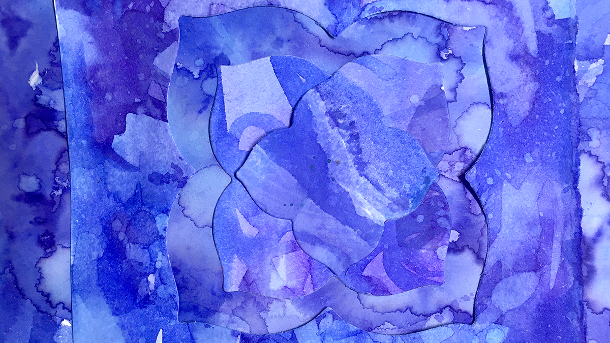
The pencil doodles were all about following the lines in the paint shapes, wiggling around the contours and the negative space in between, filling with spirals, squiggles and little circles.
Taking each piece in turn, my intention was to give each its own character, like siblings in a family, related but still unique.
This is the painting process, and how they all turned out!
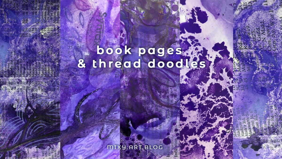
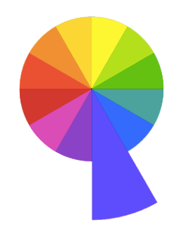
“Twelvty” 12 Colors in 12 Months
Every month this year I am making a series of mixed media pieces in just one color. At the end of the year I’ll combine them into one big multicolored work.
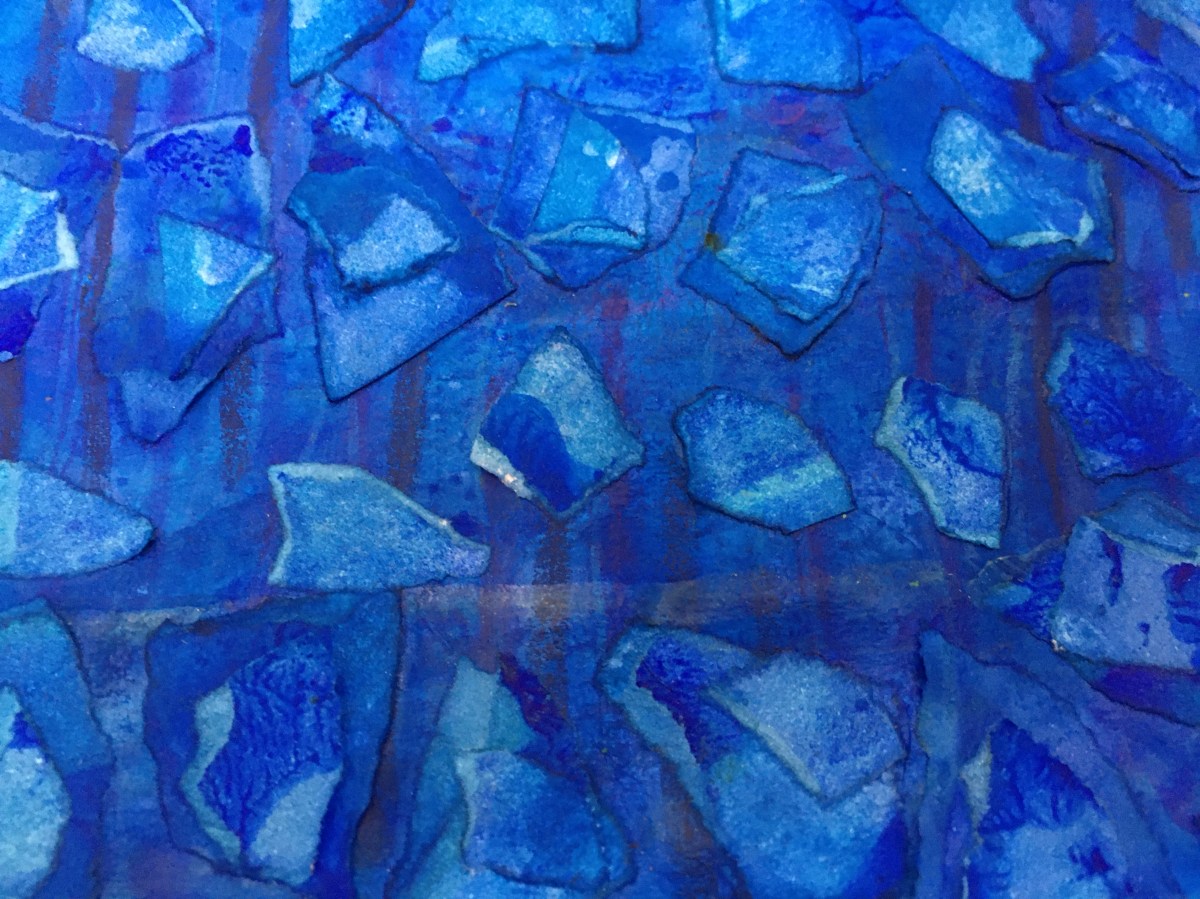
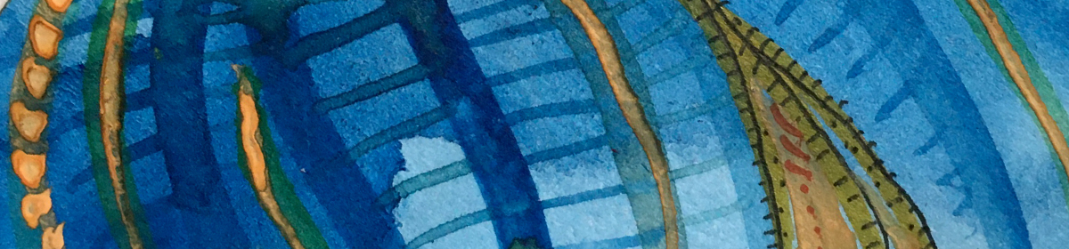
I’m sharing my process throughout this adventure here in this blog. (So far this year I’ve explored Yellow, Yellow-Green, Green, Blue-Green, Blue, Violet-Blue & Violet)
I’d love for you to join me. TWELVTY is open to everyone, and better yet, it’s free!
Sign up for my newsletter to find out more and get your free TWELVTY guide ebook.