If you’ve been following these posts you’ve maybe wondered about the name. So I’ll let you into a little secret… Ephemeral Gecko resulted from pairs …
Ephemeral Gecko
If you’ve been following these posts you’ve maybe wondered about the name. So I’ll let you into a little secret… Ephemeral Gecko resulted from pairs …
Ephemeral Gecko
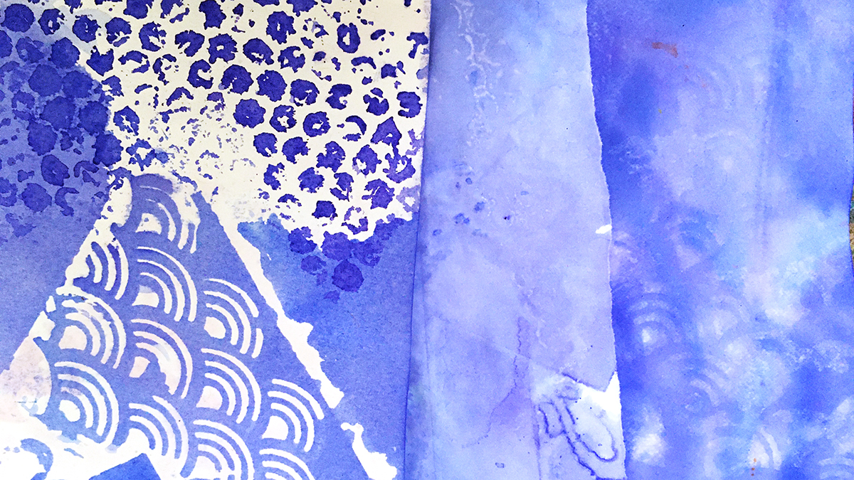
Exploring Violet-Blue by breaking all the rules of stencils in the paper dying process!
If you’ll believe in me, I’ll believe in you. Is that a bargain?
– The Unicorn
The rebel part of me who yearns to do the thing the opposite way from which it’s intended is secretly enjoying the ride of this ‘down is up, up is down’ year.
And that got thinking about stencils.
The point of the stencil is for neat tidy edges with regular lines and orderly patterns, and the contrariness of distorting the lines from a stencil appeals to my creative heart so much.
I love smudged edges and misaligned prints. I love worn paint effects, skipped lines, mis-matched patterns, mis-sprayed with glimpses of background showing through.
All this is why I love using stencils in my paper dying experiments, so that’s where I’m going in today’s first dabbles with this month’s color: Violet-Blue.
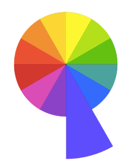
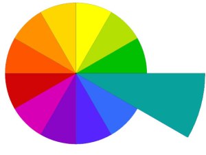
Being a tertiary color, Violet-Blue straddles the space between its neighbours in the color wheel, the place we find the moody mauves of bluebells and forget-me-knots.
And I’m excited to see how that works out in this process!
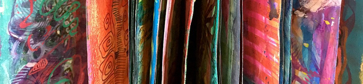
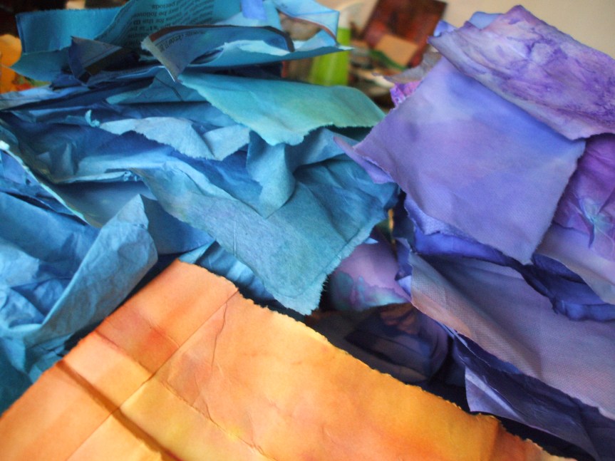
I’m using two inks: Violet by Colourcraft Brusho and Cobalt Blue by Pebeo Colorex. This blue has a strong violet undertone, and the violet is right at the coolest edge of the hue.
I’ve got a few different types of paper to play with – cartridge paper, regular copy paper, ultra thin Tomoe River paper, and some heavy watercolor paper. Different weights and absorancy of the papers all take up the ink in a different way.
Wet paper (especially the super thin stuff) goes wrinkly and buckles up. This adds even more patterns as the ink escapes through gaps and wiggles through in little rivulets between the layers.
If you don’t like the really crinkled effect you can always press the paper flat with a warm iron after it dries, or squash flat under some heavy books..
But if you do like this texture, try adding more by crumpling and folding the paper in places before you begin. Where the surface is disrupted like this it often allows the ink to penetrate the fibres more and makes a darker, stronger pattern.
What’s next?
Some of these turned out so pretty I’m leaving them just as they are, but others will be backgrounds for further adventures – maybe another round of stencil dying – maybe something else 🙂 I’ll be back next week to show you more!
Every month this year I am making a series of pieces in just one color. At the end of the year I’ll combine them into one big multicolored work.
I’m sharing my process throughout this adventure here in this blog. (So far this year I’ve explored Yellow, Yellow-Green, Green, Blue-Green & Blue)
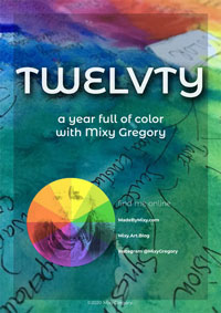
I’d love for you to join me. TWELVTY is open to everyone, and better yet, it’s free!
Sign up for my newsletter to find out more and get your free TWELVTY guide ebook.
The methods for ink dying paper are as simple or complex as you want to make them. Here are my 5 top tips to paper dying.
The methods for ink dying paper are as simple or complex as you want to make them.
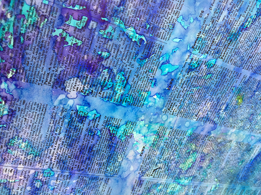
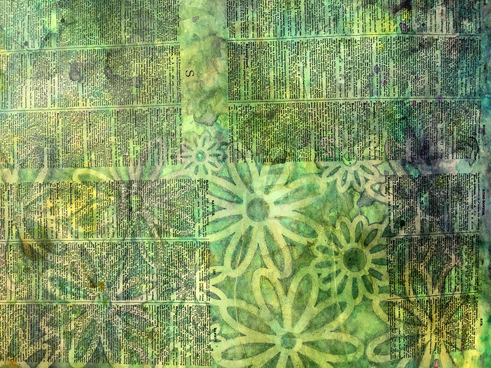
When I started out I used a shallow plastic tray and layered pieces of of paper. Each layer had splashes and squirts of ink between. Then I left them to absorb the liquid. I experimented with scraps of paper, envelopes, book pages…
Essentially that hasn’t changed much, only now I’m devouring entire books and working on a glass topped table so I can heap the inky pages directly on there. I just scaled the process up!
I cannot overstate how much it’s trial and error process. It’s the only way I work: unscientific, intuitive, learning as I make it up as I go along.
For every gloriously bespeckled rainbow I make there are blurry messes, torn pieces (wet paper is so fragile) and muddy overworked colors. But that’s how we learn, right?

These are the five main things I’m learning through my paper dying experiments:

I’ve been leaving batches of papers to soak together, letting more magic happen as color seeps through the pages to the layers below. By arranging them haphazardly so one piece part covers the next it encourages the seepage patterns to happen more.
‘Unplanned‘ is the overarching theme.
After some hours of marinading, sometimes I’ll turn the whole pile upside down after a while so the moisture seeps back (carrying the color) back the other way. Peeling apart the layers and adding more pigment, or just turning them so the pieces in the middle get some air to dry.
Wet paper wrinkles and the lines that form become channels for the color to settle. Stripes and fabulous organic patterns like an animal print appear.

Lately I’ve taken to layering in stencils and texture plates between the papers to pick up extra patterning. plastic and bubble wrap works well, as does fabric, yarns and fibres (which of course soak up some of the color, transferring their own distinctive prints)
Next time: what becomes of these papers?
Or you can get the answer to this question ahead of the others – join the cool kids in my email list — hop aboard right here!
I love sets of things, I love arrangements & collections.
When I hear a song I love, I have to scurry off as soon as I can to find the album it’s from, find the artist, track down the other tracks. Fall in love again.
When my eyes are magnetised by a piece of art, I race to seek out the artist and soak in everything else they’ve created.
I’ve done this with authors and poets, actors, directors, blogs and my current jam: podcasts. I get hooked. I have to absorb all I can until my attention is hooked someplace else.
This energy directs me, and now I’ve identified it, I can see how it plays out in all kinds of ways.
I’ve had attachment to all sorts of obsession, with habits and ritual, with a certain style of living or eating or being, with a form of minutiae that maybe only I notice, but it’s place in my days has been critical. For the moment. Then gone.
Sometimes it’s a few days, sometimes a few years, or anywhere in between. The more life I live the more context for this observation and the more patterns I can see.

Right now I’m channelling this obsessive method into making. I’m filling every moment, pouring every ounce of energy into making, and will do so until the next hook catches me. That maybe tomorrow – maybe next year – I’ll show you when.
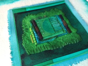
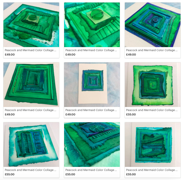
It’s manifesting itself right now as a collection of paper and fabric collages, I’m calling the Peacock & Mermaid collection. This is part two. I don’t know if there will be a part three – I might get called away by another muse.
All of the pieces shown here are available in my Etsy shop. The first part of the collection sold out the first day – so hop over quick if you’d like one of them in your home!
Would you like to get sporadic updates on my thoughts and drawings delivered right to your inbox? Hop onto my email list right here.
(and I’ll send you my ebook A Year full of Color as a thank you for joining)
Your email is utterly safe to me. It will be hidden in a secret place, I will feed it tea and biscuits as required.
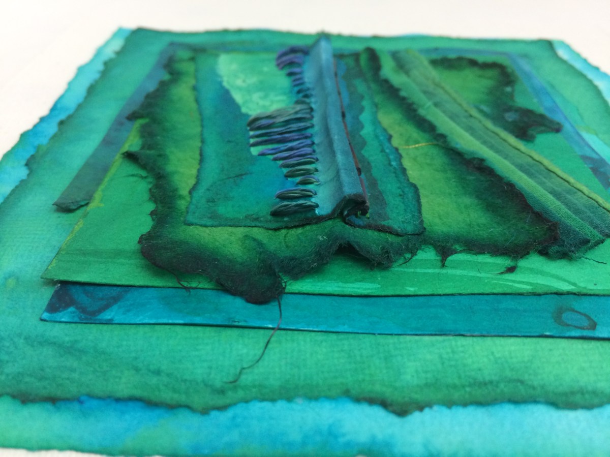
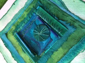
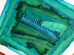
 I’ve just spent a month dwelling in a color I love so much: blue-green, and I have to admit it wasn’t easy to move on!
In this year full of color, as I journey around the color wheel, I’m devoting each month to a single color, and April was all about teal, turquoise and sea-shades of aquamarine. These are the colors of a magical world inhabited by peacocks & mermaids. And me!
At the end of each month I add the fruits of my makings to my Etsy Shop — there are only three of these in existence, so catch ’em while you can!
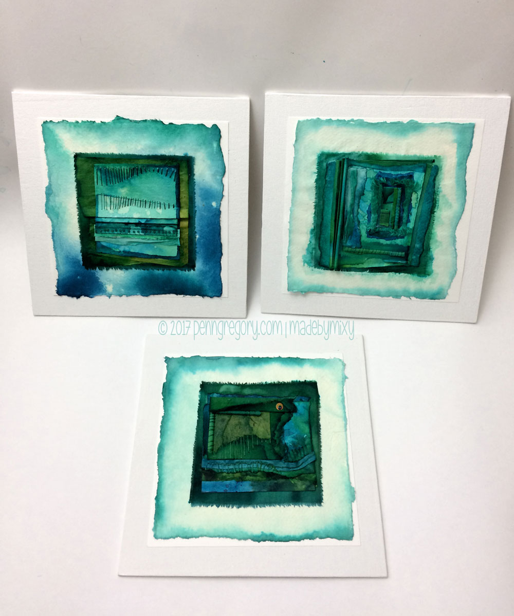
Mounted on 8 inch square canvas board, these are layered collages of hand dyed paper and cotton & silk fabric intricately detailed with little weeny glass beads and stitching.
They are ready to hang as soon as they arrive in their new homes.
Welcome to the underwater realms of my imagination …
This is one where I’m beginning in the middle. I’ll catch you up on the beginning next, but let’s start off here, just coz I feel like it.
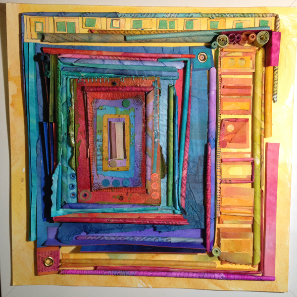
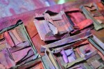
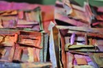
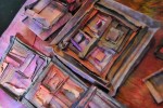
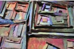
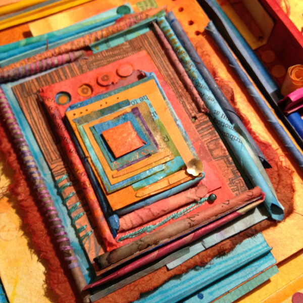
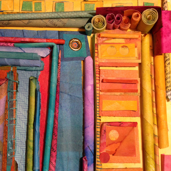
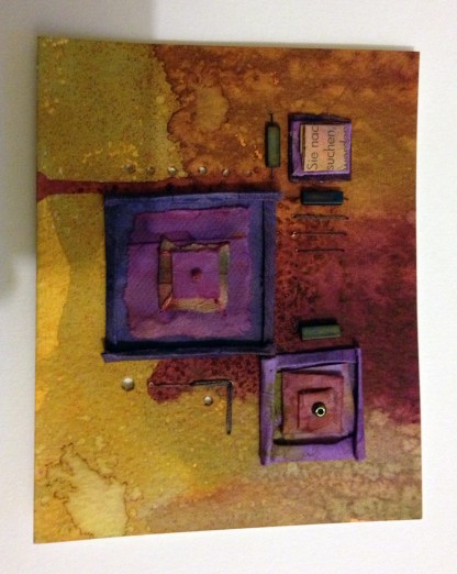
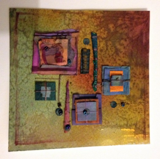
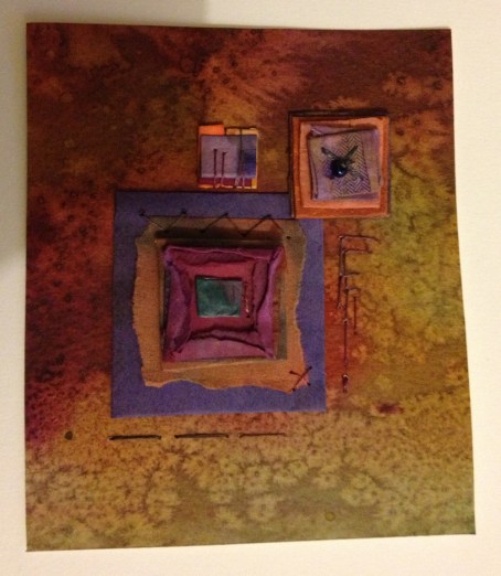
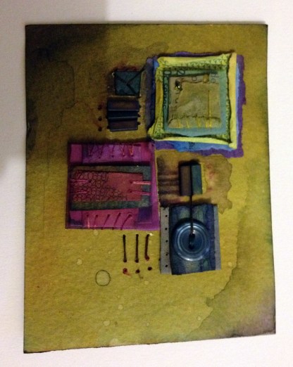
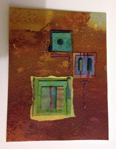
Thoughtforms are a series of relief collages I’m making from the dyed paper (way back… remember the dyed paper?) 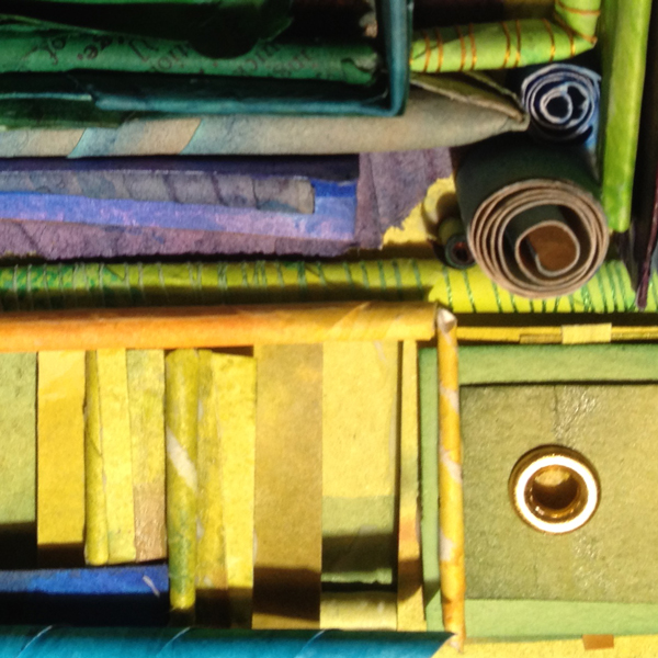
and the don’t-know-why-but-compelled-to-keep-making-them funny little colored rectangle things.
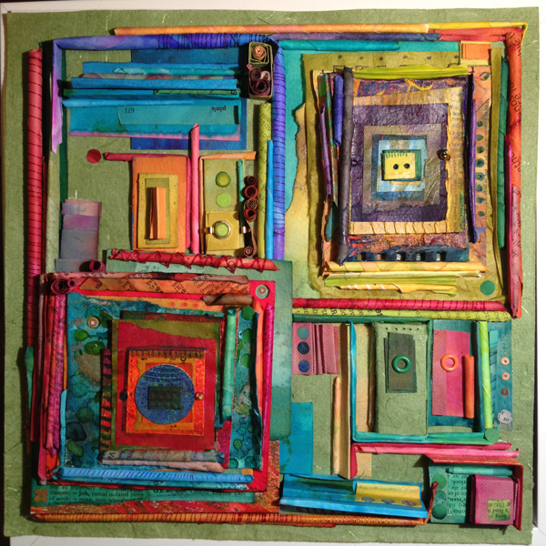
So these loose ends are also finding each other and forming into slightly more coherent entities.
Thoughtforms are continuing that recurring theme: trains of consciousness & patterns of thought. More on that later.
I’ve made 6 of a series that will total 9, 3 are still in progress. These 6 are on display (and for sale – if you’re quick before they get snapped up!) at the Upstairs Gallery
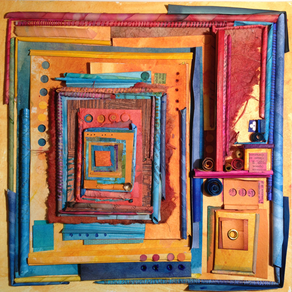
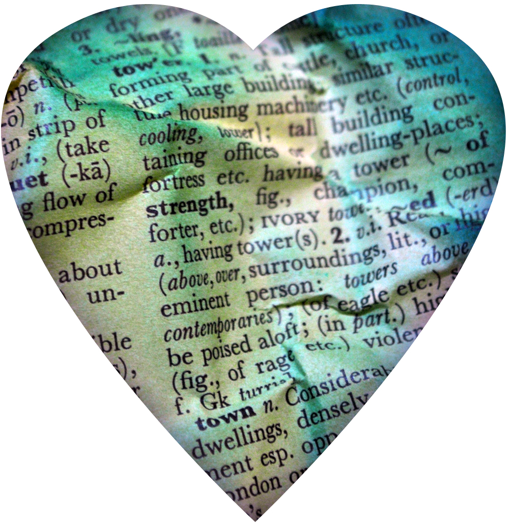
Each one is named after a fragment of text found somewhere in the piece, serendipity giving them eclectic names such as: Spacecraft, Puddings cakes etc, Fortitude and Adversity amongst others.
The next series will include more textile elements, but the overall feel will be similar.
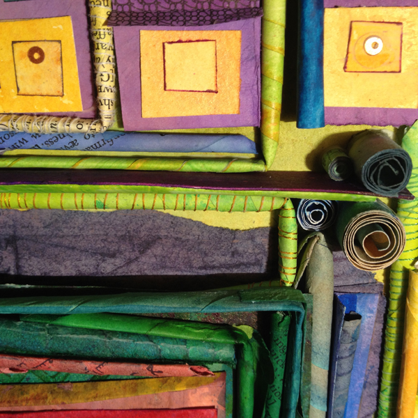
Still with that one theme leads to another, one thought folds round a corner and opens out into a coiled up spring, some buttons and a rivet, stitched onto the overarching idea of something else.
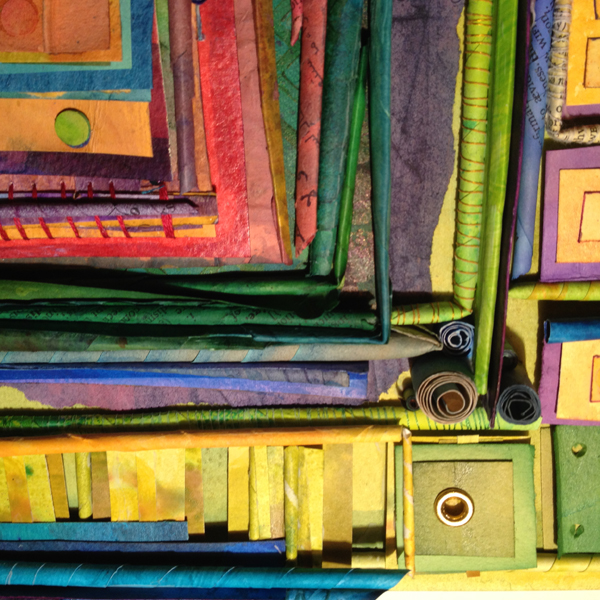
Or something. Y’know, like it does. The beauty is they can represent whatever you want them to. Or nothing at all if you .
Just thinking to myself, as I click through your wonderous creations and thoughts, how much you enrich my days.
I might not say it often, but I love you guys! X
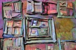
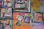
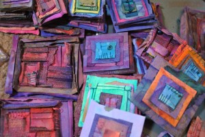
Day 2, and so far I’m quite liking 2013.

It’s demanded nothing to arduous from me.
It’s given me time to play with these square things!
They’re a work in progress, I think a little more to be done, then framing.
More pics soons! 😀
Hey folks – Happy Holidays to you all!
We’ve had a lot of dark, gloomy, rainful days here. Not a big grumble, weather happens, but the half-arsed grey wet daylight has severely hampered my ability to any good photos lately. This week, finally I got a few pics of my latest adventures and obsessions!
When time and people permit, I like to pretty much hibernate from around 21 December straight through to a couple of days into January. Not so much a big sleep, but a big re-charge. I spend most of these days actively pursuing colors and shapes in some fashion or another 😉
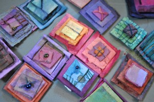
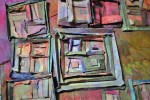
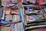
Recently I’ve found myself making a whole load of these. Srsly, like dozens of them. Ranging in size from about 1/2 inch upwards to 2 inches, they really satisfy the no scrap is too small to keep mentality!
To what end I can’t be certain, but I mounted a few up on some dyed paper and framed a few in little Ikea box frames.
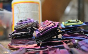
Some of them have a very dimensional quality – consisting layers of paper and some with corrugated card – so they work well in a deep box frame. (pics to follow…)
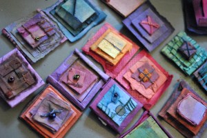
Hang on… like a deja vu thing going on here… these things remind me of something…
Yes! these things
Curious… I’d totally forgotten about them til typing this post… But do feel encouraged, at least I’m consistent with my obsessions, even if I’ve no idea what they’re for (yet).
So, dear friends and visitors, whether you’re getting ready to party the new year in, or already have done, I wish you all the very best for 2013.
May it bring you what you wish for, and more 😀
Eph X