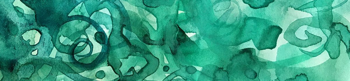
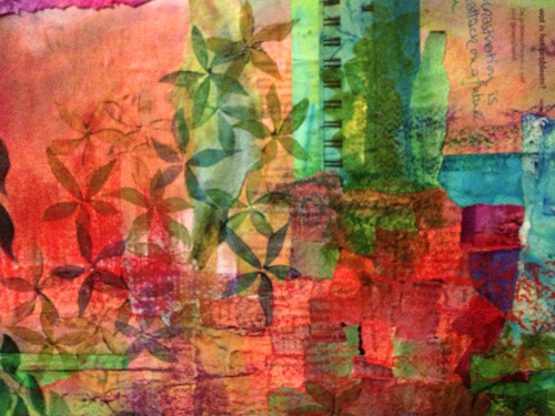
The essence of mixed media is layers. Today I want to explore a lighter, more dreamy version of layering.
Stop acting so small. You are the universe in ecstatic motion.
– Rumi
It’s all about the layers
The essence of mixed media is layers. I love piling layers up, with scribbles over paint over collage over who knows what lies beneath.
But layers don’t have to be weighty and dense.
My tendency is often towards over-ness: over complicated, over-thinking, over-working. So here is a stretch for me – cos I believe it’s always beneficial to stretch our creativity.
Today I want to explore a lighter, more dreamy version of layering.
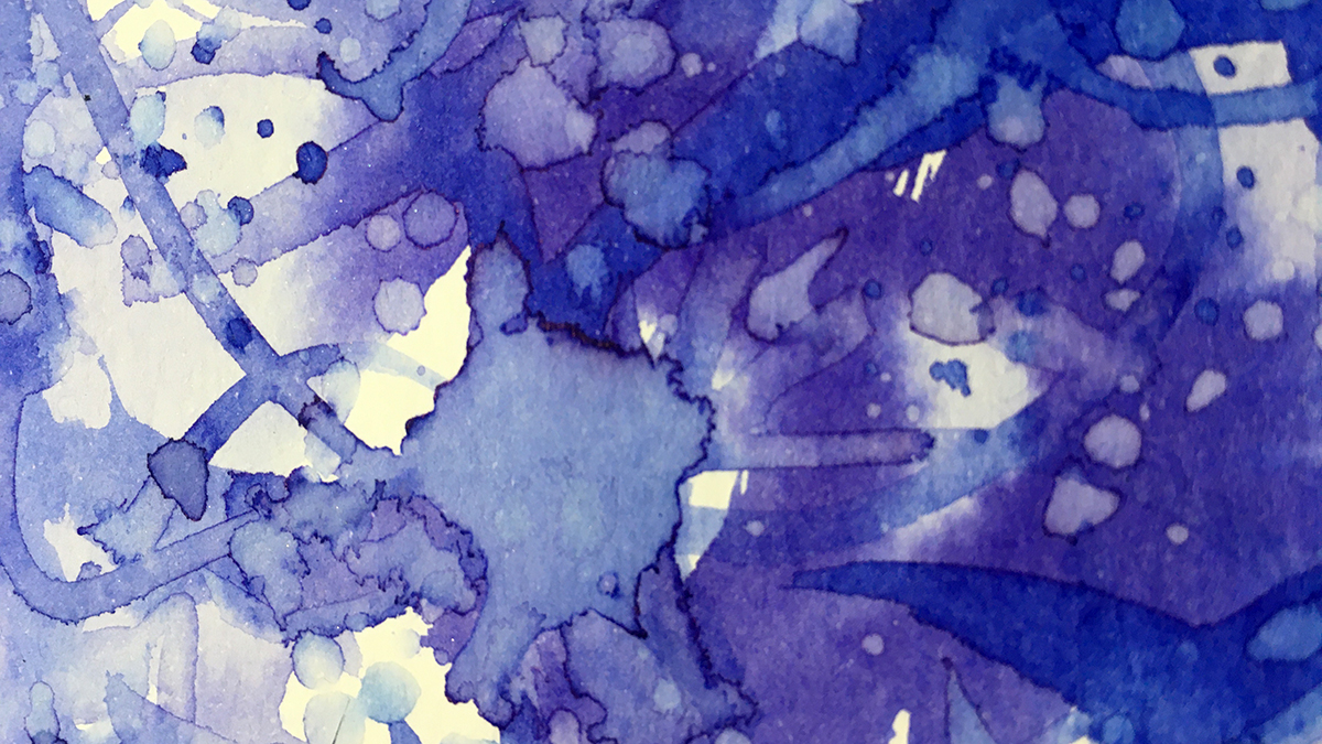
I’m using the same two inks from last time, because these colors are perfect, and because I’m all about simplifying my process right now. Less decision making & more spaciousness!
Here’s my simplicity:
Two inks + water + plain white paper.
One brush.
Paint quickly.
Don’t stop to think – keep moving.
Let it dry.
Repeat until done!
Here’s how the process played out:
The result was some delicate patterns which I find only come from creating spontaneously like this.
“Twelvty” 12 Colors in 12 Months
Every month this year I am making a series of pieces in just one color. At the end of the year I’ll combine them into one big multicolored work.
I’d love for you to join me. TWELVTY is open to everyone, and better yet, it’s free!
Sign up for my newsletter to find out more and get your free TWELVTY guide ebook.
Processing…
Success! You're on the list.
Whoops! There was an error and we couldn't process your subscription. Please reload the page and try again.
You’ll get an email to confirm you’ve signed up and are human. Sorry, only humans (and their cats) can join. Check your spam folder cos sometimes the good stuff gets swept in there by mistake. Check with your cat too. You know it’s what they expect.
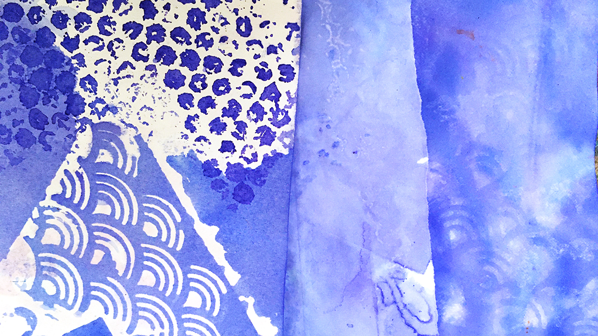
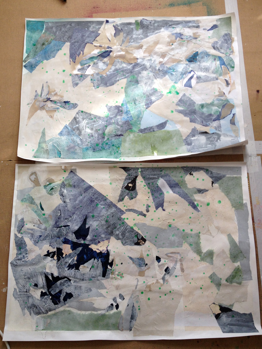
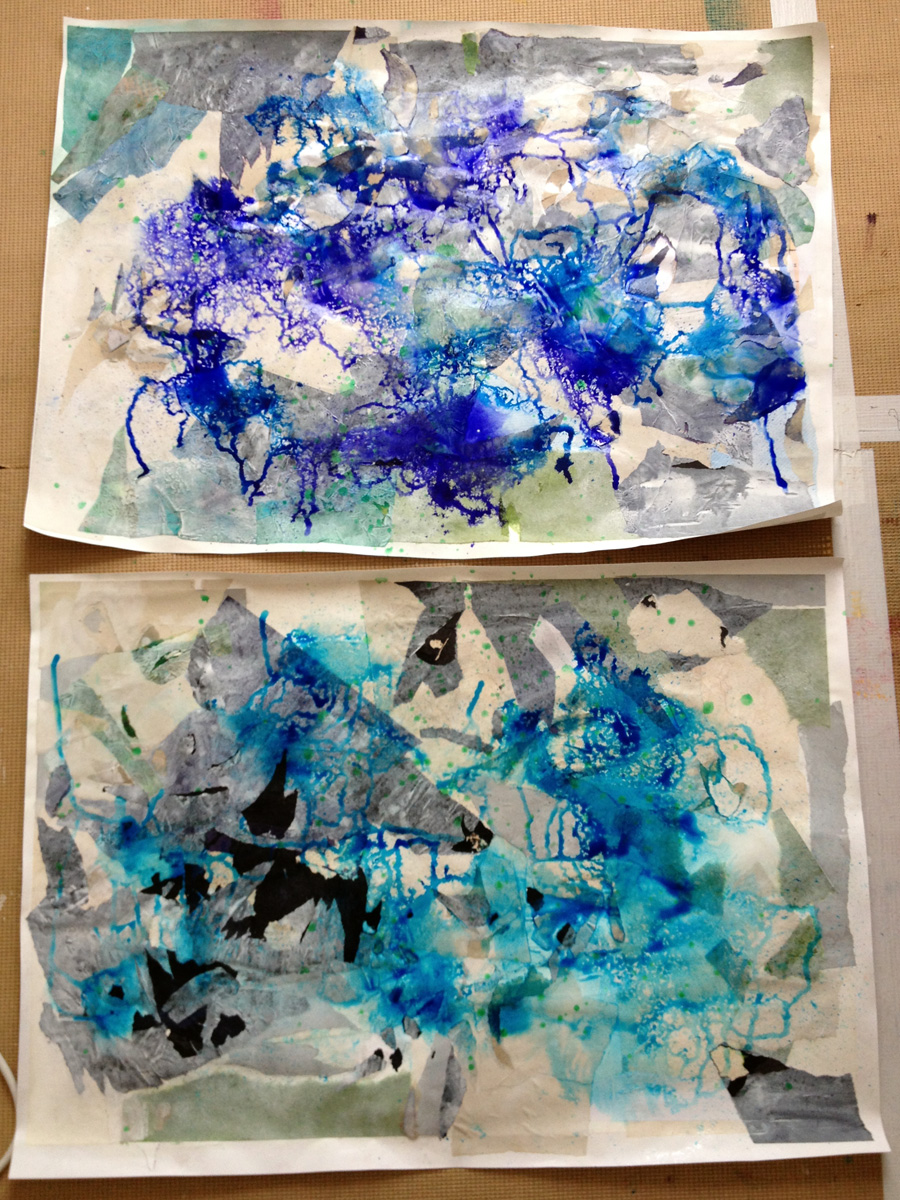
Exploring Violet-Blue by breaking all the rules of stencils in the paper dying process!
If you’ll believe in me, I’ll believe in you. Is that a bargain?
– The Unicorn
On Contrariness
The rebel part of me who yearns to do the thing the opposite way from which it’s intended is secretly enjoying the ride of this ‘down is up, up is down’ year.
And that got thinking about stencils.
The point of the stencil is for neat tidy edges with regular lines and orderly patterns, and the contrariness of distorting the lines from a stencil appeals to my creative heart so much.
I love smudged edges and misaligned prints. I love worn paint effects, skipped lines, mis-matched patterns, mis-sprayed with glimpses of background showing through.
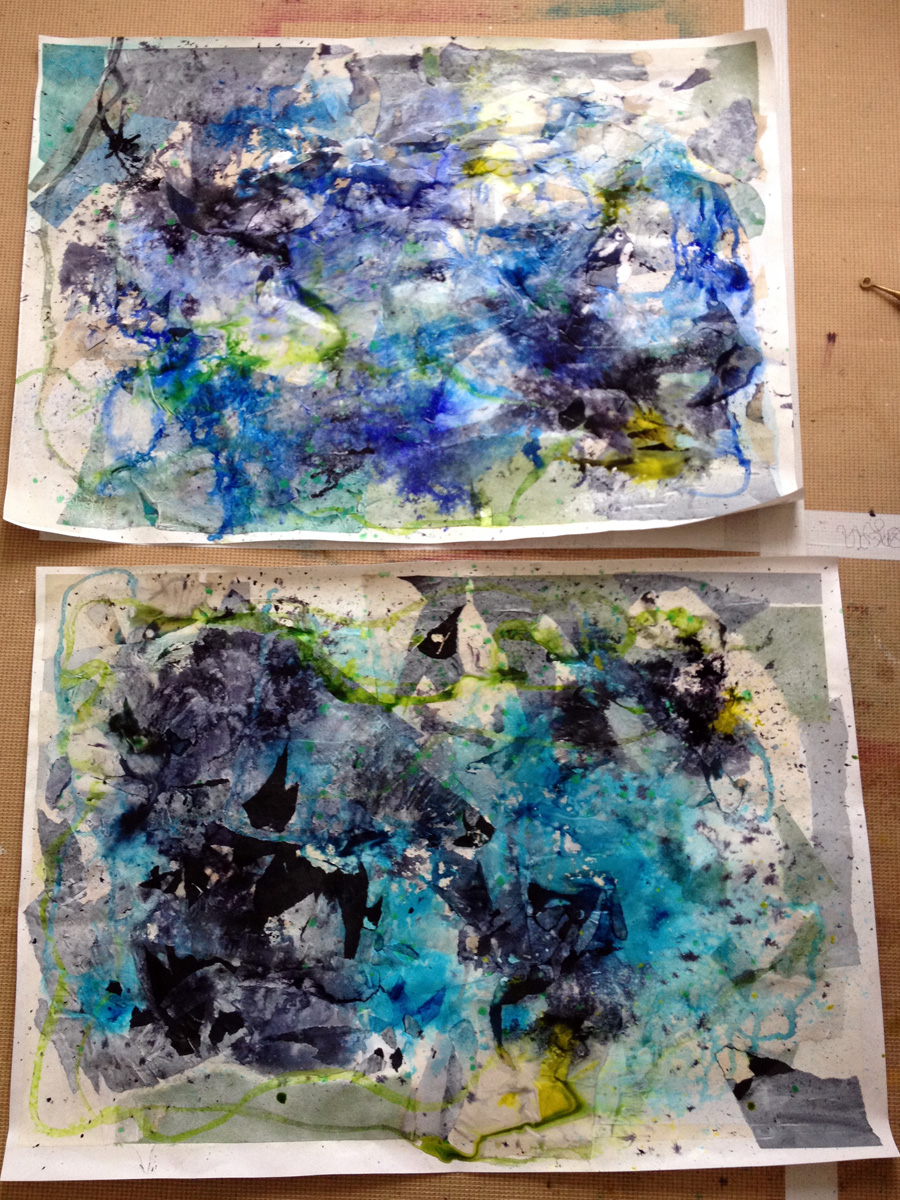
All this is why I love using stencils in my paper dying experiments, so that’s where I’m going in today’s first dabbles with this month’s color: Violet-Blue.
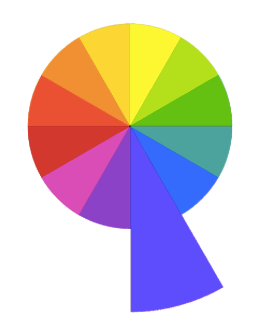
Being a tertiary color, Violet-Blue straddles the space between its neighbours in the color wheel, the place we find the moody mauves of bluebells and forget-me-knots.
And I’m excited to see how that works out in this process!
I’m using two inks: Violet by Colourcraft Brusho and Cobalt Blue by Pebeo Colorex. This blue has a strong violet undertone, and the violet is right at the coolest edge of the hue.
I’ve got a few different types of paper to play with – cartridge paper, regular copy paper, ultra thin Tomoe River paper, and some heavy watercolor paper. Different weights and absorancy of the papers all take up the ink in a different way.
Paper dying basics:
Play with a variety of paper for a range of effects
Torn edges often soak up ink to make darker edges
Wet the paper with water – spray or brush or sponge or drip.
Layer with stencils, (and/or bubble wrap, string, plastic wrap.)
Add ink (writing ink, drawing ink (thin it with water if it’s thick and gloopy), watercolor paint, dye, food coloring….
Keep adding overlapping layers of paper, water, color, stencils…
Leave to dry.
Unpeel the layers to reveal the magic!
Wet paper (especially the super thin stuff) goes wrinkly and buckles up. This adds even more patterns as the ink escapes through gaps and wiggles through in little rivulets between the layers.
If you don’t like the really crinkled effect you can always press the paper flat with a warm iron after it dries, or squash flat under some heavy books..
But if you do like this texture, try adding more by crumpling and folding the paper in places before you begin. Where the surface is disrupted like this it often allows the ink to penetrate the fibres more and makes a darker, stronger pattern.
Here’s my Violet-Blue stencil play!
What’s next?
Some of these turned out so pretty I’m leaving them just as they are, but others will be backgrounds for further adventures – maybe another round of stencil dying – maybe something else 🙂 I’ll be back next week to show you more!
“Twelvty” 12 Colors in 12 Months
Every month this year I am making a series of pieces in just one color. At the end of the year I’ll combine them into one big multicolored work.
I’d love for you to join me. TWELVTY is open to everyone, and better yet, it’s free!
Sign up for my newsletter to find out more and get your free TWELVTY guide ebook.
Processing…
Success! You're on the list.
Whoops! There was an error and we couldn't process your subscription. Please reload the page and try again.
You’ll get an email to confirm you’ve signed up and are human. Sorry, only humans (and their cats) can join. Check your spam folder cos sometimes the good stuff gets swept in there by mistake. Check with your cat too. You know it’s what they expect.
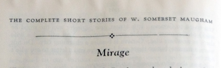
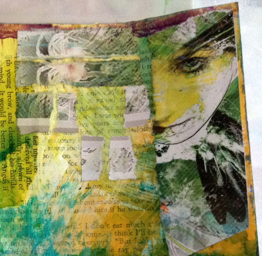
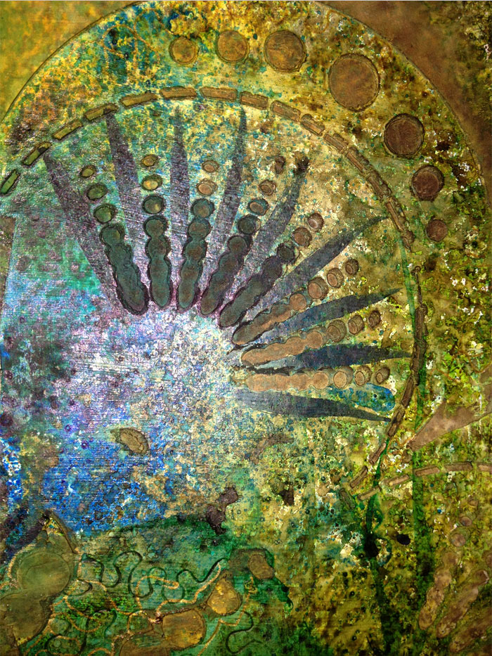
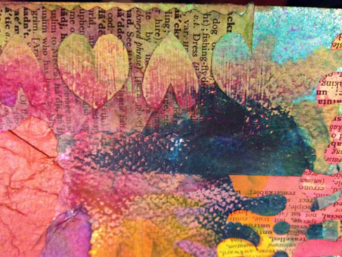
Some the pages in my altered book are already conveniently titled. The book began as an orphaned volume of short stories, and some of the tales’ titles just appealed too much to cover up.
Doesn’t Miragejust conjure such magic?
I haven’t embarked on any of these pages with a plan. Planning just isn’t in my spirit. I didn’t get that gene.
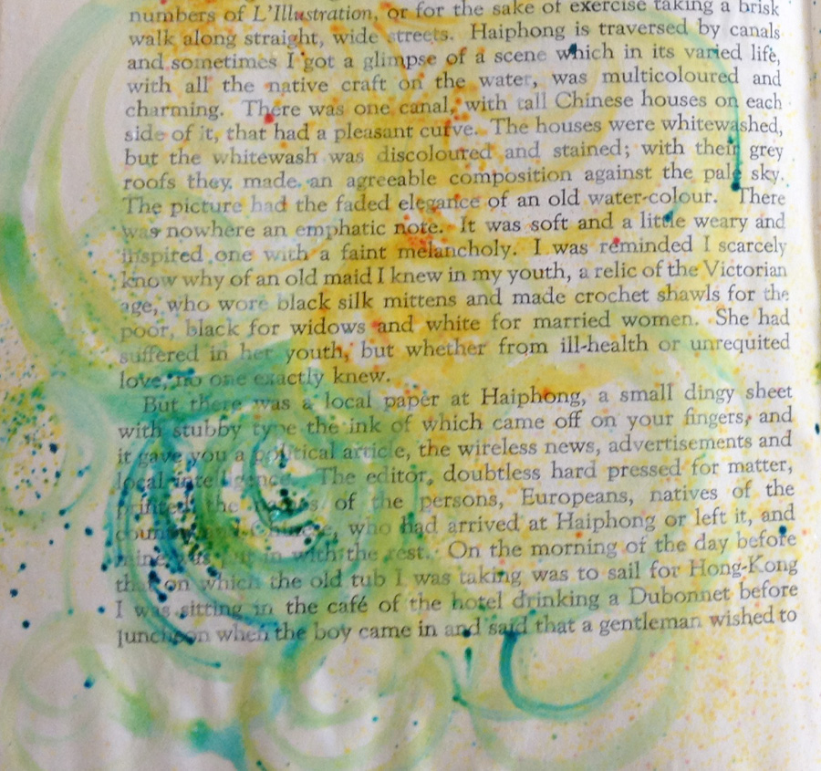
So to begin I just do something, and let that define where it wanders next.The first something that happened on this page took the form of sprinkles of Brusho swept about in circles with a wet brush.
Oh my how I love how these dusty crystals explode with colour. This stuff is the definition of less is more. More than a wee bit makes for a super rich gravy of an ink, which is gorgeous, but when you use an imperceptibly itsy amount each tiny trace of this magic erupts into zingy pigment on contact with moisture.
It is more than gorgeous. It is actual magic.
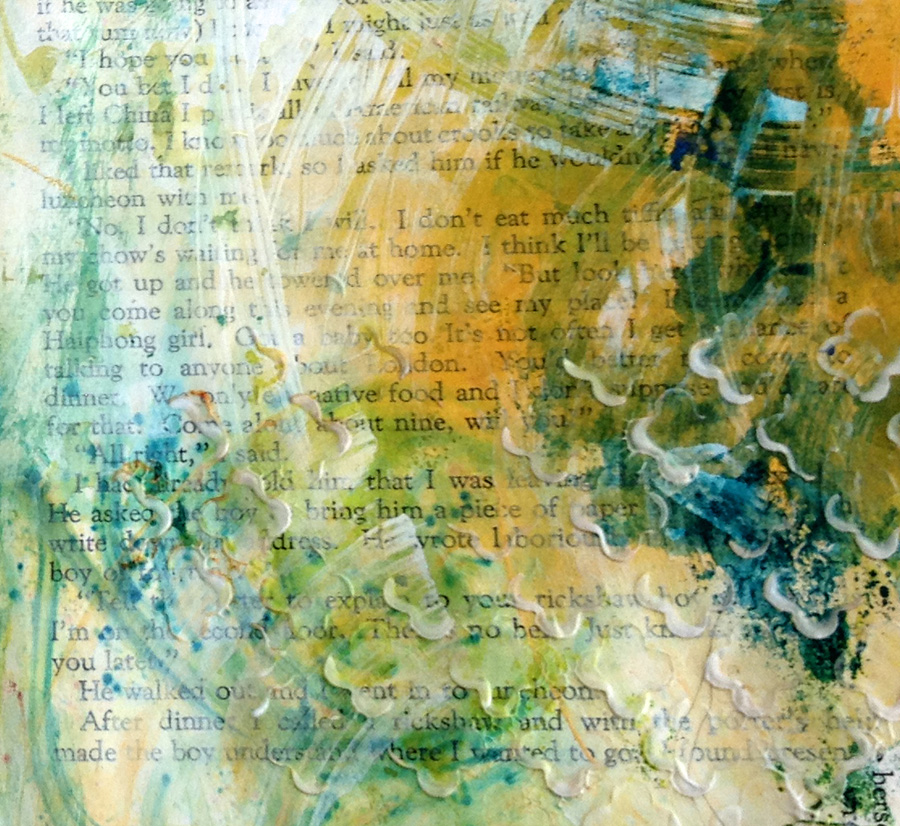
Another early layer was gesso scraped through a stencil, then extra messy gesso scraped haphazardly. If you’re a fellow scraper of gesso you’ll recognise those characteristic windshield wiper patterns of clearing excess off the scraper 😉
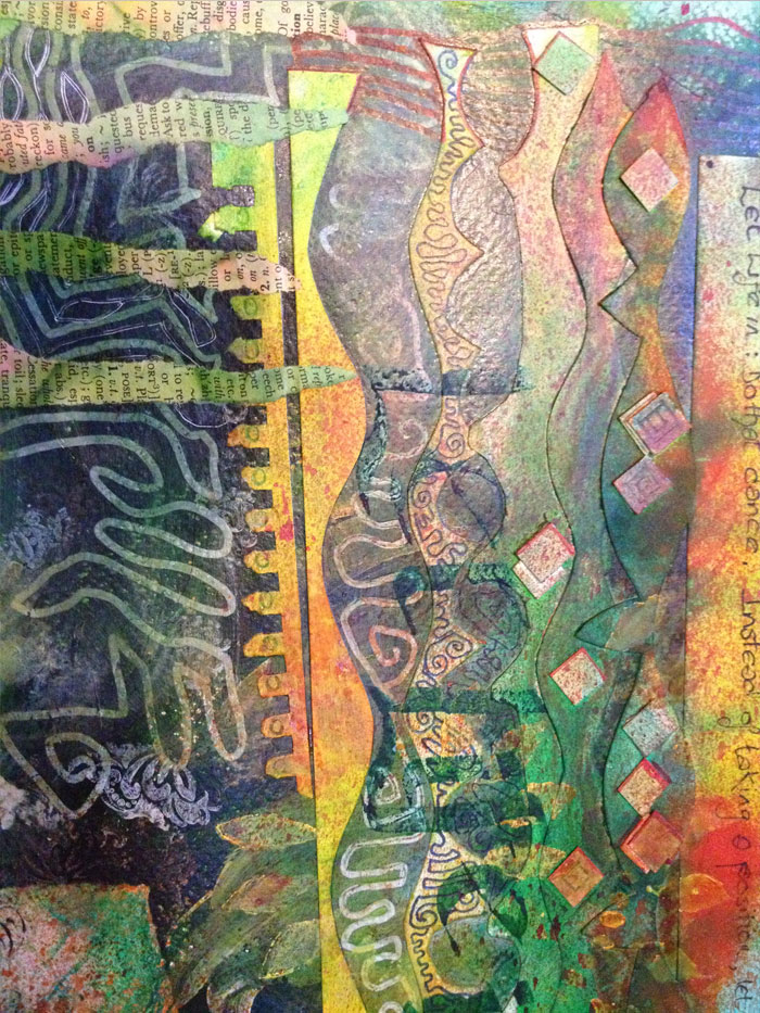
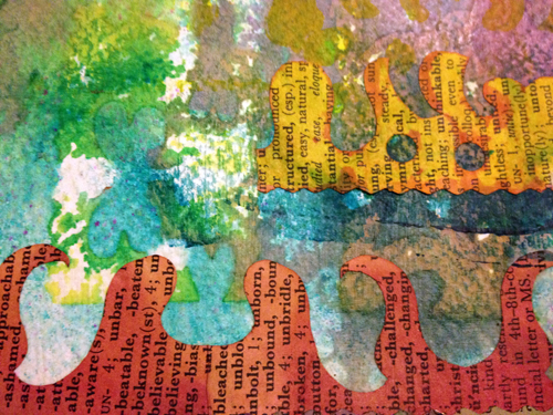
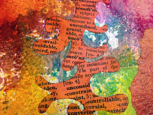
In the years preceding this project I accumulated a shed load of design magazines, rich full of the most gorgeous graphics and illustration. Just lately I embarked on transforming the knee high heap into 4 boxes of delicious collage ingredients, and a small mountain of recycling.
Thing is, I don’t know who this half a face belonged to, and as an artist I’d like to credit the creator. Any reference to the inventor got lost in the snippings. If it was you – thank you – and I hope that you like the new other half I made. In the spirit of self-portraiture I’ve mismatched the eyes for a familiar wonkiness!
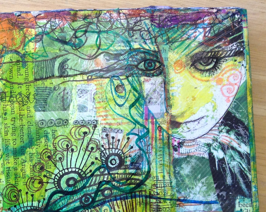
Hope you’ve enjoyed this little trip through the putting together stages. Here’s how the page developed as a whole………
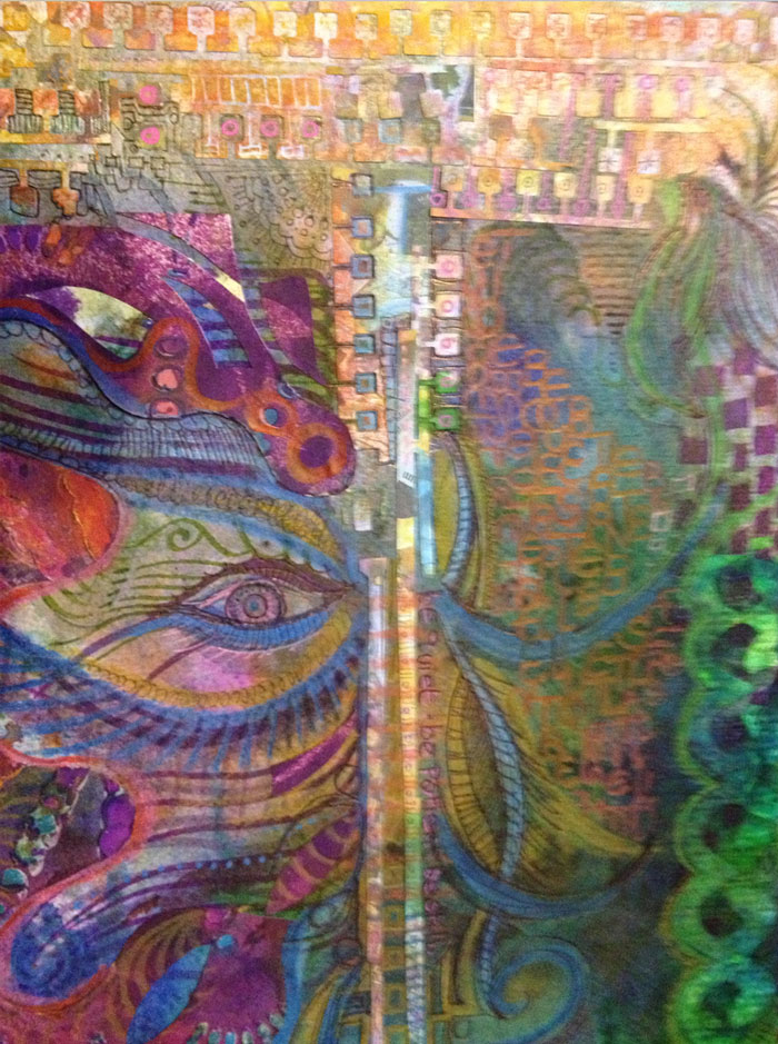
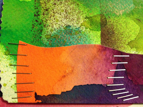
Now, if you know me at all, you’ll understand that I need colour like I need coffee, sleep and oxygen.
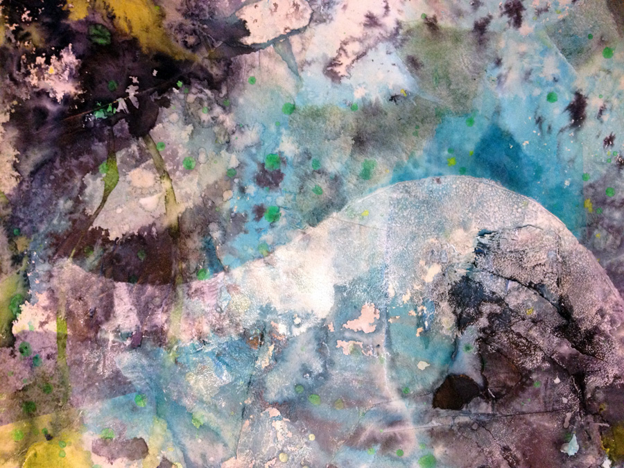
So while the peeling back process had restored some of the original brightness, it’s not enough for me. I’m getting hungry for colour and there’s only one remedy there: throw some ink at it:
Swished with water as well (yeh – Water theme – Water literally. It’s the method acting school of artistry)
Plus some black for more contrast, and some lime green and chartreuse for good measure (and for the fact they’re colours I adore)
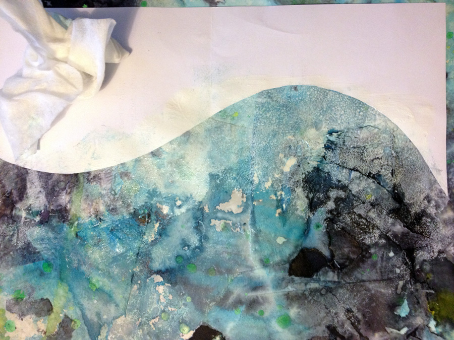
If I were to try and define my process as a shape, it would be zig-zag: No sooner had I reinstated the brightness, I felt a call to white a load of it out. I know – don’t ask – I’ve stopped trying to second guess where I’m going, I’m just hanging on for the ride now. So I feel like wavy shapes will bring in more Water-y feeling (that I just can’t see now it’s ink drenched). I neeed more wateryness!
This is a 50-50 mix of white acrylic and matt medium for a semi-transparency. painted on and dabbed about with a cloth for a dabbled bubbly sea wave froth look.
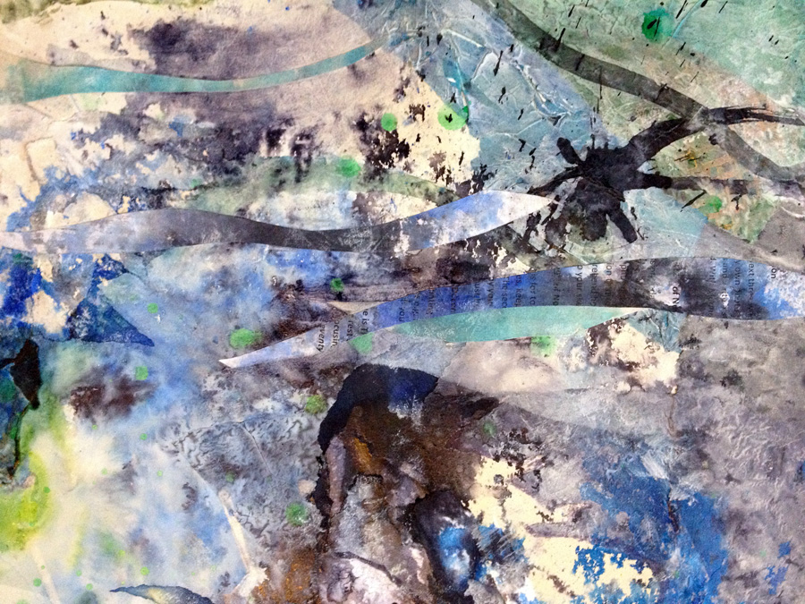
Yeh? maybe not so, but I still like the effect. On a roll with the wave shapes, along came some more collaging from scraps that got in the path of the flying ink a few days earlier. (No paper ever goes to waste here!)
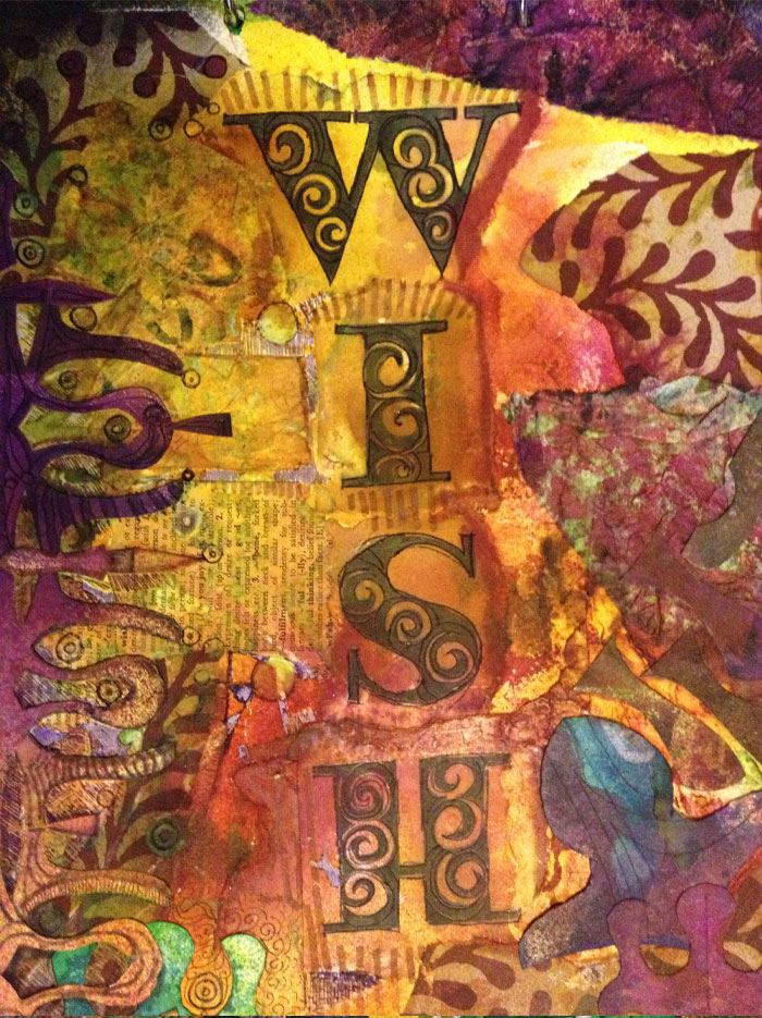
the wish book continues
the modelling paste and stencil thing has been a recent obsession so my pages are getting lumpier, but in a pleasingly ordered, symmetrical way!
Mmmmm, snippy paper bits too. Lots of them.
and as though to reiterate.
(Yes, that H does look upsidedown, I thought that too)
Hey folks, I’m back! Not that I’ve been anywhere else, I’ve been right here inside your computer, I just haven’t been getting the words and pictures out to you for a few weeks 😉
So here’s a little round up since I last posted……….
Looking back over the last few weeks I can see it’s been centred a lot around stencils and ink spraying
I treated myself to a bunch of bargain stencils a few weeks back. They were 1/2 price, it would’ve been sheer madness not to.
I also started making some of my own, cutting from acetate sheets, paper and card.
The paper/card ones are getting recycled into collages as (or before) their edges n corners begin to disintegrate!
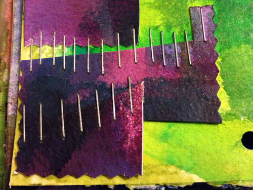
Ooh and stapling! I seem to have about a gazillion boxes of staples… so naturally they’ve joined the art ingredients
This is just scuffing the surface of the iceberg of things I’ve been busying at – more pics to follow soon! 😉
On friday I came to the final page of the page a day project. And the first page of a new book!
I’ve downsized for practicality – but every day has a double page spread so in terms of square inchage I have a little more area to cover daily.
Page 1/day 1 came with it’s first happy accident: doodling initially in yellow rollerball pen (effectively invisible in artificial light) sprayed ink through stencil and finding the ink running round the doodled lines.
As this page a day project is winding up towards the last few pages, I thought I’d share with you what’s been going on; recent days have made these recent page snippets…
Y’know that sticky mesh tape stuff you stick plaster board together with? Yeh, sure you do! Here it is… It’s meant for healing up wounds in walls n ceilings, but I have a much better use for it.
Made from fibreglass it’s super-tough and water resistant, and the tape has just the right ickiness to it. If you’ve seen my last few posts you’ll know where I’m going with this…
It makes for excellent griddy stenciling and painty fingers!