The story so far, has lead us to this point
Now, if you know me at all, you’ll understand that I need colour like I need coffee, sleep and oxygen.
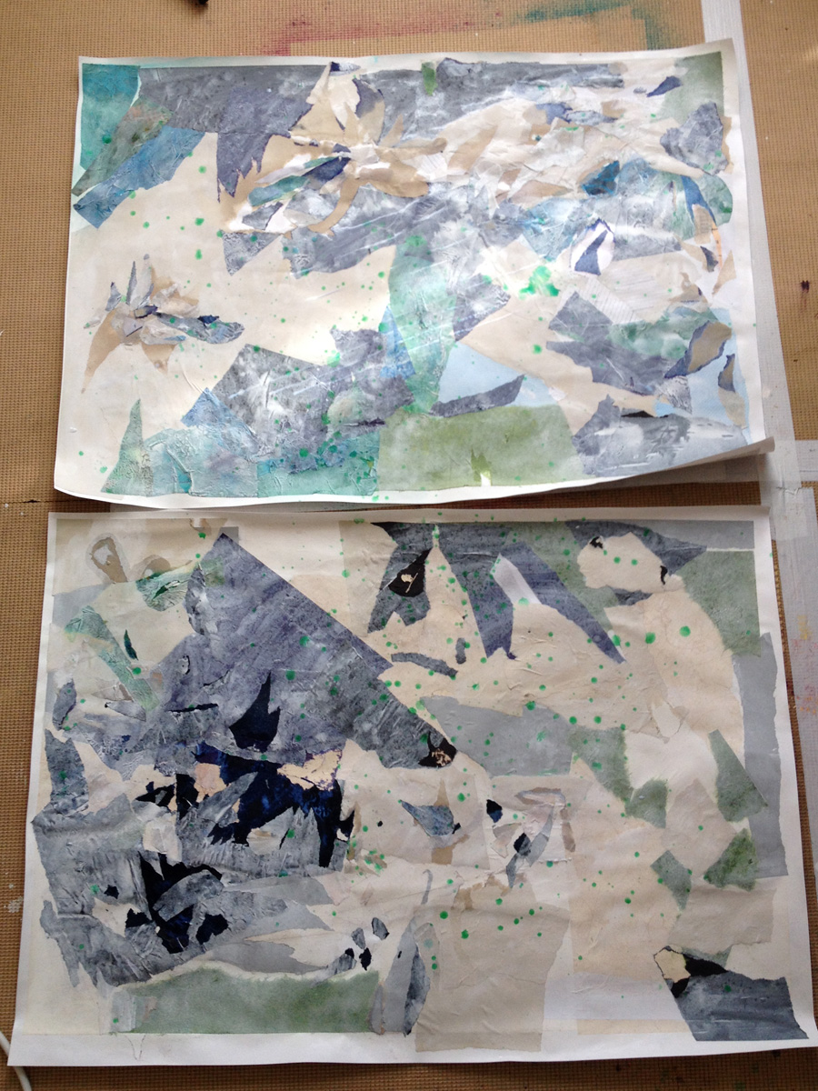
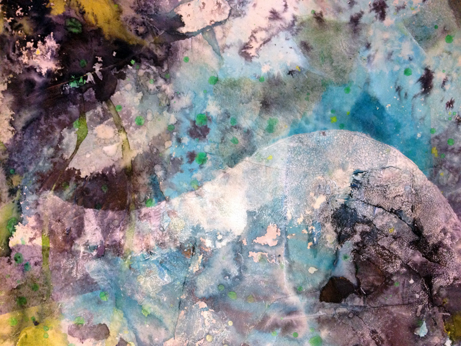
So while the peeling back process had restored some of the original brightness, it’s not enough for me. I’m getting hungry for colour and there’s only one remedy there: throw some ink at it:
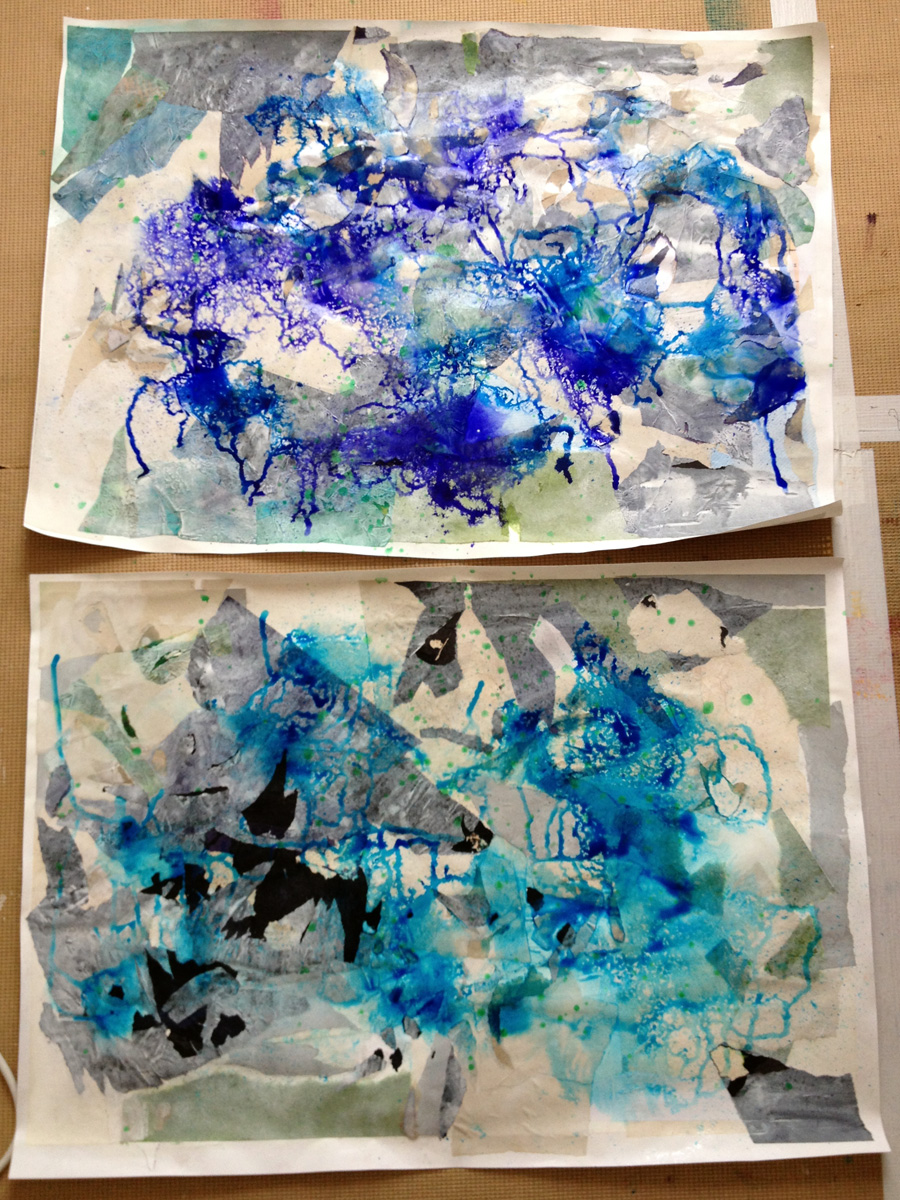
Swished with water as well (yeh – Water theme – Water literally. It’s the method acting school of artistry)
Plus some black for more contrast, and some lime green and chartreuse for good measure (and for the fact they’re colours I adore)
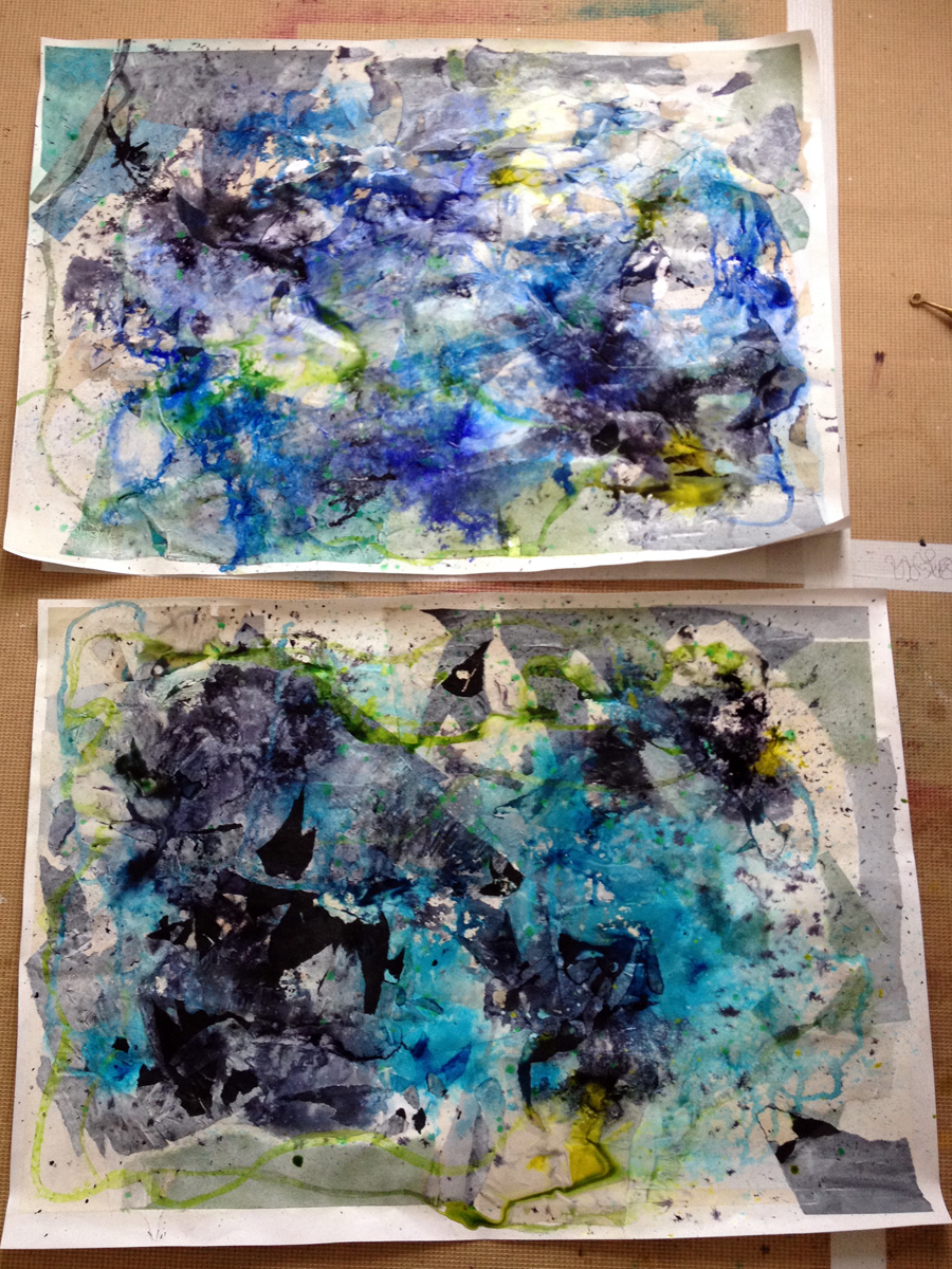
If I were to try and define my process as a shape, it would be zig-zag: No sooner had I reinstated the brightness, I felt a call to white a load of it out. I know – don’t ask – I’ve stopped trying to second guess where I’m going, I’m just hanging on for the ride now. So I feel like wavy shapes will bring in more Water-y feeling (that I just can’t see now it’s ink drenched). I neeed more wateryness!
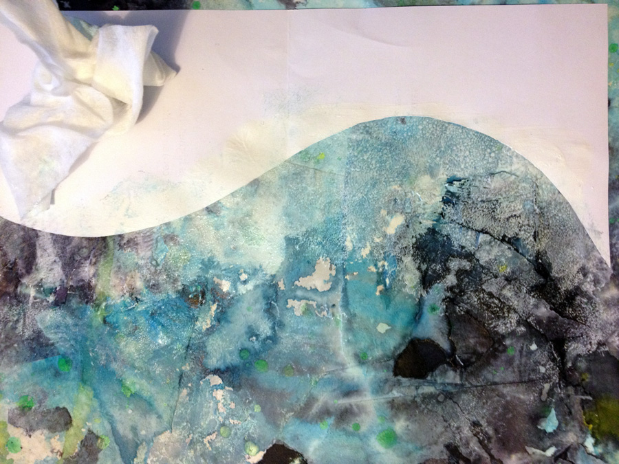
This is a 50-50 mix of white acrylic and matt medium for a semi-transparency. painted on and dabbed about with a cloth for a dabbled bubbly sea wave froth look.
Yeh? maybe not so, but I still like the effect. On a roll with the wave shapes, along came some more collaging from scraps that got in the path of the flying ink a few days earlier. (No paper ever goes to waste here!)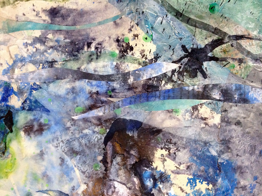
I’ll leave you here for now. Next post coming soon……….
