“You can do anything you want to do. This is your world.“
— Bob Ross
Like a lot of folks these days, I avoid using plastic as much as possible, especially the single use kind, but still it finds ways to sneak into my home and my life. This stuff can’t be recycled so I make sure as much of it as possible gets involved in my art making process before it’s inevitably binned.
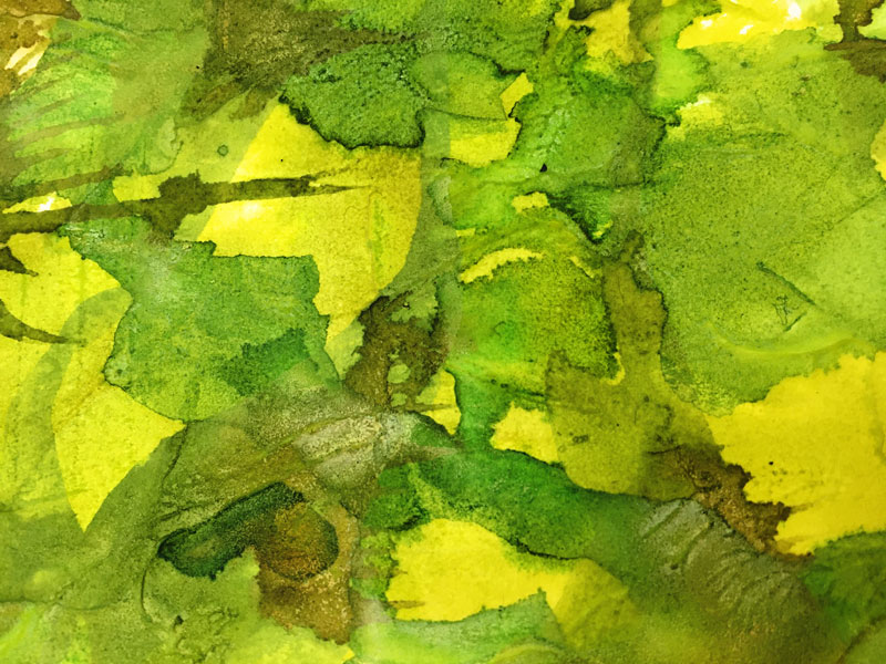
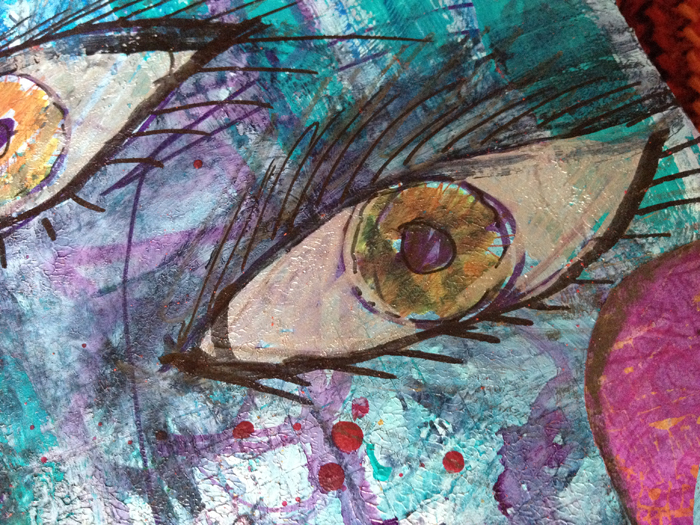
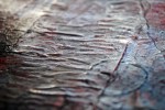
And it was with this in mind I came across a new way to make painted surfaces uniquely pattered, and super shiny too!
I’m sure to be revisiting this way to play again, there are so many degrees of shininess, texture and thicknesses which make different patterns.
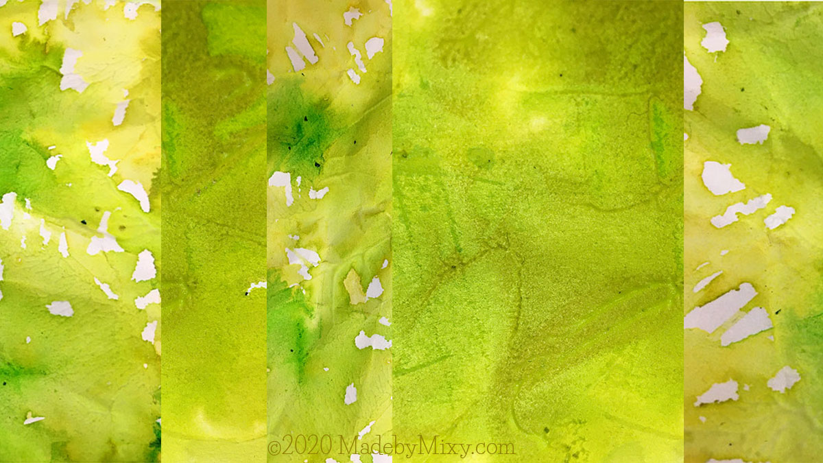
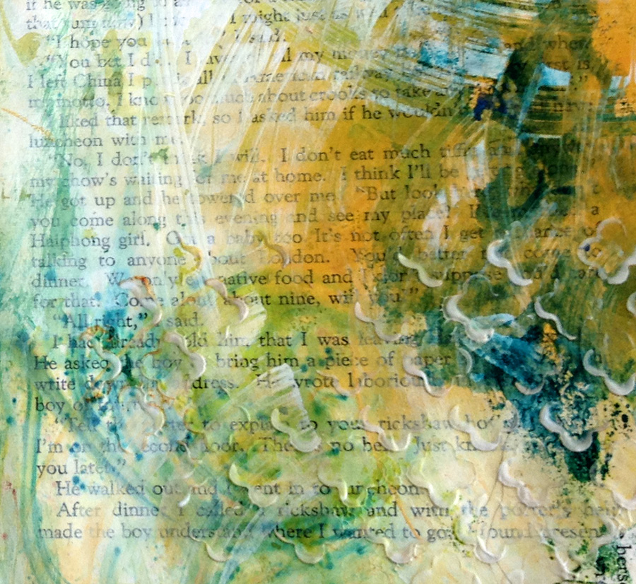
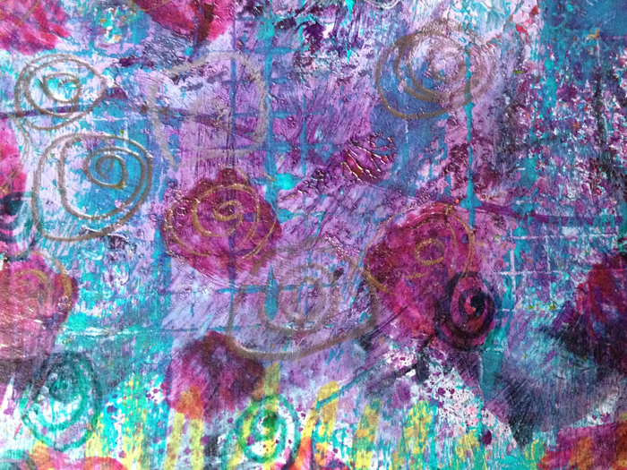
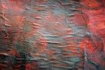
The first thought I had when I saw the effect in the yellow-greens is how like glossy leaves it looks. So just right now I want to dash off and cut out leaf shapes and collage me a big ole shrubbery or something. … But I must finish this post first!
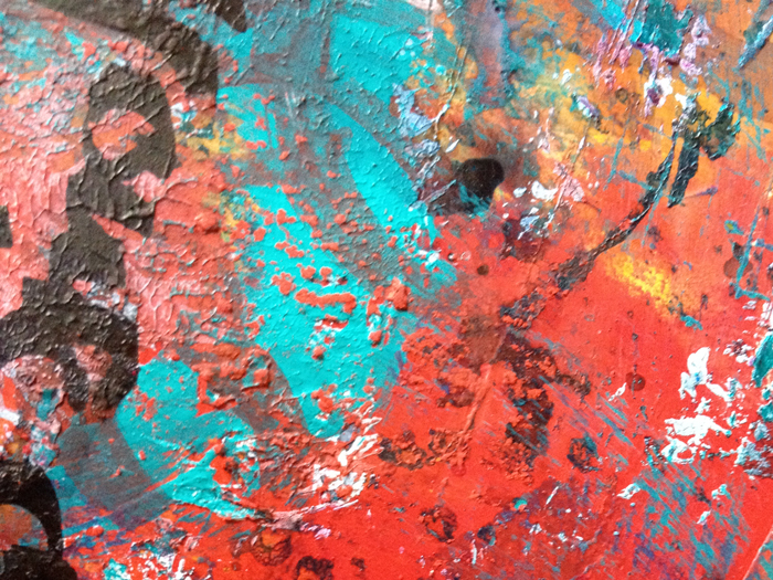
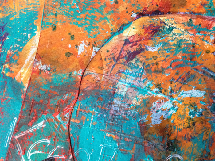
It’s a super simple process:
- A thick-ish layer of acrylic paint on paper.
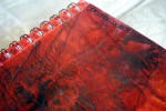
- A plastic or polythene bag laid out on the wet paint surface.
- Smoosh and squish about a bit to stir up the color and get it to stick to the plastic.
- Squidge it up in places to make little ridges and bumps and stuff.
- Wait to dry (I left it overnight)
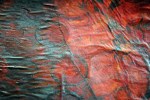
- Gently peel off the plastic to reveal deliciously rippled surface and shiny bits.
- I’ve saved the plastic to reuse again – some paint got stuck so I figure there will be interesting effects using another color with it next time . Watch this space!
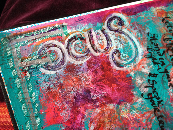
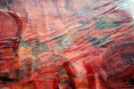
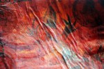
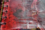
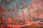
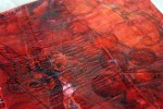
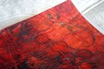
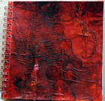
This is how my first experiment panned out:
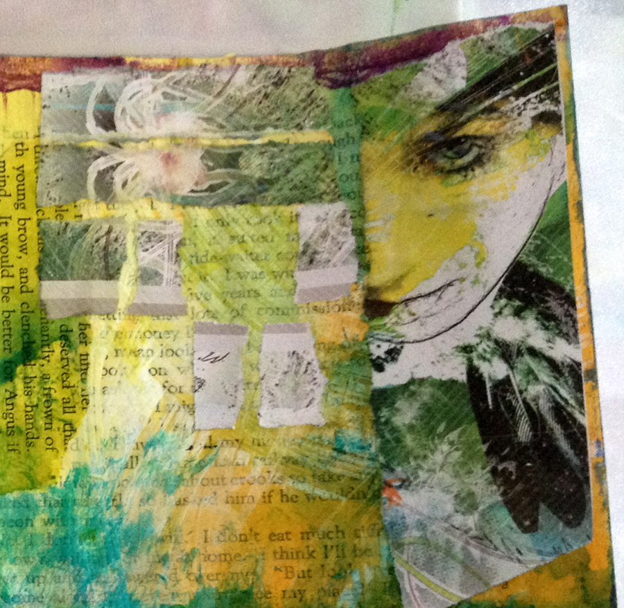
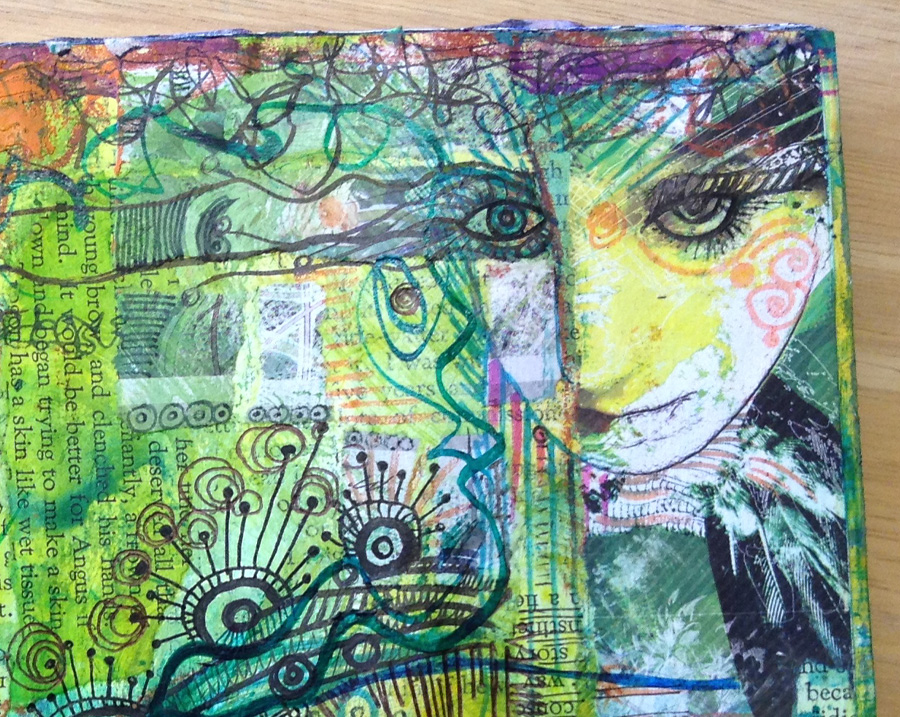
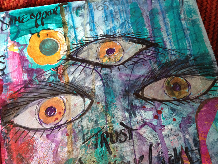
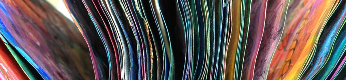
Every month this year I am making a series of pieces in just one color, so at the end of the year I can combine them into one big multicolored work.
I’ll be sharing my process throughout this adventure here in this blog.
I’d love for you to join me. TWELVTY is open to everyone, and better yet, it’s free! Sign up for my newsletter to find out more and get your free TWELVTY guide ebook.
You’ll get an email to confirm you’ve signed up and are human. Sorry, only humans (and their cats) can join. Check your spam folder cos sometimes the good stuff gets swept in there by mistake.