As we wind towards the end of the month, here’s some of the monochrome mixed media I’ve been playing with in October.
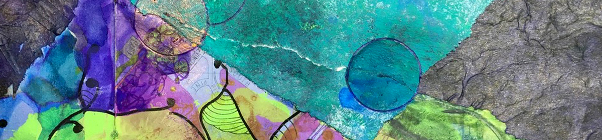
one month in one color: mixed media in autumn tones.
As we wind towards the end of the month, here’s some of the monochrome mixed media I’ve been playing with in October.
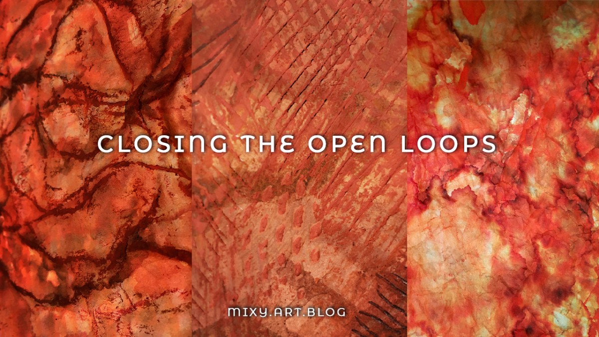
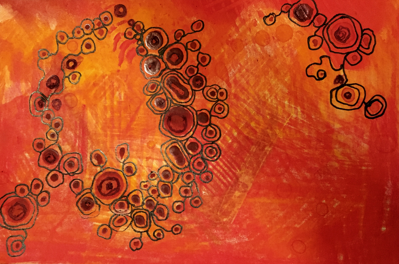
Today is a day of finishings, of closing the open loops in the pieces I’ve been adding to all month.
Today is a day of finishings, of closing the open loops in the pieces I’ve been adding to all month.
“The most important thing about art is to work. Nothing else matters except sitting down every day and trying.”
– Steven Pressfield
If you haven’t already seen them – I shared making the first layers here, followed by the tricky middle stage here. Today is when all those loose ends come together!
What all of these monochrome pieces I’m making have come together in a similar fashion:
Experimenting, playing, setting it all aside for a while to return to with fresh eyes.
I’m working towards integrating this strategy in the rest of life beyond the studio – life as a bigger work in progress – but that’s for another post another time.
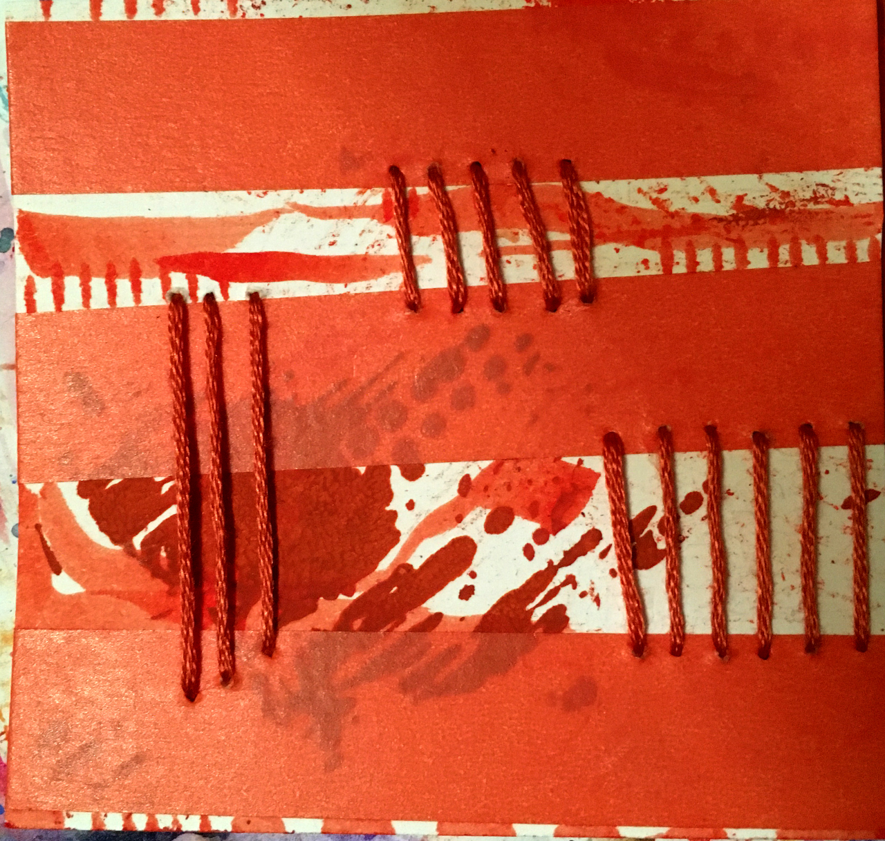
Feeling like this was the closest one to being finished, today I started out with the piece with the string.
Using loose scribbles just catching the raised parts brought more contrast to the squiggly lines. First using the same markers I began this one then with, and some oil pastels on top for a bit of extra grunge. Trimming the edges straight gave it another element of contrast with the contours and cloudy colouring.
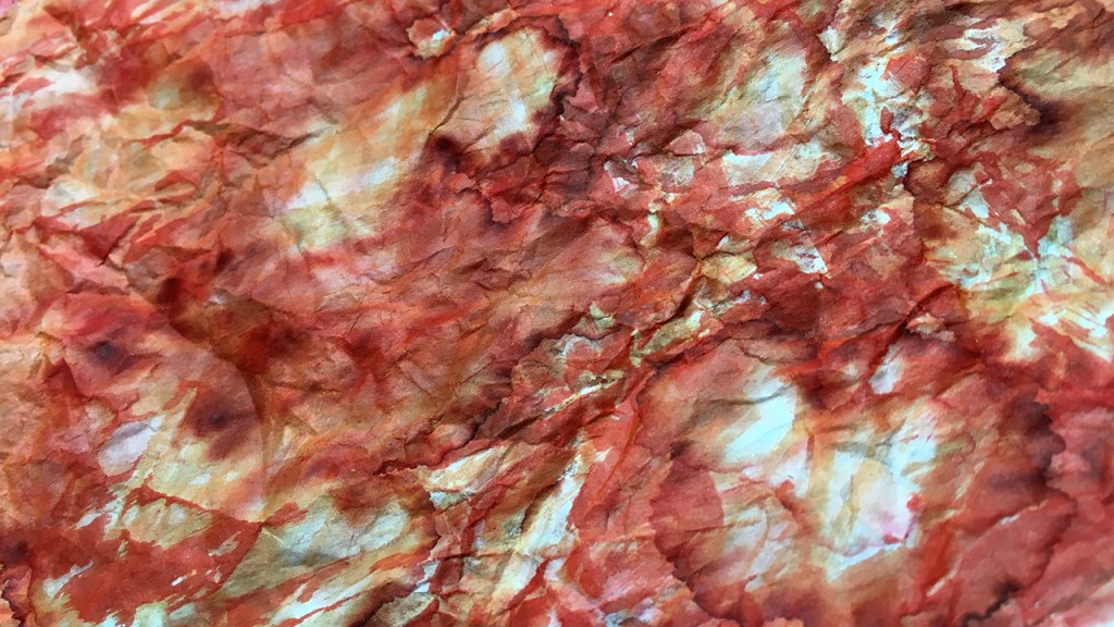
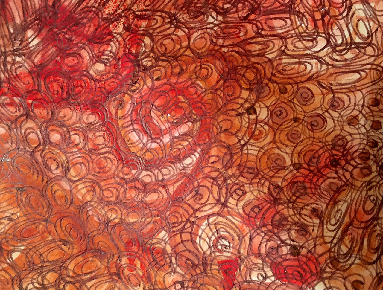
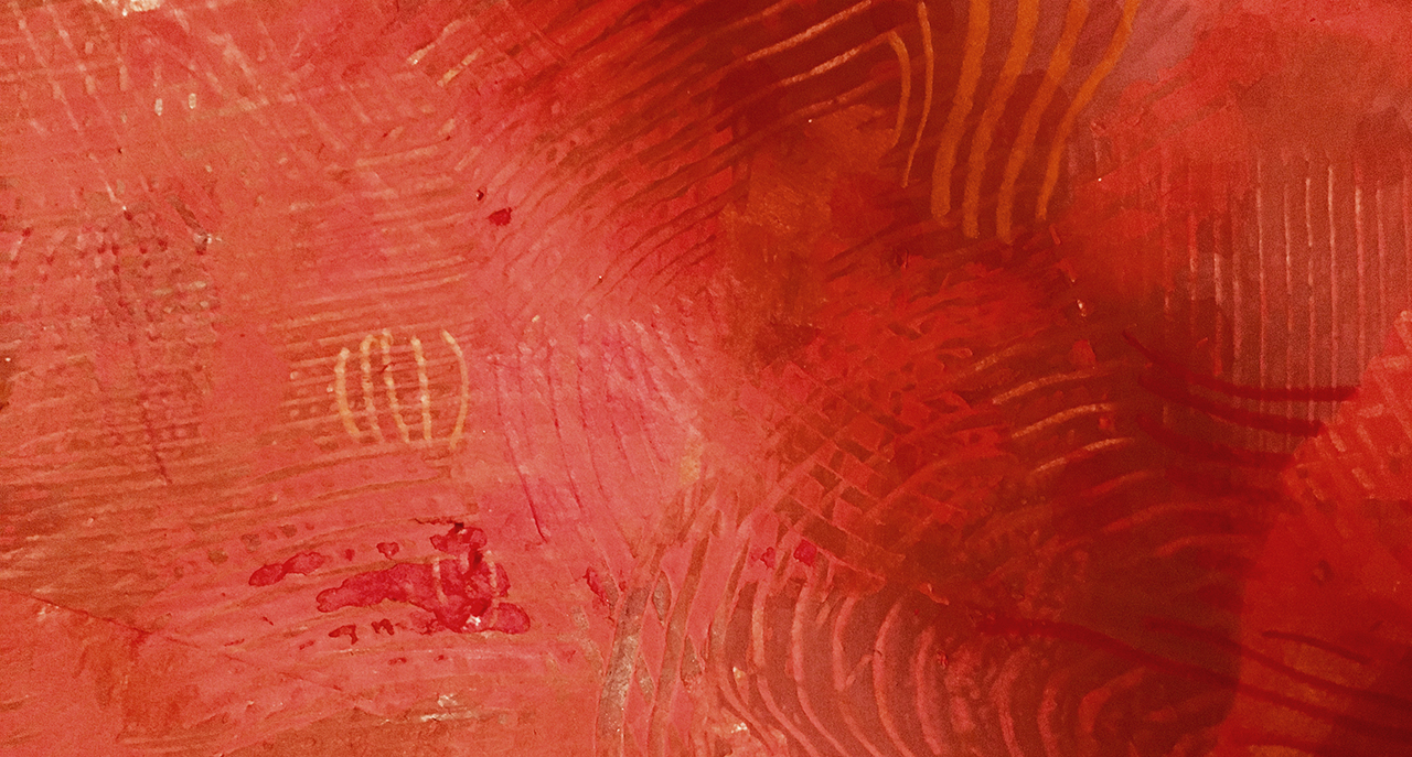
Oftentimes my entire process consists of repeating the same steps over and over, and next up we have one of these. I loved how the newsprint/packing paper took the water soluble ink and water marks, each time I added more on top of the dried layers the patterns that formed became more intricate, so this is some more of the same 😉
The painted envelope pieces were the furthest from ‘done’ at the start of today. Still having a very scrap paper vibe I began by trimming them down to get rid of the unpainted edges.
The small pieces often work well in layers together, and I like adding folds and creases to break up the flow. It’s also a way to reshape a piece without cutting it up.
Don’t forget you can add layers under as well as on top. An almost finished piece can really come to life when ‘framed’ by layering it on top of something similar or contrasting. I used a bit of the mixed media paper behind my folded envelope parts. Keep stacking until it feels right!
“Everything will be okay in the end.
If it’s not okay, it’s not the end”
— Indian proverb
I think a lot of us are – especially in early days of art experiments – prone to lose faith before a piece is done.
The more I practice making art, the more convinced I am that if it isn’t looking right, it usually just needs more.
And that can be as simple as more of the same. A stripy layer over a stripy layer over another one. The final pieces I worked on today began with dollopy blobs of paint, some finger painting swirls to more the color around, then stripes made with my trusty art comb. (formerly a hair comb, retired to much more rewarding life in the studio).
The next layer was more paint blobs and more combing. And again. Finally some stripes in marker pen and then ballpoint to finish it up. Lots of directions, lengths, weight and media – all unified in stripiness.
Here’s how today’s finishing process looked:
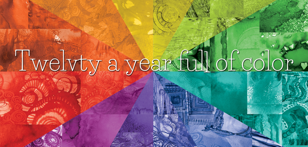
Every month this year I am making a series of mixed media pieces in just one color. At the end of the year I’ll combine them into one big multicolored work.
I’m sharing my process throughout this adventure here in this blog. (So far this year I’ve explored Yellow, Yellow-Green, Green, Blue-Green, Blue, Violet-Blue, Violet, Red-Violet & Red)
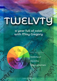
I’d love for you to join me. TWELVTY is open to everyone, and better yet, it’s free!
Sign up for my newsletter to find out more and get your free TWELVTY guide ebook.
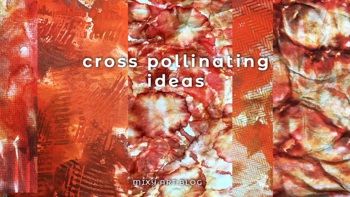
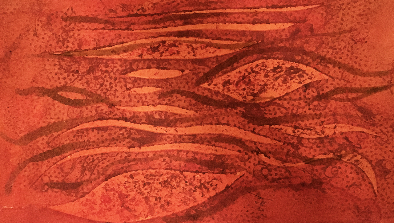
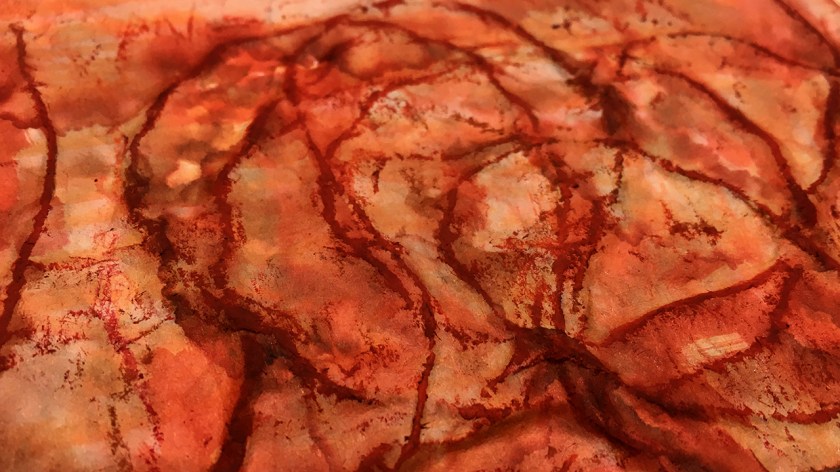
Taking up where I left off yesterpost, mixing up the mixed media ideas in this next step of red-orange monochrome.
Moving on from the first layers I showed you yesterpost, having set these pieces aside to dry I came back to find this lovely heap of semi-raw ingredients on my desk to play with today.

To unify the layers I began with, I’m using the same brush pens and acrylic paints + a little metallic orange and watercolor in deep orange and burnt sienna.
(the metallic orange looked exactly the color I wanted in the jar, but is more of a pale pinky coral on paper… but nothing that can’t be assimilated later, and some of that sheeny-shine will likely show through the layers)
Beginning with the envelopes, I wanted more vibrant color. Previously I used water to soften the coloured areas, but of course this dilutes the richness. I’ll often do this back and forth dance with pigment and water to build the layers up. As the water drops push the pigment to the outer edge of the puddles, a wiggly outline forms when it dries. Where the color is pale the pattern from the envelopes shows through.
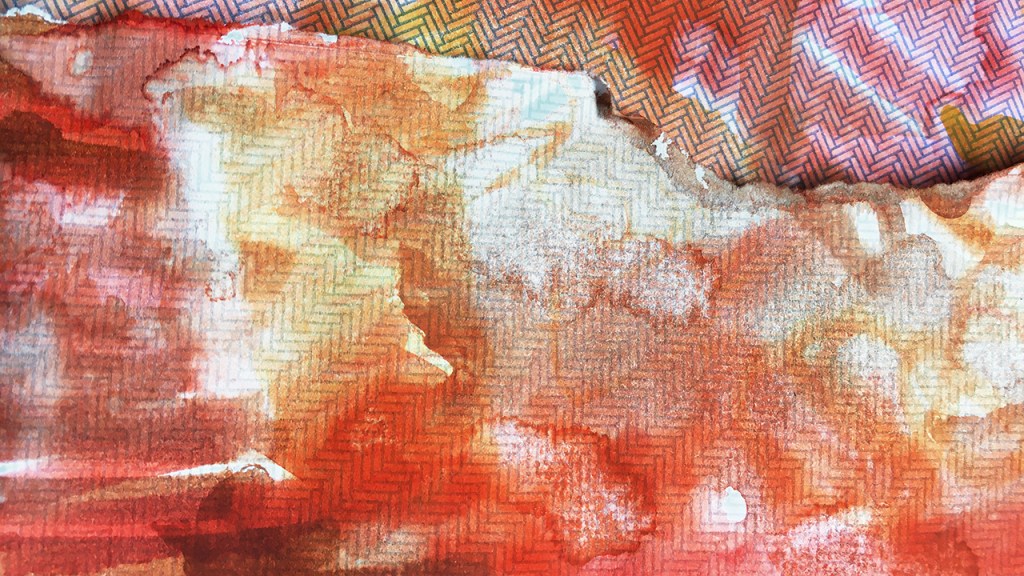
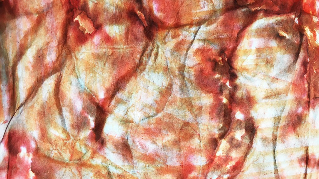
While these were drying I moved on to the packing paper/newsprint. Being so thin, the color had seeped through to the other side and I really like the effect of both side. So I tore it in two to use make 2 new pieces.
The heavy mixed media paper doubled as a drop sheet so has been gathering incidental art marks along the way. I trimmed the edges to make a backing to collage the flimsier paper onto.
Now I could have just glued it down, but the patterns from the crinkles so delighted me I wanted to take this a step further. To give it some texture underneath so I could recreate the same again with more color and water, I glued a tangle of string between the two papers.
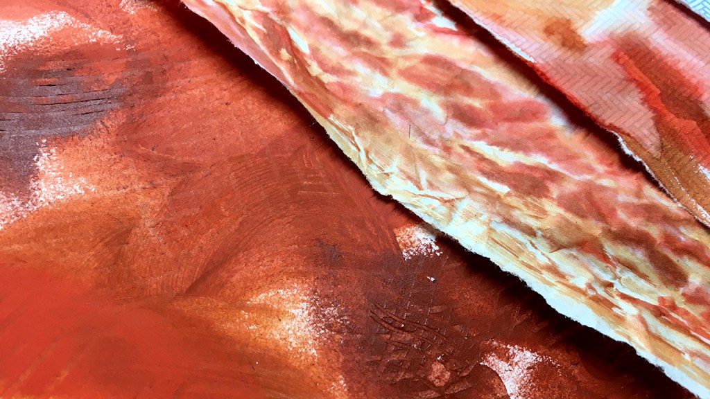
Finally I went back to the painted paper, trimming it down to make two small pieces, then adding a new layer of the acrylic, this time blending with a palette knife and repeating the mark making with the comb.
I can see potential in all of these, but none are quite finished yet – join me next time to see the final details take shape 🙂
This is what the process looked like today
Every month this year I am making a series of mixed media pieces in just one color. At the end of the year I’ll combine them into one big multicolored work.
I’m sharing my process throughout this adventure here in this blog. (So far this year I’ve explored Yellow, Yellow-Green, Green, Blue-Green, Blue, Violet-Blue, Violet, Red-Violet & Red)
I’d love for you to join me. TWELVTY is open to everyone, and better yet, it’s free!
Sign up for my newsletter to find out more and get your free TWELVTY guide ebook.
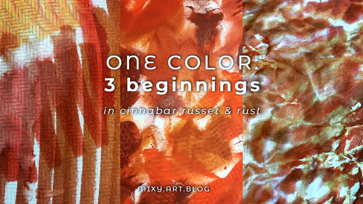
beginning a new color for the month — Orange-Red — with experimental layers. What to do when you don’t know what to do.
Where to begin?
How to begin?
What to begin?
“Start before you’re ready. Don’t prepare. Begin.”
– Steven Pressfield
Beginning before feeling ready seems easiest – in a contrary sort of way – when I’m unencumbered by ideas.
When the muse is nowhere to be seen and all I have is a heap of colors and paper, it’s like the pressure of ‘making something’ has been pushed away.
If nothing good emerges, so what. I’ve usually enjoyed the process, maybe learned something accidentally, maybe not.
And sometimes a seed of magic sprouts forth. Maybe not right away, maybe days or weeks or longer into the future. This happens enough of the time for me to trust it’s always possible.
So far in this year of color I’ve showed you a full start to finish process of some pieces in this collection. In reality though, I rarely make one piece at a time.
Mostly I cycle between few different pieces. I utilise the waiting to dry time, or the I’ve lost all direction moments, when a piece needs to be set aside and left a while. I shuffle my attention to the next piece.
Sometimes it’s a way to stretch and find divergence – I did/used one thing on this piece, now to try a different thing on this one.
Sometimes a common theme develops – like little splashes of water or paint – focussing on one, but spilling across to others (purposefully sometimes, not always). Or I’m so enjoying making – for instance – tiny squiggles that I add them here and there to different pieces until I get bored with that and feel called to make broad stripes, color washes, collage or whateverelse and around I go with that for a time.
If you have scattily erratic leanings like I do – I totally recommend this approach – especially if you like to work fast and furious!
“Start where you are, use what you have, do what you can”
– Arthur Ashe
Today – first steps into the realms of Orange-Red – was one such day: here’s what using just what’s on my desk looks like. One color, no particular ideas!
I gave myself 20 minutes or so to play and to see what early stage ideas would come up. Then to put all this away for a few days, and look at it with fresh eyes and develop the next layers [which you can see in my next post coming very soon!]
Here’s how today’s creating came together.
Every month this year I am making a series of mixed media pieces in just one color. At the end of the year I’ll combine them into one big multicolored work.
I’m sharing my process throughout this adventure here in this blog. (So far this year I’ve explored Yellow, Yellow-Green, Green, Blue-Green, Blue, Violet-Blue, Violet, Red-Violet & Red)
I’d love for you to join me. TWELVTY is open to everyone, and better yet, it’s free!
Sign up for my newsletter to find out more and get your free TWELVTY guide ebook.
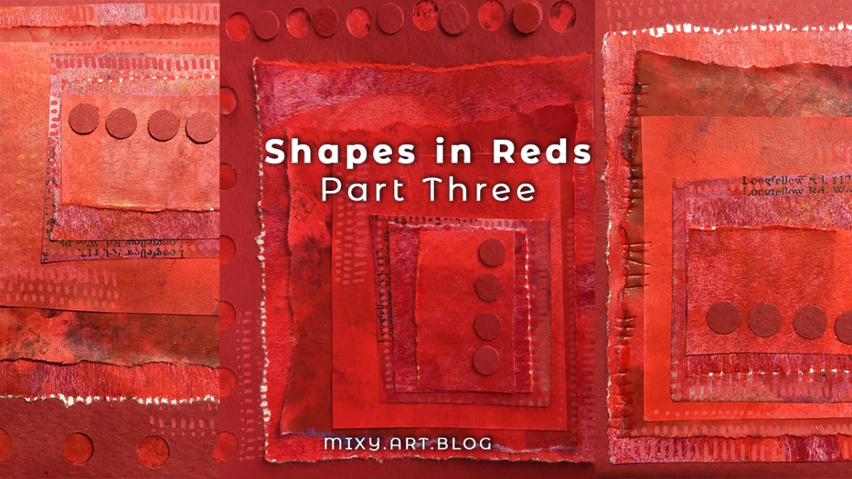
familiar patterns, following lines, dots & dashes, boxes in boxes.
What are the patterns you always return to?
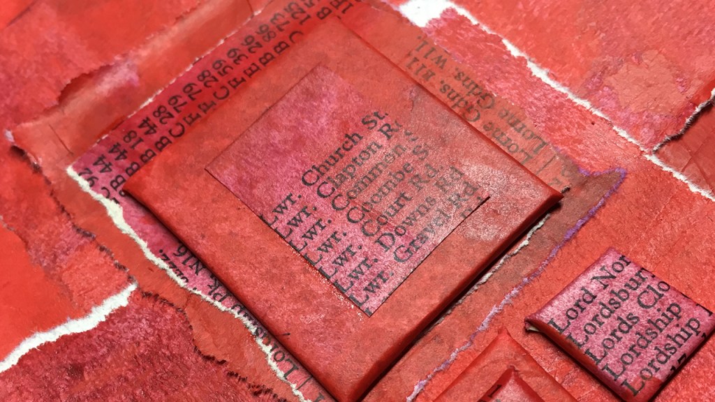
One of my favourite patterns is this stacking of squares.
I love the little bits of edge peaking out from underneath, fluffy torn edges contrasting sharp cut lines. I like them a little bit off-centre, edges lifting here and there.
Like the other techniques I’ve been showing you through this series, the beauty comes less from skill and more from repetition. I think that principle applies to more than just art making 😉
Sometimes these squares within squares are all my muse requires. Other times she demands extra!
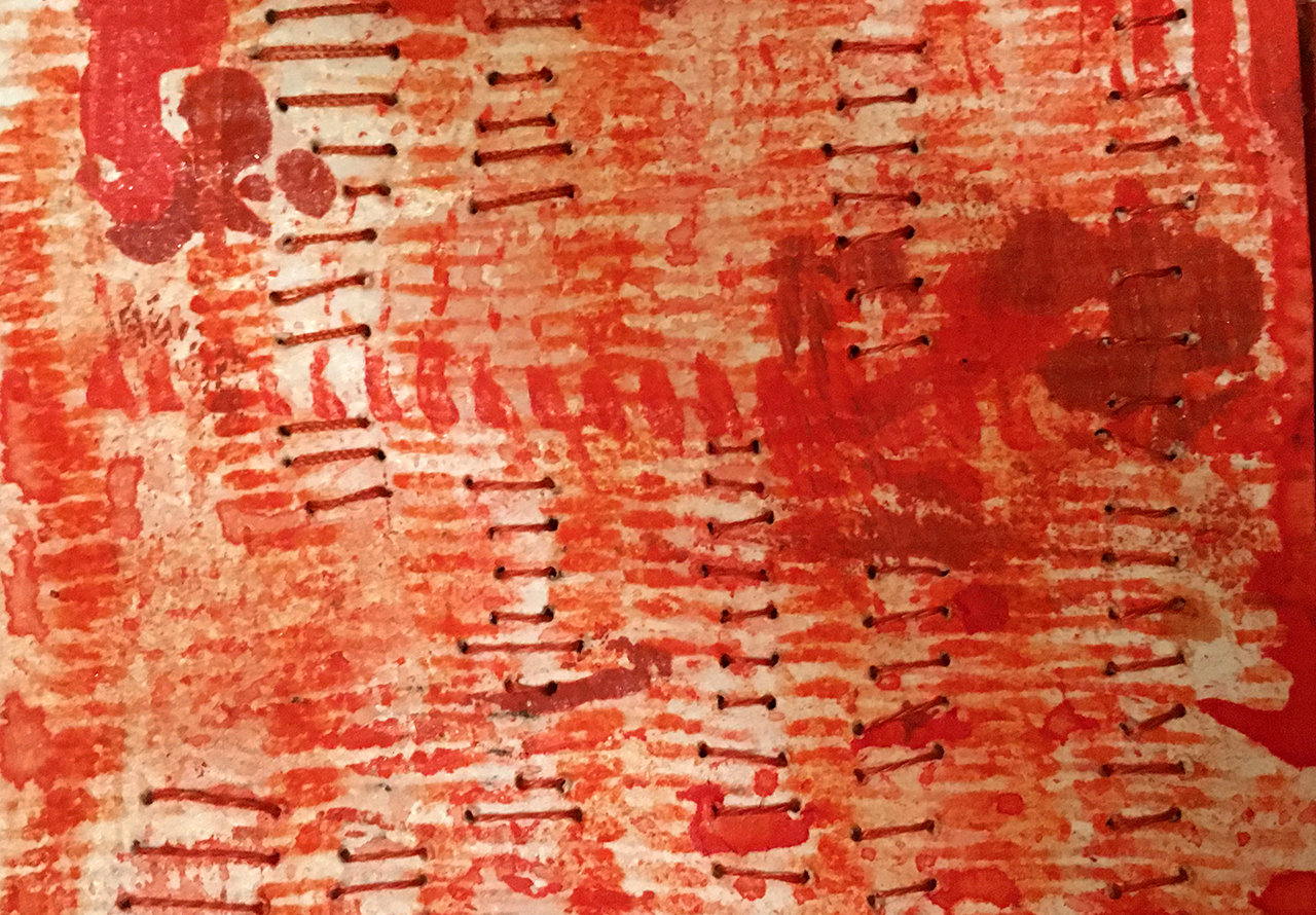
… dot … dot … dot …
All these straight lines are an invitation to tweaking into something new – dotted lines ……..
A hole punch can make two types of dots: the holes and the tiny circles that are cut out. Pen drawn dots and dashes tie these together as they can cross over the edges. Paint markers leave dots that sit slightly raised from the surface, ballpoints leave indentations as well as the ink, together these all make paths to lead the eye. The can look like little stitches (I really like mixing these little marks in with real stitches too)
Here’s how today’s creating came together.
Every month this year I am making a series of mixed media pieces in just one color. At the end of the year I’ll combine them into one big multicolored work.
I’m sharing my process throughout this adventure here in this blog. (So far this year I’ve explored Yellow, Yellow-Green, Green, Blue-Green, Blue, Violet-Blue, Violet & Red-Violet)
I’d love for you to join me. TWELVTY is open to everyone, and better yet, it’s free!
Sign up for my newsletter to find out more and get your free TWELVTY guide ebook.
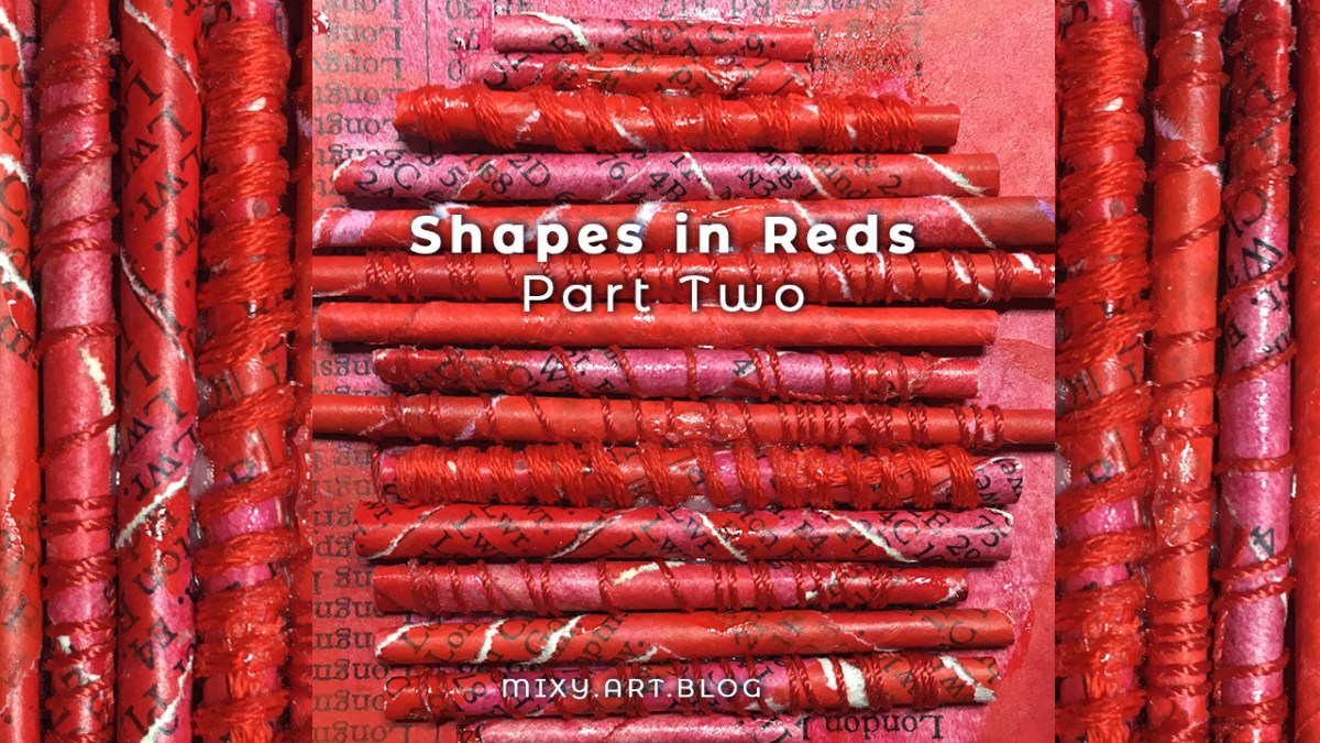
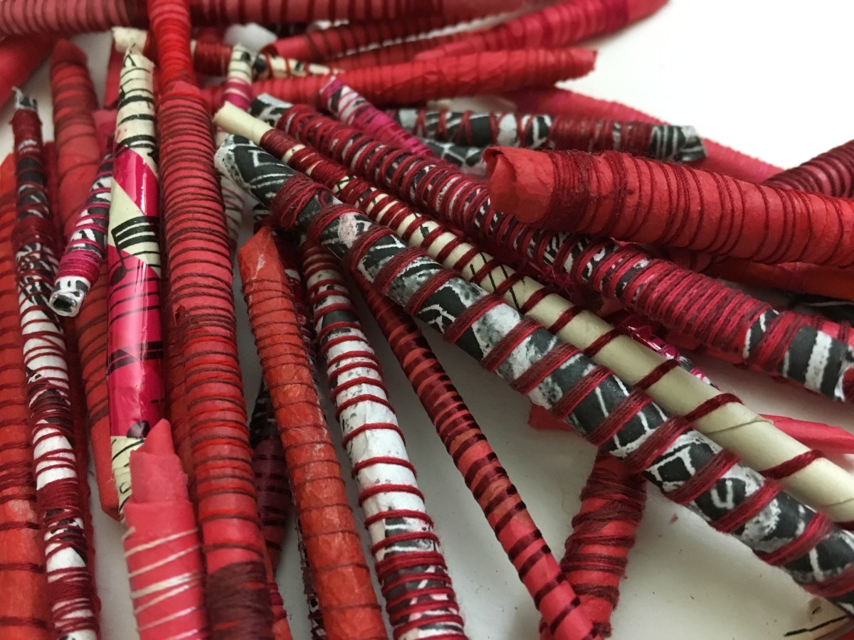
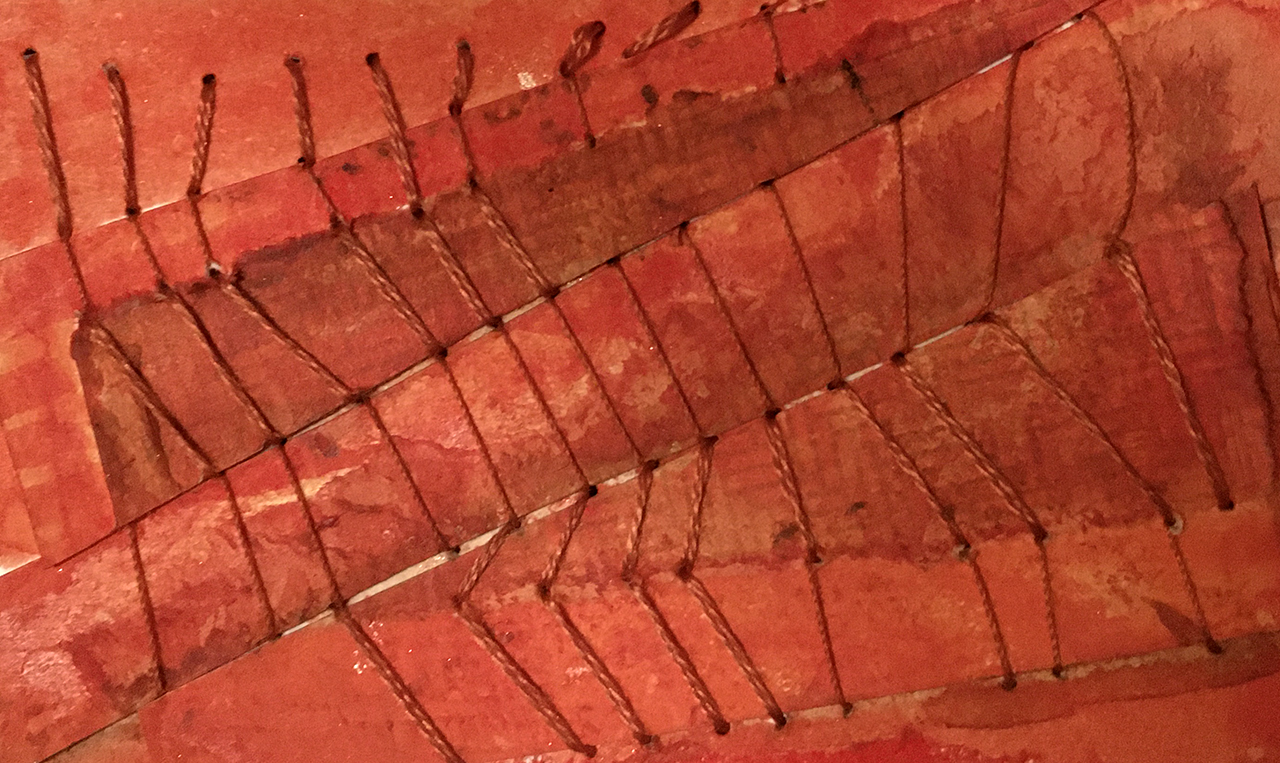
red painted papers, rolling & ravelling.
are you ready to roll?
If you saw yesterpost, you’ll know that the painted papers I made last week were intended for further adventures, I love making 3D elements in collage, so today I’m exploring this again, but in a different direction:
Instead of blocky raised shapes I’m making these rolled shapes.
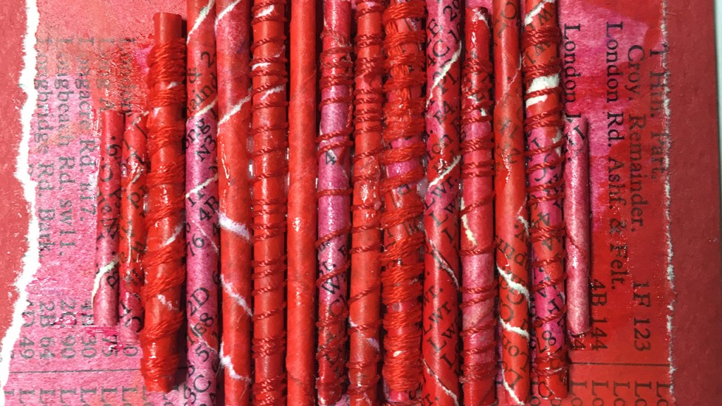
I’m fascinated by spirals, and love to explore them in every way I can in my art. The spiral is a metaphor for just about everything in life, and it’s also a super simple motif that’s super easy to create.
The rolled up paper forms are a sort of spiral through their own layers (think of looking at it end on), and by rolling the paper on the diagonal it has the appearance of changing direction in the middle.
Add to this another layer by binding in thread (which also helps hold together the sometimes unruly paper) with the alternating directions of the white torn edges, the direction of the print, altogether make a multidimensional criss-crossing which is endlessly fun to minds like mine!
I think that variation is everything.
Varying the direction, the weight and thickness of the thread, the narrow band of color with a smidge of back and white contrast, echoed by the shadows in the in between spaces and highlights of the paint’s sheen.
If I did this again I think I’d explore the variations further – with thicker yarn – and with black and white as well as red threads.
Here’s the step by step of how I made today’s piece:
Every month this year I am making a series of mixed media pieces in just one color. At the end of the year I’ll combine them into one big multicolored work.
I’m sharing my process throughout this adventure here in this blog. (So far this year I’ve explored Yellow, Yellow-Green, Green, Blue-Green, Blue, Violet-Blue , Violet & Red-Violet)
I’d love for you to join me. TWELVTY is open to everyone, and better yet, it’s free!
Sign up for my newsletter to find out more and get your free TWELVTY guide ebook.
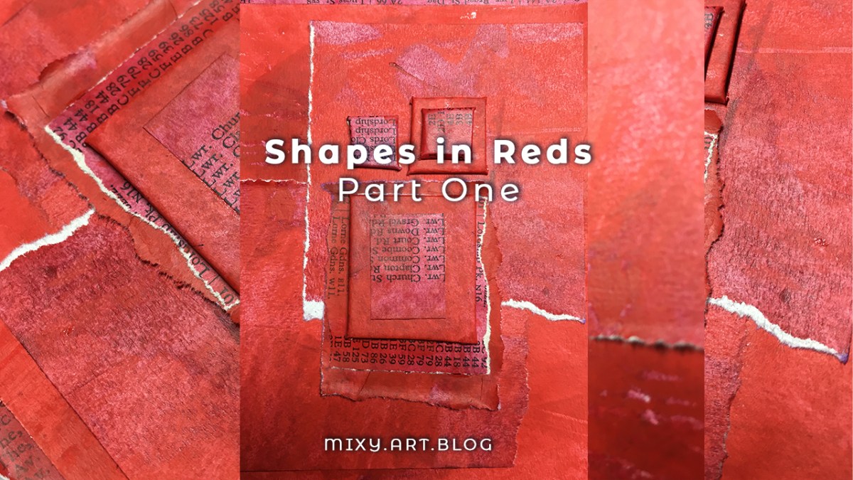
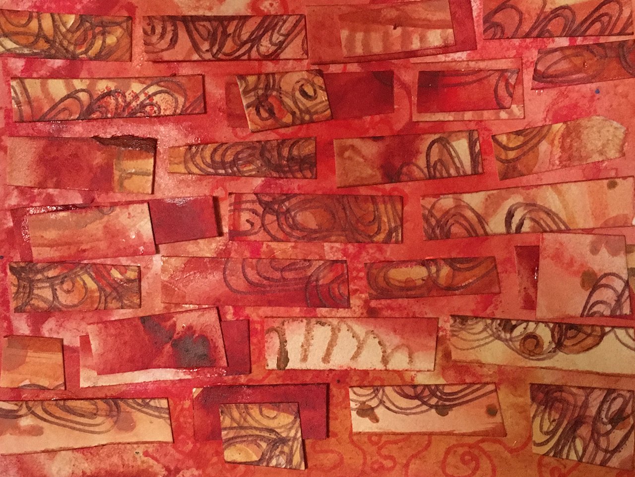
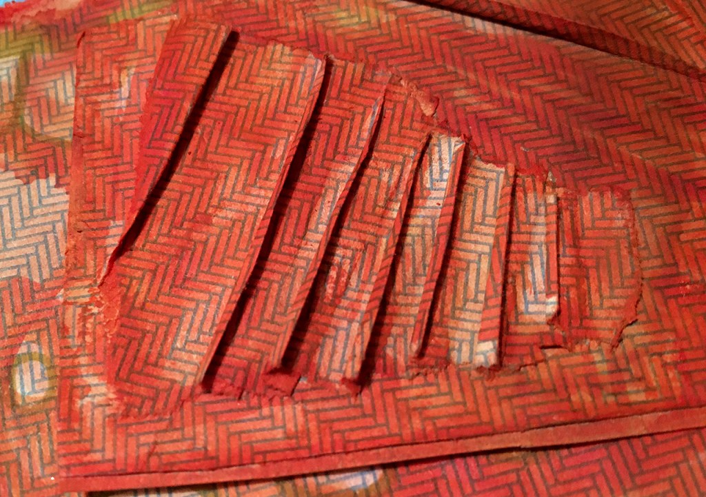
red painted papers, recycling, reinventing.
What does RED mean to you?
Often associated with passion and energy, RED is attention grabbing: from the red stop lights and warning signs to advertising where it’s the color used to draw our attention to the big SALE signs.
Today I’m using three shades of red acrylic paint and some scrap paper from some of last month’s red-violet pieces that wound up in the recycling box.
Layers of acrylic paint spread thin have a transparency that allows patterns and print show through from underneath, the color is similar enough not to interfere.
These painted papers will be the basis of three different pieces in this month of red.
This time I’m making something a bit more dimensional than the usual layered shapes: Rectangles cut from mount board, wrapped with the painted pape build up a multi layered landscape of shapes.
Working in this small scale with one color, channels all the focus into the process, it’s a jumping off point for another project further down the line. I want to revisit this theme in a bigger format… but that’s for another time!
Meanwhile, if you’d like to follow the journey of how this piece came about:
Every month this year I am making a series of mixed media pieces in just one color. At the end of the year I’ll combine them into one big multicolored work.
I’m sharing my process throughout this adventure here in this blog. (So far this year I’ve explored Yellow, Yellow-Green, Green, Blue-Green, Blue, Violet-Blue , Violet & Red-Violet)
I’d love for you to join me. TWELVTY is open to everyone, and better yet, it’s free!
Sign up for my newsletter to find out more and get your free TWELVTY guide ebook.
Yesterpost I showed you a black & white photo of a paint doodle and asked for guesses what the ‘real’ colors are.
I kept you waiting longer than I intended, only cos sometimes the days gallop by and all of a sudden it’s much later. So here we are, and here it is!
Yesterpost I showed you a black & white photo of a paint doodle and asked for guesses what the ‘real’ colors are.
I kept you waiting longer than I intended, only cos sometimes the days gallop by and all of a sudden it’s much later. So here we are, and here it is!
If you guessed red or green then you can consider yourself correct and I’ll message you with a link to claim your prize! 😀 YAY!
Thanks for playing along- it was really interesting to know what colors you ‘saw’.
Color is a real fascination of mine, and the more I learn the more intrigued I become.
This painting is one of a series which I made for a little ecourse all about color combinations: TWELVTY XTRA which I’m offering as a gift to folks on my email list. It will be available in a few weeks, so if you’re interested, join up now, and I’ll email you as soon as it launches.
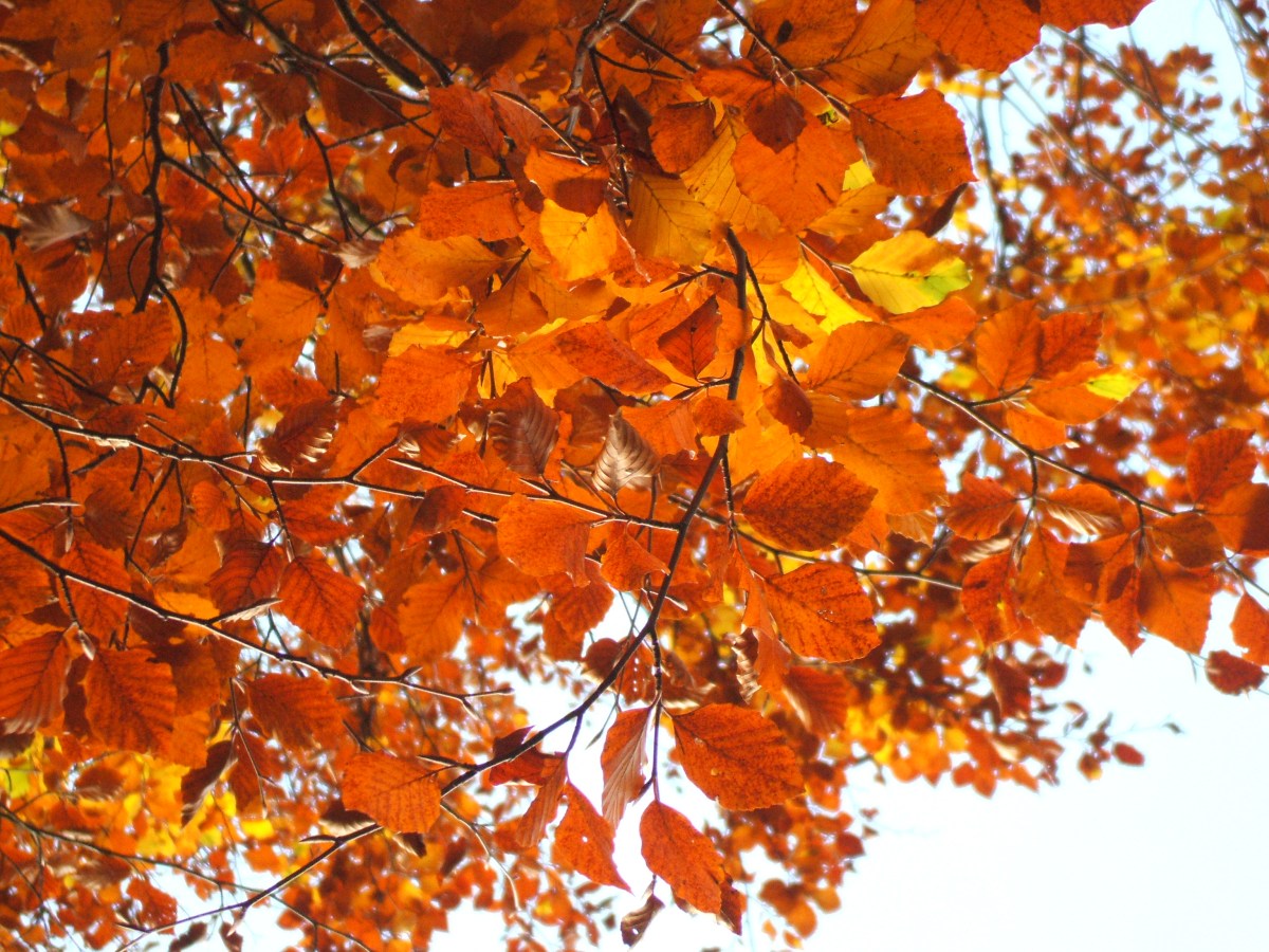
The 12 colors: 12 months project of 2017 plays back in the last 12 days of the year. Today: Red-Orange
From auburn to brick, rusty rouge, browns & burnt orange.

")
")


“The sky takes on shades of orange during sunrise and sunset, the colour that gives you hope that the sun will set only to rise again.”
~ Ram Charan
 Color is an integral part to all types of creativity, it influences our moods and emotions, it’s linked with memories. Colors have been assigned meanings and connections throughout history and around the world.
When we tune our eyes in to notice the colors around us, life becomes brighter and more vibrant.
Through 2017 I’ve been exploring these aspects of color in a year long visual adventure: one color each month.
Each month I continued adding more single color pages to this mixed media art journal.
Over the last 12 days of the year I want to show you a glimpse of this project.
Starting out in Yellow, then Yellow-Green, Green, Blue-Green, Blue and Blue-Violet, next Violet, then Red-Violet and Red. Tomorrow we’ll step around to Twelvty-Eleven: Orange
If you’re interested in understanding more about color, get my ebook A Year full of Color as well as regular monthly updates on my latest colorful antics, delivered right to your inbox:

Your email is utterly safe to me. I’ll bring it tea if it wakes up, then sing it back to sleep.
By exploring the color wheel and each of the 12 colors, I share my creative process plus a feast of resources about color I’ve collected for you.
You’ll learn about the history of how color has been used, not just by artists, but as part of different cultures around the world. You’ll discover the meanings linked to the colors, how there are connections through the ages and around the world.
There are even playlists of songs and music relating to each of the colors! (I said it was thorough, right?)
In 2018 I’m introducing a new element to TWELVTY – a shared creative project that we’ll work on together as we traverse the color wheel.
 Registration for TWELVTY 2018 is open now!
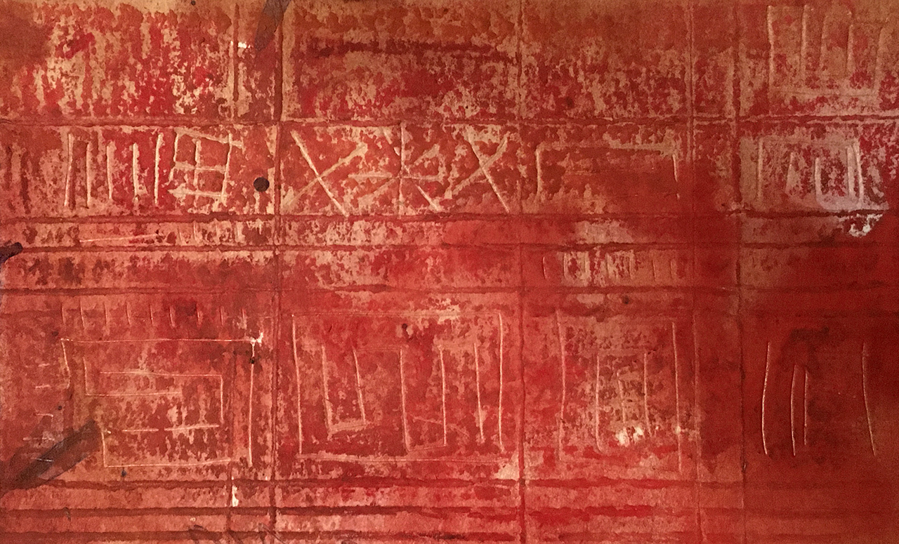
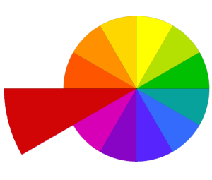
The 12 colors:12 months project of 2017 plays back in the last 12 days of the year. Today: Red
Rich reds, ruby, raspberry, crimson, claret and cherry

")
")

")
“Red is the ultimate cure for sadness”.
~ Bill Blass
 Color is an integral part to all types of creativity, it influences our moods and emotions, it’s linked with memories. Colors have been assigned meanings and connections throughout history and around the world.
When we tune our eyes in to notice the colors around us, life becomes brighter and more vibrant.
Through 2017 I’ve been exploring these aspects of color in a year long visual adventure: one color each month.
This month I played with some paper sculpture ideas (still a work in progress), and I explored digital collage from found objects (wow there’s a lot of red things out there!)
And each month I continued adding more single color pages to this mixed media art journal.
Over the last 12 days of the year I want to show you a glimpse of this project.
Starting out in Yellow, then Yellow-Green, Green, Blue-Green, Blue and Blue-Violet, next Violet, then Red-Violet. Tomorrow we’ll step around to Twelvty-Ten: Red-Orange.
If you’re interested in understanding more about color, get my ebook A Year full of Color as well as regular monthly updates on my latest colorful antics, delivered right to your inbox:
Your email is utterly safe to me. I’ll bring it tea if it wakes up, then sing it back to sleep.
By exploring the color wheel and each of the 12 colors, I share my creative process plus a feast of resources about color I’ve collected for you.
You’ll learn about the history of how color has been used, not just by artists, but as part of different cultures around the world. You’ll discover the meanings linked to the colors, how there are connections through the ages and around the world.
There are even playlists of songs and music relating to each of the colors! (I said it was thorough, right?)
In 2018 I’m introducing a new element to TWELVTY – a shared creative project that we’ll work on together as we traverse the color wheel.
Registration for TWELVTY 2018 is open now!