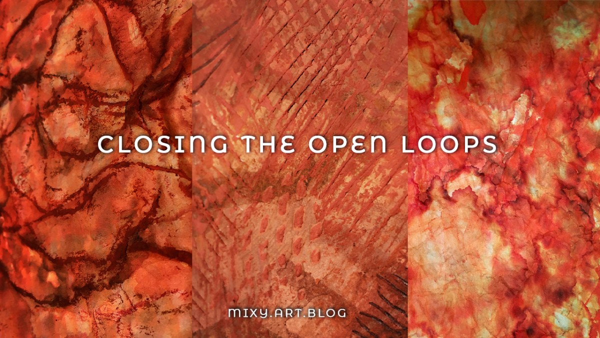
Today is a day of finishings, of closing the open loops in the pieces I’ve been adding to all month.
“The most important thing about art is to work. Nothing else matters except sitting down every day and trying.”
– Steven Pressfield
If you haven’t already seen them – I shared making the first layers here, followed by the tricky middle stage here. Today is when all those loose ends come together!
What all of these monochrome pieces I’m making have come together in a similar fashion:
Experimenting, playing, setting it all aside for a while to return to with fresh eyes.
I’m working towards integrating this strategy in the rest of life beyond the studio – life as a bigger work in progress – but that’s for another post another time.
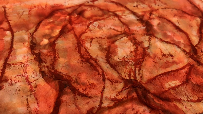
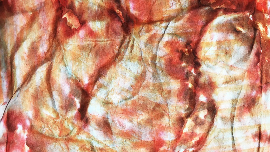
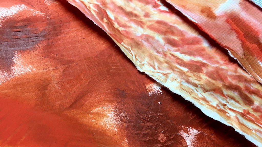
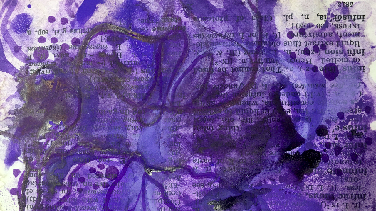
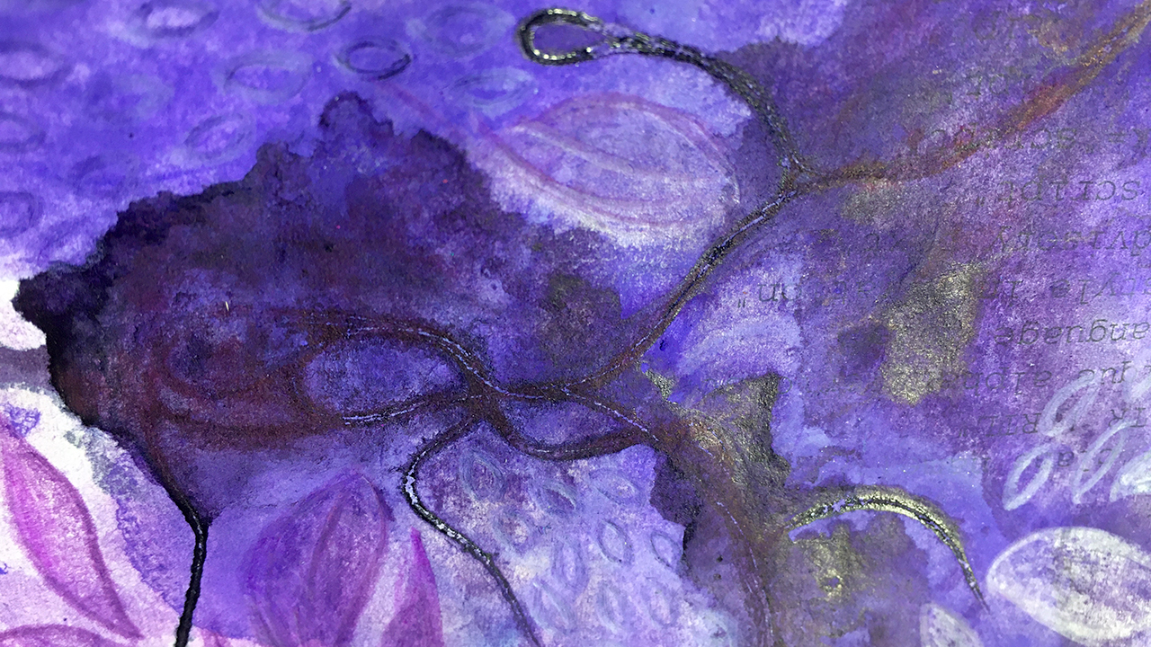
Feeling like this was the closest one to being finished, today I started out with the piece with the string.
Using loose scribbles just catching the raised parts brought more contrast to the squiggly lines. First using the same markers I began this one then with, and some oil pastels on top for a bit of extra grunge. Trimming the edges straight gave it another element of contrast with the contours and cloudy colouring.
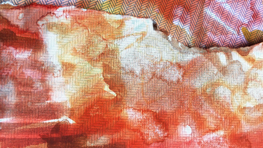
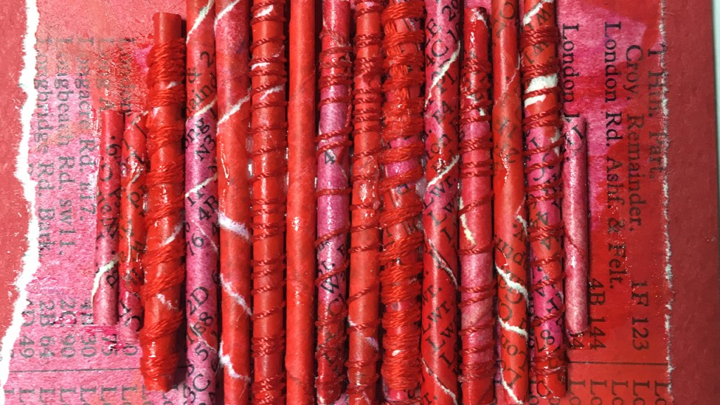
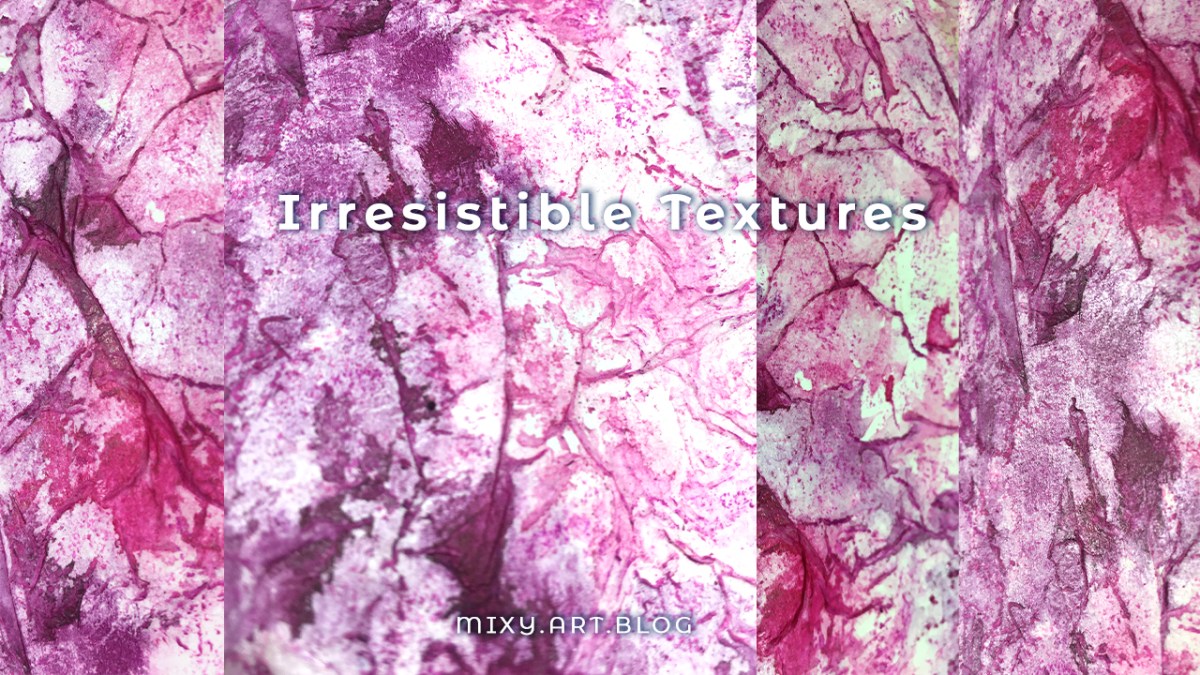
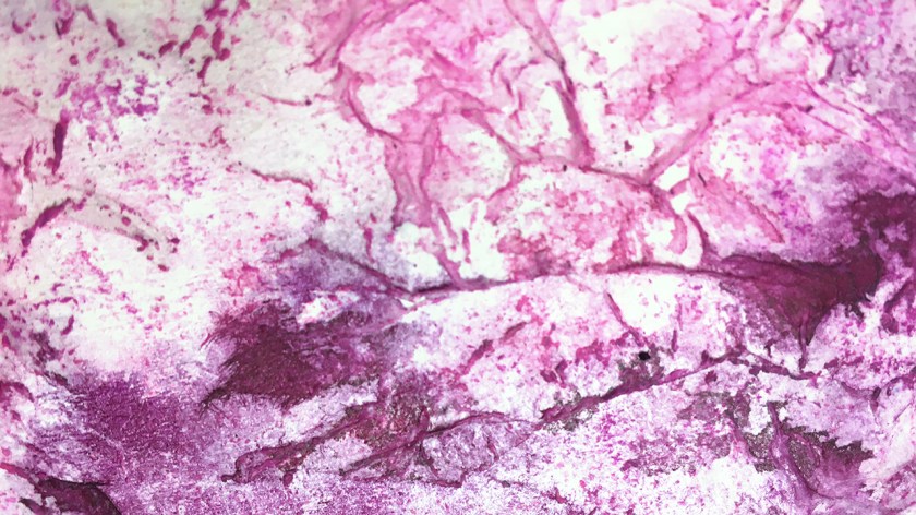
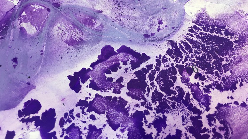
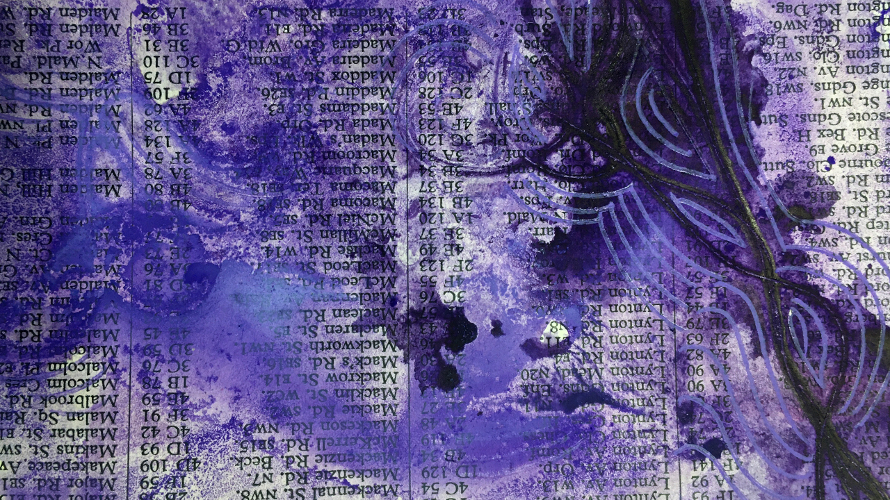
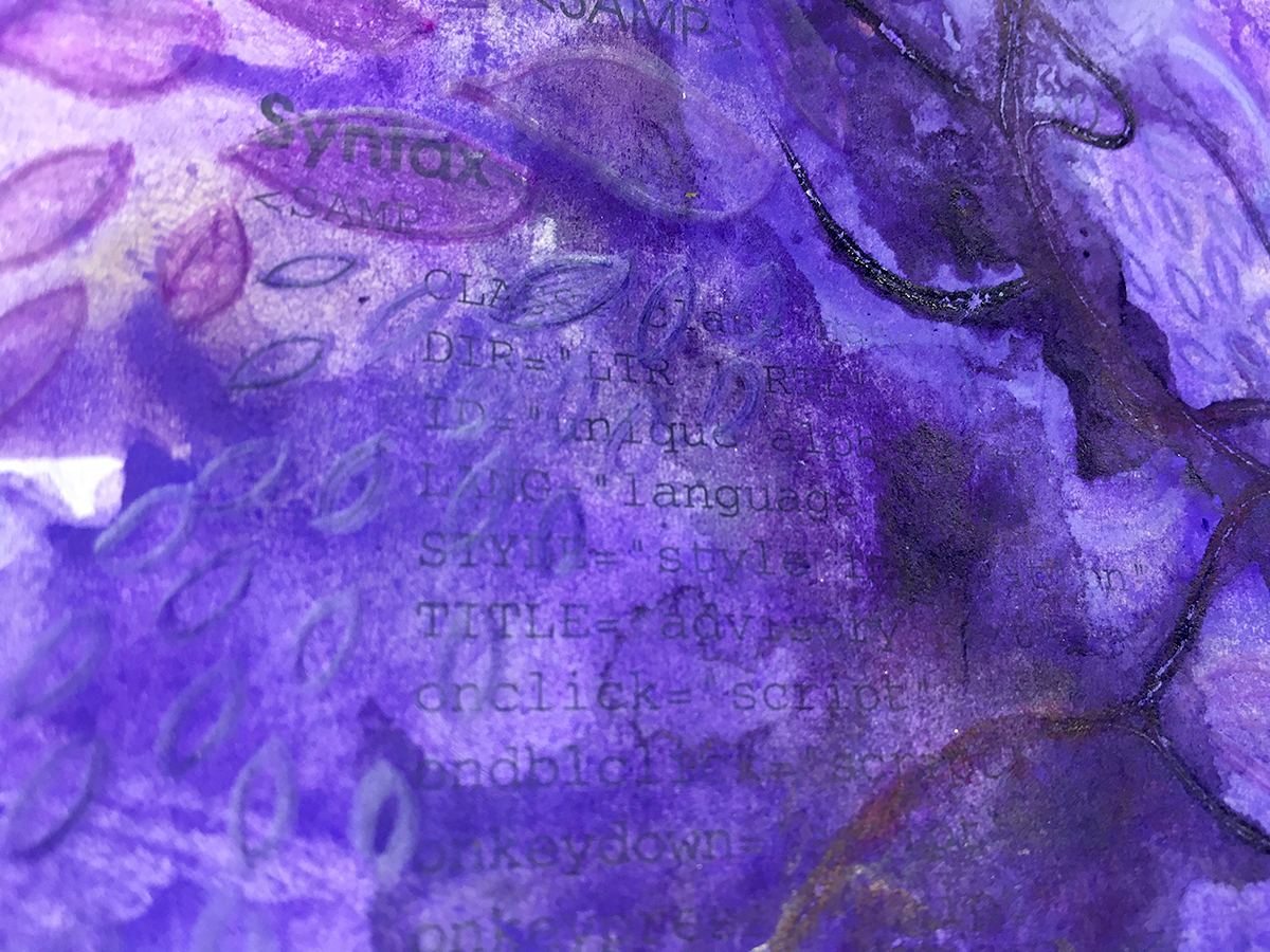
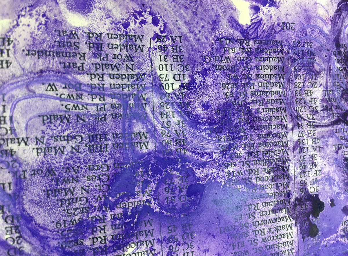
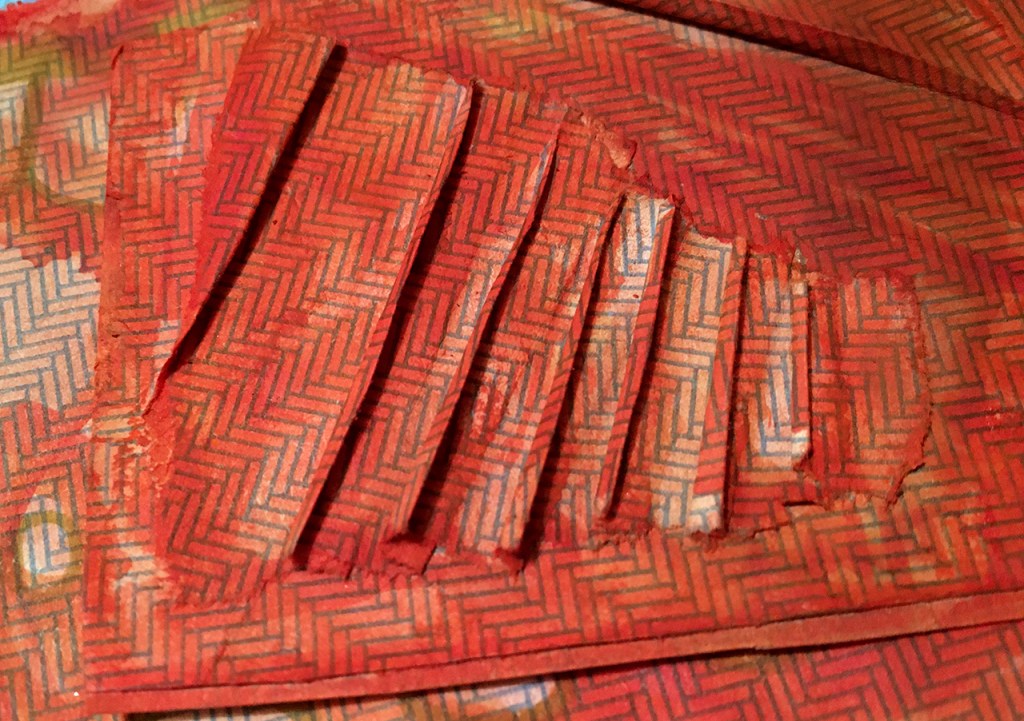
Oftentimes my entire process consists of repeating the same steps over and over, and next up we have one of these. I loved how the newsprint/packing paper took the water soluble ink and water marks, each time I added more on top of the dried layers the patterns that formed became more intricate, so this is some more of the same 😉
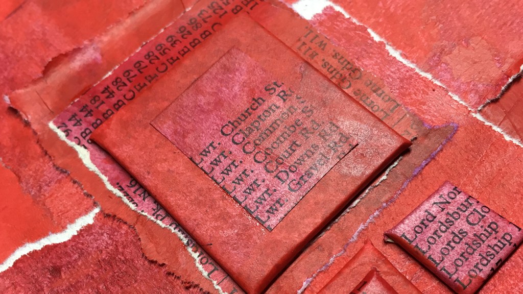
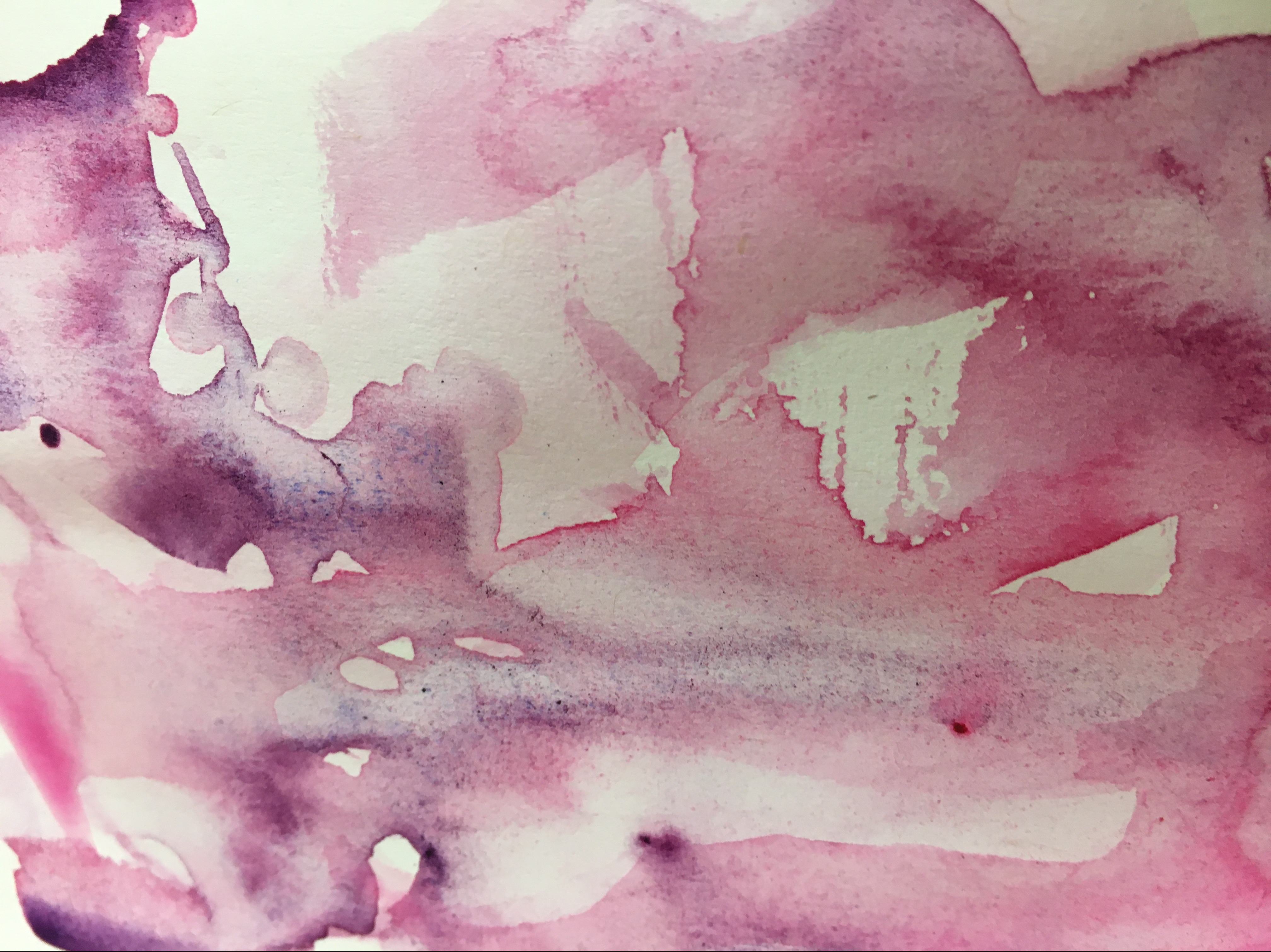
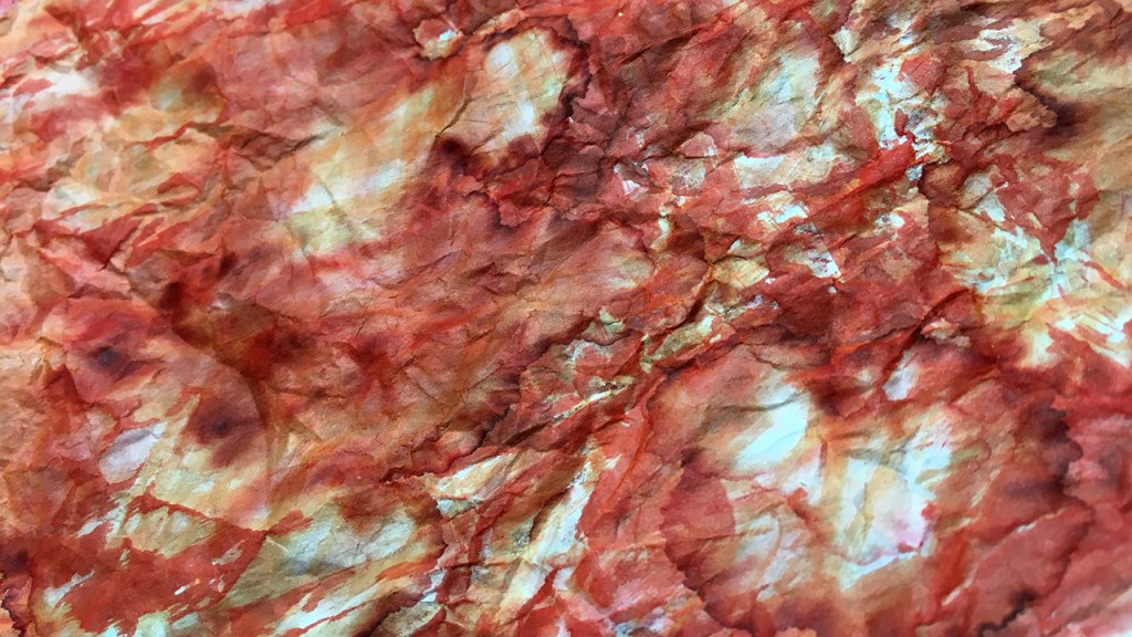
The painted envelope pieces were the furthest from ‘done’ at the start of today. Still having a very scrap paper vibe I began by trimming them down to get rid of the unpainted edges.
The small pieces often work well in layers together, and I like adding folds and creases to break up the flow. It’s also a way to reshape a piece without cutting it up.
Don’t forget you can add layers under as well as on top. An almost finished piece can really come to life when ‘framed’ by layering it on top of something similar or contrasting. I used a bit of the mixed media paper behind my folded envelope parts. Keep stacking until it feels right!
“Everything will be okay in the end.
If it’s not okay, it’s not the end”
— Indian proverb
I think a lot of us are – especially in early days of art experiments – prone to lose faith before a piece is done.
The more I practice making art, the more convinced I am that if it isn’t looking right, it usually just needs more.
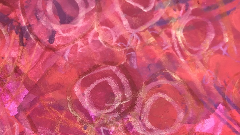
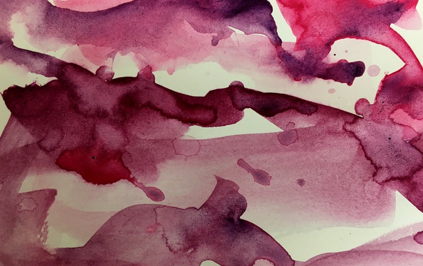
And that can be as simple as more of the same. A stripy layer over a stripy layer over another one. The final pieces I worked on today began with dollopy blobs of paint, some finger painting swirls to more the color around, then stripes made with my trusty art comb. (formerly a hair comb, retired to much more rewarding life in the studio).
The next layer was more paint blobs and more combing. And again. Finally some stripes in marker pen and then ballpoint to finish it up. Lots of directions, lengths, weight and media – all unified in stripiness.
Here’s how today’s finishing process looked:
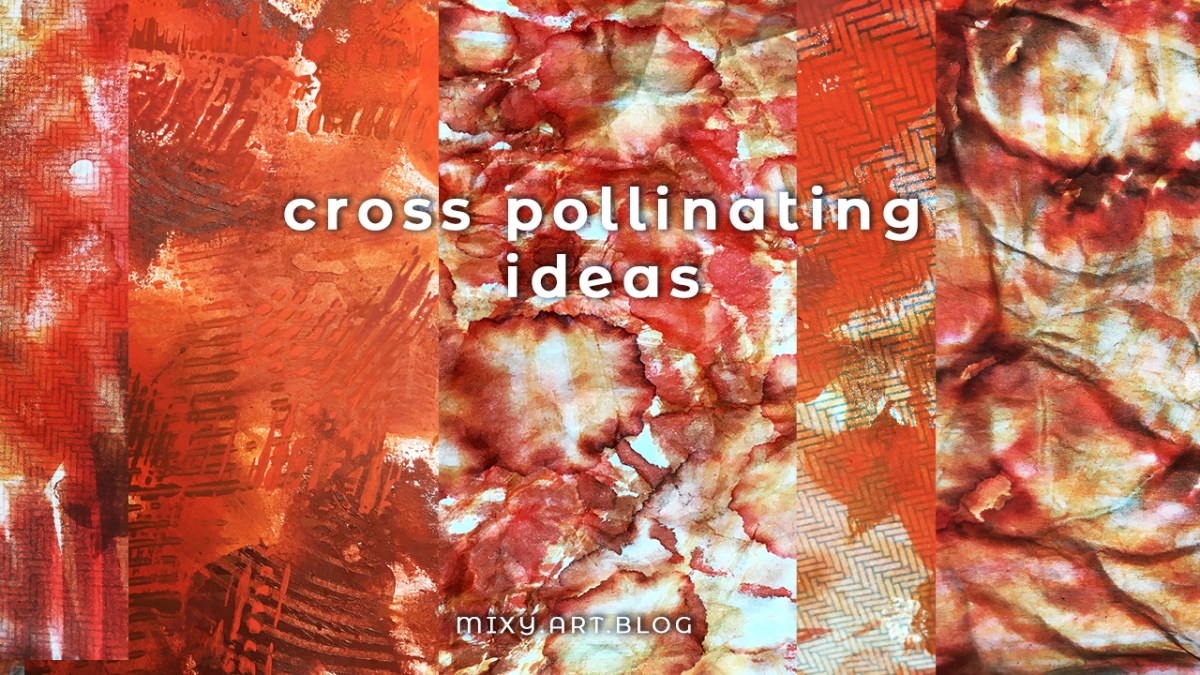
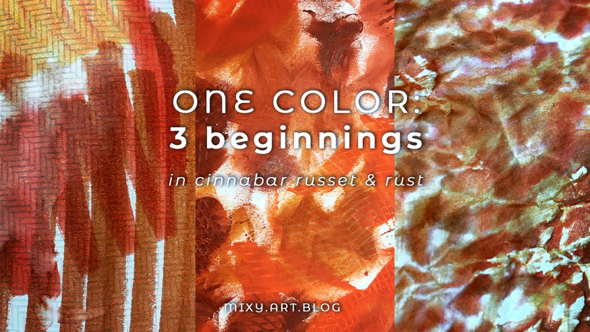
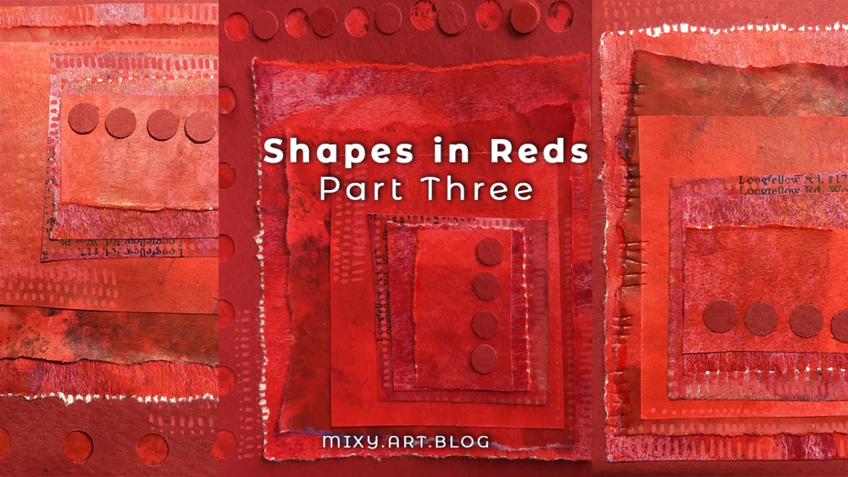
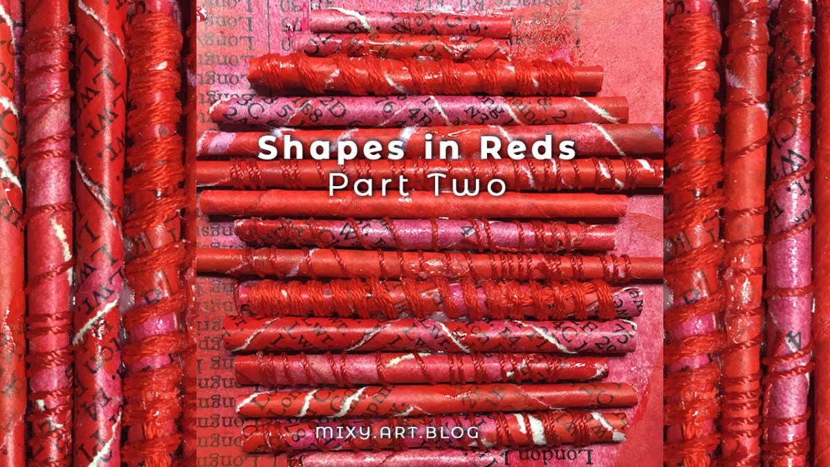
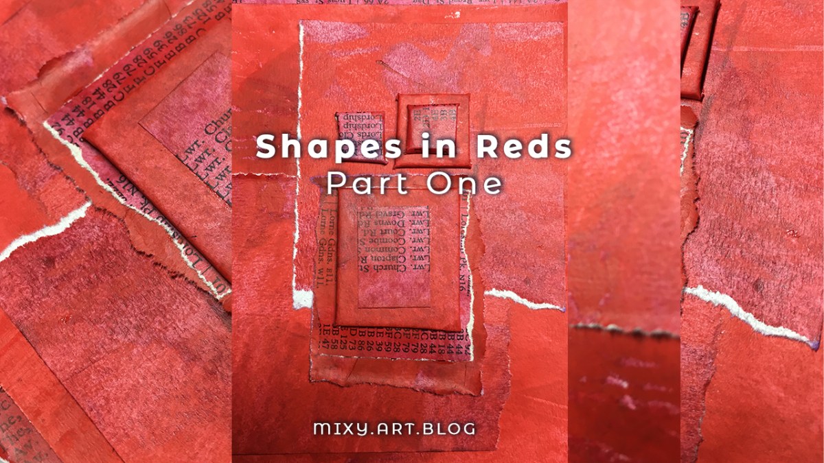
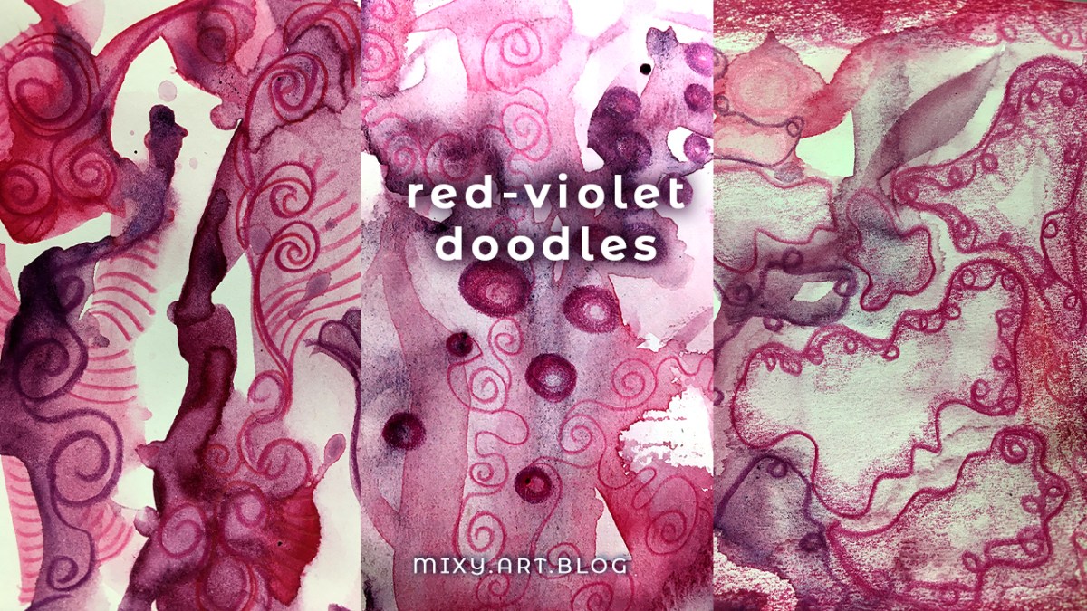
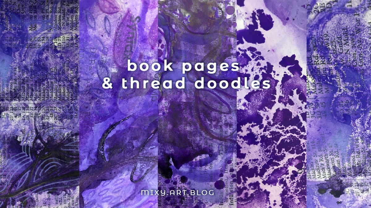
“Twelvty” 12 Colors in 12 Months
Every month this year I am making a series of mixed media pieces in just one color. At the end of the year I’ll combine them into one big multicolored work.
I’m sharing my process throughout this adventure here in this blog. (So far this year I’ve explored Yellow, Yellow-Green, Green, Blue-Green, Blue, Violet-Blue, Violet, Red-Violet & Red)
I’d love for you to join me. TWELVTY is open to everyone, and better yet, it’s free!
Sign up for my newsletter to find out more and get your free TWELVTY guide ebook.