Yellow-Green: Plastic Fantastic

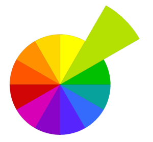
As we begin a new month I’m stepping round to the next color in the wheel in the year full of color project. Twelvty this month is exploring Yellow-Green.

You can do anything you want to do. This is your world.

— Bob Ross

Like a lot of folks these days, I avoid using plastic as much as possible, especially the single use kind, but still it finds ways to sneak into my home and my life. This stuff can’t be recycled so I make sure as much of it as possible gets involved in my art making process before it’s inevitably binned.

And it was with this in mind I came across a new way to make painted surfaces uniquely pattered, and super shiny too!

I’m sure to be revisiting this way to play again, there are so many degrees of shininess, texture and thicknesses which make different patterns.

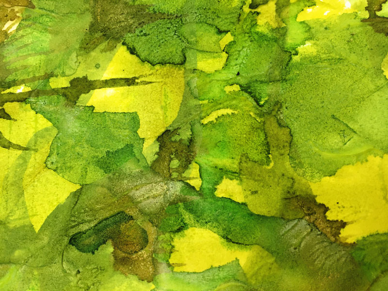
The first thought I had when I saw the effect in the yellow-greens is how like glossy leaves it looks. So just right now I want to dash off and cut out leaf shapes and collage me a big ole shrubbery or something. … But I must finish this post first!

It’s a super simple process:

  • A thick-ish layer of acrylic paint on paper.
  • A plastic or polythene bag laid out on the wet paint surface.
  • Smoosh and squish about a bit to stir up the color and get it to stick to the plastic.
  • Squidge it up in places to make little ridges and bumps and stuff.
  • Wait to dry (I left it overnight)
  • Gently peel off the plastic to reveal deliciously rippled surface and shiny bits.
  • I’ve saved the plastic to reuse again – some paint got stuck so I figure there will be interesting effects using another color with it next time . Watch this space!

This is how my first experiment panned out:


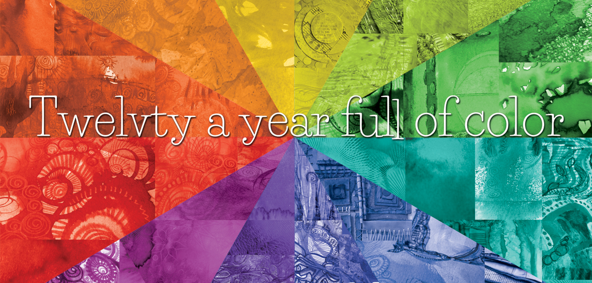
Every month this year I am making a series of pieces in just one color, so at the end of the year I can combine them into one big multicolored work. 

I’ll be sharing my process throughout this adventure here in this blog.

I’d love for you to join me. TWELVTY is open to everyone, and better yet, it’s free! Sign up for my newsletter to find out more and get your free TWELVTY guide ebook. 

Processing…
Success! You're on the list.

You’ll get an email to confirm you’ve signed up and are human. Sorry, only humans (and their cats) can join. Check your spam folder cos sometimes the good stuff gets swept in there by mistake.

Weaving & Wiggles.

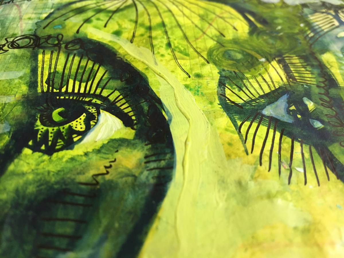
Sometimes I find my painting experiments take me to unexpected places. And the results aren’t always what I’d like them to be.

“I found I could say things with color and shapes that I couldn’t say any other way–things I had no words for.”

Georgia O’Keeffe 

Sometimes I find my painting experiments take me to unexpected places. And the results aren’t always what I’d like them to be.

It’s no secret I mostly create this stuff in a haphazard, directionless fashion. I like throwing color around. I don’t much like planning my art. There’s plenty enough opportunity outside the studio to be responsible and ‘adult’. When I’m making art it is – for the most part – spontaneous messy fun.

Generally I keep going until I have a result that I like, and stop there. Of course there are small regretful moments of taking something too far, but it’s only paint on paper and the remorse soon fizzles away.

sometimes moving paint and color about makes for something like this, and I’m happy to leave it be. But not always.

When a piece gets stuck or stale or I just don’t know what direction to take it in next, I set it aside to rest.

And then there are other times, when more layers of color just don’t feel like the right next step and impatience won’t let me leave it to rest. I’m compelled to make it into something else.

At times like this I’ll often take the scissors to it. Cutting it up and rearranging the pieces takes the adventure in a whole new direction.

There are all kinds of cutting up – with scissors or a craft knife, tearing up, die-cutting and punching out possibilities to make collage bits for remixing and reassembling, but today I’ve got something else for you:

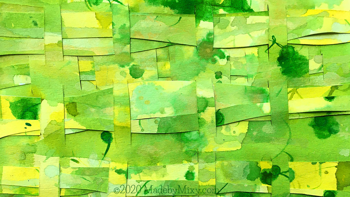
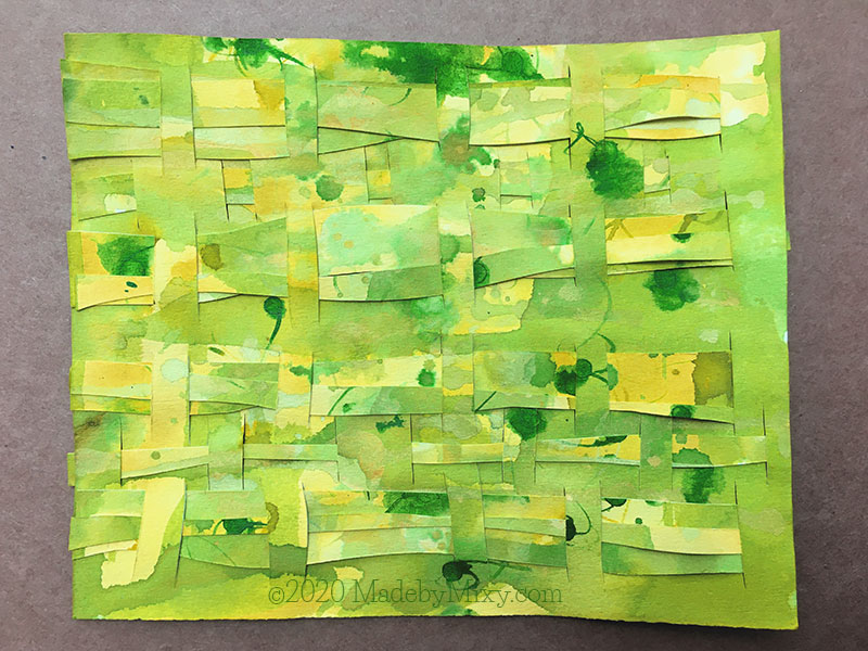
Paper Weaving

This works best with lightweight cardstock, watercolor paper or heavy cartridge paper. Lighter weight floppier paper might be possible, but I suspect could become infuriatingly fiddly.

Use straight lines or wiggly ones, vary the spacing, overlap the pieces.

In my usual manner, I made this up as I went – adding more strips to already woven bits and then filling in some spaces in between later. I don’t know how instructional this video will be – but you might like to use it to spark some ideas.

When all else fails cut it up and make something new with the bits.


Every month this year I am making a series of pieces in just one color, so at the end of the year I can combine them into one big multicolored work. 

I’ll be sharing my process throughout this adventure here in this blog.

I’d love for you to join me. TWELVTY is open to everyone, and better yet, it’s free! Sign up for my newsletter to find out more and get your free TWELVTY guide ebook. 

Processing…
Success! You're on the list.

You’ll get an email to confirm you’ve signed up and are human. Sorry, only humans (and their cats) can join. Check your spam folder cos sometimes the good stuff gets swept in there by mistake.

Yellow-Green: Surfaces & Texture

As we begin a new month I’m stepping round to the next color in the wheel in the year full of color project. Twelvty this month is exploring Yellow-Green.

“Colour is my day-long obsession, joy and torment.”

Claude Monet 

Yellow-Green

As we begin a new month I’m stepping round to the next color in the wheel in the year full of color project. In Twelvty this month I’m exploring Yellow-Green.

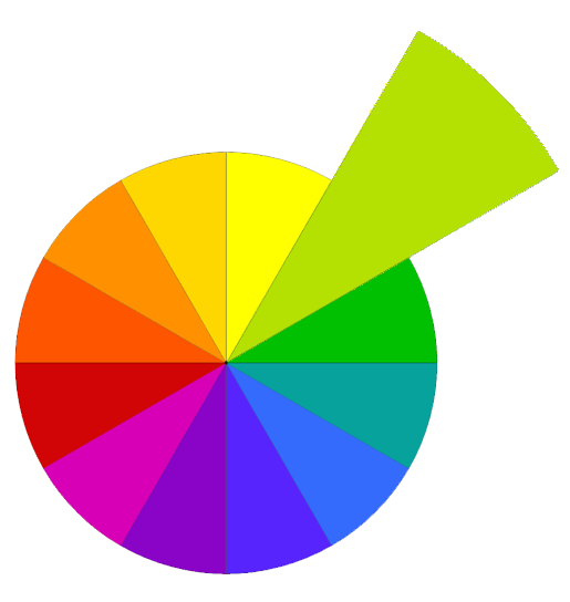
This is the first of the tertiary colors we encounter in our journey around the colour wheel: these are the intermediates, the not-really-one-nor-the-other.

When it comes to playing with yellow-green as a single color, it becomes like a dance between it’s color wheel neighbours.

watercolor & ink on gesso on watercolor paper

Painting on Texture

There are so many different combinations and ways to add color to texture. Here are some I like playing with a lot.

Gesso (clear or white), matte gel medium or white acrylic paint all make for a good base layer, and all give slightly different effects. Try covering the whole piece, or leave places bare for contrast

When this layer is dry you can add even more texture by crumpling and folding the paper, breaking the surface of the gesso

Do experiment – tell me which you like best!

I like to agitate the surface with a plastic card before the gesso sets to get those lovely tree bark patterns with peaks and ridges and organic wiggly, wavy lines.

I’ve had equally good results dabbing at the wet surface with a plastic bag. I shared a demo of this in a previous episode, but for this post we’re jumping in at the point where this is done, and the paper has dried.

Adding Color

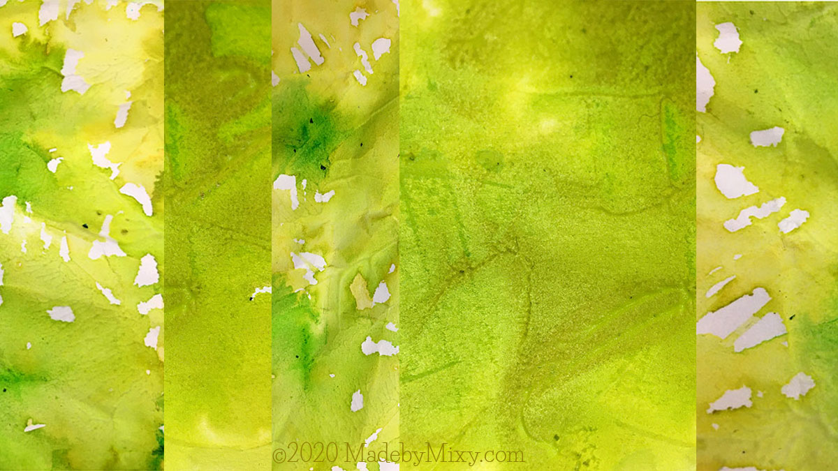
The color I used was a very watery watercolor paint in yellow + green drawing inks (‘chartreuse’, ‘olive green’, ‘grass green’). Any water based color will work – I always advocate the use what you have principle – any yellows and greens that aren’t too blue-ish will work for this.

Version One: I gave the whole piece a wash of light, thin, watery color then added drips and drops of stronger color.

Version Two: Ink drips first onto dry gesso then watercolor dropped on top.

Lifting and tipping the paper side to side encourages the color to run around in the textured surface, so pigment settles in the valleys and shows up the patterns.

Where the wet color puddles I dragged it about with a paint brush, linking the pools together for the color to flow between.

Explore all the ways to hold and move the paint brush – left handed, right handed, by the very tip of the handle – let it hop and skip across the surface – try with eyes closed – twisting and flicking color about – dance the brush in time to music or a rhythm in your head.

Here’s how my first layers of color over gesso began…

Yellow-Green, ink and watercolor on gesso on paper. Layers on layers on layers!

Next post I’ll show you a way I like to use painted papers – especially the ones that haven’t gone the way I would have liked!


Every month this year I am making a series of pieces in just one color, so at the end of the year I can combine them into one big multicolored work. 

I’ll be sharing my process throughout this adventure here in this blog.

I’d love for you to join me. TWELVTY is open to everyone, and better yet, it’s free! Sign up for my newsletter to find out more and get your free TWELVTY guide ebook. 

Processing…
Success! You're on the list.

You’ll get an email to confirm you’ve signed up and are human. Sorry, only humans (and their cats) can join. Check your spam folder cos sometimes the good stuff gets swept in there by mistake.
day 2: 12 days of Twelvty

Over the last 12 days of the year I’m sharing my year of color: 12 colors in 12 months. Today –
Twelvty-Two: Yellow-Green


Twelvty-Two: Yellow-Green

From luscious lime to opulent olive: the color of spring time.

“I am going to try to pay attention to the spring. I am going to look around at all the flowers, and look up at the hectic trees. I am going to close my eyes and listen.”
~ Anne Lamott

Twelvty-Two: Yellow-Green in the color wheel
Twelvty-Two: Yellow-Green

Color is an integral part to all types of creativity, it influences our moods and emotions, it’s linked with memories. Colors have been assigned meanings and connections throughout history and around the world.

When we tune our eyes in to notice the colors around us, life becomes brighter and more vibrant.

Through 2017 I’ve been exploring these aspects of color in a year long visual adventure: one color each month.

Every month I’ve worked just in the month’s colors, this month I made a series of textile collages and each month I added some more to this mixed media art journal.

Over the last 12 days of the year I want to show you a glimpse of this project.

Yesterday we looked at Yellow, tomorrow we’ll step around to Twelvty-Three: Green


If you’re interested in understanding more about color, get my ebook A Year full of Color as well as regular monthly updates on my latest colorful antics, delivered right to your inbox:

YearFullOfColorbyPennGregoryR2017_Page_01

Your email is utterly safe to me. It will be wrapped up snug in a blanket until the spring arrives.  


Next year I’m revisiting the Twelvty project, but this time with some exciting additions! Find out more here

Registration for TWELVTY 2018 is open now!
Find out more & join here

penngregoryTwelvty1200x574

SaveSave

What 3 months of color looks like…

These are the art journal pages from the first three months of Twelvty: This is the story so far.

January: Yellow


When I look at these pages I’m whisked back the to adventures and explorations of the first month of this year long adventure. Using just one color brings out nuances and subtleties too quiet to hear above the sound of other colors. 

I chose yellow as a starting place in the color wheel because it is simple, it is small. 

There’s not much space or contrast in yellow – take it darker and you have shades of ochre, tan into browns. Only a smidge lighter before you hit white. No room to step either way before falling into yellow-orange or yellow-green, and they have their own months in Twevlty.

Yellow is compact with well defined parameters. 


February: Yellow-Green

Yellow-green: the first tertiary color we explored – and suddenly there’s a depth of tone to play with. Luscious lime to opulent olive.  Chartreuse. Char-freaking-treuse, people! 

And here’s the beginning of the “is it or isn’t it?” questions that will bob up all through this year. When does it stop being yellow and start being green? Where’s the spot in the middle? We’re navigating a continuum, there are no strict boundaries. It’s all part of the fun 😉

March: Green

Another month, another step round, deeper into greens. Each collage scrap and cut out shape here has a story and will serve to remind me of ideas that were born and then took a turn I didn’t foresee. I’m only the vehicle through which these ideas come to being, sometimes I forget this and try to control them. But, like water,  they find their own way.


This book is the place a leave seeds of ideas to incubate: reminders to a me-in-the-future. We’re nearing the end of a month of blue-green as I type this to you, and about to dive into the ocean of blue for May. Check back to see the cool bluey loveliness that emerges!


Would you like to get sporadic updates on my thoughts and drawings delivered right to your inbox? Hop onto my email list right here.

(and I’ll send you my ebook A Year full of Color as a thank you for joining)

Your email is utterly safe to me. It will be wrapped up in blankets. I will bring it tea and biscuits on Wednesdays.

Spring Greens

Ever since I was a little kid, I always loved to sew.

Not just to be able to make things, but the actual meditative act of stitching.

The up & down, the back & forth, like the inhale & exhale, it’s a rhythm I melt into.


Textile Collage on Etsy


As part of my year full of color project, TWELVTY, I spent much February stitching together these gorgeous little textile wall art pieces from layers of hand-dyed recycled fabric, paper, buttons, beads and embroidered together with happy thoughts.


Textile Collage on Etsy

All of these concoctions are in the color of the month: ranging shades of yellow-green from luscious lime to opulent olive.

These ones are mounted on 8″ square canvas board. There are four, they’re equally lovely on their own, or grouped together as a little family.


You can find all of these creations (and more!)
in my Etsy shop


Would you like to get sporadic updates on my makings & doings delivered right to your inbox? Hop onto my email list right here.

(and I’ll send you my ebook A Year full of Color as a thank you for joining)

Your email is utterly safe to me. It will be tucked up snug and nestled with a hot water bottle until the spring arrives. I will bring it fresh socks every three weeks, or as required.

%d bloggers like this: