Monochrome Monday

I’ve thought about a black and white page for a while.
I’ve even tried.
But resisting any color at all was harder than I cared to admit!

Anyway, prompted by John Clinock of Art Rat Cafe I determined to give it another go. Armed just with black and white gesso, black and white Dr PH Martens’ Bombay Inks, black and white gel pens, this is what happened!

I’d do it again – thanks for the nudge, John!

ink runs

Two pages in one post,


Playing with ink never tires, never gets samey, never ceases to amuse me.

Alternating between transparent, opaque, and water in drips and runs, watching the pigments flow and merge;
Pulling at the puddle edges with a brush or pen or stick… imprinting in wet ink…

Big love for ink!

Moments in the process

There is often a stage in the process where I look at the page and think WTF? What is going on? It might fly off on a tanget, or it might develop recognizably from here. But until it does, I have no way of telling…

Pushing on from this point gets easier every time. Like this…


Beginning the page with Black Gesso, some white writing and doodling. Tissue paper for texture.


Building up the shapes with slices of dyed envelopes


And some splashing – I used Dr Martin’s Bombay inks and some dilute acrylic paints.

And left to dry…


…to doodle on…


…and on…

to this! 😀

paper dying – new techniques!

I really thought that stash of dyed papers would last a long time, but supplies are getting low, so last night I began another batch, and in so doing I’ve streamlined the process a bit.

This slideshow requires JavaScript.

It’s the same ‘lasagna‘ of paper and ink/dye, but instead of leaving it to marinade for ages, once it had a good soaking (1-2 hrs I guess) I spread the bits out on some more ‘scrap paper’. I used a super-cheap watercolor pad – v low quality and rubbish for painting on – but nice and absorbant, so just the job for this! Given a good squash (I stood on it, then danced about a bit) the colors soak through to the watercolor pad the bonus of more dyed paper than I’d bargained for + far quicker drying time. Result!

They’re drying right now – will show you the pics tomorrow. Meanwhile I’m planning another batch in different colors. I’m torn between blues, greens and purples next… What d’you reckon, folks? 🙂

confessions of a color junkie

Can’t help myself, every day gotta get a fix of colors. Colors in combinations that don’t always sit comfortably. Colors in big splashy forms. Speckles n freckles you only see close up….

day of the ephemeral dragon

When I was doing the paper dying thing I was using future pages of sketchbook to catch the drips.

Today this page came round. Pleasant in itself, but that was then. The nature of this is to be ephemeral, fleeting, evolving. This page belongs to today: time to change.

Skipping over the stages I forgot to photograph… then came the inky bit

What’s with white ink, then? I know, like dilute white paint. Just concept of ‘white ink’ doesn’t sit straight in my head. Anyways, white ink can be a bit milky, but dripping onto wet colored ink gives this effect. Can’t always guarantee inky splodge is dragon shaped 😉

The dragonyness left as he dried. But I think the idea of the shape got stuck in my head as I remembered I hadn’t done any cut outs for a while…

Back with the metaphors this book throws up: Y’know when the events of one day echo and reverberate, the memory creeps into the next few days? Such will be the next few pages!

More ink, sprayed, dripped, smudged…

integrating the stark whiteness from underneath, and stenciling its negative onto what will be next Tuesday’s page.

As the colors warmed up, it seemed to be wanting some gold. Metallic card stuck to the back of the page shines through.

adventures in color: ingredients

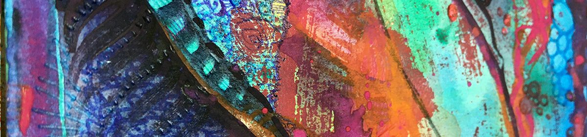
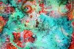
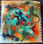
In response to the feed back on my paper dying project, thought I’d share some inspiration and some of my fave ingredients if you’re interested in doing something similar.

Firstly I must introduce you to an artist I find enormously inspirational, Ruth Issett.

Ruth has authored several books of mouth-wateringly delicious adventure in color and frequently runs courses and workshops.

Take a peak at her Glorious Papers: Techniques for Applying Colour to Paper – this is one of my fave books to set ideas flowing.

Dyes

For real vibrant colors, both for fabric and paper, I use Procion dyes. These are available at some art/craft stores, or the trusty shop that sells most everything.
The dye powder needs to mixed with water, and the colors blend beautifully. If you’re using them for paper there’s no need to use any fixative, just treat them like an ink.

Inks

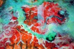
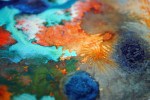
I also love to use Brusho inks. Again these come in powder form to be mixed with water.
If you sprinkle the dry powder (a little goes a long way) on damp paper you can get some fabulous starburst effects and color separation from the individual hues of pigments . Try it and find out!


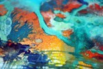
Then there’s the Ranger Adirondack Color Wash sprays.
These can be used on fabrics too if heat set with an iron.
Ready mixed, these come in spray bottles.


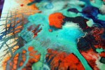
Dr P H Martin’s Bombay ink.

Having picked up a bottle of this at my local art shop, in a fit of extravagance I got myself both full sets of 12 colors and have to say it was a great investment.

They come in dropper bottles, perfect for dripping onto paper!

The colors are vibrant and strong, so again you don’t need to use loads, and a bottle lasts a long time.

Paints

Koh-I-Noor paints are fab for several reasons.

The colors are rich and intense dye-based paints which come as 4 stackable palettes. The middle bit of each palette, along with the lid, can be used for water or mixing shades, and they are perfect if you want to take your colors out and about with you.

NB Koh-I-Noor also make stackable palette sets like this with regular watercolor – this is the one in the illustration. The ones I use are the intense dark dye based ones. Check out the comparison of colors here. Read more about playing with these here


I hope you’ve found this interesting/useful and it may have sparked some ideas for you. Til next time, happy creating, folks! 😀

running with color

As the book of daily doodles progresses, it must be time for another catch up…

As the days and the pages go by I’m seeing how there’s so much more to this project than I ever expected. And I’m not even 3 weeks in!

This page was play with acrylic tar gel and inks. The ugly scratchiness and clogs in places are more than outweighed by the fun in doing this and the lessons learned.

Dr PH Martin’s Inks have a delicious gloop to them. They make for good splotting and over-printing with a wooden print block. Adirondack dye ink spray has a fine mist sometimes a little spitty. Inky mist, spit and splot are the essence of this page.

Not truly done justice in the photos, but the effect of dripping the Dr Martin’s inks and swishing with a sponge when a little bit dried was too fluffy and gentle to draw over.

So instead, I drew around it

From humble beginnings, a new character is born. This page is seen through Eyebird View 🙂

%d bloggers like this: