Happy endings

Ingredients:

  • Paper. I can recommend a HP940C printer manual, but guess anything made out of paper would do just as well 😉
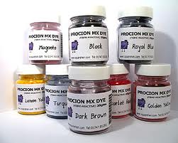
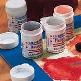
  • Procion dye. Super vivid colors. I used Magenta and Yellow.
  • Brusho. (Or any ink). I chose Brusho for it’s intense colors
  • Spray inks – like dylusions or Ranger color wash. Or any ink in a spray bottle
  • Water – spray bottle or brushed on to merge colors
  • About a week for inter-page drying and adding ink/dye to the uncolored bits. Building up the colors in stages prevents murky colors
  • Sunshine and a washing line for quicker drying (optional)
  • Suspended expectations. This project steers itself!

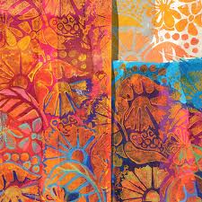
Here are some of the results…….

This slideshow requires JavaScript.


(More on how this came into being here)

unlikely treasure

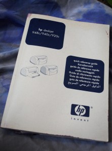
..buried in the paper recycling box (I was scuffling about for envelopes and scraps to dye) – when I found this:

No. Haven’t uploaded the wrong photo.

It is the manual to my faithful old printer. (11 years old, some bits have fallen off, but still working, I digress.)

The treasure is in the 7/8 of the pages which are printed in languages foreign to me, almost entirely text-based, on nice absorbant paper.

I love using printed paper especially when the forms of the words aren’t distracted by their meaning.


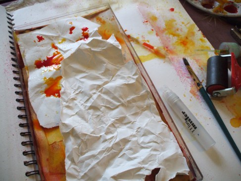
All it wants is some color…Beginning in drips


Water and ink, drippier and drippier


Then the bit where my inner-kid gets all excitable


Gasp!


Ta-da!


A good swish of dylusions yellow to soften the purples, then on to the next page while this dries!


I’ll post more as they dry and develop 🙂

adventures in color: ingredients

In response to the feed back on my paper dying project, thought I’d share some inspiration and some of my fave ingredients if you’re interested in doing something similar.

Firstly I must introduce you to an artist I find enormously inspirational, Ruth Issett.

Ruth has authored several books of mouth-wateringly delicious adventure in color and frequently runs courses and workshops.

Take a peak at her Glorious Papers: Techniques for Applying Colour to Paper – this is one of my fave books to set ideas flowing.

Dyes

For real vibrant colors, both for fabric and paper, I use Procion dyes. These are available at some art/craft stores, or the trusty shop that sells most everything.
The dye powder needs to mixed with water, and the colors blend beautifully. If you’re using them for paper there’s no need to use any fixative, just treat them like an ink.

Inks

I also love to use Brusho inks. Again these come in powder form to be mixed with water.
If you sprinkle the dry powder (a little goes a long way) on damp paper you can get some fabulous starburst effects and color separation from the individual hues of pigments . Try it and find out!


Then there’s the Ranger Adirondack Color Wash sprays.
These can be used on fabrics too if heat set with an iron.
Ready mixed, these come in spray bottles.


Dr P H Martin’s Bombay ink.

Having picked up a bottle of this at my local art shop, in a fit of extravagance I got myself both full sets of 12 colors and have to say it was a great investment.

They come in dropper bottles, perfect for dripping onto paper!

The colors are vibrant and strong, so again you don’t need to use loads, and a bottle lasts a long time.

Paints

Koh-I-Noor paints are fab for several reasons.

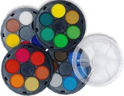
The colors are rich and intense dye-based paints which come as 4 stackable palettes. The middle bit of each palette, along with the lid, can be used for water or mixing shades, and they are perfect if you want to take your colors out and about with you.

NB Koh-I-Noor also make stackable palette sets like this with regular watercolor – this is the one in the illustration. The ones I use are the intense dark dye based ones. Check out the comparison of colors here. Read more about playing with these here


I hope you’ve found this interesting/useful and it may have sparked some ideas for you. Til next time, happy creating, folks! 😀

paper dying, part one.

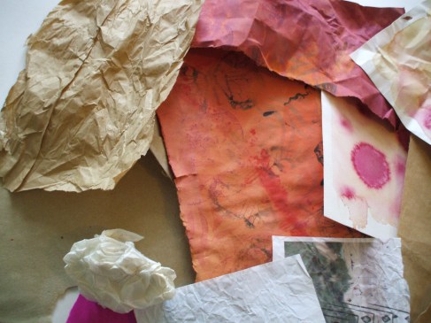
With fabric and textiles, I’m rarely put off by material being the ‘wrong’ color, provided I can dye it. Lately I’ve expanded this reasoning to include paper too. Fortunately for the sake of this project I’d already squirreled away a stock of paper, and the only preparation to be done was some therapeutic tearing  and scrumpling.
Image

Some paper (tough brown envelopes, cartridge, wallpaper lining, and watercolor) will tolerate heavy handed roughing up. Tissue, copier, newsprint and (my least fave) sugar paper just don’t have the same endurance, but will survive a lower level of scrunch.

The purpose of this is break up the surface, the scar lines offer a more porous surface for the dye to bleed through, and sometimes give a nice batik-y result.And sometimes they don’t. But we don’t care, we’re just here for shits and giggles.

Let the messy stage commence!
Image

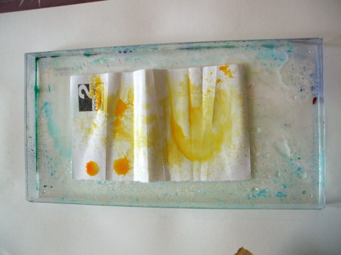
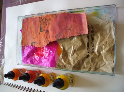
Plastic tray, bit of paper, swish with water, drips of dye & ink.
Image

From here it’s a matter of layering (thinking ‘lasagna’, but without the food elements. Srsly, that would be a whole different result, and not what I’m after here at all)

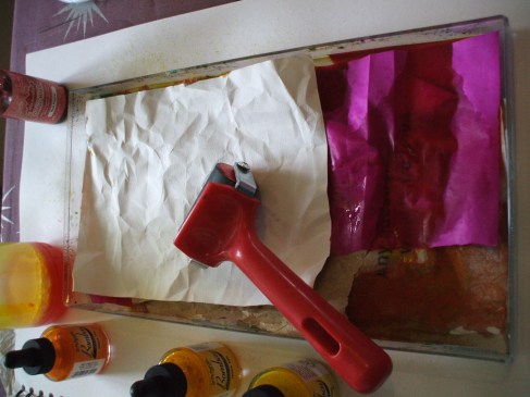
Thicker acrylic based inks work best thinned right down with water,acrylic acts as an adhesive and if/when used thickly will gum the papers together into an unpickapartable cludge.
Image

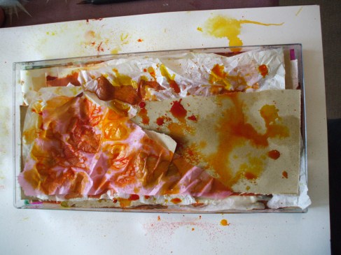
Some layers through I like to give the soaking papers a bitova squish with a roller (brayer). The dye will penetrate the paper fibres better, and slop out of the edges of the tray if you’re not careful.
Image

Sometimes I pour off a bit of excess wet into a jar and reuse it further up the ‘lasagna’.

Image

See the batik-y thing going on? Yay!

Image

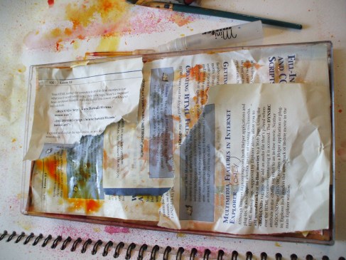
Onward n upward, paper, water, dye, swish, squish, paper, color, swish, etc
Image

Disclaimer: no books were harmed in this production. Apart from this one. (Second hand and out of date when I got it, 15 year old book on web site building. ) Just saying. Books are my friends, and I never deliberately dismember friends, even in the name of art. Except for the very dead ones.

Image

Some hours later, tray filled, excess juice drained, the soggy lump of color gets tipped out onto something porous (I used a selection of my finest knackered tea towels) and left to dry by the radiator. (If time and climate allow, sunshine will do the trick too)
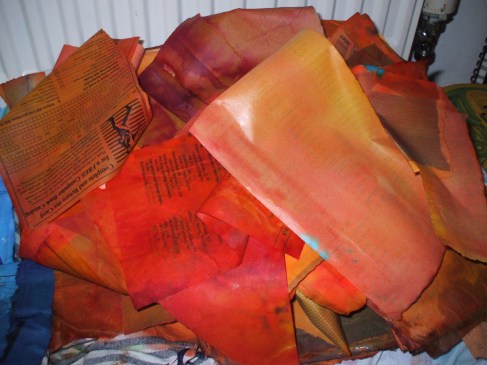
Image

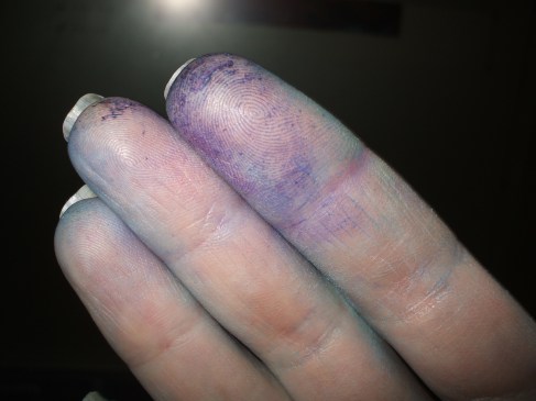
Oh, n you might wanna be wearing gloves for this. Or, like me, you might only remember this once you have dyed fingers…
Image


“Obstinate & Concious”

I’ve shared some little snips and bits of my doodlings with you over the last few days to introduce you to my projects. Today I thought I’d explain a little more of how some pages come about.

I advocate the belief that art materials can be made of pretty most anything. Beyond “making use”, “recycling” or other worthy intents, this is closer to a manic scavenging, edged with disproportionate glee, in discovering a source of free material that is unwanted by the world.

The basis of this page is a case in point. I work in an office, everyday there’s a delivery of interestingly patterned paper. Business envelopes.
Opened up, inside outed to see the squiggly abstract patterning, the best of the bunch get flattened and hoarded up for later.

I’d already dyed some envelopes, by layering them in a plastic tray (yup, scavenged from the kitchen) with dilute Procion dyes and inks in shades of blues and green. Purely experimental. Or just mental? Whatever, in their soggy state the pre-gummed bits re-gummed themselves to their neighbours. This page made use of the scrappy torn bits, picked apart shreds + the borders around the windows, (window frames?) deemed too bitty to save for future who-knows-whattery.

detail from page

Collaging with Mod Podge, I built up a background for doodling on. Before it dried I added more color with little sprinklings of dry Brusho powder in gamboge, lemon and orange. Swishing with water got the colors to liven up a bit before being left to dry.

Layered up 3-4 deep in places, the overlaps and natural crunkling of the paper caused by heavy dosing with liquid, gave an undulating surface. Less camera-friendly (at least at the time of light I chose), but pleasing to draw on as the contours and furrows guide the lines on which the patterns build.

The doodlings take on a life of their own in a setting like this. Torn edges and inky tide marks sew the seeds from which the lines grow. The padded quality of the surface make biro doodles dimensional as the pressure of the ballpoint makes indented patterns. Marker pen sits on the surface and gives iridescent sheen at the right angle of light. Felt pens glide over the surface and make subtle marks.

Torn words grow new meanings, Private & Confidential became Obstinate & Conscious.

%d bloggers like this: