“Don’t think about making art, just get it done. Let everyone else decide if it’s good or bad, whether they love it or hate it.
While they are deciding, make even more art.”
–Andy Warhol
a story about edges
How do we find contrasts when making art in monochrome?
There’s the tonal value: darks offsetting lights. What else?
Today I’m exploring contrasting edges:
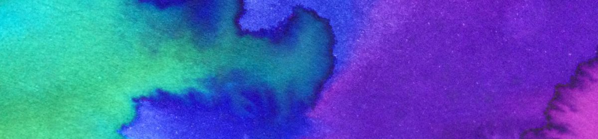
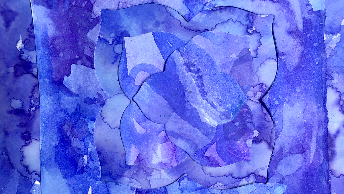
From the wibbly-edged puddles and spills of ink from yesterpost, with frayed torn edges for an organic and weather-beaten feel, beside the sharp clean outline of geometric die-cut pieces.
Because if we don’t try, we won’t know, right?
I collaged the die-cut pieces onto a background of torn pieces, playing with different layouts, using the negative space shapes and a mixed up almost symmetry.
I get twitchy with anything approaching perfection so the off centred aesthetic is not a mistake 😉 I like the sense of what I make being one zoomed in part of an unknown bigger whole, like a passing snapshot, a glimpse.
I’m curious to see how that all adds to the effect when I piece these bits together in the next stage of this project.
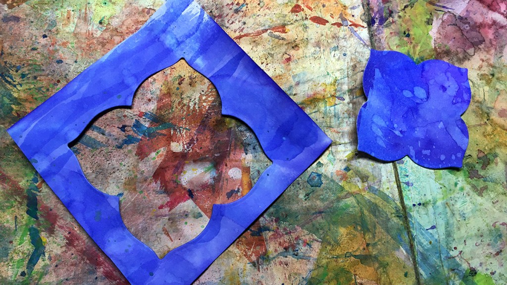
I keep any leftovers to use in my art journals as a reminder of projects gone by. Likely we’ll see these bits show up on a future page of the 100 day project 🙂
Here’s how I put together a couple of versions of this idea
“Twelvty” 12 Colors in 12 Months
Every month this year I am making a series of mixed media pieces in just one color. At the end of the year I’ll combine them into one big multicolored work.
I’m sharing my process throughout this adventure here in this blog. (So far this year I’ve explored Yellow, Yellow-Green, Green, Blue-Green & Blue)
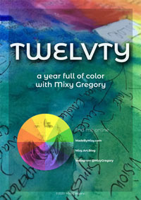
I’d love for you to join me. TWELVTY is open to everyone, and better yet, it’s free!
Sign up for my newsletter to find out more and get your free TWELVTY guide ebook.
