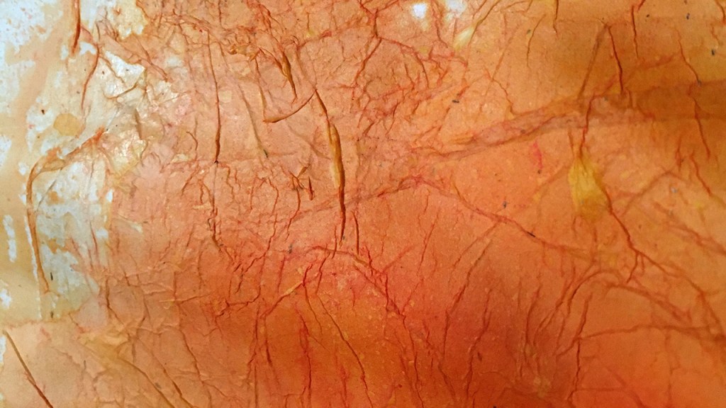
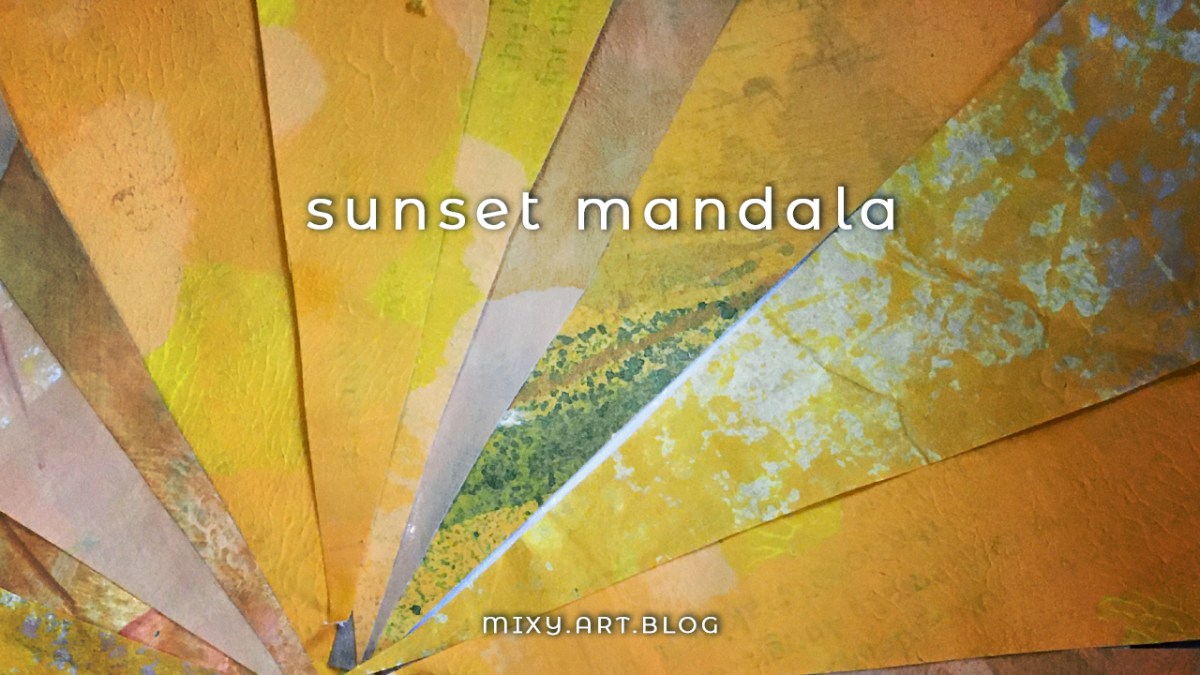
Folks, we’re into the last phase of this color wheel trip! Our final color to explore is orange-yellow, the golden hues of ochre, turmeric and saffron, late afternoon sun, and desert sands.
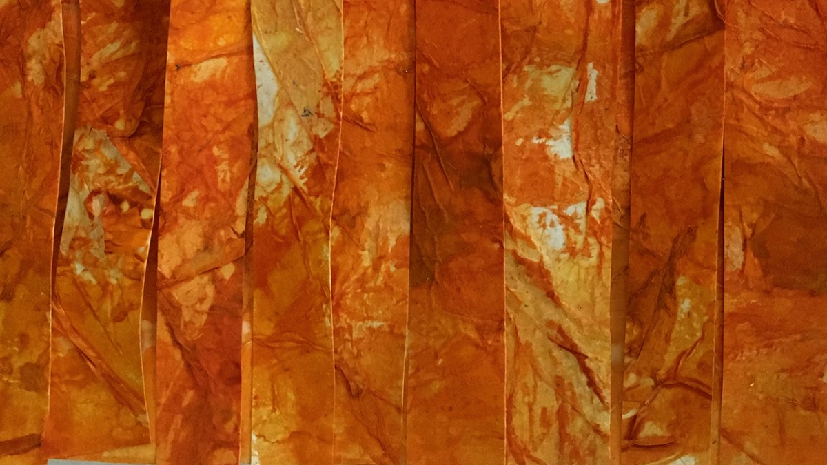
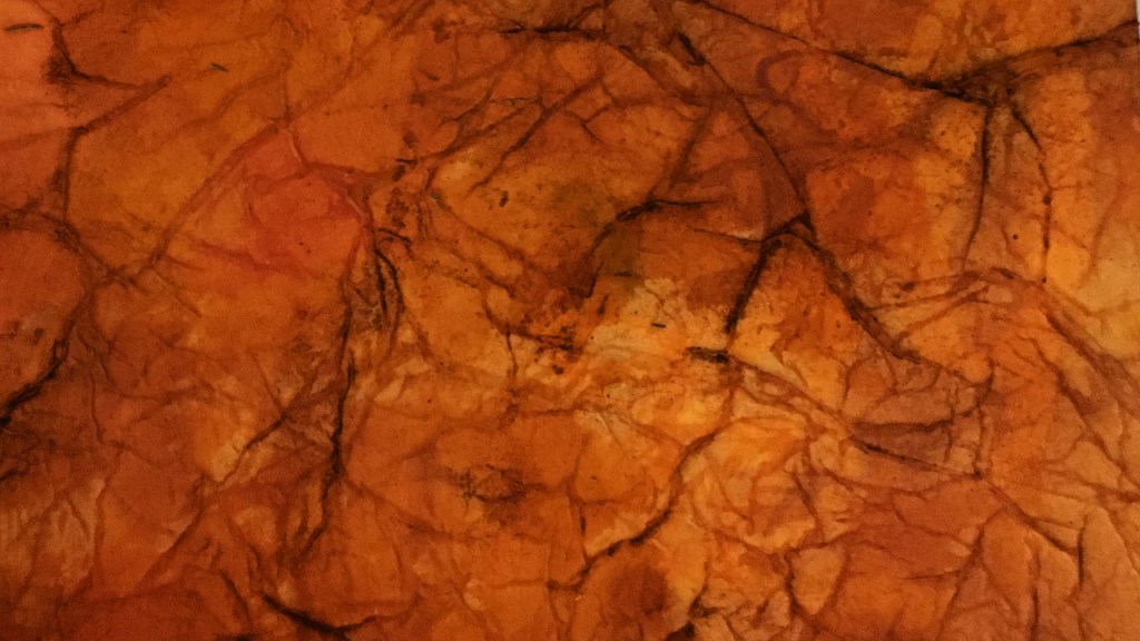
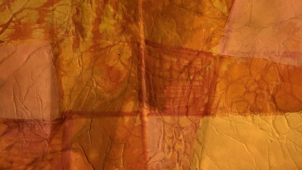
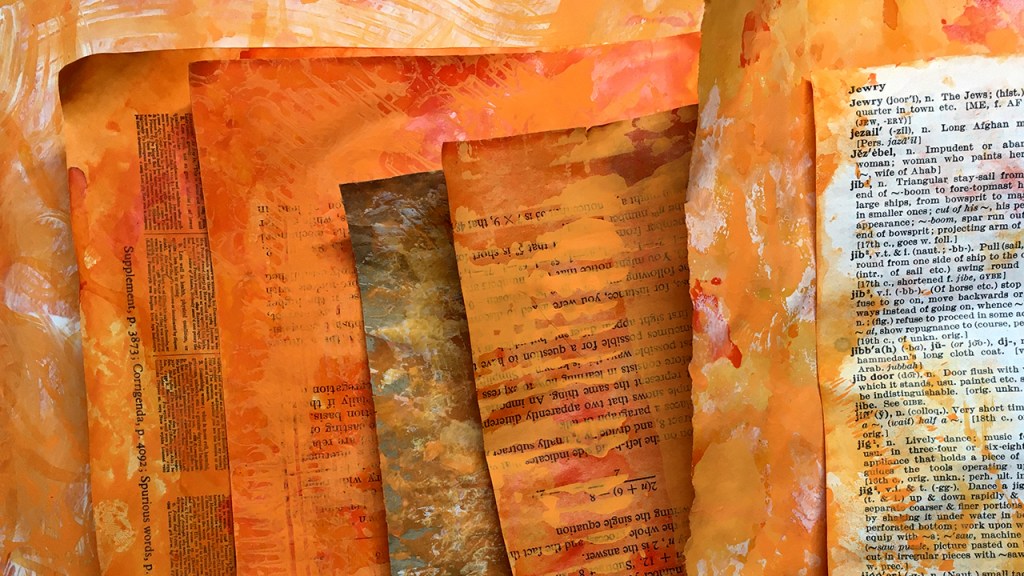
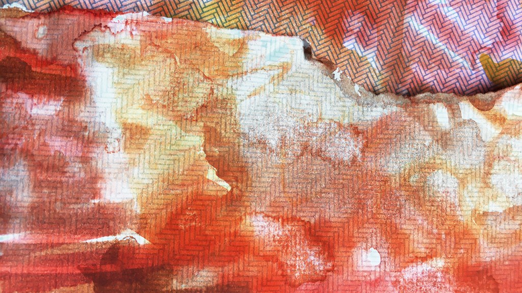
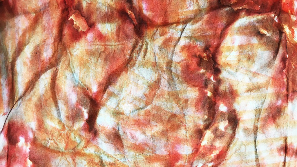
Today’s exploration began with some painted papers (much more of these in a separate post soon!)
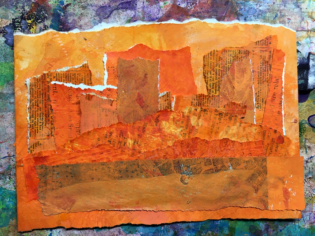
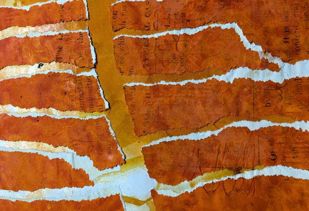
The paper I’m using is all scrap – from magazine pages, old drawings and a paper bag – the stuff that would end up in the recycling basket if I didn’t have this compulsion to turn everything into art.
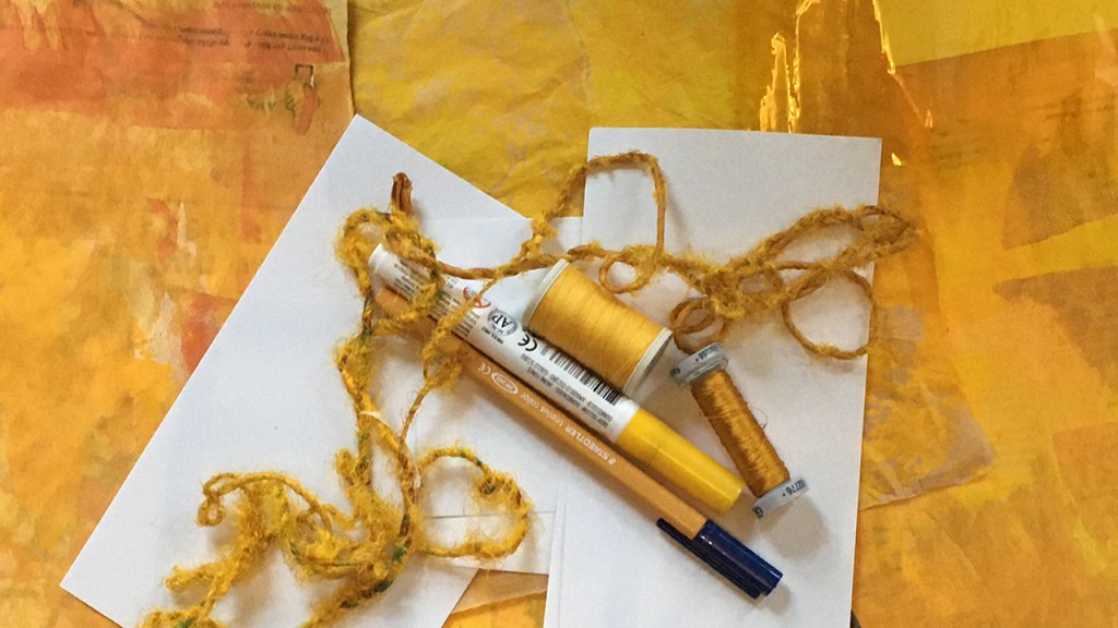
I’ve been sorting through some art supplies i haven’t played with in a long while and came across some coloured cellophane too, so that’s in the stash as well as some thread and yarn and a couple of sandy-ochre coloured markers.
Let’s see what we can make with this assortment of orange-yellow things!
I’ve got a real fascination with mandalas right now (again – more to come on these in a few post’s time!) so that’s the idea which sparked today’s creation.
Beginning with a small piece from each of the painted papers I cut out a bunch of triangles. Using PVA glue on a piece of card for a backing I arranged the triangles, alternating the different papers, pizza-slice-fashion into a mandala of sorts.
I’m left wondering if it wants some patterns doodled onto some of slices, so this might still be a work in progress.
Options (as usual) remain open 😉
Here’s how today’s process took shape
Next post I’ll show you how the rest of the painted papers became part of this orange-yellow series.
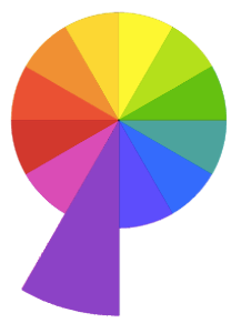
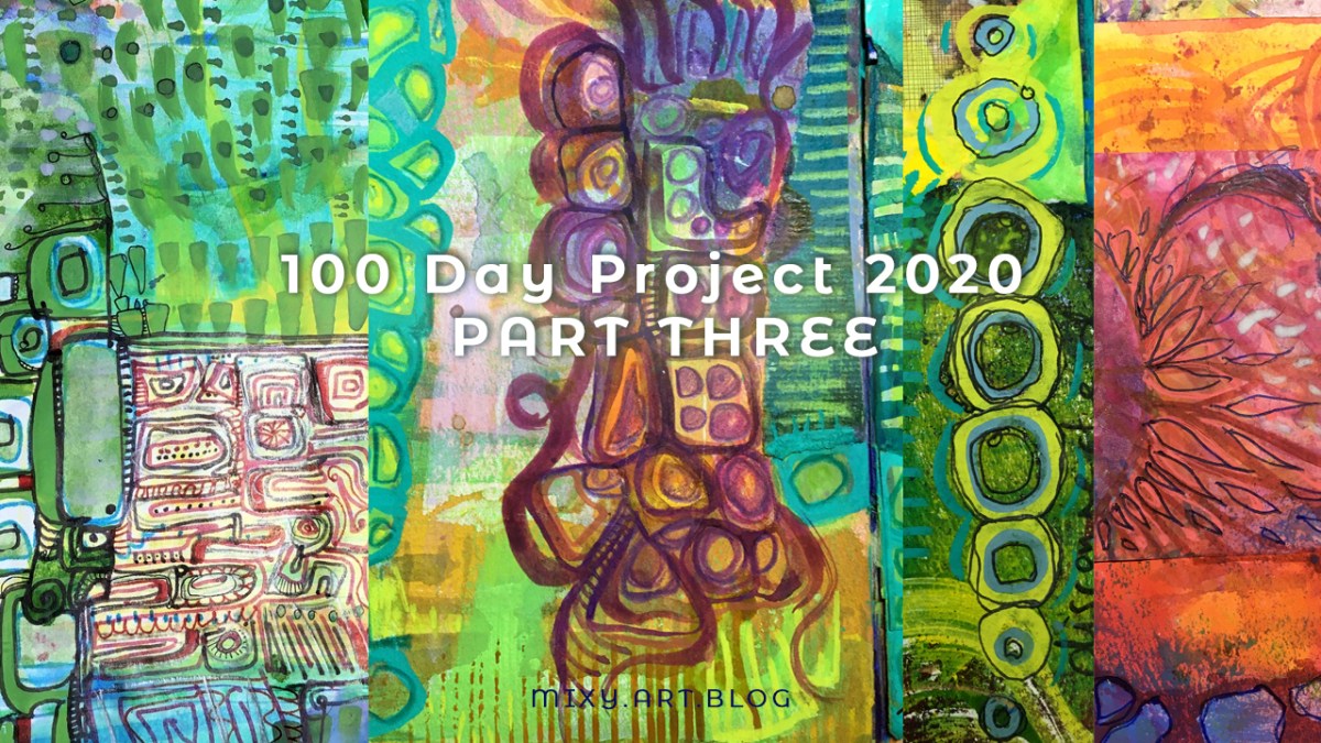
“Twelvty” 12 Colors in 12 Months
Every month this year I am making a series of mixed media pieces in just one color. At the end of the year I’ll combine them into one big multicolored work.
I’m sharing my process throughout this adventure here in this blog. (So far this year I’ve explored Yellow, Yellow-Green, Green, Blue-Green, Blue, Violet-Blue, Violet, Red-Violet, Red, Red-Orange & Orange)