Easy Batik – the verdict!

Some little while ago I got all buzzed up about an idea to do some batik. A trawl through the web came up with Dylon Easy Batik and as I couldn’t resist (HA! geddit!!) giving it a go.

I have to say firstly, it is a lot of fun.

With the consistency of cream (shake well – I forgot one time and it does separate unshaken), it paints on nicely. I was using cotton sheeting, and found it absorbed and spread, so even the finest lines came out a bit chunky. In that sense it’s limited in comparison to real batik, but something to build into the design I guess. The other main difference is that unlike batik wax it is flexible when it’s dry, so none of that lovely crackle effect. But other fabrics need testing on!

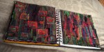
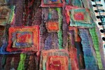
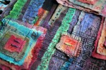
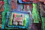
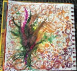
First easy batik doodles!

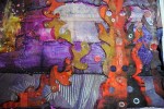
This is the underside of a freshly dye-painted sample. The eagle eyed amongst you might notice the batik-stuff appears speckled. It isn’t. This only happens if you use a fluffy-with-velvet-trimming-fuzz-covered surface to paint on. Oops. No matter, it all comes out in the wash.

Now that leads me on to another thing. If one were to follow the instructions one would paint on the stuff and allow to dry, pref overnight, then iron to fix (did all that), then to place the fabric flat in the dye for 30 mins (longer and the resist loses resistance), not aggitating it for fear of loosening the stuff from the fibres.

If, on the other hand, one is me, one might choose to go off recipe at the point after the ironing…

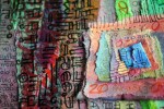
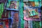
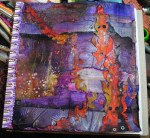
I had planned to paint and drip procion dyes, swish with water, get a nice watercolory-effect then fix with soda ash per dying instructions on the bottle. Building up by layers, some more batik-stuff, more drying-ironing-inking cycle, etc…

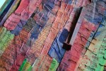
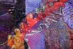
But, surrounded as I was by so many delicious colored inks (not fixable), I ended up using a mix of procion dye (unfixed, didn’t bother since all the other ingredients became involved), ink, dylusions spray, coffee, tea…
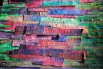
It was a giddy whirl of color, it was really out of my control altogether. i just decided these samples would be ingredients for non-washable creations. Simple as!

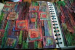
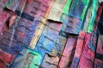
But sometimes, just knowing something won’t work is not reason enough not to give it a try. After all that ironing a certain amount of fixing must have happened. Plus I knew full well if I’d been wearing white when I did this, no amount of laundering would have got the splashes out! So I *washed some edge snippings to see what happened… just how much color loss and more importantly, washability of the stuff
Surprised by the results – less color loss than I expected, and total stuff removal (speckles n all!)
*washing: hand washed in cool water, no detergent, just til the water ran clear.

day last-but-one

While I was playing with my new inks last week, I developed some of these experiments on Thursday’s and Friday’s pages

the milky opacity of white ink dripped in transparent colored ink details the runs of the liquid

With a thick coating of white gesso on part of the page, scribed with pencil for deep furrows of swirl, the inks had routes to wander around

ink on wet white gesso reduces the saturation of blending colors

and new routes made with small watercolor brush, trying the page together as a whole.

swirls an spirals painted into the ink before it dries

The ‘day last-but-one’ thing – well, I’ll explain that bit later…. 😉

subtlety

The range of colors, the colors themselves, all add up to a mood or visual sensation. By changing the hues, we change much more.

Restricting colors (I find this a BIG challenge!) is a technique I am striving towards.

When space limits me to work on just one project at time, the Inner Kid won’t listen to me. “More Colors!” is the constant command.

If I had a few pieces on the go and space to dip between them this would be much more simple

But for now, working within the parameters of my living/painting space, I have to exercise a little more self discipline to make these more subtle images happen

Initially this page was to be just 2 colors: Olive green and burnt orange.

So the fact that I only allowed in some different shades of orange, I consider a victory!

And the results have (for now at least) left Inner Kid in slightly hushed awe: Maybe less is more!

Moments in the process

There is often a stage in the process where I look at the page and think WTF? What is going on? It might fly off on a tanget, or it might develop recognizably from here. But until it does, I have no way of telling…

Pushing on from this point gets easier every time. Like this…


Beginning the page with Black Gesso, some white writing and doodling. Tissue paper for texture.


Building up the shapes with slices of dyed envelopes


And some splashing – I used Dr Martin’s Bombay inks and some dilute acrylic paints.

And left to dry…


…to doodle on…


…and on…

to this! 😀

This thing

The things with the dyed paper, the cut outs and torn edges, the outlining and the doodlings. The purple and orange thing that’s a little shiny in places. This thing here…

the book as a metaphor

As one day merges into another, so the theme of a page drifts through those either side. I’ve noticed this more and more as the book goes on.

(Starting in mid March I’ve probably only got about a week’s worth of pages to go. Three months have flewn!)

The past week I’ve been more than a bit preoccupied with paper cut outs. I’ve been using up some of the dyed paper

Repeating shapes unite the pages. Contrasting colors separate them.

Layers on layers, lifting edges, like leaves.

textile adventures

I’m always striving to find new directions of creativity to explore (given that I can’t settle on any preference, might as well try as much as I can find).

Last weekend I spent learning the art of machine embroidery from the very inspirational Gina Ferrari. I’d only ever dabbled with this sort of machining before but by the end of the weekend course I’d produced a few samples and things, including this.

Not to mention full-to-the-brim with new ideas! 😀

Design a site like this with WordPress.com
Get started