subtlety

The range of colors, the colors themselves, all add up to a mood or visual sensation. By changing the hues, we change much more.

Restricting colors (I find this a BIG challenge!) is a technique I am striving towards.

When space limits me to work on just one project at time, the Inner Kid won’t listen to me. “More Colors!” is the constant command.

If I had a few pieces on the go and space to dip between them this would be much more simple

But for now, working within the parameters of my living/painting space, I have to exercise a little more self discipline to make these more subtle images happen

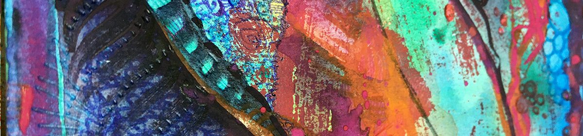
Initially this page was to be just 2 colors: Olive green and burnt orange.

So the fact that I only allowed in some different shades of orange, I consider a victory!

And the results have (for now at least) left Inner Kid in slightly hushed awe: Maybe less is more!

Jam Jar Art

Have you ever noticed the underside of a *jam jar?

Me neither… until by happy accident. I checked all the old jars I have collected up, and they all seem to be the same. (I’ll wait here, you go off to the kitchen if you need to check yours now)

They all have a ring of raised dots – like glass Braille – I guess an anti-slipping thing.

Turns out if you wash out a jar and instead of drying it, leave it to dry naturally on the nearest flat surface, like maybe an inky page of an open sketchbook, a beautiful ring of dots appear where the water has run down the sides and puddled round these dots!

Oh yeh – and if you get carried away trying to recreate the effect you can obliterate the dot circles just as easily with too much water!

The patterning reminded me of sewing machined lines (unthreaded needle, just perforating the paper) …that seemed like the best thing to go with the page in progress

So that’s what became of page 36!

* strictly speaking mine are all coffee, mayo & pasta sauce jars. I don’t like jam. Funny how they’re always called jam jars…

%d bloggers like this: