If you’ll believe in me, I’ll believe in you. Is that a bargain?
– The Unicorn
On Contrariness
The rebel part of me who yearns to do the thing the opposite way from which it’s intended is secretly enjoying the ride of this ‘down is up, up is down’ year.
And that got thinking about stencils.
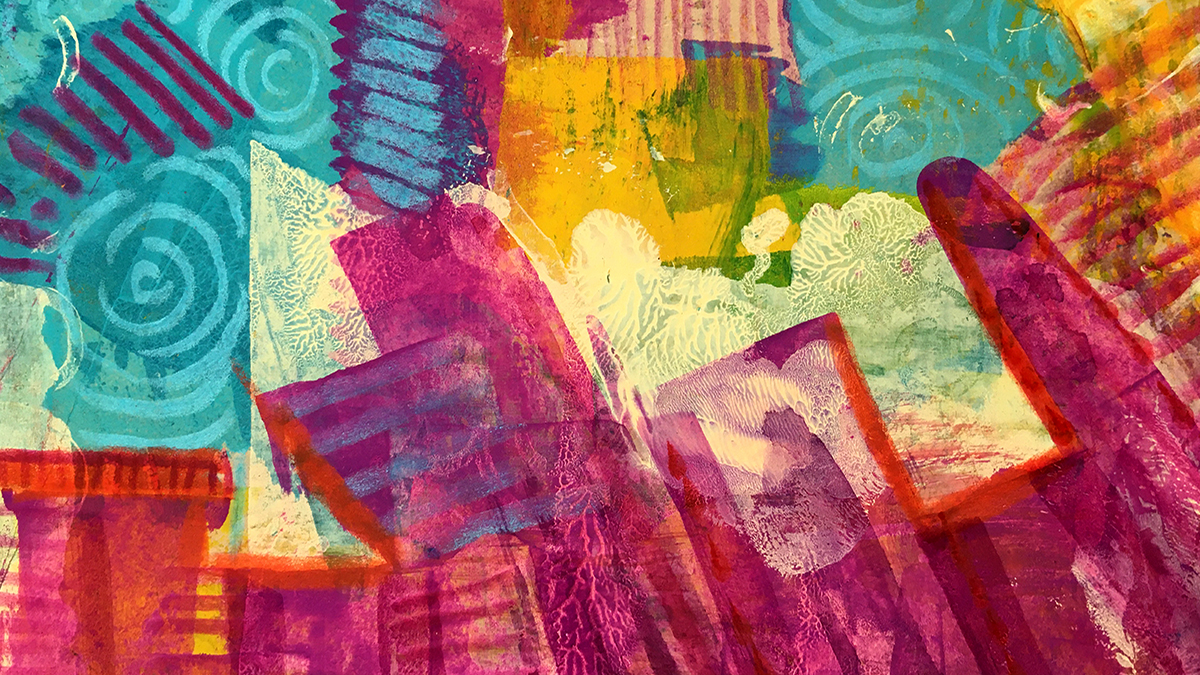
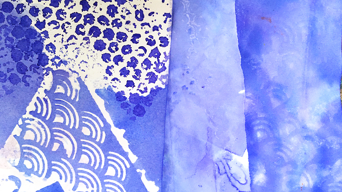
The point of the stencil is for neat tidy edges with regular lines and orderly patterns, and the contrariness of distorting the lines from a stencil appeals to my creative heart so much.
I love smudged edges and misaligned prints. I love worn paint effects, skipped lines, mis-matched patterns, mis-sprayed with glimpses of background showing through.
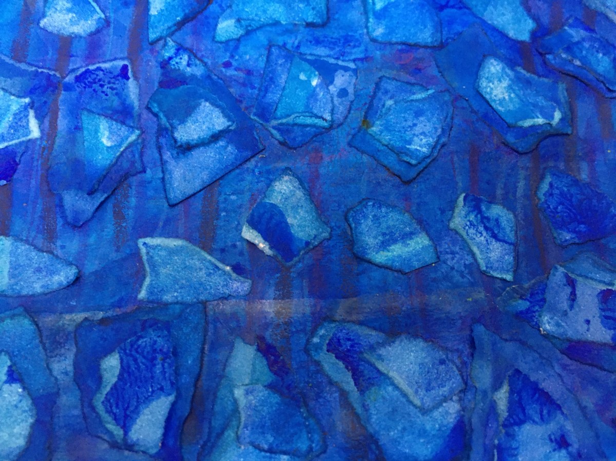
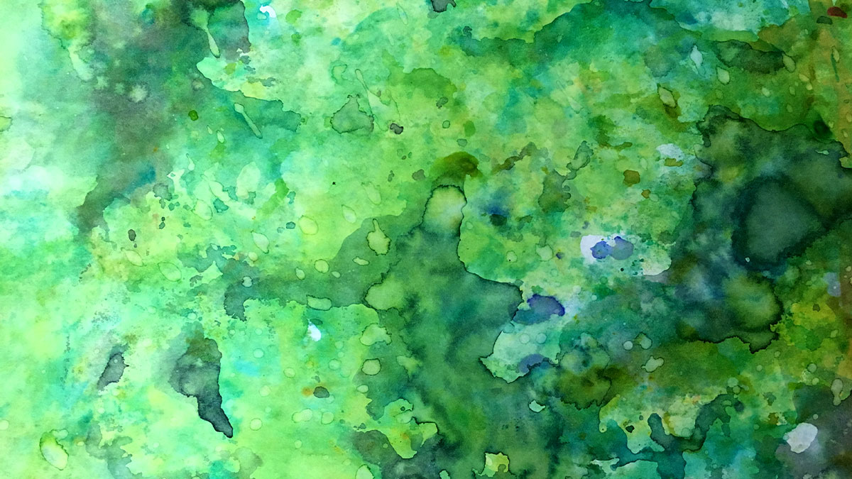
All this is why I love using stencils in my paper dying experiments, so that’s where I’m going in today’s first dabbles with this month’s color: Violet-Blue.
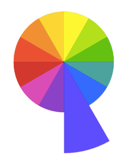
Being a tertiary color, Violet-Blue straddles the space between its neighbours in the color wheel, the place we find the moody mauves of bluebells and forget-me-knots.
And I’m excited to see how that works out in this process!
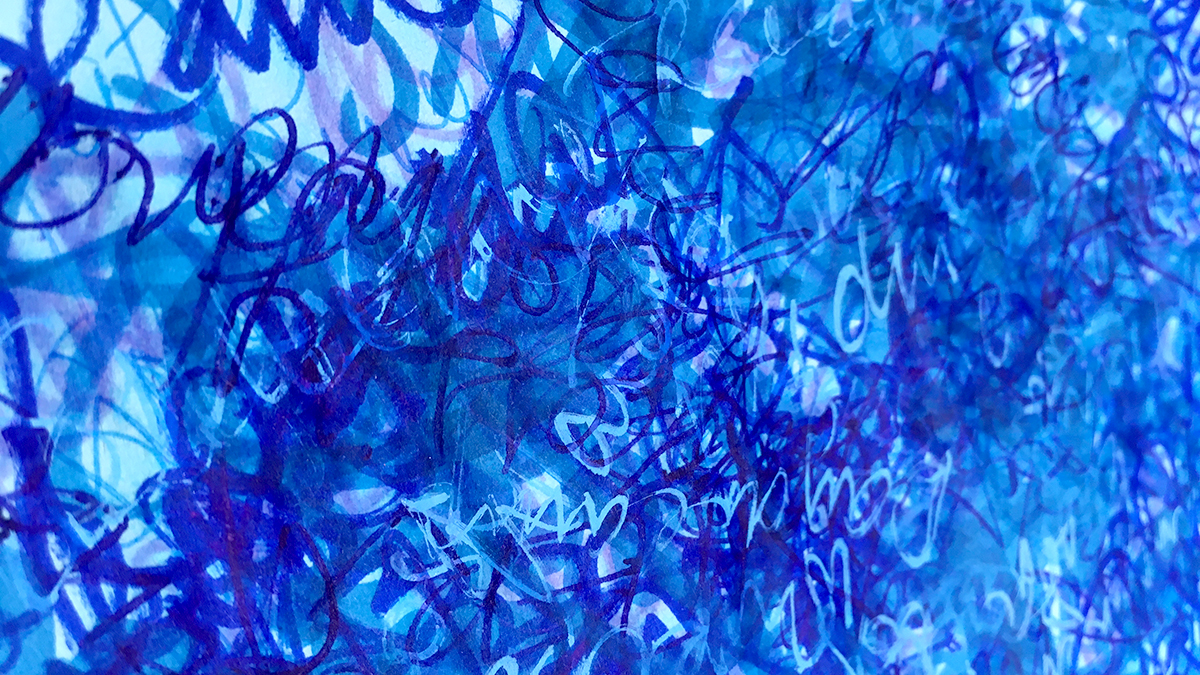
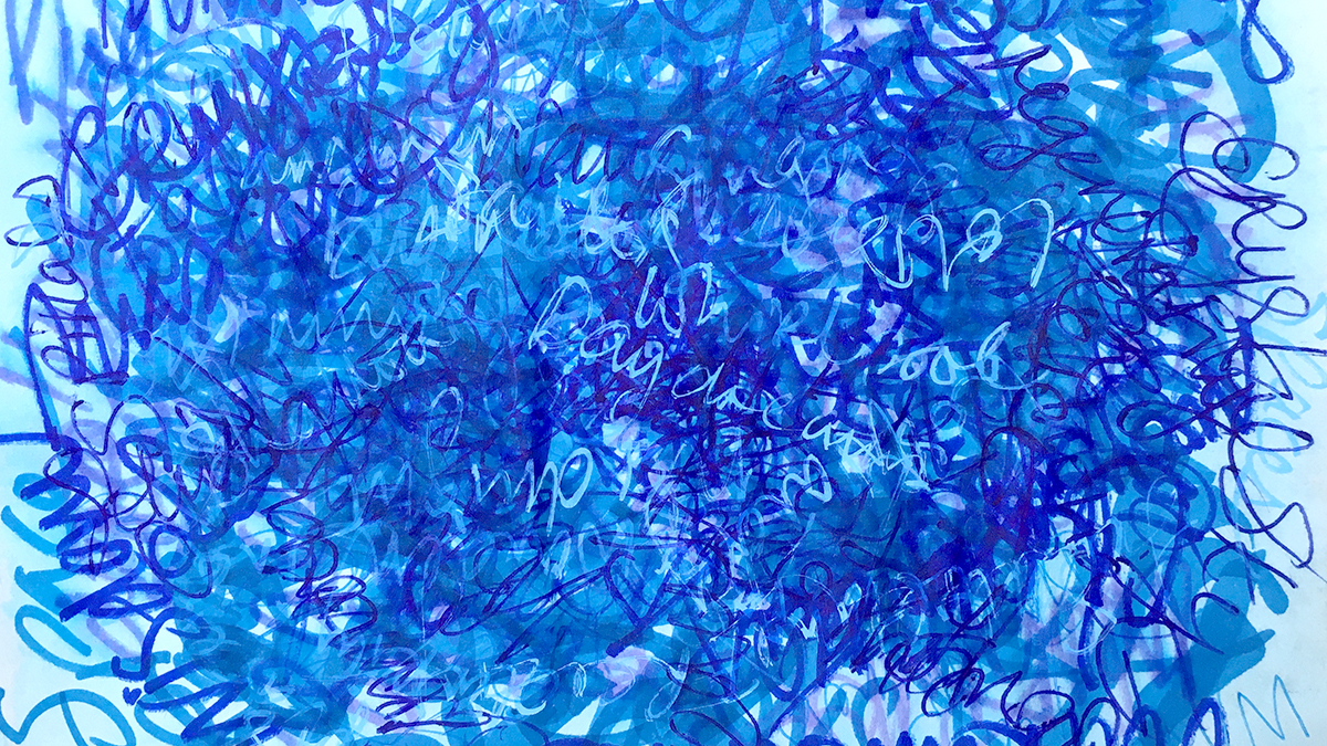
I’m using two inks: Violet by Colourcraft Brusho and Cobalt Blue by Pebeo Colorex. This blue has a strong violet undertone, and the violet is right at the coolest edge of the hue.
I’ve got a few different types of paper to play with – cartridge paper, regular copy paper, ultra thin Tomoe River paper, and some heavy watercolor paper. Different weights and absorancy of the papers all take up the ink in a different way.
Paper dying basics:
- Play with a variety of paper for a range of effects
- Torn edges often soak up ink to make darker edges
- Wet the paper with water – spray or brush or sponge or drip.
- Layer with stencils, (and/or bubble wrap, string, plastic wrap.)
- Add ink (writing ink, drawing ink (thin it with water if it’s thick and gloopy), watercolor paint, dye, food coloring….
- Keep adding overlapping layers of paper, water, color, stencils…
- Leave to dry.
- Unpeel the layers to reveal the magic!
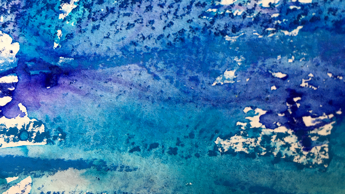
Wet paper (especially the super thin stuff) goes wrinkly and buckles up. This adds even more patterns as the ink escapes through gaps and wiggles through in little rivulets between the layers.
If you don’t like the really crinkled effect you can always press the paper flat with a warm iron after it dries, or squash flat under some heavy books..
But if you do like this texture, try adding more by crumpling and folding the paper in places before you begin. Where the surface is disrupted like this it often allows the ink to penetrate the fibres more and makes a darker, stronger pattern.
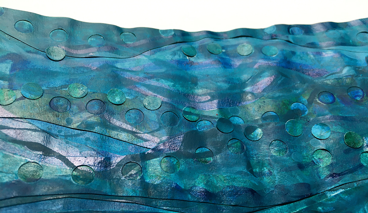
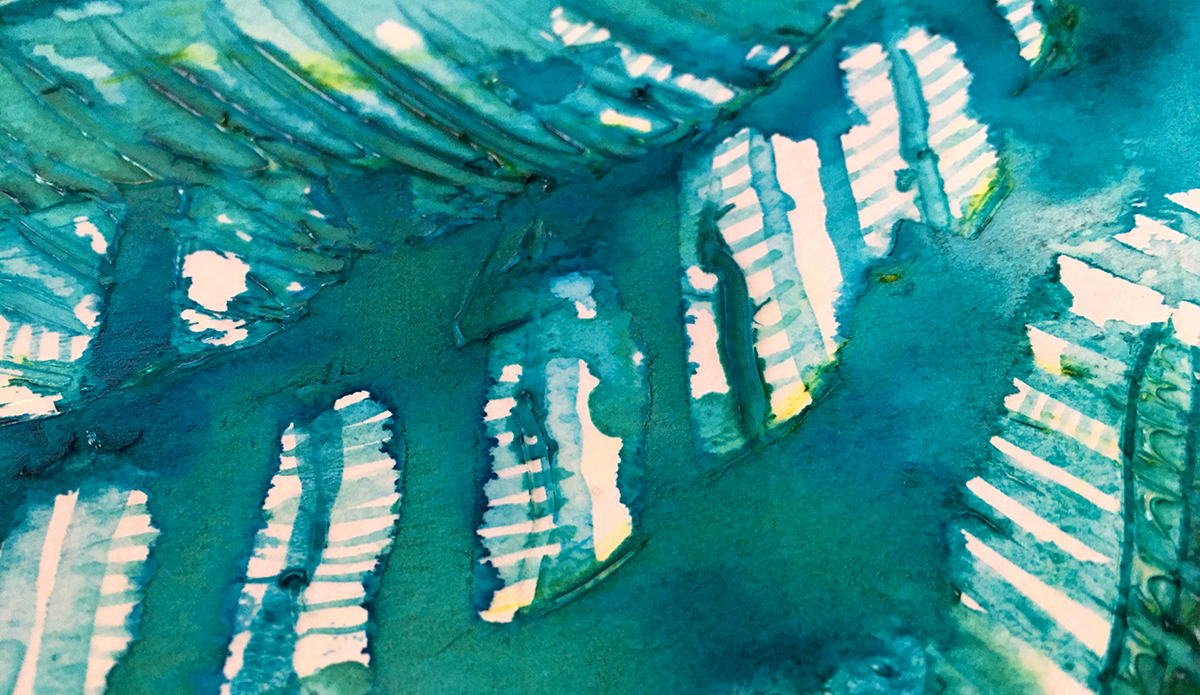
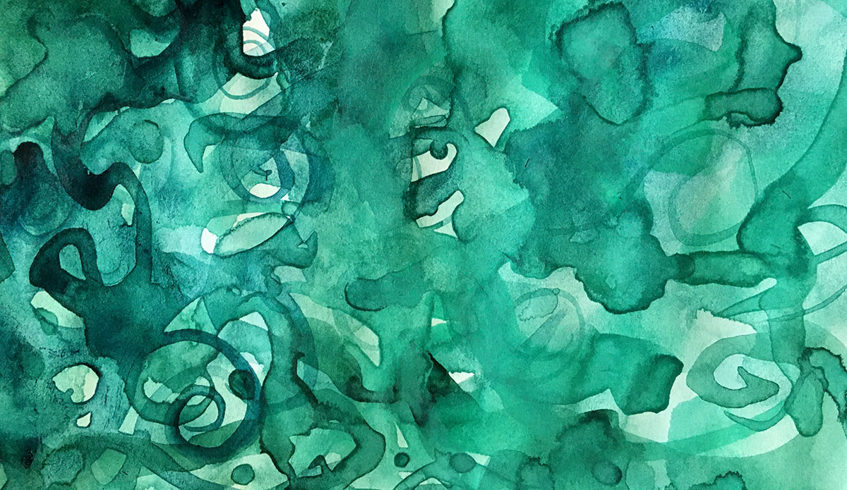
Here’s my Violet-Blue stencil play!
What’s next?
Some of these turned out so pretty I’m leaving them just as they are, but others will be backgrounds for further adventures – maybe another round of stencil dying – maybe something else 🙂 I’ll be back next week to show you more!
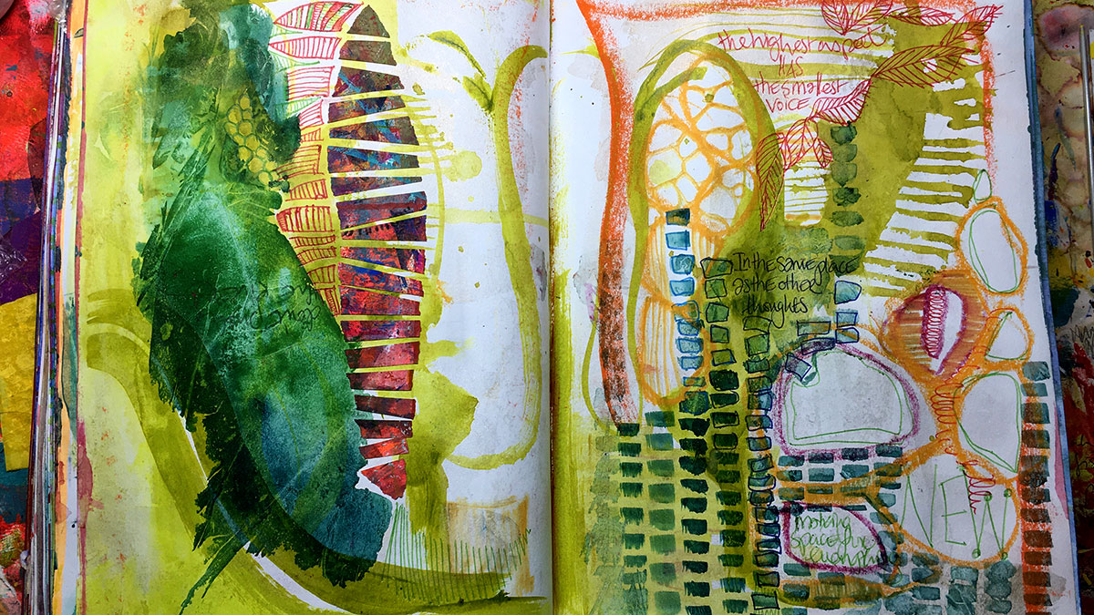
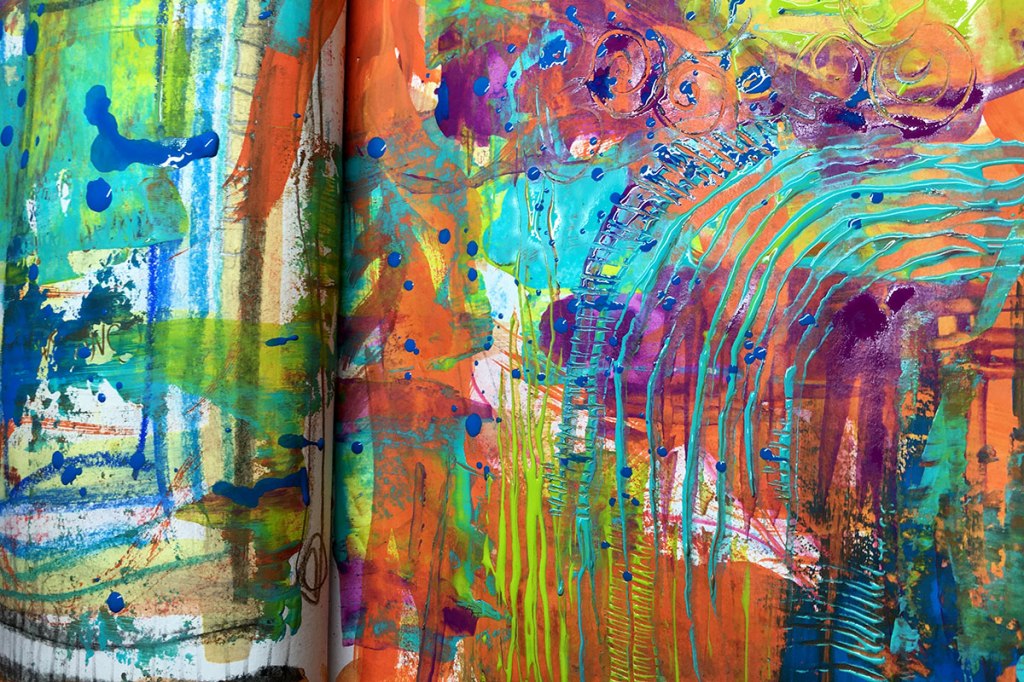
“Twelvty” 12 Colors in 12 Months
Every month this year I am making a series of pieces in just one color. At the end of the year I’ll combine them into one big multicolored work.
I’m sharing my process throughout this adventure here in this blog. (So far this year I’ve explored Yellow, Yellow-Green, Green, Blue-Green & Blue)
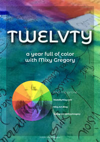
I’d love for you to join me. TWELVTY is open to everyone, and better yet, it’s free!
Sign up for my newsletter to find out more and get your free TWELVTY guide ebook.