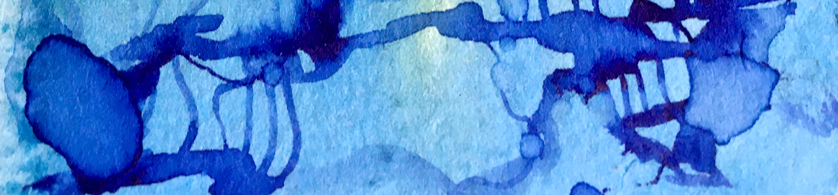
contrasting the wibbly-edged puddles and spills of ink from yesterpost with frayed torn edges against the sharp clean line of geometric die-cut pieces.
“Don’t think about making art, just get it done. Let everyone else decide if it’s good or bad, whether they love it or hate it. While they are deciding, make even more art.”
–Andy Warhol
a story about edges
How do we find contrasts when making art in monochrome?
There’s the tonal value: darks offsetting lights. What else?
Today I’m exploring contrasting edges:
From the wibbly-edged puddles and spills of ink from yesterpost, with frayed torn edges for an organic and weather-beaten feel, beside the sharp clean outline of geometric die-cut pieces.
Because if we don’t try, we won’t know, right?
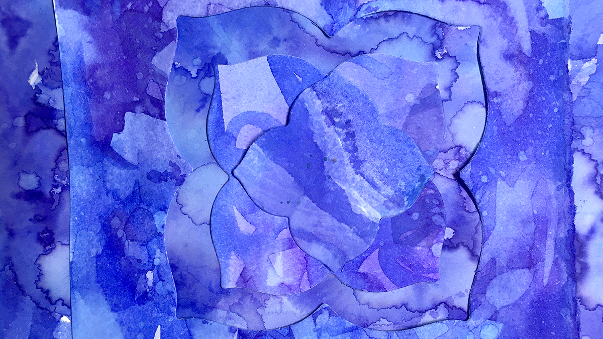
I collaged the die-cut pieces onto a background of torn pieces, playing with different layouts, using the negative space shapes and a mixed up almost symmetry.
I get twitchy with anything approaching perfection so the off centred aesthetic is not a mistake 😉 I like the sense of what I make being one zoomed in part of an unknown bigger whole, like a passing snapshot, a glimpse.
I’m curious to see how that all adds to the effect when I piece these bits together in the next stage of this project.
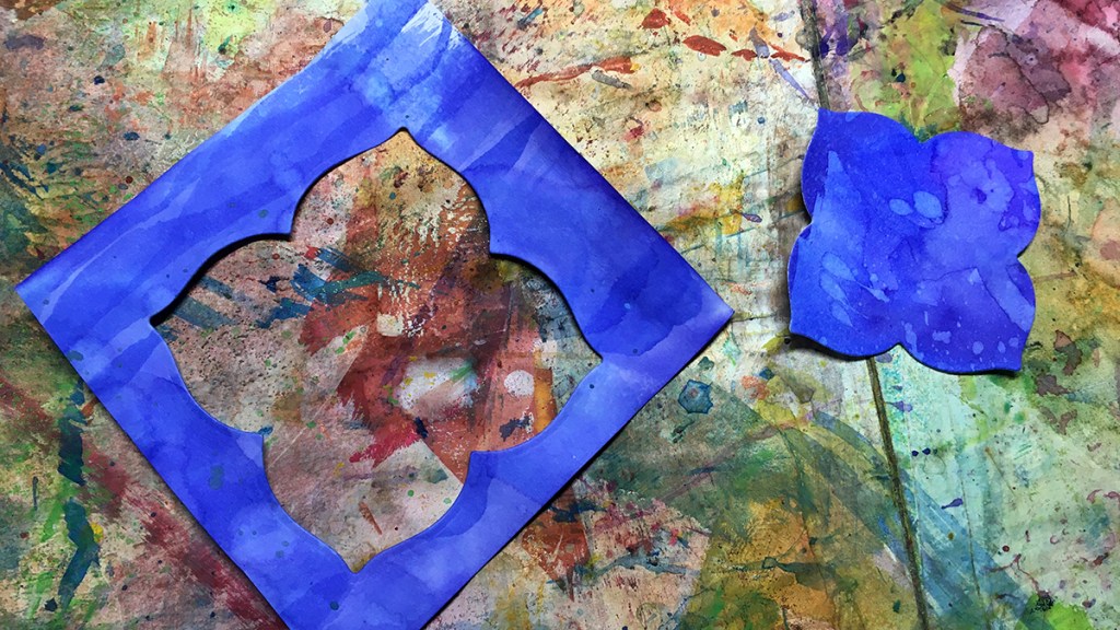
I keep any leftovers to use in my art journals as a reminder of projects gone by. Likely we’ll see these bits show up on a future page of the 100 day project 🙂
Here’s how I put together a couple of versions of this idea
“Twelvty” 12 Colors in 12 Months
Every month this year I am making a series of mixed media pieces in just one color. At the end of the year I’ll combine them into one big multicolored work.
I’d love for you to join me. TWELVTY is open to everyone, and better yet, it’s free!
Sign up for my newsletter to find out more and get your free TWELVTY guide ebook.
Processing…
Success! You're on the list.
Whoops! There was an error and we couldn't process your subscription. Please reload the page and try again.
You’ll get an email to confirm you’ve signed up and are human. Sorry, only humans (and their cats) can join. Check your spam folder cos sometimes the good stuff gets swept in there by mistake. Check with your cat too. You know it’s what they expect.
here’s what (almost) a year of doodles looks like, page by page.
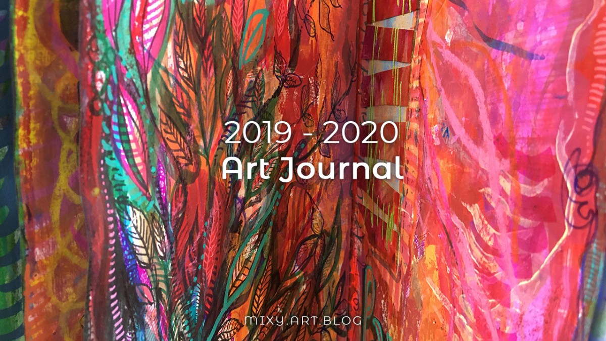
Just about a year ago I began this art journal.
It’s a monster of a thing at around 100 pages.
I bought two of these books because I was bewitched by the delightfully bright covers, this one in magenta, another in cherry red.
It took almost a year to doodle my way through this book from cover to cover.
I took a while to get used to the pages.
At first I was at odds with the paper which didn’t take ink and watercolor well.
Gessoing or collaging more ink friendly paper to the pages was bulking it up too much to be manageable.
Over the months I found the best solution was to tear out some pages and recycle them into other projects.
Some of these pages went on to become part of the junk journal I’m using for this year’s 100 day project.
I like the idea that this book seeded a brand new book, allowing ideas to overflow between the two.
Finally I reached the point at which the book felt done, ready to set aside to focus my attention on other things. There’s always an overlap with my art journals – I began playing with the second of these books earlier this year – so maybe we can expect a flip through of that one next spring!
Meanwhile, here’s what (almost) a year of doodles looks like, page by page.
This daily exercise has stretched my creative muscles & become the scaffolding of my days these last few weeks.
The project began a week or two into lockdown, and it’s been the one consistent part to my days while everything else is in flux.
I come and go to this book through the day – adding a bit and leaving it while the paint dries to get on with something else.
I wind down in the evening by adding bits of collage here and there, shuffling through my stash of painted papers to find just the right bit for just the right space.
It’s like a meditation of sorts.
And as day 100 looms I’m thinking I’ll likely carry this on past that point. In such wildly uncertain times it’s wonderful to have something to anchor my attention to. Let’s see!
Meanwhile, I’ll be back with Part four in a few weeks time 🙂
So join me, will you?
I’m@mixygregoryover on Instagram, and for the course of these 100 (or so) days I’m posting daily updates with the tags
The essence of mixed media is layers. Today I want to explore a lighter, more dreamy version of layering.
Stop acting so small. You are the universe in ecstatic motion.
– Rumi
It’s all about the layers
The essence of mixed media is layers. I love piling layers up, with scribbles over paint over collage over who knows what lies beneath.
But layers don’t have to be weighty and dense.
My tendency is often towards over-ness: over complicated, over-thinking, over-working. So here is a stretch for me – cos I believe it’s always beneficial to stretch our creativity.
Today I want to explore a lighter, more dreamy version of layering.
I’m using the same two inks from last time, because these colors are perfect, and because I’m all about simplifying my process right now. Less decision making & more spaciousness!
Here’s my simplicity:
Two inks + water + plain white paper.
One brush.
Paint quickly.
Don’t stop to think – keep moving.
Let it dry.
Repeat until done!
Here’s how the process played out:
The result was some delicate patterns which I find only come from creating spontaneously like this.
“Twelvty” 12 Colors in 12 Months
Every month this year I am making a series of pieces in just one color. At the end of the year I’ll combine them into one big multicolored work.
I’d love for you to join me. TWELVTY is open to everyone, and better yet, it’s free!
Sign up for my newsletter to find out more and get your free TWELVTY guide ebook.
Processing…
Success! You're on the list.
Whoops! There was an error and we couldn't process your subscription. Please reload the page and try again.
You’ll get an email to confirm you’ve signed up and are human. Sorry, only humans (and their cats) can join. Check your spam folder cos sometimes the good stuff gets swept in there by mistake. Check with your cat too. You know it’s what they expect.
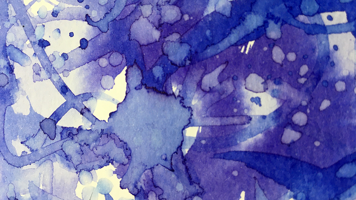
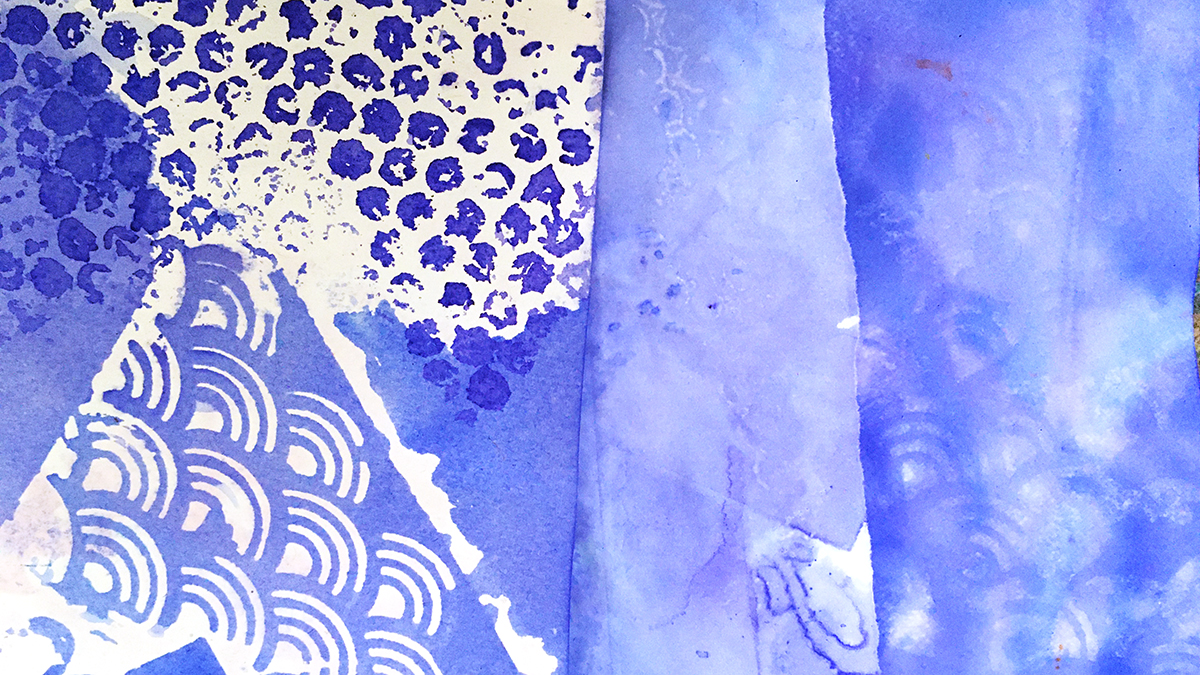
Exploring Violet-Blue by breaking all the rules of stencils in the paper dying process!
If you’ll believe in me, I’ll believe in you. Is that a bargain?
– The Unicorn
On Contrariness
The rebel part of me who yearns to do the thing the opposite way from which it’s intended is secretly enjoying the ride of this ‘down is up, up is down’ year.
And that got thinking about stencils.
The point of the stencil is for neat tidy edges with regular lines and orderly patterns, and the contrariness of distorting the lines from a stencil appeals to my creative heart so much.
I love smudged edges and misaligned prints. I love worn paint effects, skipped lines, mis-matched patterns, mis-sprayed with glimpses of background showing through.
All this is why I love using stencils in my paper dying experiments, so that’s where I’m going in today’s first dabbles with this month’s color: Violet-Blue.
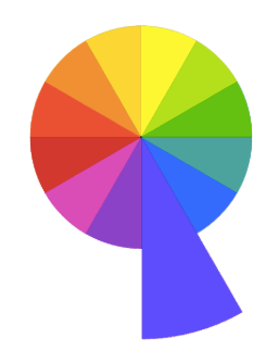
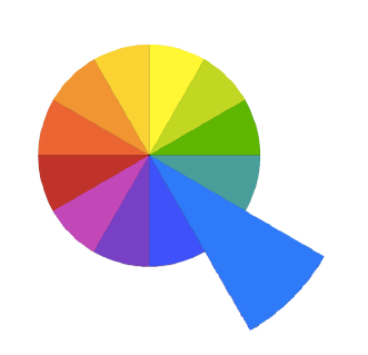
Being a tertiary color, Violet-Blue straddles the space between its neighbours in the color wheel, the place we find the moody mauves of bluebells and forget-me-knots.
And I’m excited to see how that works out in this process!
I’m using two inks: Violet by Colourcraft Brusho and Cobalt Blue by Pebeo Colorex. This blue has a strong violet undertone, and the violet is right at the coolest edge of the hue.
I’ve got a few different types of paper to play with – cartridge paper, regular copy paper, ultra thin Tomoe River paper, and some heavy watercolor paper. Different weights and absorancy of the papers all take up the ink in a different way.
Paper dying basics:
Play with a variety of paper for a range of effects
Torn edges often soak up ink to make darker edges
Wet the paper with water – spray or brush or sponge or drip.
Layer with stencils, (and/or bubble wrap, string, plastic wrap.)
Add ink (writing ink, drawing ink (thin it with water if it’s thick and gloopy), watercolor paint, dye, food coloring….
Keep adding overlapping layers of paper, water, color, stencils…
Leave to dry.
Unpeel the layers to reveal the magic!
Wet paper (especially the super thin stuff) goes wrinkly and buckles up. This adds even more patterns as the ink escapes through gaps and wiggles through in little rivulets between the layers.
If you don’t like the really crinkled effect you can always press the paper flat with a warm iron after it dries, or squash flat under some heavy books..
But if you do like this texture, try adding more by crumpling and folding the paper in places before you begin. Where the surface is disrupted like this it often allows the ink to penetrate the fibres more and makes a darker, stronger pattern.
Here’s my Violet-Blue stencil play!
What’s next?
Some of these turned out so pretty I’m leaving them just as they are, but others will be backgrounds for further adventures – maybe another round of stencil dying – maybe something else 🙂 I’ll be back next week to show you more!
“Twelvty” 12 Colors in 12 Months
Every month this year I am making a series of pieces in just one color. At the end of the year I’ll combine them into one big multicolored work.
I’d love for you to join me. TWELVTY is open to everyone, and better yet, it’s free!
Sign up for my newsletter to find out more and get your free TWELVTY guide ebook.
Processing…
Success! You're on the list.
Whoops! There was an error and we couldn't process your subscription. Please reload the page and try again.
You’ll get an email to confirm you’ve signed up and are human. Sorry, only humans (and their cats) can join. Check your spam folder cos sometimes the good stuff gets swept in there by mistake. Check with your cat too. You know it’s what they expect.
I think the key to the 100 day project for me is to always be ahead of the game. Previously I’d find myself chasing my tail to get something done and posted every day. It got progressively less fun day by day!
That’s the reason I chose to make a junk journal for my 2020 project.
Every page is made from already started art – bits of dyed book pages, painted papers, oddments and scraps from around my studio.
So my foundations were solid this time.
And I’ve been adding to the pages ahead of time. As I find more things to add, or have left over paint to use up, I find a space in these pages and add a little bit more. When I’m stuck for ideas I pick up this little book and doodle a bit.
The one part for me that I keep to a strict daily practice is to number and date today’s page and post it to Instagram.
A side benefit is it’s a daily reminder what today’s date is – which right now is the only way I know!
So join me, will you?
I’m@mixygregoryover on Instagram, and for the course of these 100 (or so) days I’m posting daily updates with the tags
A stream of consciousness on the theme of the color.
“Life is a continual flow of events, streaming in from the universal stream of consciousness in such a way that it exactly matches our own stream of consciousness.”
Neale Donald Walsch
I like to use text in my art. My art journals and sketchbooks are strewn with scribbled down words and phrases, song lyrics and notes to myself. I jot down things I hear as I’m doodling, from the radio or a podcast. Sometimes words just appear in my head and I have to trap the thought on paper before it evaporates.
Other times words are just another form of mark making, a sort of a scribble to fill in a space, a dance for the pen across a surface and make some pleasing patterns. Words over words over words become a cacophony of layered shapes, delightful squiggles that merge into one vivid buzzing hum.
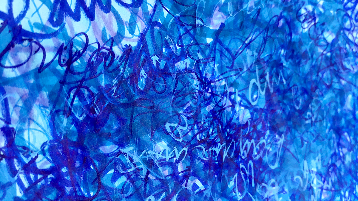
“Word Soup”
While we are exploring a single color at a time, I played this is with idea using word association. Words connected to “Blue”.
I grabbed a bunch of blue pens and set about filling my paper with a stream of consciousness about my thoughts on the color blue.
I set a few ground rules to begin:
One word, change pen.
Rotate the page between each word (to stir up the word soup).
Don’t think – if nothing comes to mind – begin again with ‘Blue’.
Repeating the same words is just fine.
Keep cycling round until the paper is full or I get bored with it – whichever happens first!
The pens themselves effect how it turns out – some are chunky and make big, bold letters, some flow easily, some are scratchy and prone to skipping. All of this is great – it adds to the variety and fills the space with different shapes and marks.
I kept going until I’d filled the space, then gave it all a wash over with some water to merge the colors just a little bit more.
Here’s my Blue themed stream of consciousness
“Twelvty” 12 Colors in 12 Months
Every month this year I am making a series of pieces in just one color. At the end of the year I’ll combine them into one big multicolored work.
I’m sharing my process throughout this adventure here in this blog. (So far this year I’ve explored Yellow, Yellow-Green, Green & Blue-Green)
I’d love for you to join me. TWELVTY is open to everyone, and better yet, it’s free!
Sign up for my newsletter to find out more and get your free TWELVTY guide ebook.
Processing…
Success! You're on the list.
Whoops! There was an error and we couldn't process your subscription. Please reload the page and try again.
You’ll get an email to confirm you’ve signed up and are human. Sorry, only humans (and their cats) can join. Check your spam folder cos sometimes the good stuff gets swept in there by mistake. Check with your cat too. You know it’s what they expect.
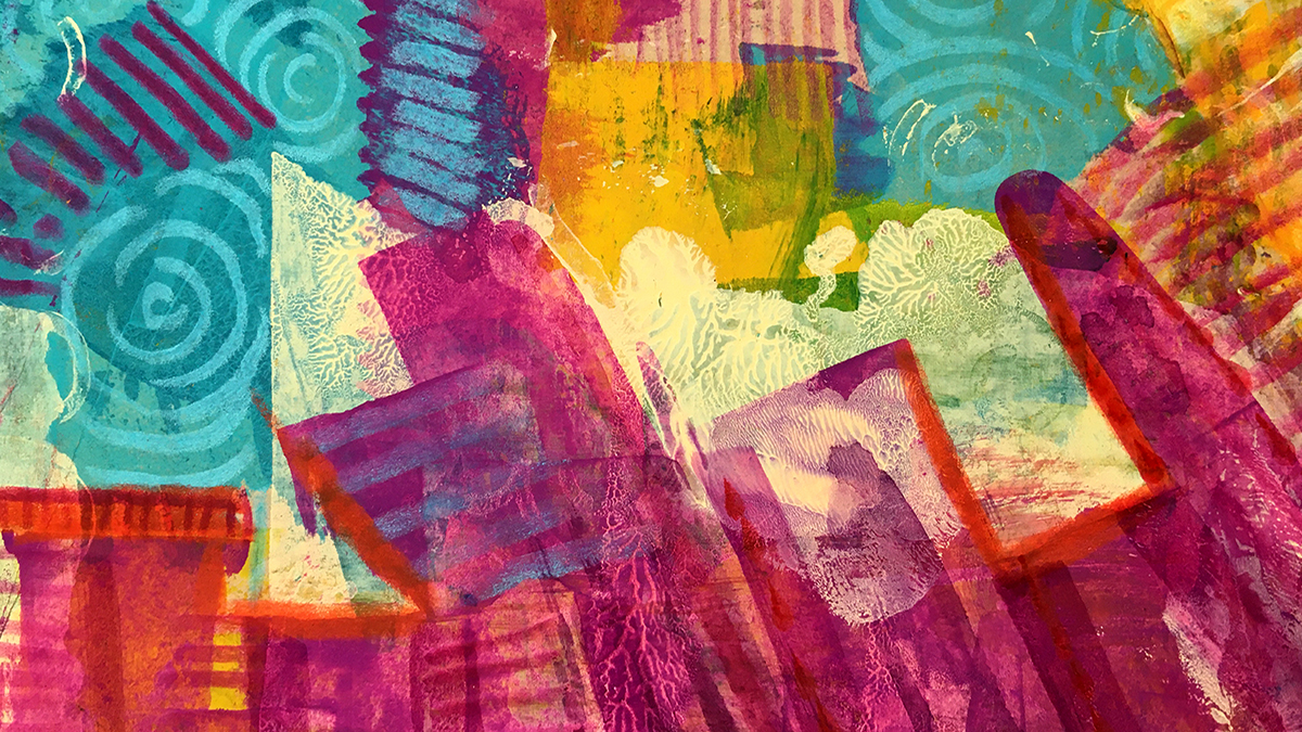
This week I’ve been noodling about with some collage ideas.
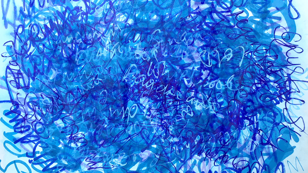
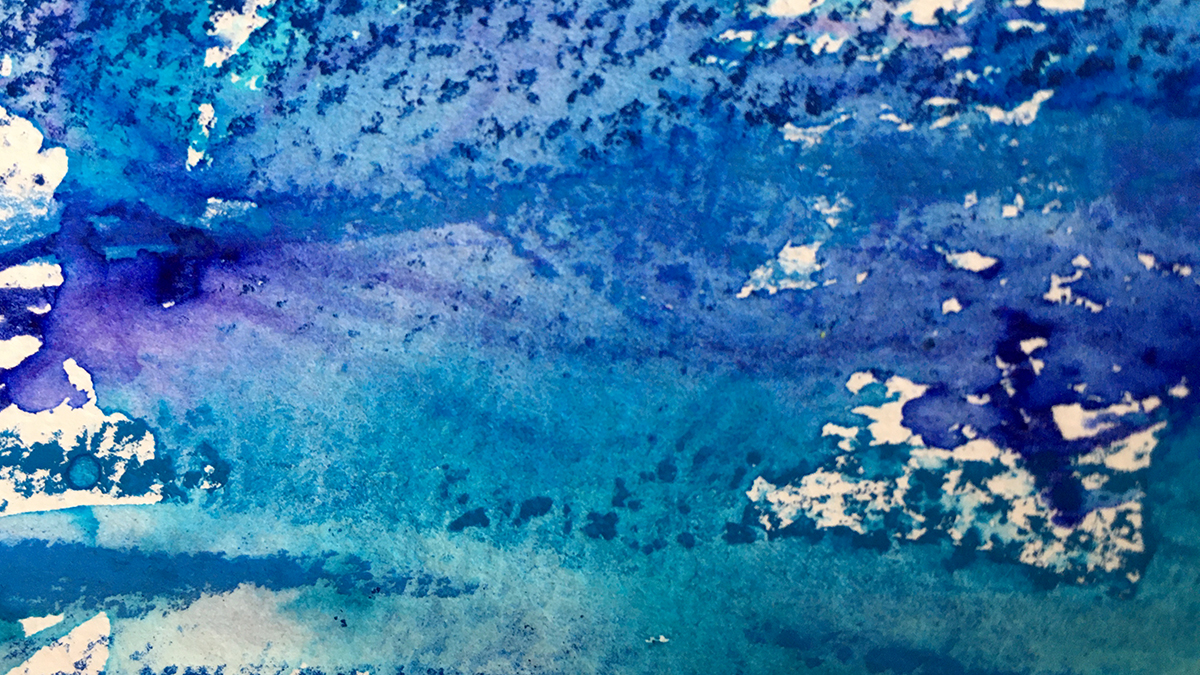
I can’t see the color blue without thinking of water.
Each time I take this circular journey through the colors, I build a familiarity with each segment of the wheel, and each time I get to the blues I’m drawn into making something watery!
This time I want to keep it super simple, to allow the water make the patterns.
I gathered up all my water based pens and water soluble media (my favs are the Derwent intense blocks, but this time it was the felt pens that made the best inky patterns).
Using all these blues on watercolour paper, I made some scribbly marks – doodled lines, dotted and dashed, thick and thin, light and heavy, wiggly, wavy and straight – some over lapping and some spaced apart.
Brushing loosely with water to loosen the pigments, I left it to dry. What I find really fascinating in this process is seeing how the ink colors separate – the undertones of turquoise and violet appear and surround the main hues of blue.
Let water + serendipity be collaborators in yourart!
“Twelvty” 12 Colors in 12 Months
Every month this year I am making a series of pieces in just one color. At the end of the year I’ll combine them into one big multicolored work.
I’m sharing my process throughout this adventure here in this blog. (So far this year I’ve explored Yellow, Yellow-Green, Green & Blue-Green)
I’d love for you to join me. TWELVTY is open to everyone, and better yet, it’s free!
Sign up for my newsletter to find out more and get your free TWELVTY guide ebook.
Processing…
Success! You're on the list.
Whoops! There was an error and we couldn't process your subscription. Please reload the page and try again.
You’ll get an email to confirm you’ve signed up and are human. Sorry, only humans (and their cats) can join. Check your spam folder cos sometimes the good stuff gets swept in there by mistake. Check with your cat too. You know it’s what they expect.
This week I’ve been noodling about with some collage ideas.
“Blue has no dimensions. It is beyond dimensions.”
~ Yves Klein
This month in our adventure around the color wheel, we’re exploring the cool and soothing tones of blues.
This week I’ve been noodling about with some collage ideas.
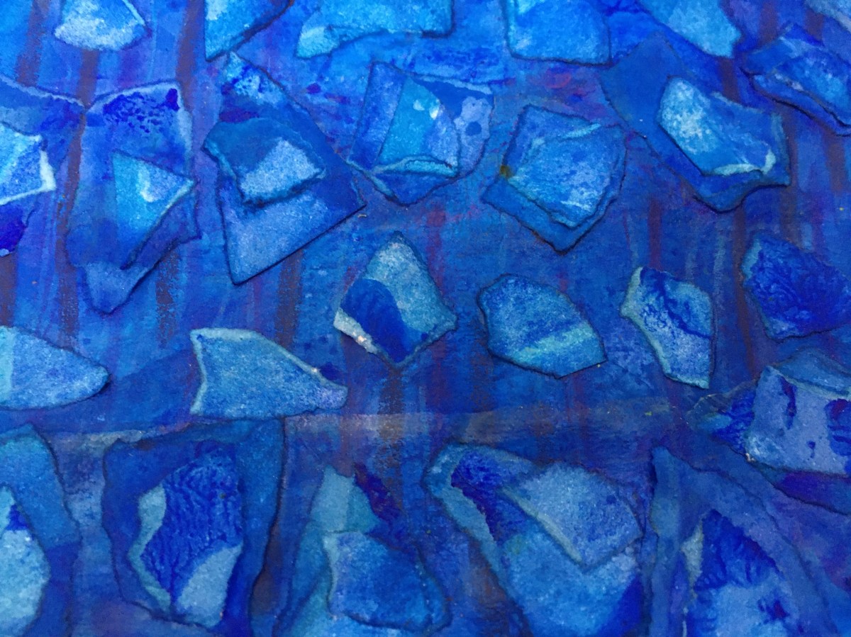
I’ve always got a stack of painted papers under my desk – created from mopping up the last of what’s on my palette before it dries up – and ready for backgrounds and collage bits in my art journals.
That’s what inspired me to play with this idea in monochrome blues.
I began with two postcard sized papers, painted in blue acrylic paint: One for the background and one for some bitty torn up pieces. I do love me some torn edges!
Using diluted PVA glue to attach the bits, in between the collage layers I gave it all a wash with watered down blue ink. The rough torn edges soak in the ink and create lovely outlines to each shape.
Like most of these experiments, there’s no right or wrong way, but if you’re looking to make something bit like this, here’s how I did this.
(excuse my messy desk and inky fingers!)
“Twelvty” 12 Colors in 12 Months
Every month this year I am making a series of pieces in just one color. At the end of the year I’ll combine them into one big multicolored work.
I’m sharing my process throughout this adventure here in this blog. (So far this year I’ve explored Yellow, Yellow-Green, Green & Blue-Green)
I’d love for you to join me. TWELVTY is open to everyone, and better yet, it’s free!
Sign up for my newsletter to find out more and get your free TWELVTY guide ebook.
Processing…
Success! You're on the list.
Whoops! There was an error and we couldn't process your subscription. Please reload the page and try again.
You’ll get an email to confirm you’ve signed up and are human. Sorry, only humans (and their cats) can join. Check your spam folder cos sometimes the good stuff gets swept in there by mistake. Check with your cat too. You know it’s what they expect.
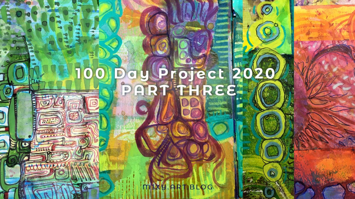
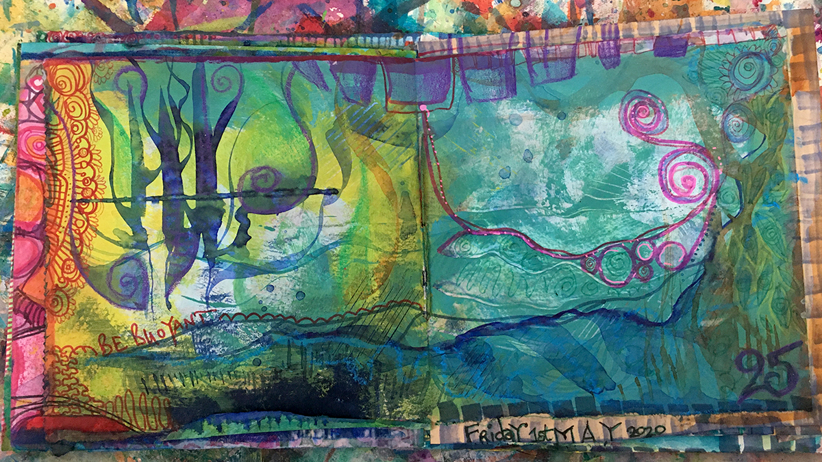
To celebrate the Day 25 milestone in the 2020 #100dayproject, here’s a quick whizz through my first 25 pages in this ever evolving junk journal.
The 2020 #100dayproject is a quarter of the way through!
To celebrate the Day 25 milestone, here’s a quick skip through the first 25 pages in this ever evolving junk journal.
I am having the most fun making this!
I’m finding use for all those bits of collage leftovers, the snippets and scraps, dyed and painted papers. All my odd in between bits of day are spent doodling in corners, outlining edges and shapes, filling spaces with stripes and spots, scribbles and squiggles.
Although I knew I’d made a few extra pages (because just in case) for the book (also because, it turns out they are a lot of fun to make too) …..aaaand I know I get carried away when I get enthralled in the making zone….
….But it turns out I’ve got closer to 200 than 100 pages to fill. Let’s see how it goes, but I might just keep going after the 100 days are up!
So join me, will you?
I’m@mixygregoryover on Instagram, and for the course of these 100 (or so) days I’m posting daily updates with the tags