a day in a page, part 2

With a good thick layer of textures heaped onto the page, we really wanted it to look … well… less of a shambles

and splattering, squirting, dripping and flicking color at it seemed the most fun way to proceed.

Much love for the infinite ways that different materials soak, absorb, repel, or seem indifferent towards the colors thrown at them…

merging and reacting…separating and absorbing.

I can suddenly see a composition of sorts, a way forward, a ‘design’ in mind…
But Inner Kid gets twitchy:
Too much the orangey yellow sameness. I need purple! Purple and scissors and curly edges. And I need them now!

More! More curly edges!
Yuh. So looks like we’re headed in a new direction again…. cool….
Mutant Space Geckos!

……………………..to be continued! …………………….. 😉

papery things

The dyed printer manual has really got me thinking about all the other redundant paper lurking in the house and office – future dying ideas………..

  • All instruction manuals – speshly those ones relating to things long broken, gone or forgotten
  • Phone directories; the Yellow Pages would be a fab base for warm-colored dyings
  • Newspaper, magazines (but not the very glossy type – unless there’s time to give them a very thorough scrumpling to break the surface up)
  • Old bills and receipts, tickets, shopping lists, that kinda stuff
  • Paper bags

Added to previously explored and sucessfully played with……..

  • Old envelopes
  • Out of date manuals/instructions, insurance docs (they send me all this art paper every year!)
  • Diary Pages – the calendar pages, the lists of international holiday dates and all the extra stuff that isn’t actual diary & the unused pages!
  • Maps
  • Sheet Music
  • Misprints from the computer – y’know when it fails to feed the paper and you get the top inch on one page and the rest on another. Both of these!

Any more for the list? Yeh……there must be! All suggestions welcomed 🙂

dripping with extra texture

Another part of the process with the now familiar printer manual: Scrumpling!

Both before and after the inky stage, scrumpling the paper helps it dry unevenly

Uneven drying makes for gorgeous textural effects.

With sharp folds the fibres of the paper is damaged just enough to make it super absorbant, and make for darker lines and patterns.

The inks run to and through the chanels formed by the creases

12 in 12 to the end of April

Half way through another month seems a fitting time to update you on the 12 in 12 project.

In a book dedicated to the project, every month focuses on just one color in the color-wheel. April was the month for blue, and these are the previously unposted April pages…

detail here….

This brings us to May, and shades of blue/green colors I’m naturally drawn to!
I shall post these pages so far in a bit!

serendipity

Serendipity [noun] “an aptitude for making desirable discoveries by accident.”

I think this sums up so much of what I do. Yesterday’s post about recycling was a tangent I wandered down when thinking about how the collage pieces I make come into being.

Paper is readily recyclable these days (indeed it’s often recycled when it’s ‘new’) but I like to get every last ounce of use out of it. Once it’s been printed on (both sides) with info that’s no longer needed, it retires to a life in art.

Images and pictures, blocks of color or gradients, maps, poetry, lyrics, photos, scanned doodles and sketchbook pages, mish-mashed up in photoshop, I let fate take over and set the printer running. And if there are gaping spaces left, the page gets turned around and over-printed again. Serendipity occurs!

The ones that don’t happen into something immediately usable cover my work table to take on new nuances with splashed color, and as testing grounds for paints and inks and stampings. Or used to soak up excess color from dying fabrics and threads (I think this must be where the great paper-dying project originated… one idea bears fruit and blossoms into new ideas and schemes and badly mixed metaphors!)

adventures in color: ingredients

In response to the feed back on my paper dying project, thought I’d share some inspiration and some of my fave ingredients if you’re interested in doing something similar.

Firstly I must introduce you to an artist I find enormously inspirational, Ruth Issett.

Ruth has authored several books of mouth-wateringly delicious adventure in color and frequently runs courses and workshops.

Take a peak at her Glorious Papers: Techniques for Applying Colour to Paper – this is one of my fave books to set ideas flowing.

Dyes

For real vibrant colors, both for fabric and paper, I use Procion dyes. These are available at some art/craft stores, or the trusty shop that sells most everything.
The dye powder needs to mixed with water, and the colors blend beautifully. If you’re using them for paper there’s no need to use any fixative, just treat them like an ink.

Inks

I also love to use Brusho inks. Again these come in powder form to be mixed with water.
If you sprinkle the dry powder (a little goes a long way) on damp paper you can get some fabulous starburst effects and color separation from the individual hues of pigments . Try it and find out!


Then there’s the Ranger Adirondack Color Wash sprays.
These can be used on fabrics too if heat set with an iron.
Ready mixed, these come in spray bottles.


Dr P H Martin’s Bombay ink.

Having picked up a bottle of this at my local art shop, in a fit of extravagance I got myself both full sets of 12 colors and have to say it was a great investment.

They come in dropper bottles, perfect for dripping onto paper!

The colors are vibrant and strong, so again you don’t need to use loads, and a bottle lasts a long time.

Paints

Koh-I-Noor paints are fab for several reasons.

The colors are rich and intense dye-based paints which come as 4 stackable palettes. The middle bit of each palette, along with the lid, can be used for water or mixing shades, and they are perfect if you want to take your colors out and about with you.

NB Koh-I-Noor also make stackable palette sets like this with regular watercolor – this is the one in the illustration. The ones I use are the intense dark dye based ones. Check out the comparison of colors here. Read more about playing with these here


I hope you’ve found this interesting/useful and it may have sparked some ideas for you. Til next time, happy creating, folks! 😀

paper dying, part one.

With fabric and textiles, I’m rarely put off by material being the ‘wrong’ color, provided I can dye it. Lately I’ve expanded this reasoning to include paper too. Fortunately for the sake of this project I’d already squirreled away a stock of paper, and the only preparation to be done was some therapeutic tearing  and scrumpling.

Image

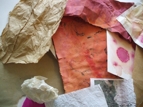
Some paper (tough brown envelopes, cartridge, wallpaper lining, and watercolor) will tolerate heavy handed roughing up. Tissue, copier, newsprint and (my least fave) sugar paper just don’t have the same endurance, but will survive a lower level of scrunch.

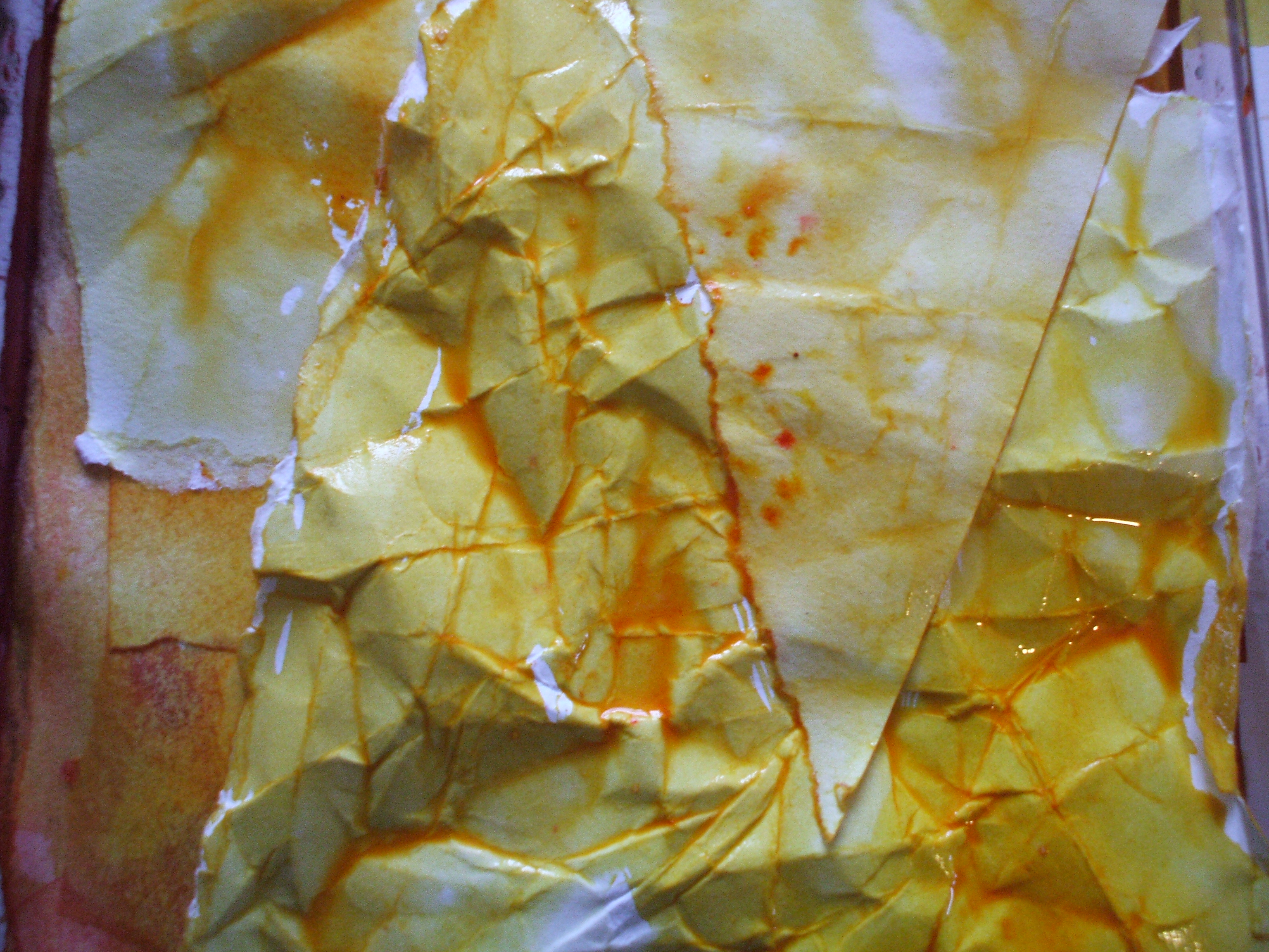
The purpose of this is break up the surface, the scar lines offer a more porous surface for the dye to bleed through, and sometimes give a nice batik-y result.And sometimes they don’t. But we don’t care, we’re just here for shits and giggles.

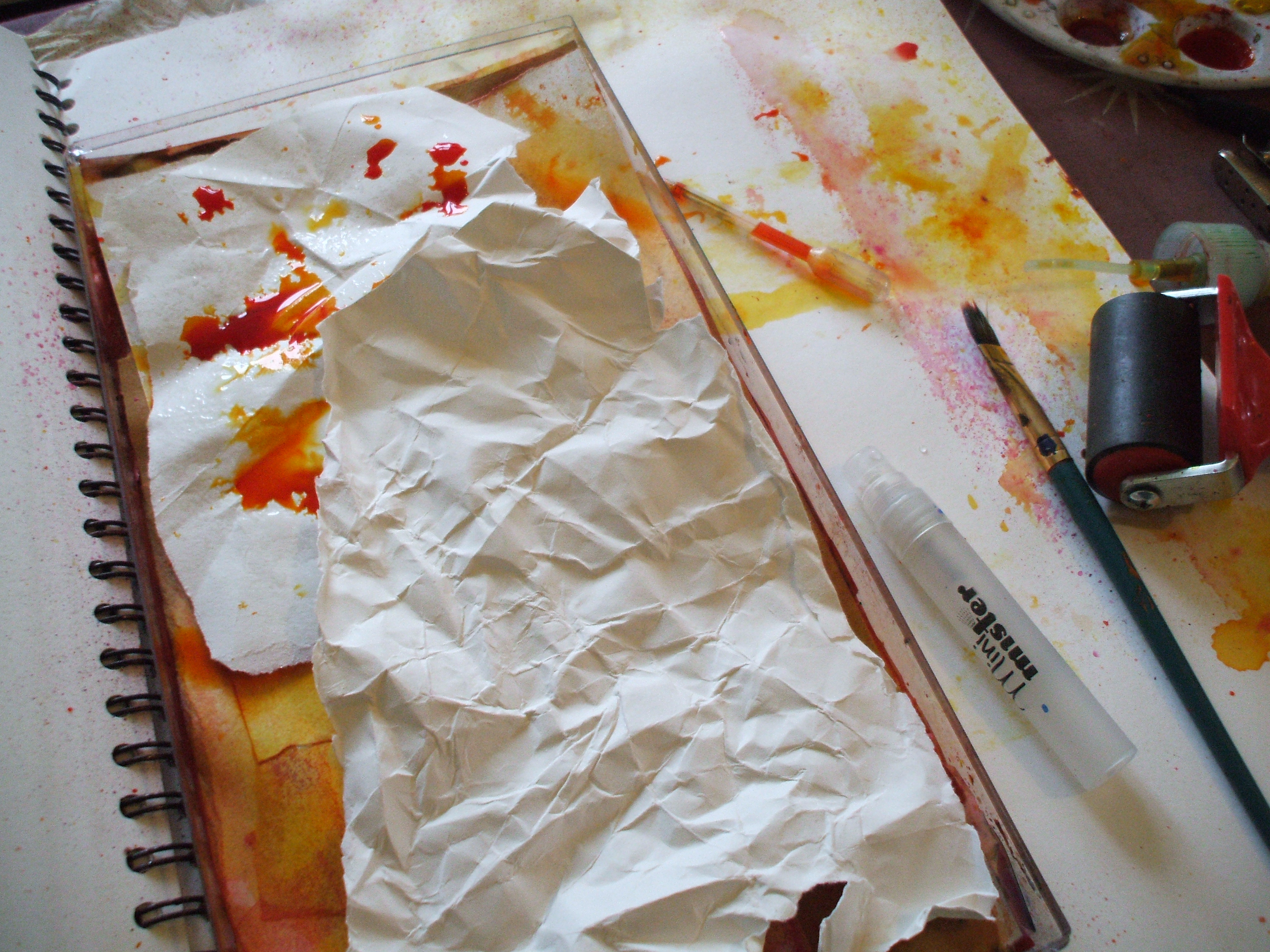
Let the messy stage commence!

Image

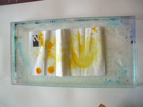
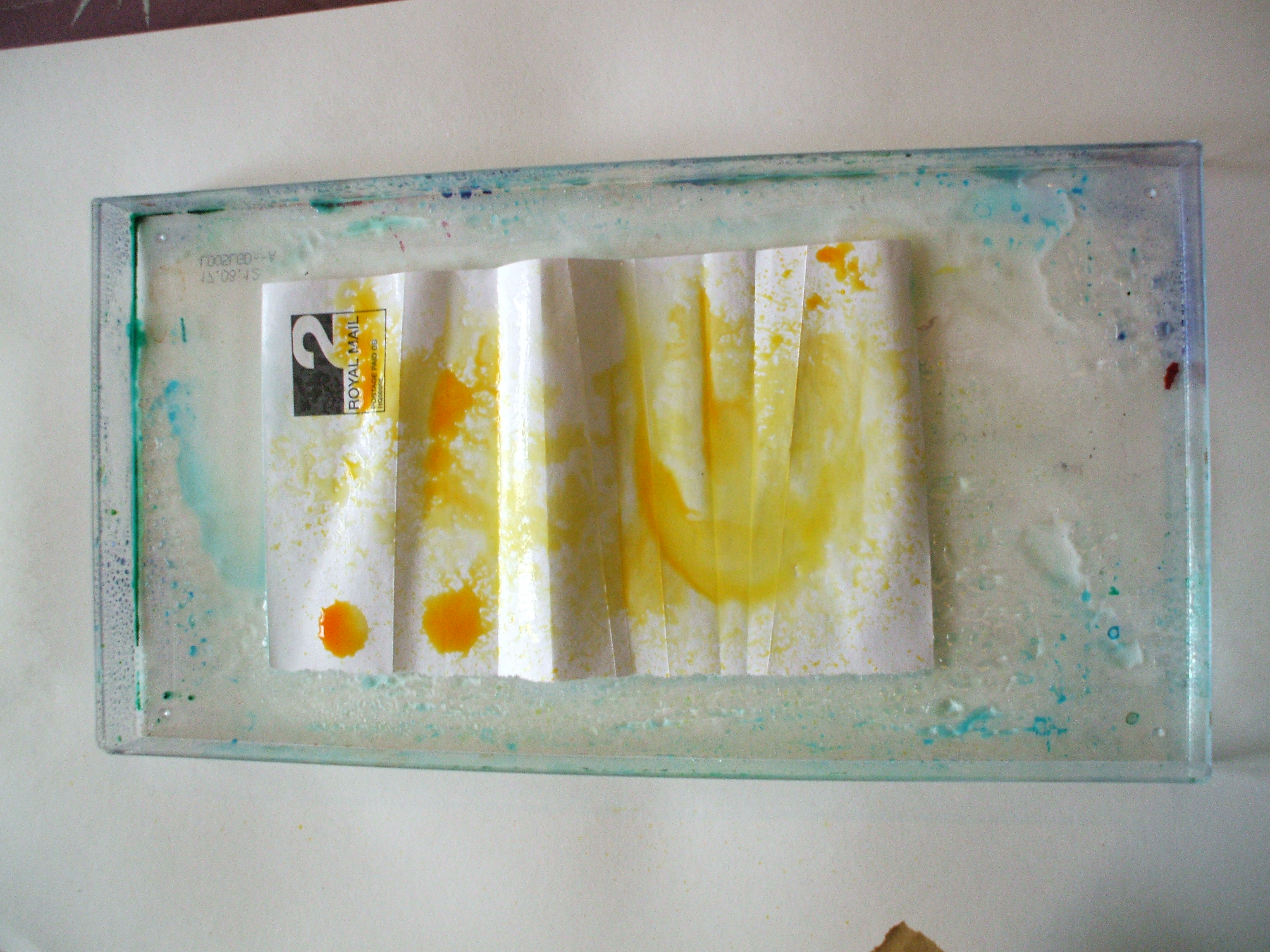
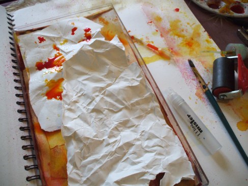
Plastic tray, bit of paper, swish with water, drips of dye & ink.

Image

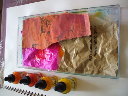
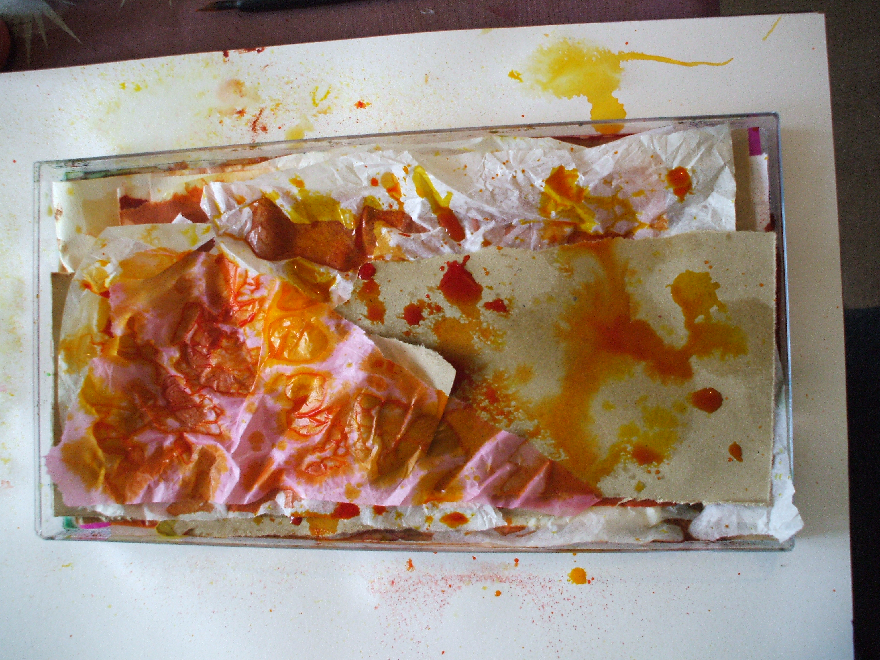
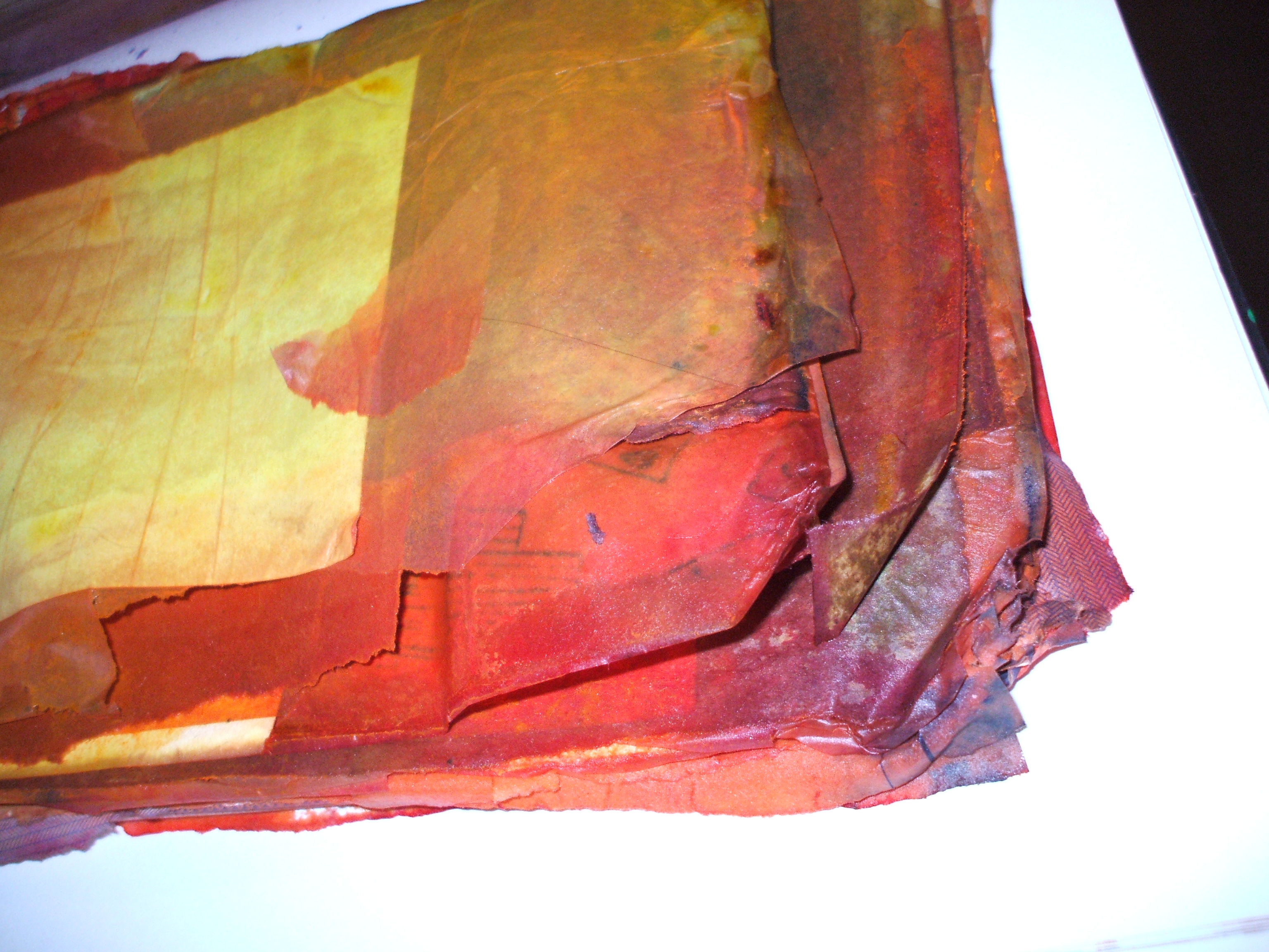
From here it’s a matter of layering (thinking ‘lasagna’, but without the food elements. Srsly, that would be a whole different result, and not what I’m after here at all)

Thicker acrylic based inks work best thinned right down with water,acrylic acts as an adhesive and if/when used thickly will gum the papers together into an unpickapartable cludge.

Image

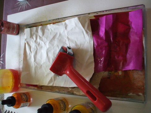
Some layers through I like to give the soaking papers a bitova squish with a roller (brayer). The dye will penetrate the paper fibres better, and slop out of the edges of the tray if you’re not careful.

Image

Sometimes I pour off a bit of excess wet into a jar and reuse it further up the ‘lasagna’.

Image

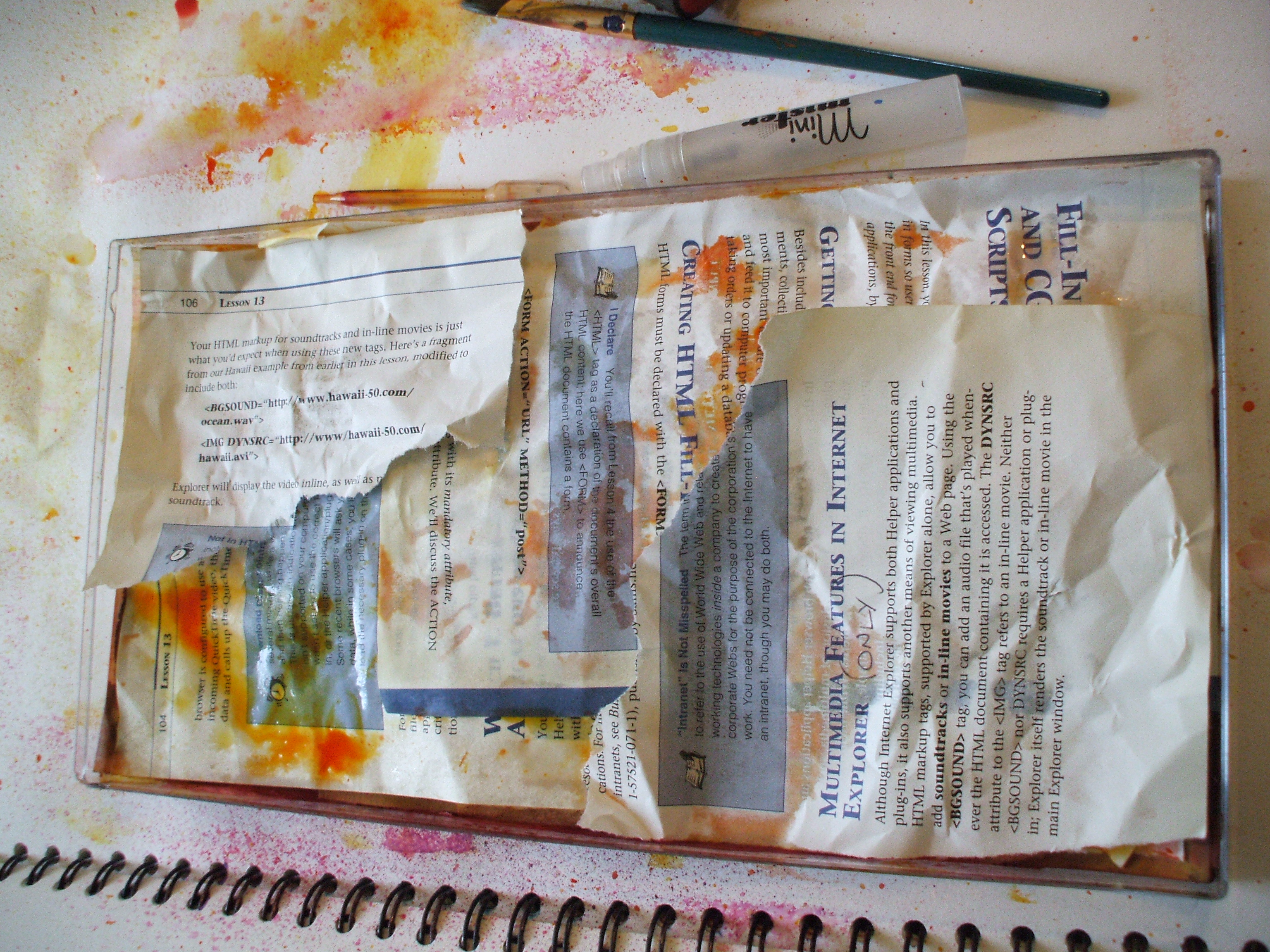
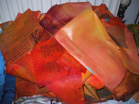
See the batik-y thing going on? Yay!

Image

Onward n upward, paper, water, dye, swish, squish, paper, color, swish, etc

Image

Disclaimer: no books were harmed in this production. Apart from this one. (Second hand and out of date when I got it, 15 year old book on web site building. ) Just saying. Books are my friends, and I never deliberately dismember friends, even in the name of art. Except for the very dead ones.

Image

Some hours later, tray filled, excess juice drained, the soggy lump of color gets tipped out onto something porous (I used a selection of my finest knackered tea towels) and left to dry by the radiator. (If time and climate allow, sunshine will do the trick too)

Image

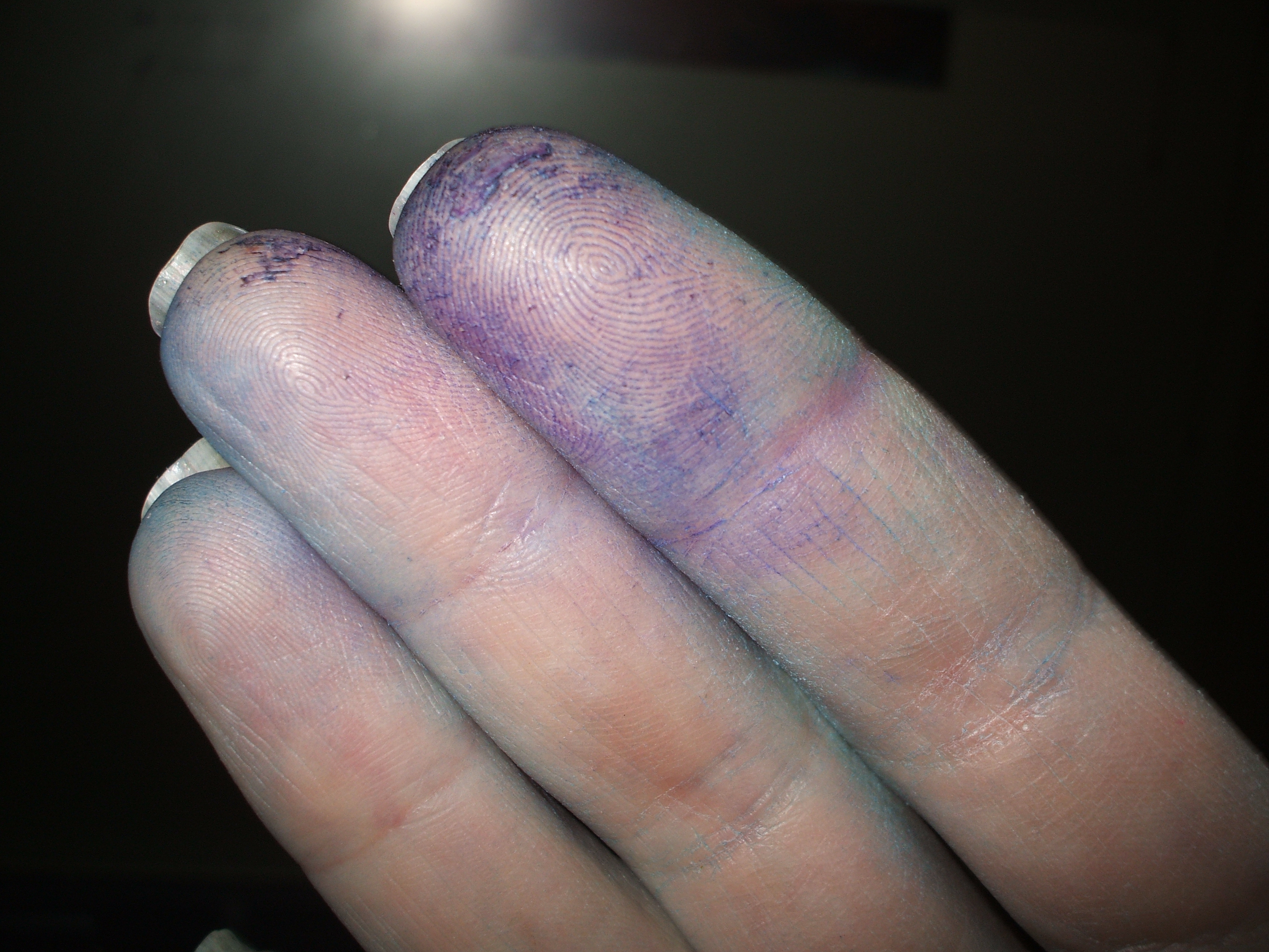
Oh, n you might wanna be wearing gloves for this. Or, like me, you might only remember this once you have dyed fingers…

Image


Ingredients

Where some people see scrap, I often see ingredients.

Only when it really doesn’t fit with social expectations can I curb my collecting, but I will usually come home with something I didn’t leave the house with earlier in the day.

Leaves, paper scraps, foil and cellophane from sweets, sketches and photos of interesting shapes, patterns and textures; jotted words and phrases from the radio, books, internet or my own head. Findings!

Today I resisted the feathers I saw scattered on the verge as I walked to work. Thinking roadkill, bird-flu, infection, dirt. I saw more feathers, one was 7-8 inches long with a fluffy plumed edge and speckly pattern. Conscious of passing driver’s impression of a grown adult picking up and stashing litter from the roadside. More feathers, smaller but irresistibly velvety. Their owner must have come to an unfortunate end to lose so many clothes. Pheasant? (no corpse), idk.

Thinking aside, when I got to work there was, in my bag, a perfect, elegant, inspirational, new-to-me ingredient.

It wasn’t until I photographed it I discovered it’s a feather and a half!

It might be a subject to draw, a shape to photograph, to inspire. It might act as a brush, then retire to join one of many collages. When the time comes, it will be an ingredient in at least one something I make.

It also looks (to me) like a tiny porcupine with no face.

%d bloggers like this: