I want to draw together some of leftovers and dangling ends from recent posts. The person who will enable this is Franz Ackermann. Faceland/White Crossing I – Ackermann
There’s a charm to this portrait that hooked up in my head with the (so far very much) unconnected themes I was juggling. It was my missing link. Ackerman’s brought the map like quality in, and that high contrast, vector style I love as well.
So, am I going to show you the portraits now… or am I going to keep you hanging on?
Well, kinda neither…
The screen print portraits are still a work in progress as other priorities have leapt the queue in my sphere of makings.
But I’ve been dabbling with other prints and watercolor doodles. The first of which is………
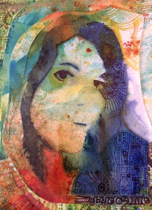
There’s a project I’m working on, a commission that’s a continuation from a college brief last year (I’ll share that with you in a future post), which has led me on to begin a series of self portraits.
Pre- art school days I would have seen this as a self-indulgent vanity, but, (of course) the art school years have shifted my perspective. My subject is simply the face I’ve seen the most often. (Although I’m mainly on the inside looking out, but that’s another discussion for another time.)
Inspirations that bobbed up my horizon and found their way to develop the style for this came from a London gallery trip a little over a year ago. Firstly, Zak Smith at the Saatchi gallery. I was quite entranced.
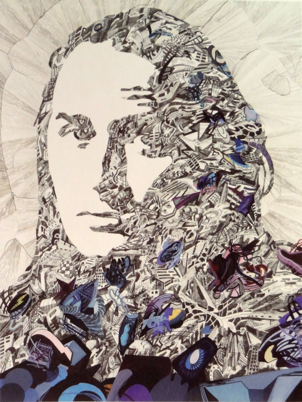
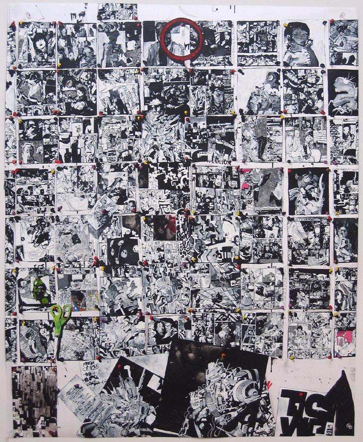
Things I Drew and Pinned to the Wall – Zak Smith
Do love me a bit of monochrome! And the boxy, graphic-novel-layout going on here. This picture tells a story, and it looks like a story.
Girls in the Naked Girl Business: Mandy Morbid (II)
Girls in the naked girls business is a series that speaks to Smith’s parallel career in adult movies. Splashes of vivid brightness in the field of mono. More metaphors.
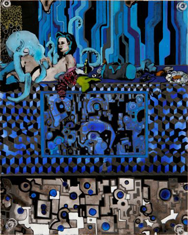
100 Girls and 100 Octopuses (detail)
100 Girls and 100 Octopuses is just that, and visually combines the storyboard layout with the chunky blocks of color. Largely blue.
One of the reasons I was so enraptured was the instant association with an artist I’ve adored for such a long time. You’ll know this image, even if art isn’t your thing
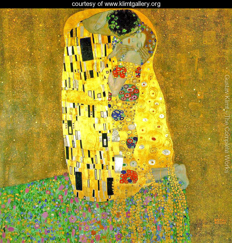
The Kiss – Gustav Klimt (1908)
A century on, Smith’s images resonate the essence of Klimt‘s in visual language and sexuality. Completing a circle perhaps.
Yesterday I showed you the first page of my latest project – the first one I could call finished (ish).
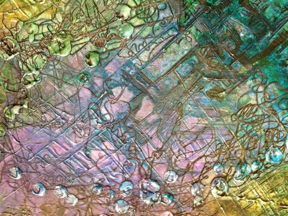
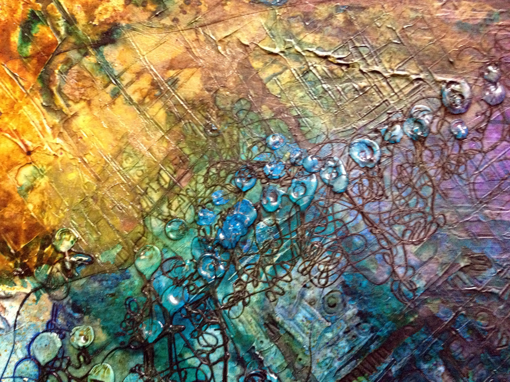
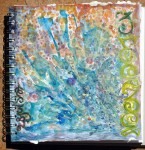
This is the latest page, I began playing with over the weekend.
Starting out with gesso and inks, layered up and finished with hot glue blobs
Inspired by the very lovely and talented Contadina K
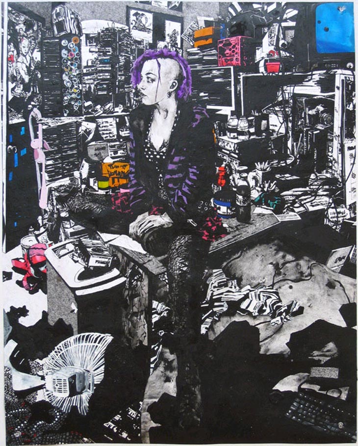
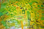
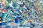
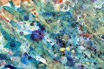
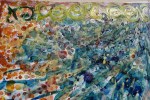
One of our major projects for this term is beginning to take shape. I’m expecting it to be a series of images (or ‘outcomes’) with a connecting theme – someone very special to me – as a form of memorial. Incorporating digital photo editing, screenprinting, and some painting. So here’s a little bit of where I’m at just now
It’s looking a bit murky, I’m venturing into muted tones… (it’s weird out there!)
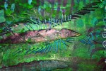
This is a series of experimental backgrounds.
I’d forgotton the salt on watercolor trick. It is actual magic!
Restricting colors to focus on form and layers.
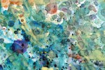
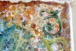
White ink, then dilute black procion dye, then collaged.
I’m looking to get a slightly dream-like, ethereal quality…
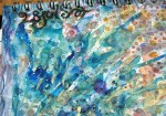
This one doesn’t fit with the theme, so will wind up in a future project some day…
Dabbling in doodling. I want a taste of the post WW2 era print designs.
Playing with ink… bound to get a bit spattery 😉
Too dark, but I can see it meeting up with that other one from earlier.
I’ve got some part-written posts on other comings and goings which I must get round to finishing! Feet not touching the floor much these days – but I’ll be back again soon! 😀
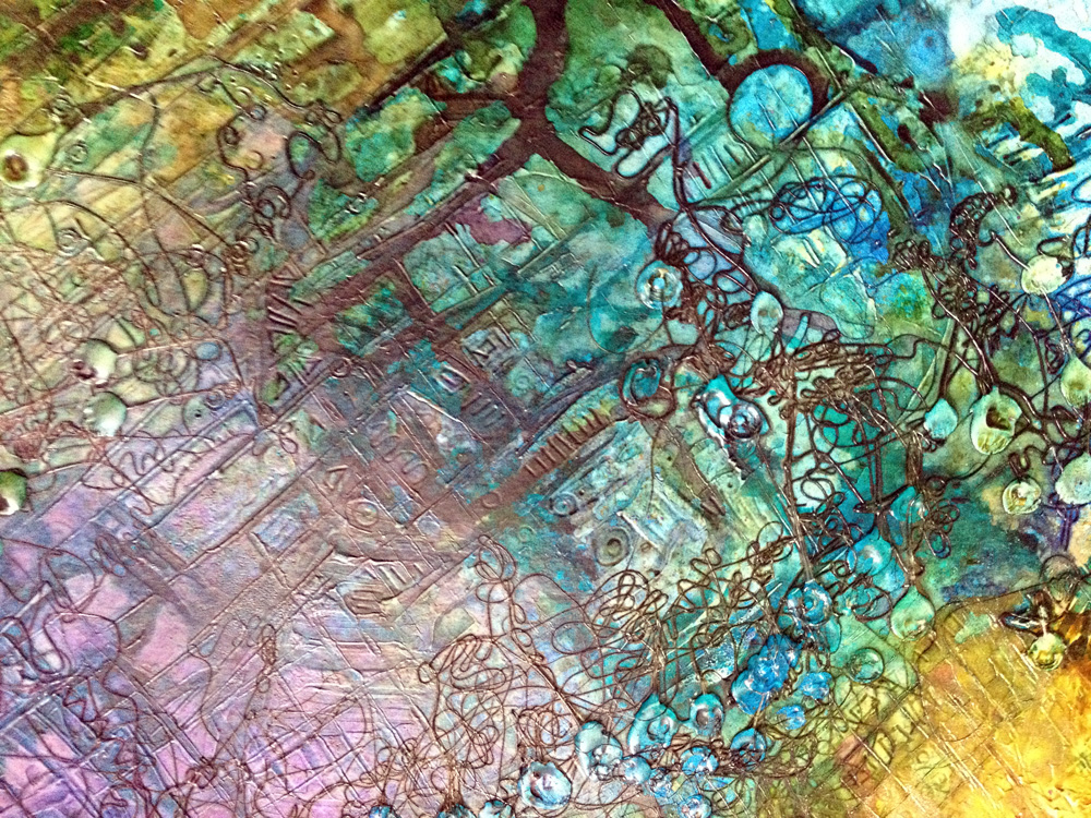
Have you ever noticed the underside of a *jam jar?
Me neither… until by happy accident. I checked all the old jars I have collected up, and they all seem to be the same. (I’ll wait here, you go off to the kitchen if you need to check yours now)
They all have a ring of raised dots – like glass Braille – I guess an anti-slipping thing.
Turns out if you wash out a jar and instead of drying it, leave it to dry naturally on the nearest flat surface, like maybe an inky page of an open sketchbook, a beautiful ring of dots appear where the water has run down the sides and puddled round these dots!
Oh yeh – and if you get carried away trying to recreate the effect you can obliterate the dot circles just as easily with too much water!
The patterning reminded me of sewing machined lines (unthreaded needle, just perforating the paper) …that seemed like the best thing to go with the page in progress
So that’s what became of page 36!
* strictly speaking mine are all coffee, mayo & pasta sauce jars. I don’t like jam. Funny how they’re always called jam jars…