Do you know Jason Silva? He’s media artist, futurist, philosopher,
he’s a ball of frenetic energy and enthusiasm and with a magnificent mastery of descriptive language he spills this energy out into the internet in Shots of Awe.
I like Jason Silva a LOT.
I was listening to him talking with Tim Ferris while I made the most part of this page.
For every action, so they say, there is an equal and opposite reaction.
In balancing the outward reach, a degree of reaching inwards naturally follows
As Im exploring my journey of imagination and making, I’m looking through inner worlds as places of thought and reflection, and I’m acknowledging the past to step into the future.
Who is this reaching out? Looking In?
Looking every which way …..
… re-drawn digitally …
….. morphs in and out of a multi-faced abstract
I’m learning to move out of my shadows, into the light.
I’m learning to nourish and nurture my own light.
I want to draw together some of leftovers and dangling ends from recent posts. The person who will enable this is Franz Ackermann. Faceland/White Crossing I – Ackermann
There’s a charm to this portrait that hooked up in my head with the (so far very much) unconnected themes I was juggling. It was my missing link. Ackerman’s brought the map like quality in, and that high contrast, vector style I love as well.
So, am I going to show you the portraits now… or am I going to keep you hanging on?
Well, kinda neither…
The screen print portraits are still a work in progress as other priorities have leapt the queue in my sphere of makings.
But I’ve been dabbling with other prints and watercolor doodles. The first of which is………
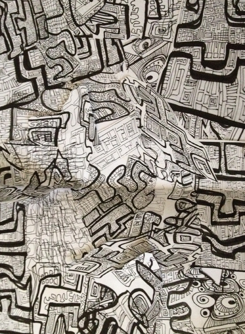
Did I tell you how much I love to screen print? There’s something of an alchemy in screen printing I never knew til I began to experiment. If you enjoy an unpredictable path to imagery I urge you to give this a try if the opportunity comes your way. It’s the most magical thing!
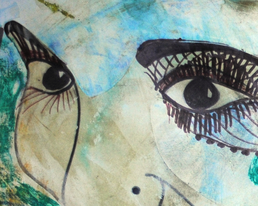
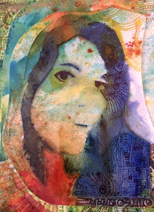
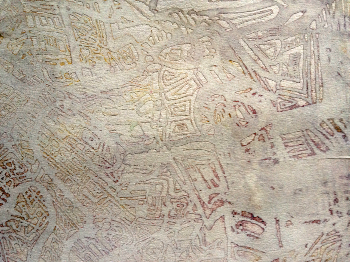
For instance: painting the screen with Procion (fabric) dye at letting it dry, then printing with white ink on white paper, you get this kinda effect of a shadow, dimensional kinda thing.
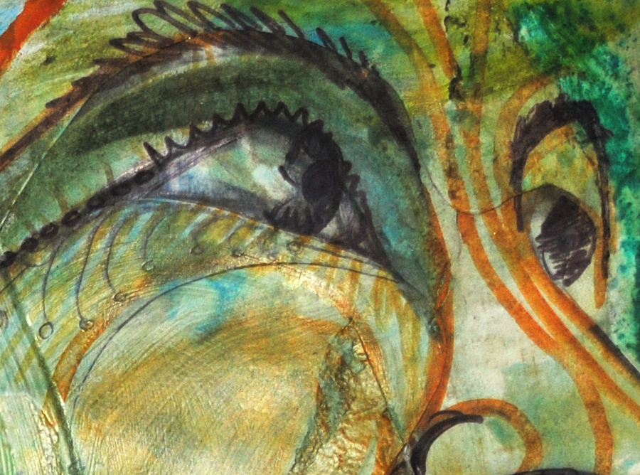
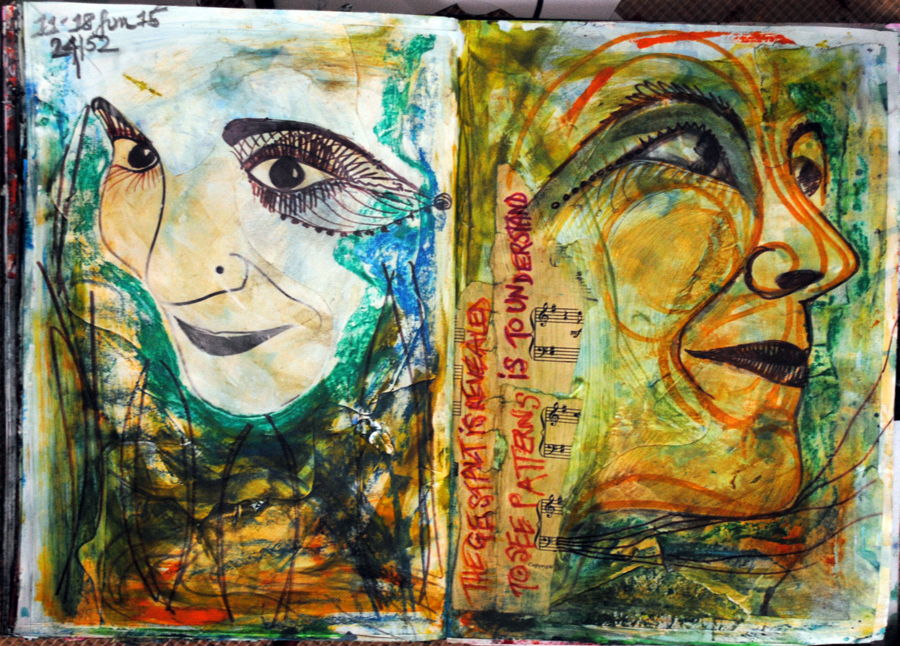
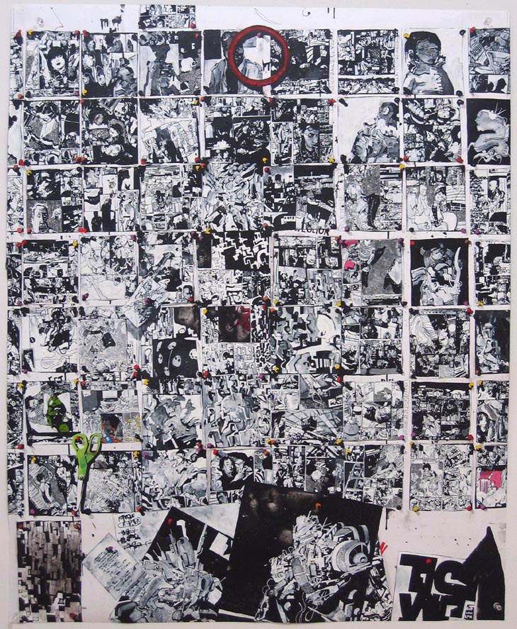
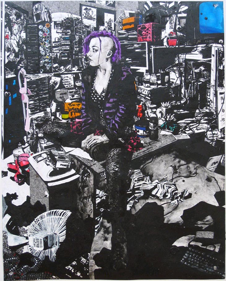
The photos are poor quality (from phone, wobbling with giddy excitement at the print!) but you get the idea.
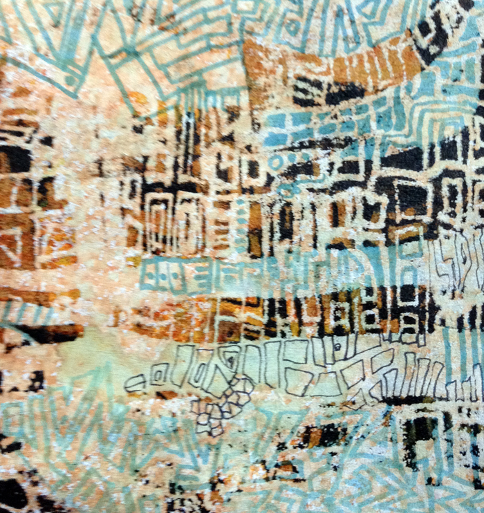
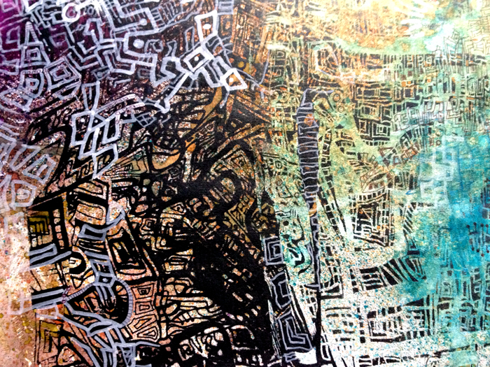
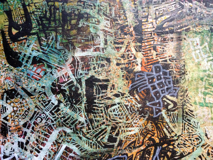
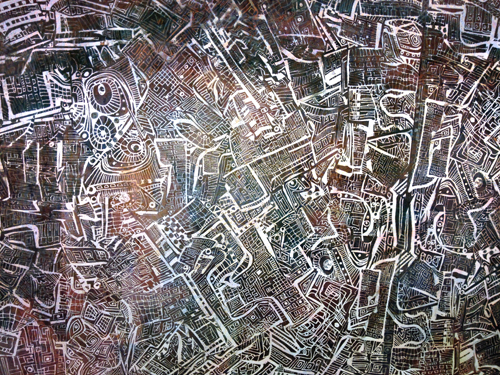
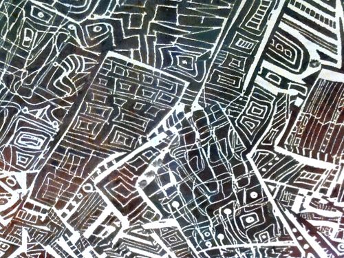
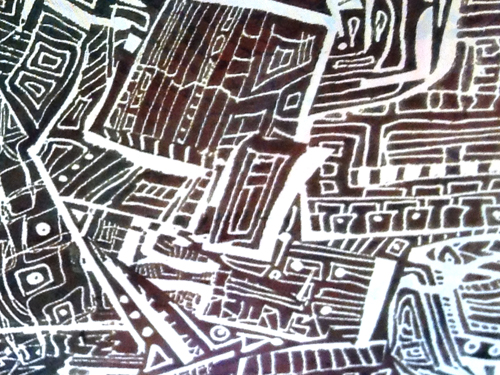
Then there’s the masking off areas with torn paper, and going back to doodle in the gaps. Some overprinting and joining the overprints in the same way
.
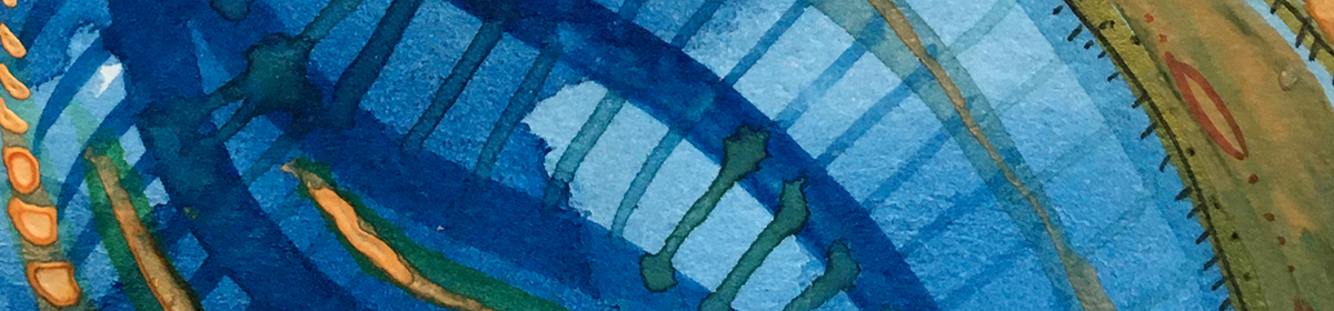
White on black on white; orange and blue on monochrome, semi-opaque, translucent and solid intense blockiness. Go on, let the imagination do the running! Let the ideas fly.
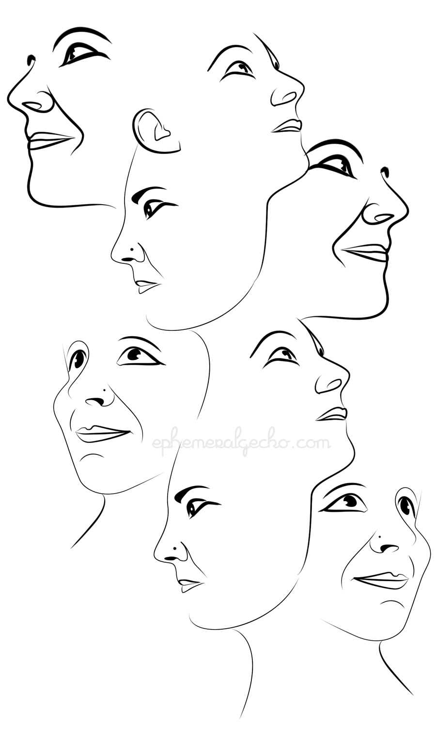
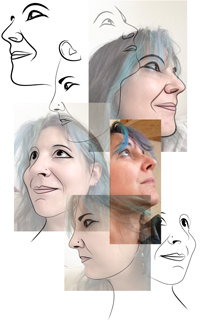
Oh, but wait a mo, didn’t this have something to do with self portraits? isn’t that where we began?
Did the gecko run off with the wrong end of the conversation and get lost down another rabbit hole?
Maybe, maybe not.
Check back again and we’ll see if these loose ends can be knitted back up into something resembling a thing again. (A real thing? well, maybe, yes)
If it’s all looking a bit disparate with uncongealed ideas; If you’re still following, I commend you! And I forewarn you – it’s maybe gonna seem more scattered before it starts coming together – but bear with me…
Yester-post I was explaining how the combined doodles that emerged from the Zak Smith – Dominic McGill ideas were the raw ingredients for my silk screen design.
Next step was to dismember and re-member them into new shapes and surprises. Photographed and scanned, reduced to monochrome, printed, chopped, rearranged, photocopied, resized, rechopped, glued back together. Began to look like this:
a collage of a collage of a collage
It’s taking on mappy qualities, and I like the metaphor of this too. It’s a journey of loops within loops. Mapping the ineffable unmappable.
There’s a project I’m working on, a commission that’s a continuation from a college brief last year (I’ll share that with you in a future post), which has led me on to begin a series of self portraits.
Pre- art school days I would have seen this as a self-indulgent vanity, but, (of course) the art school years have shifted my perspective. My subject is simply the face I’ve seen the most often. (Although I’m mainly on the inside looking out, but that’s another discussion for another time.)
Inspirations that bobbed up my horizon and found their way to develop the style for this came from a London gallery trip a little over a year ago. Firstly, Zak Smith at the Saatchi gallery. I was quite entranced.
Things I Drew and Pinned to the Wall – Zak Smith
Do love me a bit of monochrome! And the boxy, graphic-novel-layout going on here. This picture tells a story, and it looks like a story.
Girls in the Naked Girl Business: Mandy Morbid (II)
Girls in the naked girls business is a series that speaks to Smith’s parallel career in adult movies. Splashes of vivid brightness in the field of mono. More metaphors.
100 Girls and 100 Octopuses (detail)
100 Girls and 100 Octopuses is just that, and visually combines the storyboard layout with the chunky blocks of color. Largely blue.
One of the reasons I was so enraptured was the instant association with an artist I’ve adored for such a long time. You’ll know this image, even if art isn’t your thing
The Kiss – Gustav Klimt (1908)
A century on, Smith’s images resonate the essence of Klimt‘s in visual language and sexuality. Completing a circle perhaps.