


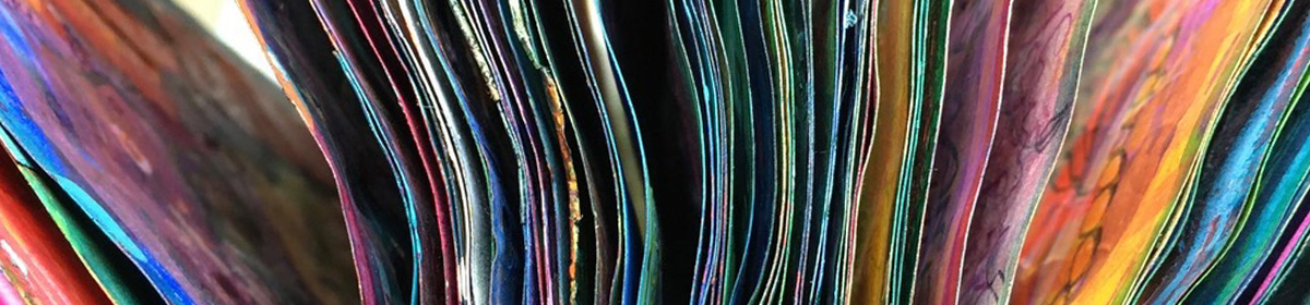
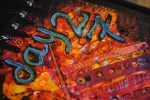
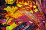
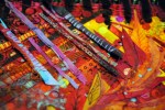
Todays snippings are from the spring to early summer and range from the violet edge of blue through to sunny yellows 😀


Some little while ago I got all buzzed up about an idea to do some batik. A trawl through the web came up with Dylon Easy Batik and as I couldn’t resist (HA! geddit!!) giving it a go.
I have to say firstly, it is a lot of fun.

With the consistency of cream (shake well – I forgot one time and it does separate unshaken), it paints on nicely. I was using cotton sheeting, and found it absorbed and spread, so even the finest lines came out a bit chunky. In that sense it’s limited in comparison to real batik, but something to build into the design I guess. The other main difference is that unlike batik wax it is flexible when it’s dry, so none of that lovely crackle effect. But other fabrics need testing on!

First easy batik doodles!

This is the underside of a freshly dye-painted sample. The eagle eyed amongst you might notice the batik-stuff appears speckled. It isn’t. This only happens if you use a fluffy-with-velvet-trimming-fuzz-covered surface to paint on. Oops. No matter, it all comes out in the wash.

Now that leads me on to another thing. If one were to follow the instructions one would paint on the stuff and allow to dry, pref overnight, then iron to fix (did all that), then to place the fabric flat in the dye for 30 mins (longer and the resist loses resistance), not aggitating it for fear of loosening the stuff from the fibres.

If, on the other hand, one is me, one might choose to go off recipe at the point after the ironing…

I had planned to paint and drip procion dyes, swish with water, get a nice watercolory-effect then fix with soda ash per dying instructions on the bottle. Building up by layers, some more batik-stuff, more drying-ironing-inking cycle, etc…

But, surrounded as I was by so many delicious colored inks (not fixable), I ended up using a mix of procion dye (unfixed, didn’t bother since all the other ingredients became involved), ink, dylusions spray, coffee, tea…
It was a giddy whirl of color, it was really out of my control altogether. i just decided these samples would be ingredients for non-washable creations. Simple as!

But sometimes, just knowing something won’t work is not reason enough not to give it a try. After all that ironing a certain amount of fixing must have happened. Plus I knew full well if I’d been wearing white when I did this, no amount of laundering would have got the splashes out! So I *washed some edge snippings to see what happened… just how much color loss and more importantly, washability of the stuff
Surprised by the results – less color loss than I expected, and total stuff removal (speckles n all!)
*washing: hand washed in cool water, no detergent, just til the water ran clear.
One of our major projects for this term is beginning to take shape. I’m expecting it to be a series of images (or ‘outcomes’) with a connecting theme – someone very special to me – as a form of memorial. Incorporating digital photo editing, screenprinting, and some painting. So here’s a little bit of where I’m at just now
It’s looking a bit murky, I’m venturing into muted tones… (it’s weird out there!)

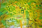
This is a series of experimental backgrounds.

I’d forgotton the salt on watercolor trick. It is actual magic!

Restricting colors to focus on form and layers.

White ink, then dilute black procion dye, then collaged.

I’m looking to get a slightly dream-like, ethereal quality…

This one doesn’t fit with the theme, so will wind up in a future project some day…

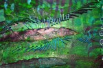
Dabbling in doodling. I want a taste of the post WW2 era print designs.

Playing with ink… bound to get a bit spattery 😉

Too dark, but I can see it meeting up with that other one from earlier.

I’ve got some part-written posts on other comings and goings which I must get round to finishing! Feet not touching the floor much these days – but I’ll be back again soon! 😀

I love the way ideas and moods will just flip upside down sometimes.

From a sure and steady point, no warning, suddenly everything is reversed, inside-outed. Its own antithesis.

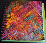
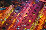
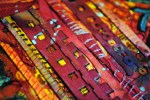
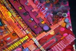
Yesterday was strong and richly toned, uncoordinated, bloated with opulence and excess.

Today has a muted, balmy calm behind knotty labyrinthine lines.

Tomorrow? we’ll have to wait and see! 😉
Remember the fantastic ink squirting device from earlier today? Well here it returns but with even more ridiculous proportions. We needed red instead of yellow, which meant draining the yellow out of the squirty-bit. Never wanting to waste color, we released the residue onto tomorrow’s page.

Tomorrow’s page was temporary resting place for the palette we had lined up for later – (clear plastic box lid). No other space for it, so plonked back down on the puddle of ink.And wow! Happyaccidental art!

Look! It just happened!!

These pages are now both very soggy.

So it kinda didn’t matter to get a bit more soggier still… cue: coffee dregs. (Such a shame to waste)

Proper drying time now needed. I have to say, at this stage all I know is this is way off finished. It could absolutely go in ANY direction and I wouldn’t be surprised. Check back soon-ish, I’ll show you what comes next 😉
With a good thick layer of textures heaped onto the page, we really wanted it to look … well… less of a shambles

and splattering, squirting, dripping and flicking color at it seemed the most fun way to proceed.

Much love for the infinite ways that different materials soak, absorb, repel, or seem indifferent towards the colors thrown at them…

merging and reacting…separating and absorbing.

I can suddenly see a composition of sorts, a way forward, a ‘design’ in mind…
But Inner Kid gets twitchy:
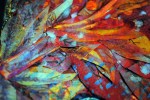
Too much the orangey yellow sameness. I need purple! Purple and scissors and curly edges. And I need them now!

More! More curly edges!
Yuh. So looks like we’re headed in a new direction again…. cool….
Mutant Space Geckos!

……………………..to be continued! …………………….. 😉
I was away for a couple of days, but the page a day project ticks along!
Friday’s page is here….

Being fascinated by mechanics, numbers and time, clocks are a constant source of interest to me.

Over the years I’ve often incorporated clock faces in art, and I thought it was about time I had one in this series 😉

I like the regularly spaced hour long segments, contrasting the unequally balanced chunks of time into which we split our days

An hour spent waiting in traffic is so much longer than an hour spent in the company of ppl we love. An hour of sleep is not the same size of time as an hour at work…

……………I’ll catch you up with the others in a bit 🙂


