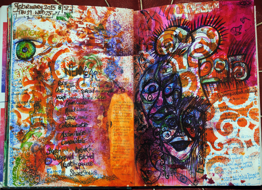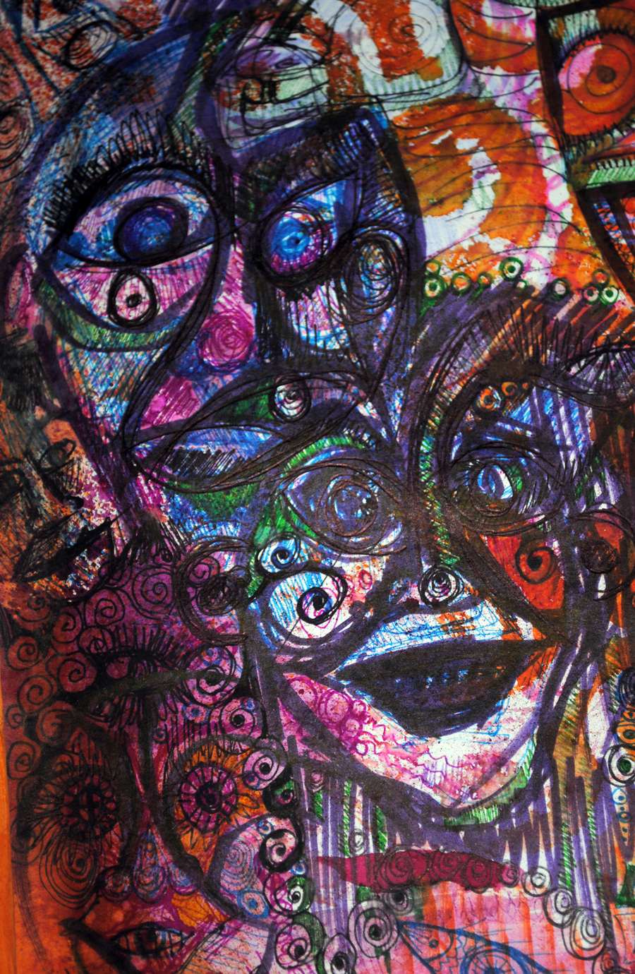
This morning I launched my newest project – a year full of color – “TWELVTY” All as scheduled, 9am my time, so the early wee hours for the cross-pond recipients.
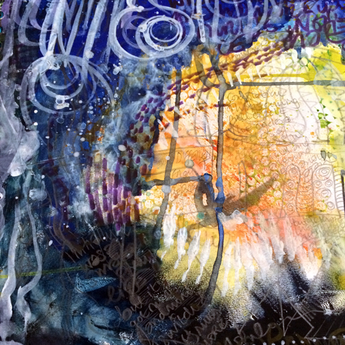
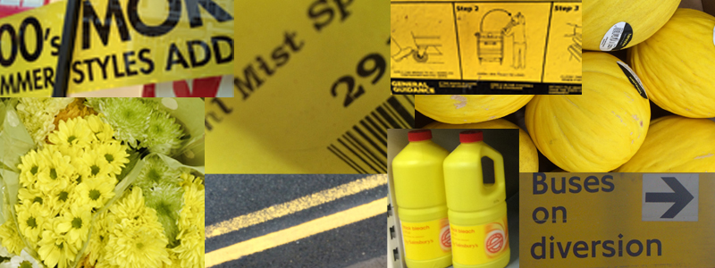
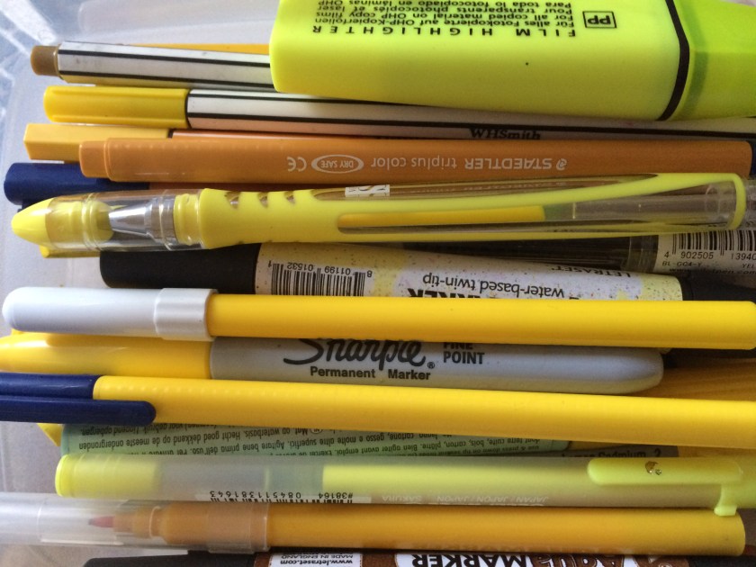
Each month this year has it’s own color: January is yellow, and it’s flooding my thoughts.
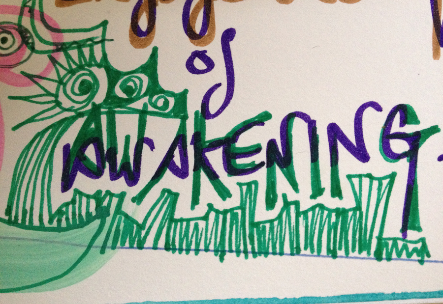
It’s the sunrise of a new project.
The idea came to me just a couple of months ago when I was on holiday. Bumbling about taking photos… as one does.
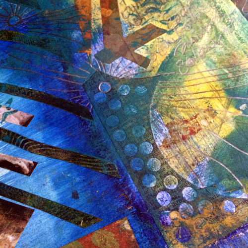
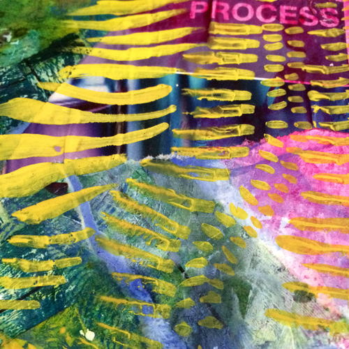
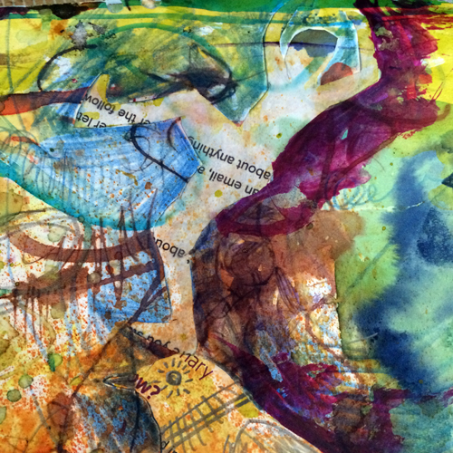
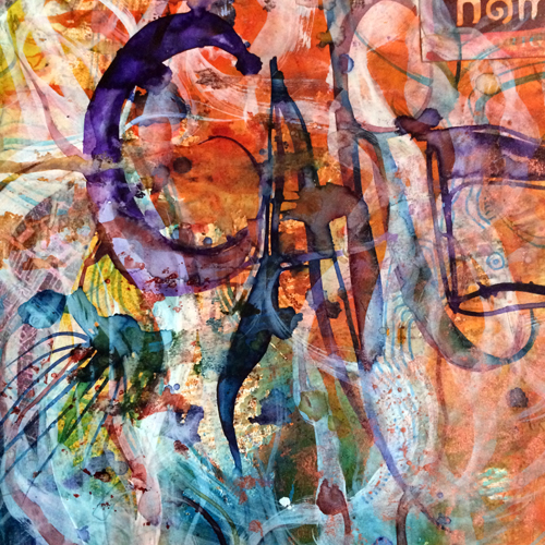
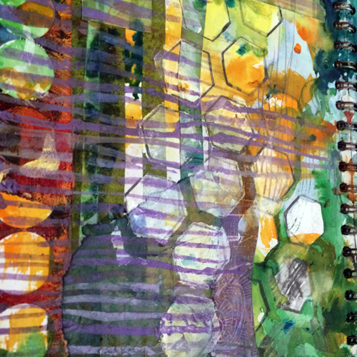
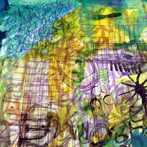
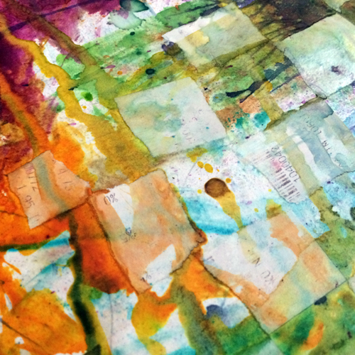
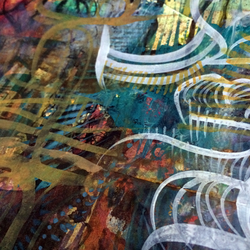
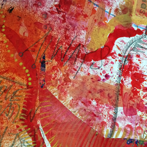
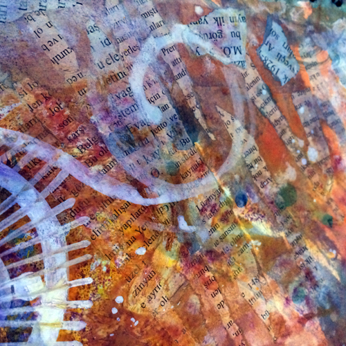
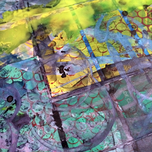
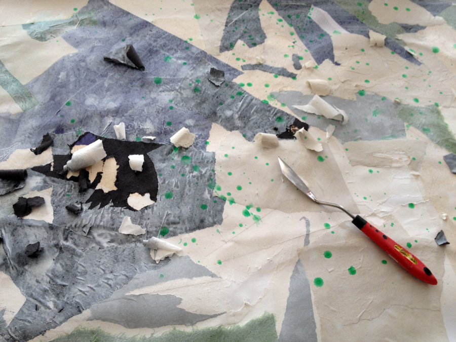
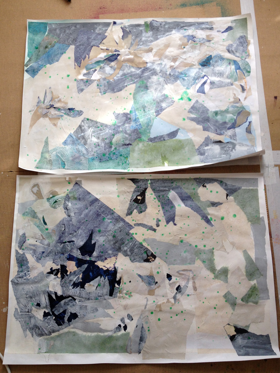
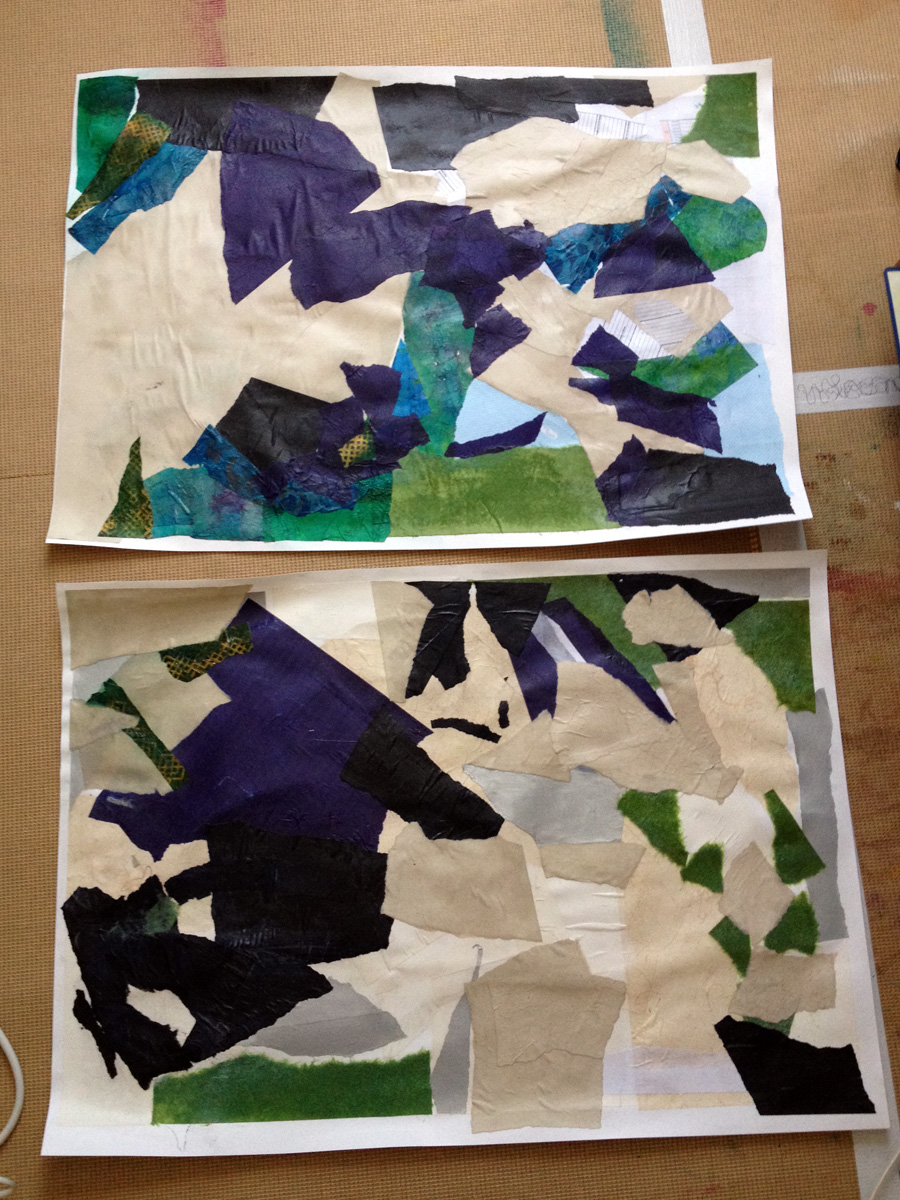
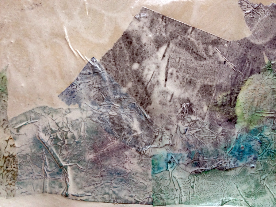
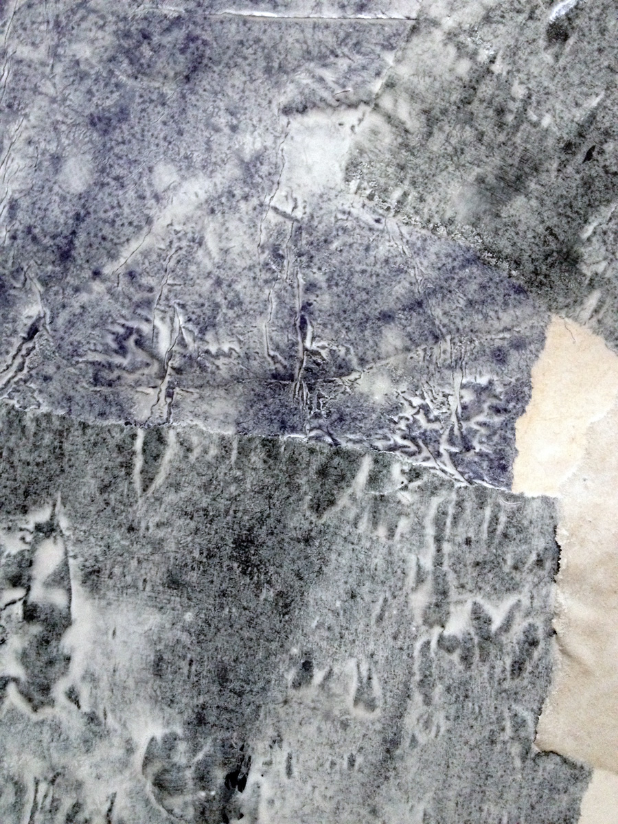
I notice color everywhere.
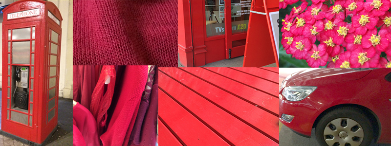
I had a moment of profound realisation when I found myself taking photos of a group of tourists emerging from their (red & blue) coach, just because almost all of them seemed to be dressed to match in some shades of red & blue….
I had one of those moments: Do other people see this too?
Like the fish who doesn’t know it’s swimming in water, my ideas have only swum in my mind, I’ve got no comparison unless I step away and try to look in from outside.
I mentioned the tourists & matching coach to someone a few days later – with gushing enthusiasm – but was met with blank nothingness. Not even the edge of a WTF? response I sometimes get when I share arty revelations like this, just a totally empty, disinterested blankness.
That was the moment I knew: I need to connect up with others who see & appreciate what I see & appreciate. My tribe. We need each other.
We need each other in a world of unknown areas of empty, disinterested blankness, a world with WTF? reactions to gushing arty revelations.
We need to reflect back to each other the magic of seeing some crazy spontaneous colour synchronicity, of seeing some beautifully matched chance happening, some little something somewhere that gets overlooked by most but makes our hearts sing just because of its orangeness, or blueness, or purpleypink, or whateverness.
I love how the idea is resonating among the folks who’ve joined already, the excitement bubbling up, and most of all the anticipation of what will emerge from this group as the year unfolds.
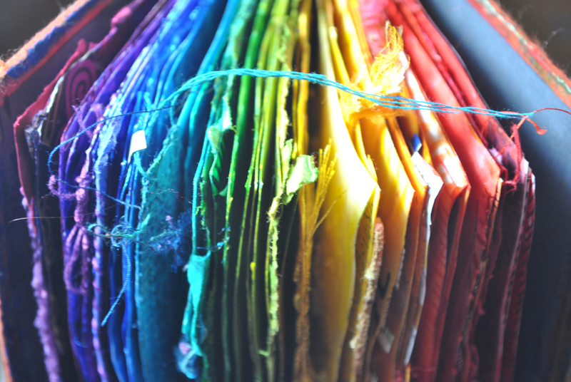
It’s going to be bright and glorious and I love it!
Want to make your 2017 brighter and more colorful?
Sign up below for more news on my doings & makings through the year, and get a lovingly hand crafted ebook all about color
…oh, and you can join TWELVTY too !

Be well, my friends, Much love to you all X
**********************************
(Your email is absolutely safe with me, I’ll just pop by and check up on it time to time, feed it biscuits, plump up its cushions, that sort of thing.)