Water In Parallel (part 5)

The ongoing story of the two paintings about Water bumbles on… collage on top of painting on top of collage.

Next? Next came more painting!

I love the stuff that going on here, it’s expressing the watery vibe I want it too. But there’s a lot of it with no central focus. It’s uncoordinated jazz that needs summoning together into something more melodious.

IMG_4025

Blocking out bigger areas in white was the best way I could find to start this stage of the process.

IMG_4026

Then I got thinking about ripples….

IMG_4038 IMG_4036 IMG_4035

I’m really nearly done on this now. I’ve got some more pulling together to do – and I know just what (I’ll show you next post). This came to me in place of sleep last night. Insomnia is a double edged phenomena: it leads to tiredness and inconvenience, but it also provides the space for thoughts that just don’t seem to have room to surface in the bustle of daytime.

Water In Parallel (part 3)

Having left off at this point, the next question inevitably is: where next?

IMG_3957

Well. Now it’s dried the hasty haphazard approach to the initial gluing has resulted in a bumpy bubbled surface. Which kinda appeals, not least as a literal interpretation of the Water theme. But it doesn’t give the substrate the integrity we all know it needs, given I’m just into week two of a six week projected plan, and I’m not gentle with my art. It’s gotta be tough to survive.

So some surgery is required:

IMG_3972

Delicately lifting the blisters and… oh who am I trying to kid?

IMG_3973

Stabbing and slashing with a palette knife! pulling up anything not firmly adhered….

IMG_3974

preserving the torn scraps in water to replace and patch with later.

IMG_3977

Part way through the slash and patch process, I’m loving the way splashes of colors emerge back to life in places. And there’s almost  a suggestion of composition beginning to emerge as well! Lordy whatever next!!

Water In Parallel (part 2)

Last post I had just constructed these thick papery substrates on which I had not the foggiest idea what was to happen.

IMG_3948

Which is a really exciting place to be!

When in doubt, I like to make a big move: a doing or an undoing, doesn’t really matter which. Time to make a change: lose the colors.

IMG_3957

They were there to serve a purpose: get focused on the theme of Water. Now move along! IMG_3959

Diluted white gesso on scrumpled paperis just lush – all those lovely rivulets and wrinkles were already there, but they needed shining up and showing off!

IMG_3960

Next installment coming soon….!

Water in Parallel (part 1)

I’m working on a project over the next 6 months, part of which is to produce a collection of eight works, two at a time through each six week cycle.

So…. 6 weeks, huh?

I’m just into week 2. The logical, ordered part of my mind says ‘so you’re like about 25% done, right?’ Then when I stop laughing, collect myself, I can get on with showing you where it began:
IMG_3942

I’ve got a theme: Water. But I’ve got no limits, no plan, and no expectations. Apart from – this is gonna be so much FUN!

Experience tells me straight off:

  1.  Make it Big (I’ve gone A1, cos I have that sized cartridge paper, and post-masive-sort-out, I’ve got that sized working area, both on table and floor)
  2. Make it Strong (I know me; paper gets dog-eared and crumpled just by touching it. If I’m playing with this for more than a few days it’ll get holes in and ripped and all manner of fucked up – unless it’s super-tough) So this substrate’s gonna need layers! That’s where the heap of other papers comes in to play.

IMG_3943

Ooooh tearing paper – inner kid – she’s in her element here – construction from destruction (yeh – eventually – but first let’s relish a bit of ripping deconstruction!)

IMG_3947

Like day follows night, gluing follows tearing.

IMG_3948

Working the two in parallel (here’s the plan) will keep them in sync. It’s now layered two to four thick, much more substantial to hold up over the coming weeks!

More developments in due course…………….!

butterfly overflow (9/52)

IMG_3888IMG_3887

Week 9 of this year is made out of the colours of Spring, honoring the sense of Spring as the world comes back to life after her quiet  dormant months. And some of last week’s butterflies have flitted across into this week too. I had a big old tidy up after finishing that project and all the left over butterflies have landed here. (I say all of them… a few got away as you’ll see on the next page).

IMG_3890

The week fell on the crossover from February to March, so warranted another list. Seems like there’s a reason for a list pretty much every week now. It’s in the background, but it can germinate there. I’ll patiently await the first shoots of development as the month wears on.

IMG_3889

Another week, another meme:

When you do what you fear the most you can do anything.

Ok, yeh, I can take that on as a challenge. I’ve crossed some metaphorical bridges lately, and my metaphorical-bridge-crossing skills are notably sharper as a result. I’ve also come to realise I can’t always tell the difference between the pit-of-the-guts anxiety feeling and its close cousin, the visceral buzz of anticipation feeling.

So I’ve actively decided that henceforth, if I’m in any doubt, I’ll assume its the latter.

IMG_3891

It is the feeling of butterflies.

New Beginnings

It’s that time of year, time of life, time of day.. it’s also the name of an exhibition I have some work in.

The title is open to interpretation but it got me thinking about the saying What the caterpillar calls the end, the rest of the world calls a butterfly.

an untidy desk is the sign of...
an untidy desk is the sign of…

So with my fav kind of glorious inky messy, the divinely joyous, the snipping up of little bits of paper, the gluing bits accidentally to my sleeves, hair, floor… and the itsy small doodles on the wings… the magical making process, another project began to unfurl.

I remembered how I hadn’t done this for so long – let the inner kid out to play without any rules or boundaries – well, one – just do butterflies. We jumped in with both feet!

IMG_3847I began with 3 different butterfly images, digitally reduced to grey-scale, then high contrast mono before printing in a few different sizes. Some flipped over to fly in the opposite direction.

Enough of the tidy digital world, enough of the pristine pixel arrangement. Time for IK to make a mess with layers of inky goodness before cutting out the little beasties for collaging, and extra doodles.

So far there are 2 framed collages, and a series of cards. I’m in the process of setting them up over on DeviantArt so prints are available too  ……….. and I’ve got another little side project where they’ll be flitting through too -> watch this space!

Odoodem

odoodem_pd2A project I began working on as college brief in September 2013 finally came to fruition recently. The task was to design a site specific artwork for the National Spinal Injury Centre.

I described earlier my design of a ‘Totem’ honouring and celebrating the spirit of the Spinal unit, the great work that is done there and the kinship that develops between patients, the therapists and staff, the patients’ friends and families – the community.

The perfect location turned out to be an eight-sided brick pillar in the centre of reception: the spine of the unit, and conveniently totem-esque in shape; so defining the design, and informing the scale.

odoodem_bw1 odoodem_pd1 odoodem_dg1 odoodem_sc1

I decided early on that the artwork would consist of a series of portraits of people who have shown a level of determination and spirit that can inspire others. The stories I read in the course of researching who to include were often beyond awe-inspiring. Testament to the strength of character that comes to the fore in times of crisis, and a need to share that sense of possibility with others.

A really strong sense of people are amazing. I’ve also had some really wonderful feedback from the folks whose portraits I used. Absolutely heartwarming, I’ve so loved this project.

I’d like to thank everyone involved in the project:

aaron davidWeir MikeNemesvary jaredDuntan markPollock melanieReed catrionaWilliams peteDonnely ericaDavis  bonnie tricia darius andyWalker suzanneCowan barryWest frankGardner

Aaron Baker, David Weir, Mike Nemesvary, Jared Duntan,
Mark Pollock, Melanie Reid, Catriona Williams, Pete Donnelly,
Erica Davis, Bonnie Lewkowicz, Trish Downing, Darius Glover,
Andy Walker, Suzanne Cowan, Barry West & Frank Gardner.

Some More Metaphors

‘Odoodem’

Totem to the Artist 1925-30 by Leon Underwood 1890-1975The idea for the final design was really concreted by a trip to the Tate Britain where I saw Leon Underwood’s Totem to the Artist. The word Totem is derived from the Algonquian word Odoodem, meaning kinship group.

The idea behind this art installation is to celebrate the mutual support and sense of kinship that develops in the National Spinal Injury Centre, between the hospital staff, therapists, patients and their families through each person’s stay in the unit.

I also want to weave together themes that are integral to the work carried out here at the centre: perseverance and determination to overcome and adjust to changed lifestyle and self-identity.

In the main foyer/waiting area there’s this brickwork column, the central support, the ‘spine’ of the building, this is where the 16 portraits will hang. Each of the collaged portraits is of someone with an inspiring story of extraordinary accomplishment living with a spinal injury. The way the portraits are displayed is intended to echo the appearance of a totem pole, which in turn echoes the appearance of a spine, a central support. And a seamlessly circular metaphor. (I like that kind best).

IMG_3749_400The images are made from hand-cut layers of silk screen prints which in turn were over-painted with repeating abstract patterns to emulate the carved designs of a traditional totem pole, and also symbolise the patience and determination required for the repetition involved physio and occupational therapies.

more photos to follow…

The Sum of Its Metaphors

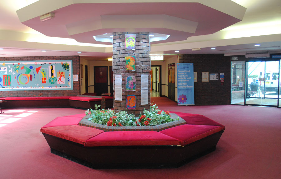
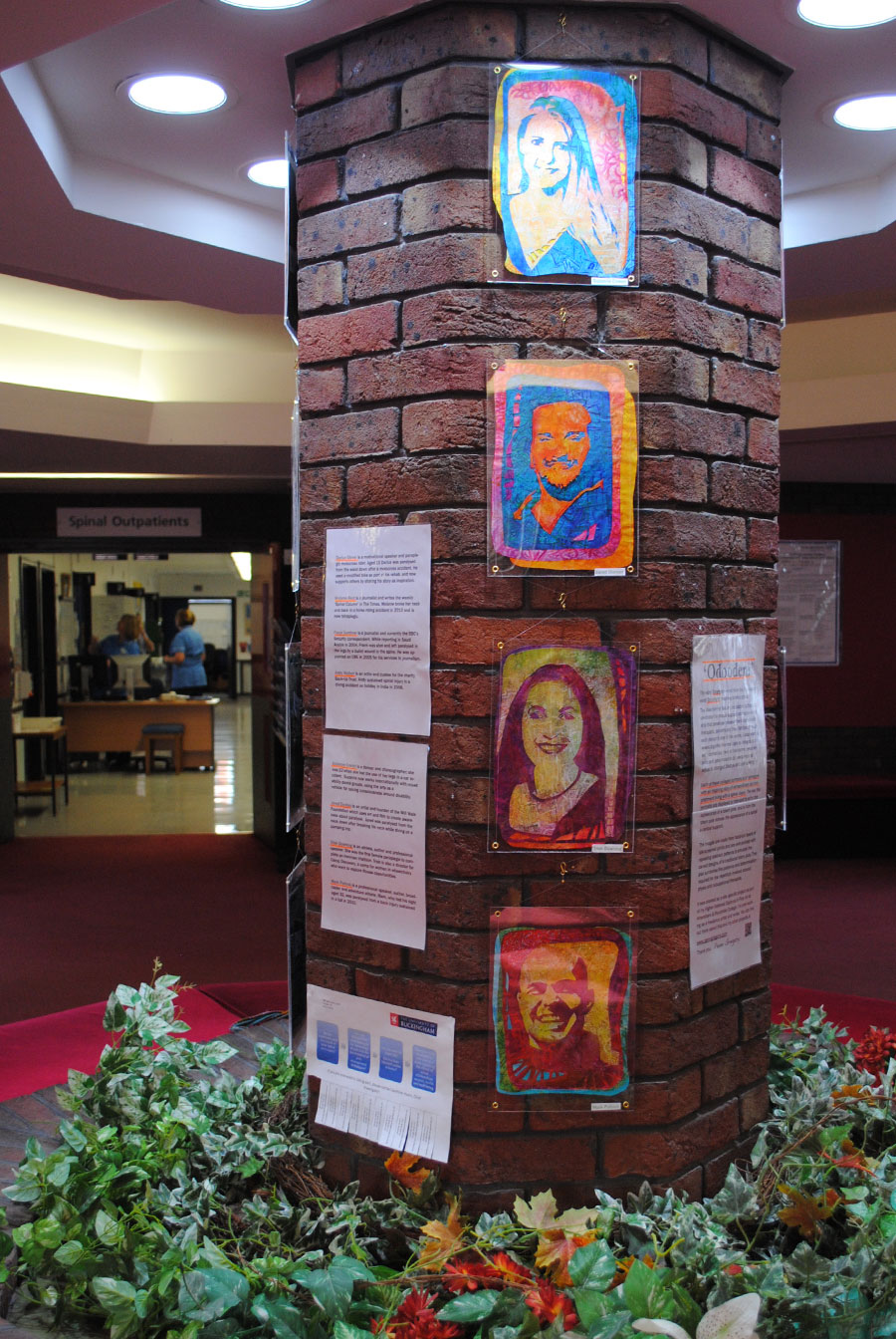
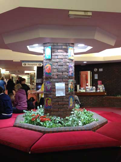
Following on from the More Than The Sum posts. Y’know what? this week I finally completed the project! 18 months since the initial brief, the planning, the researching, the thinking and playing began. 16 collaged portraits which will be hanging in their final home tomorrow.

Almost all art has at least one metaphor. Sometimes it’s a visual message, daft or clever, subtle or blatant. And often times it’s something that shows itself in the creative process.

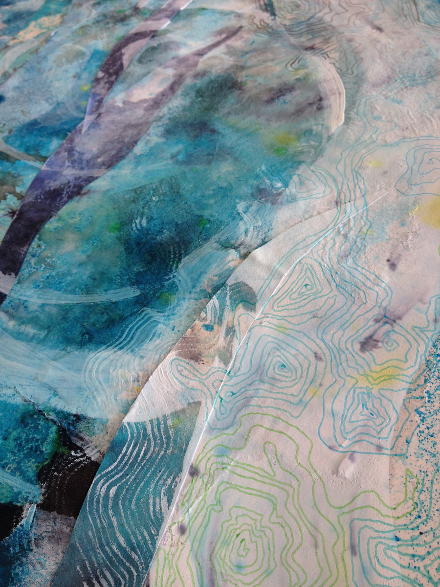
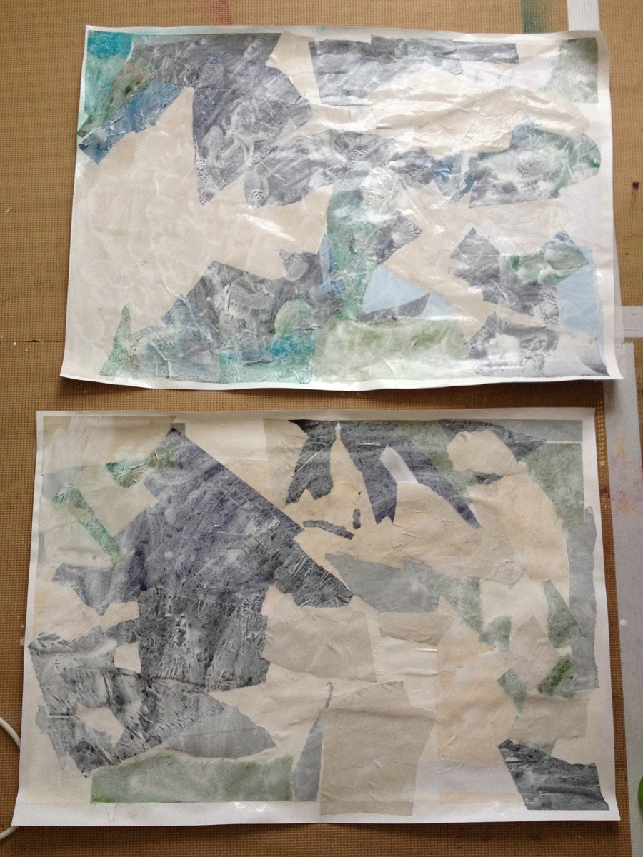
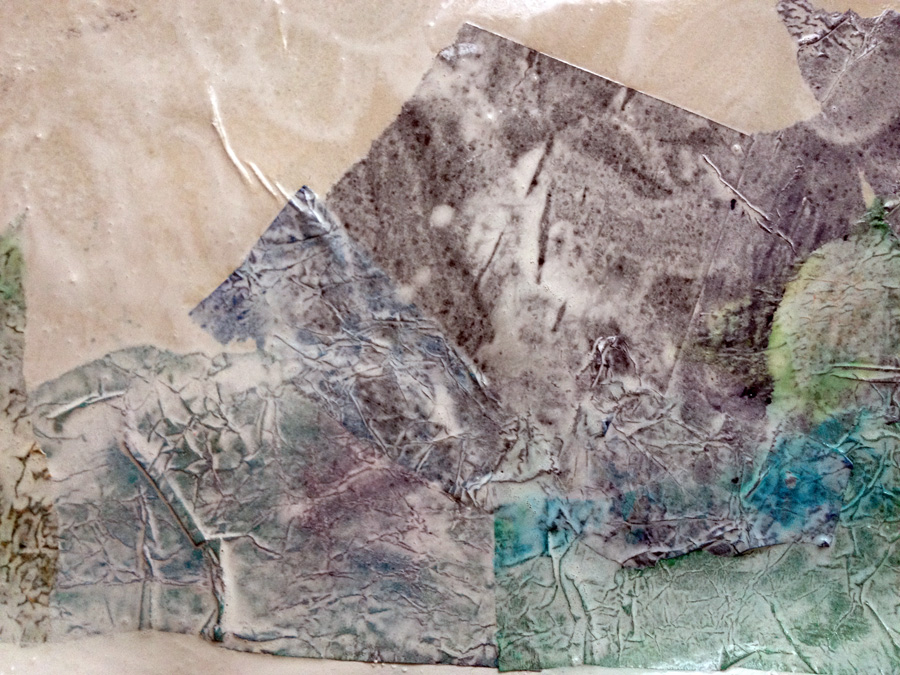
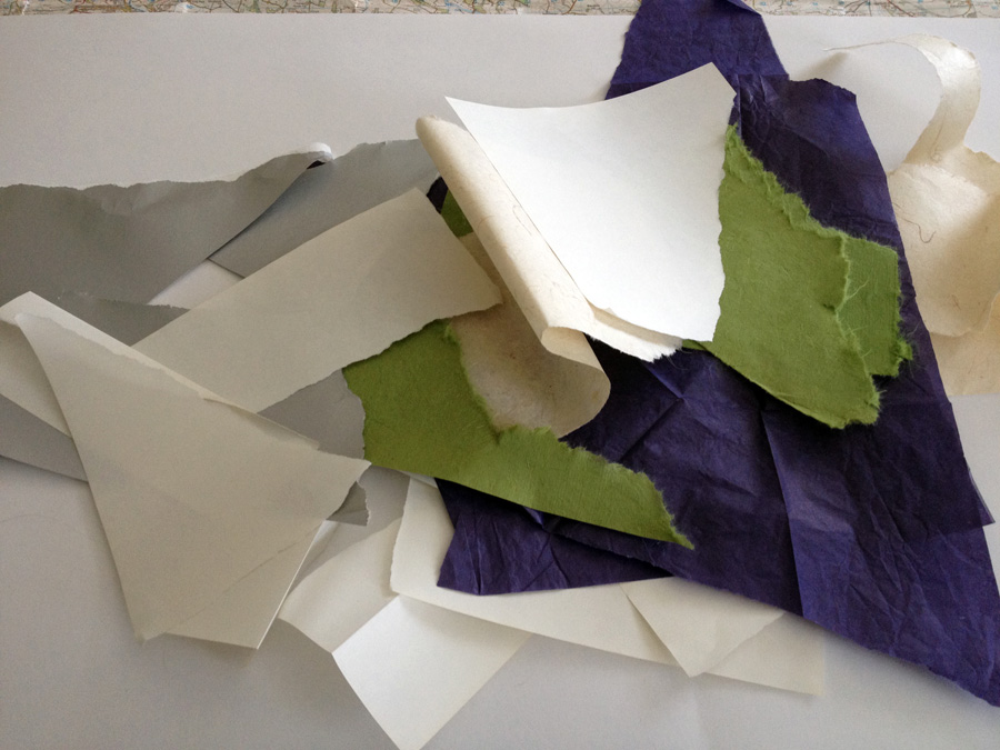
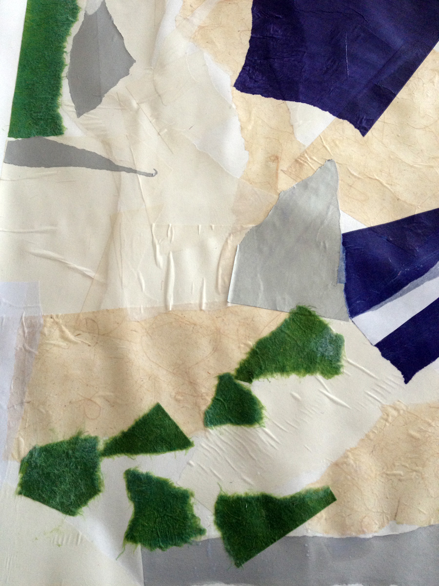
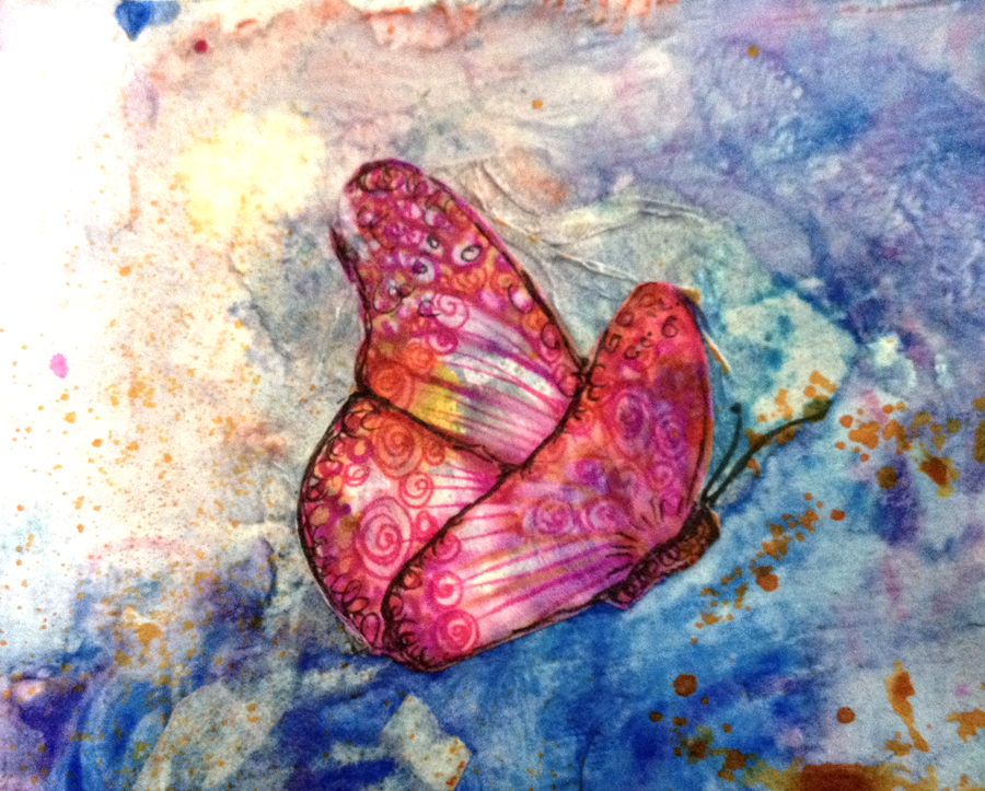
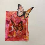
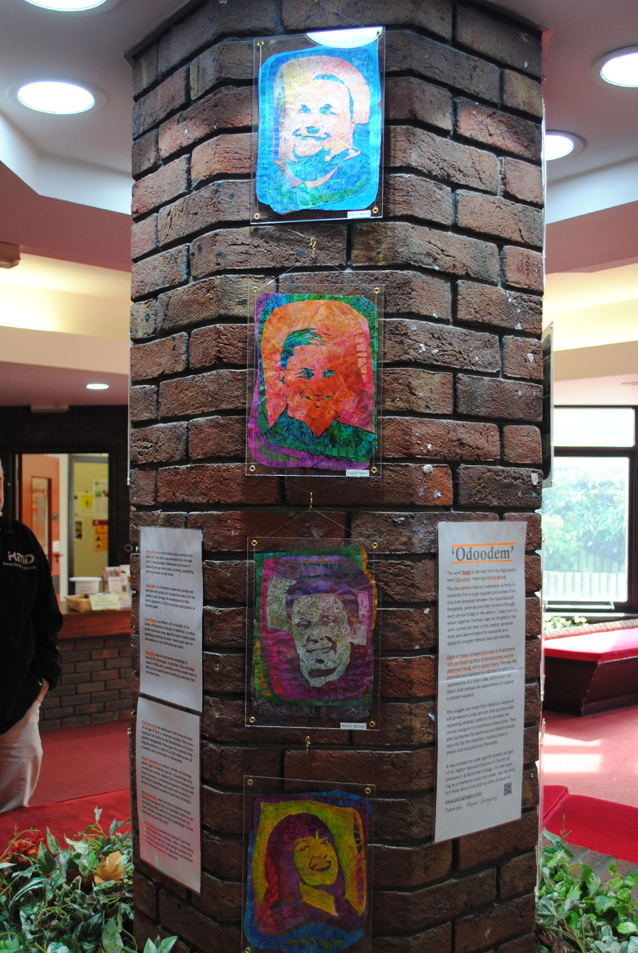
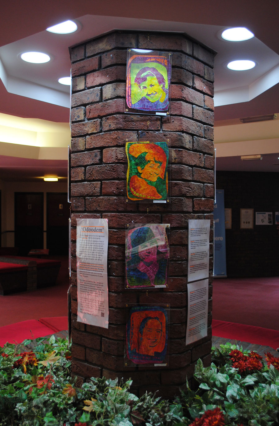
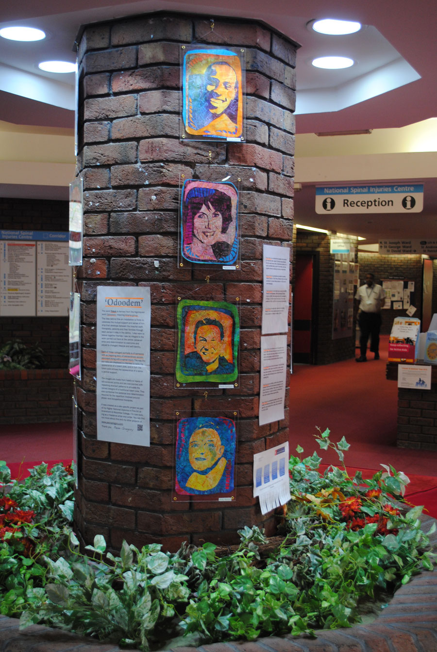
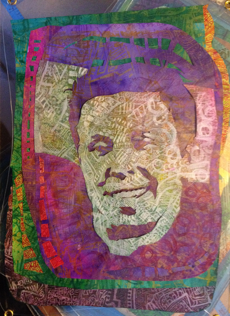
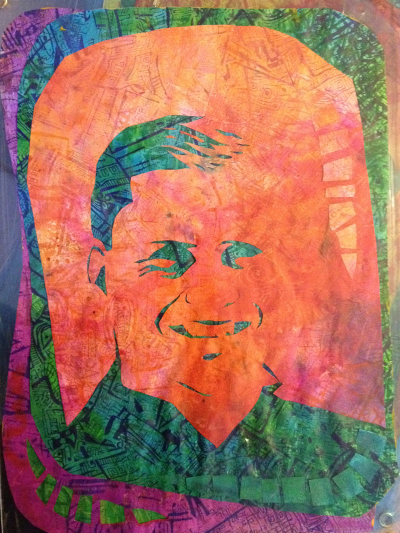
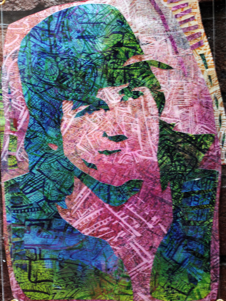
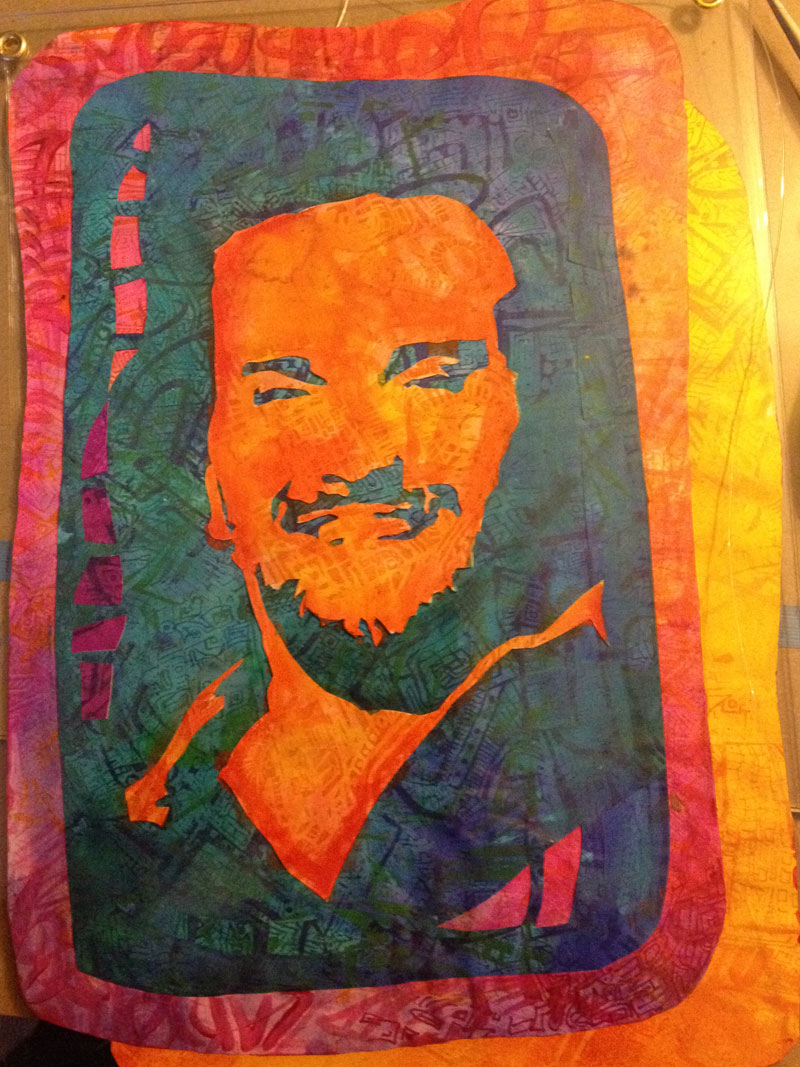
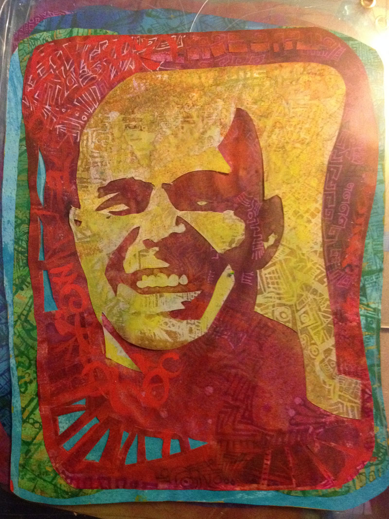
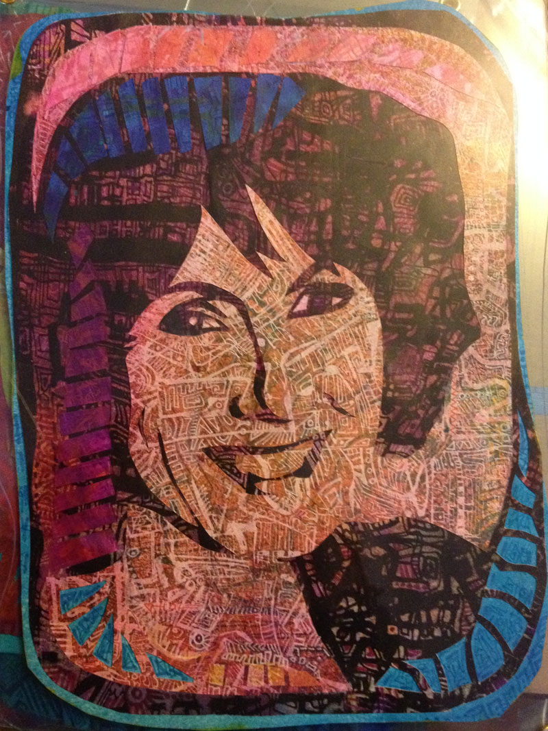
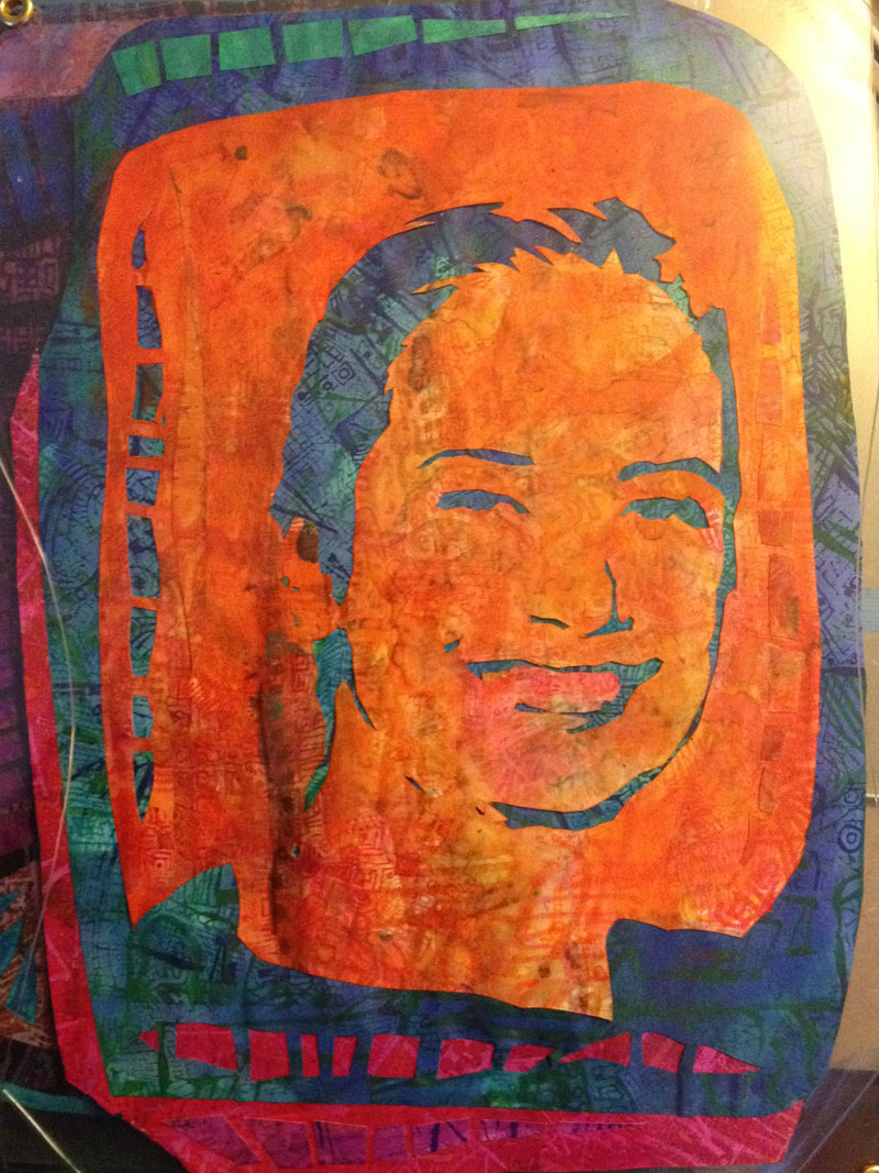
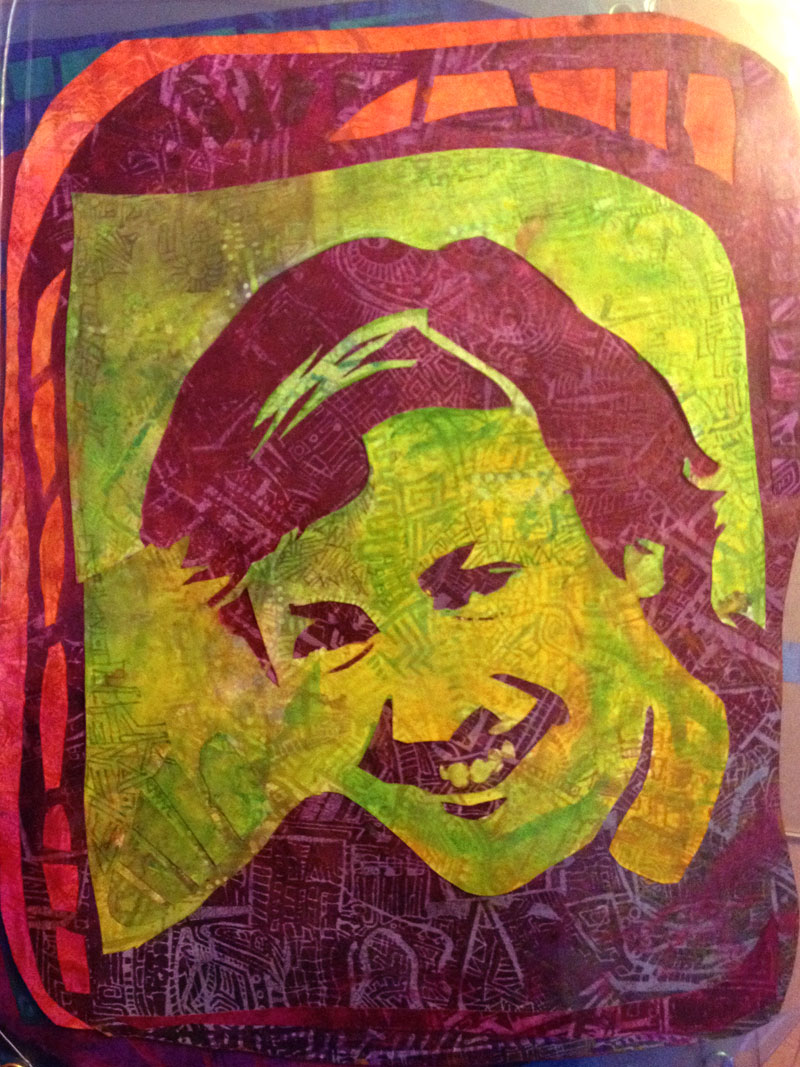
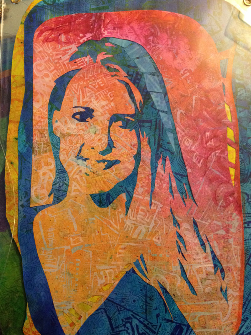
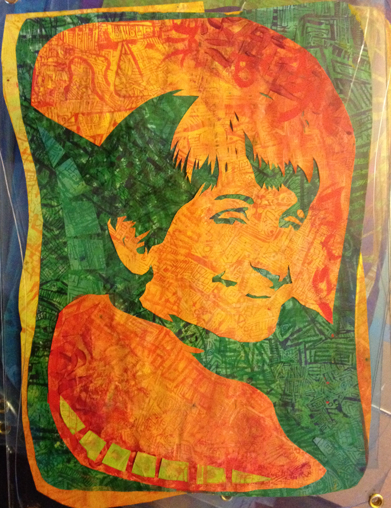
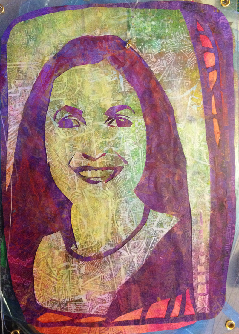
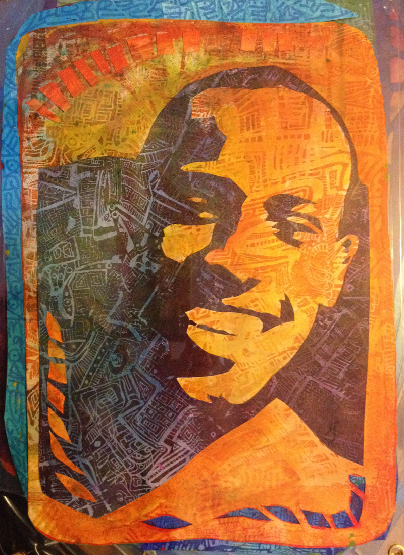
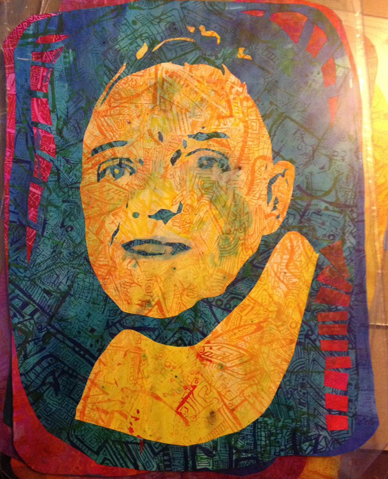
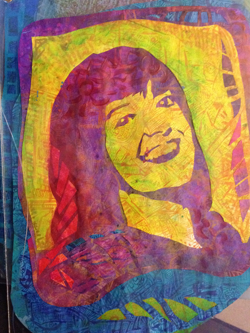
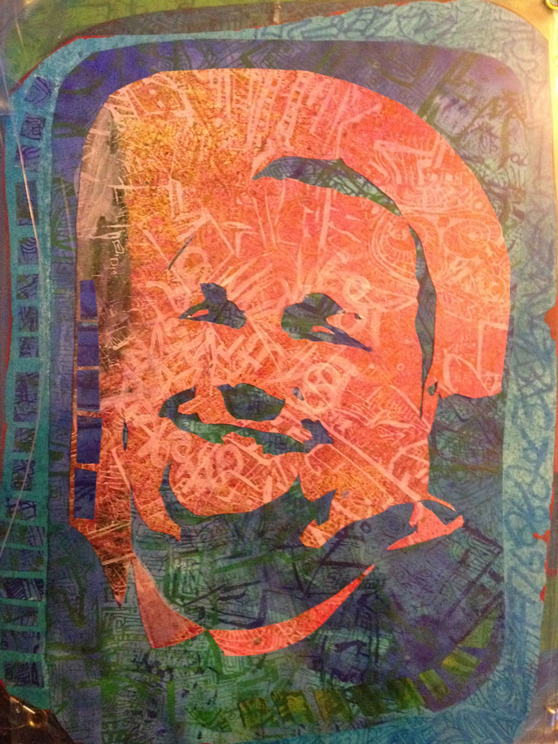
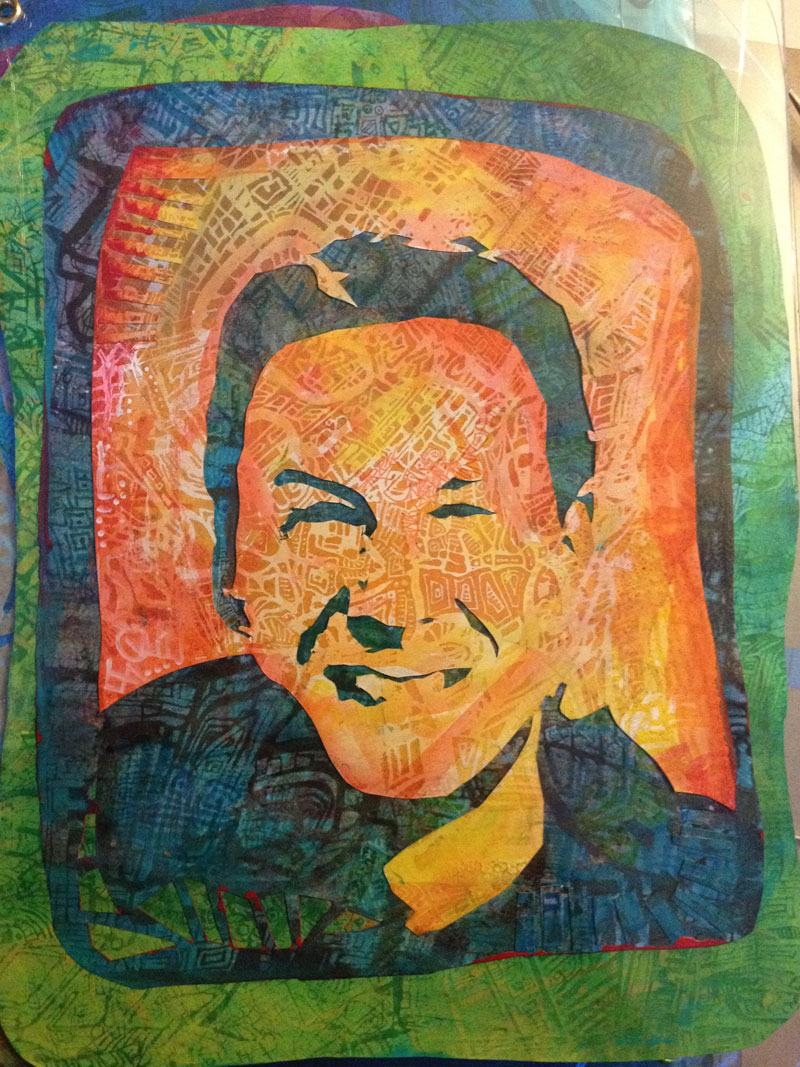
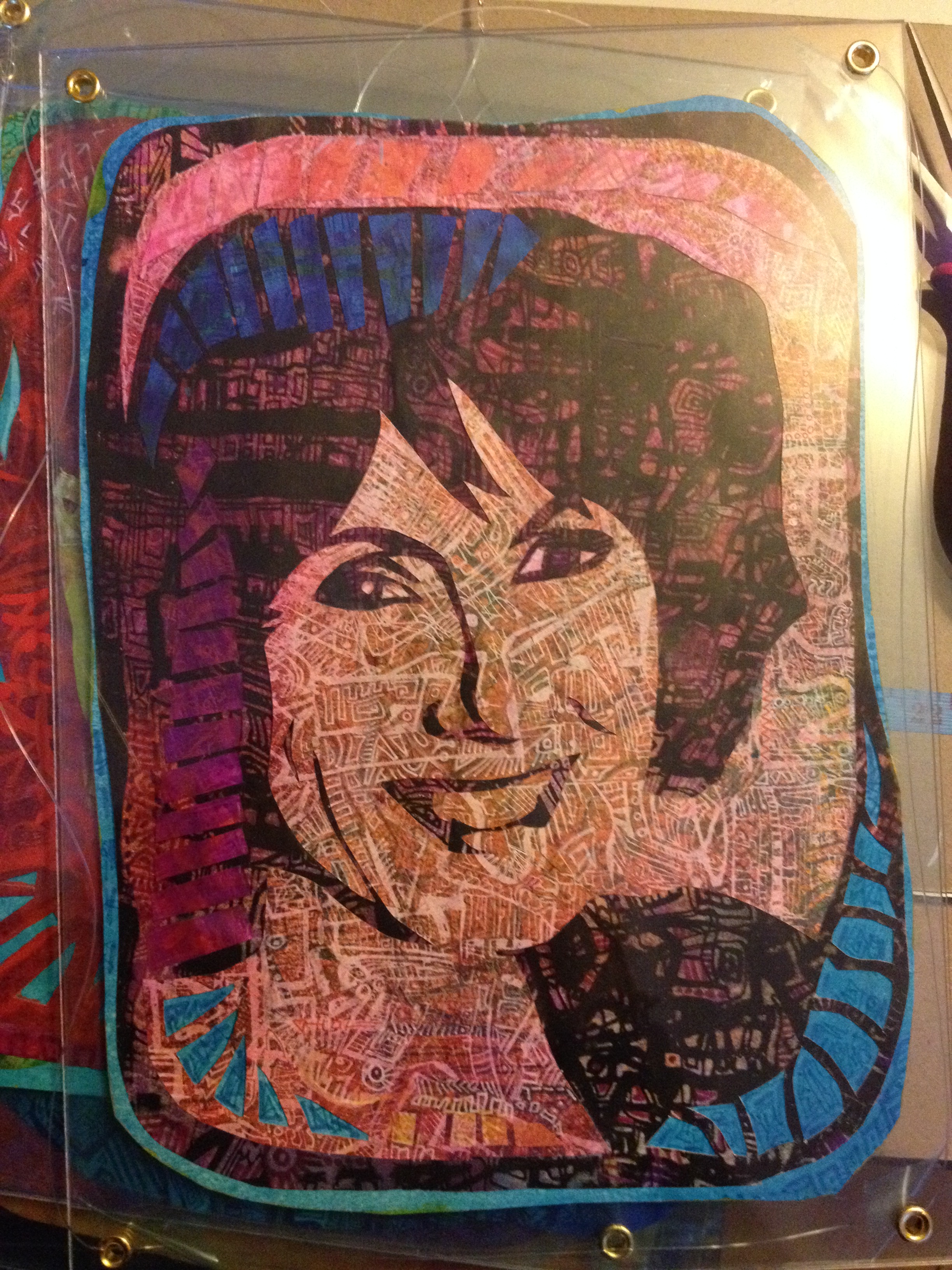
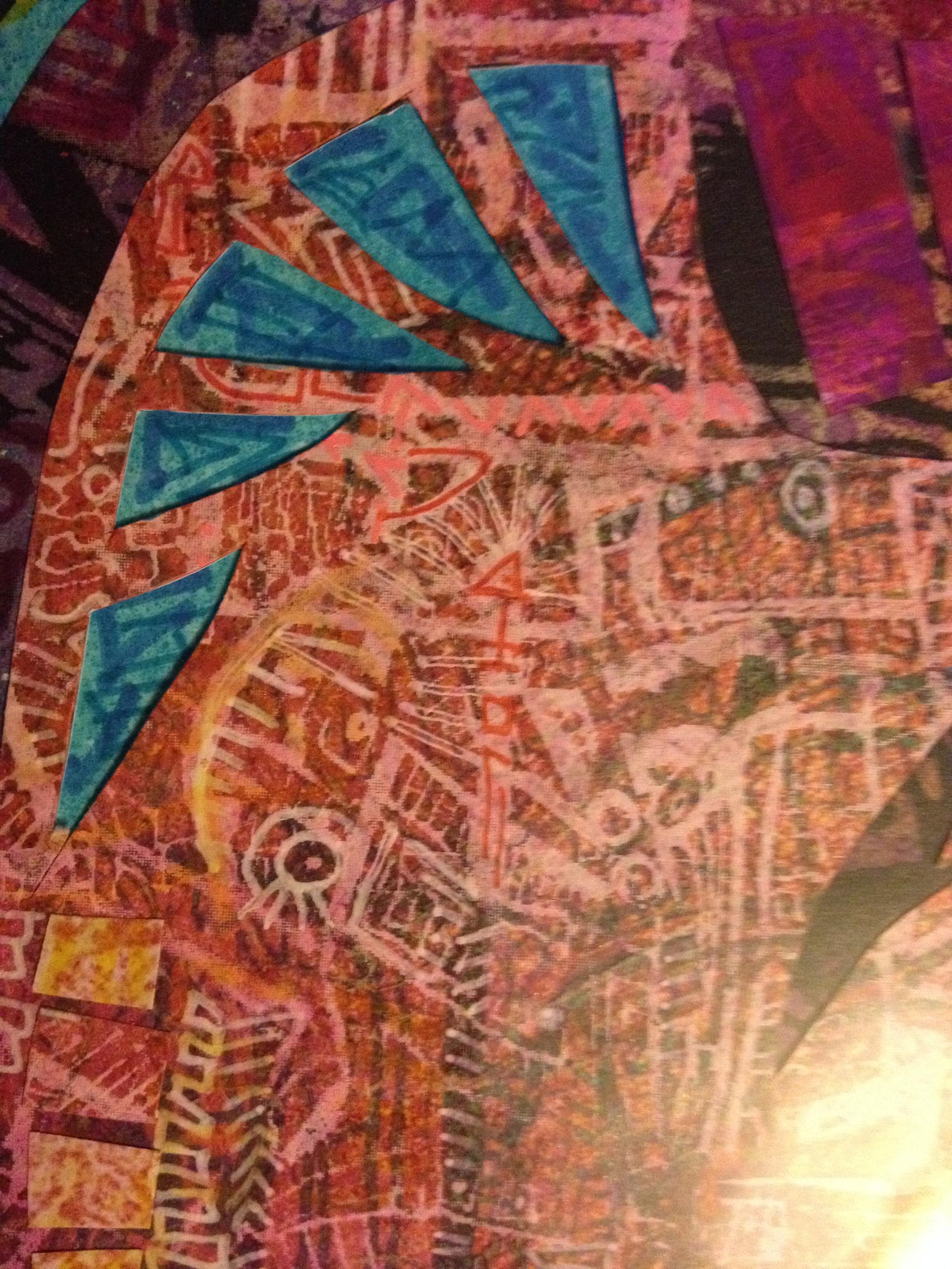
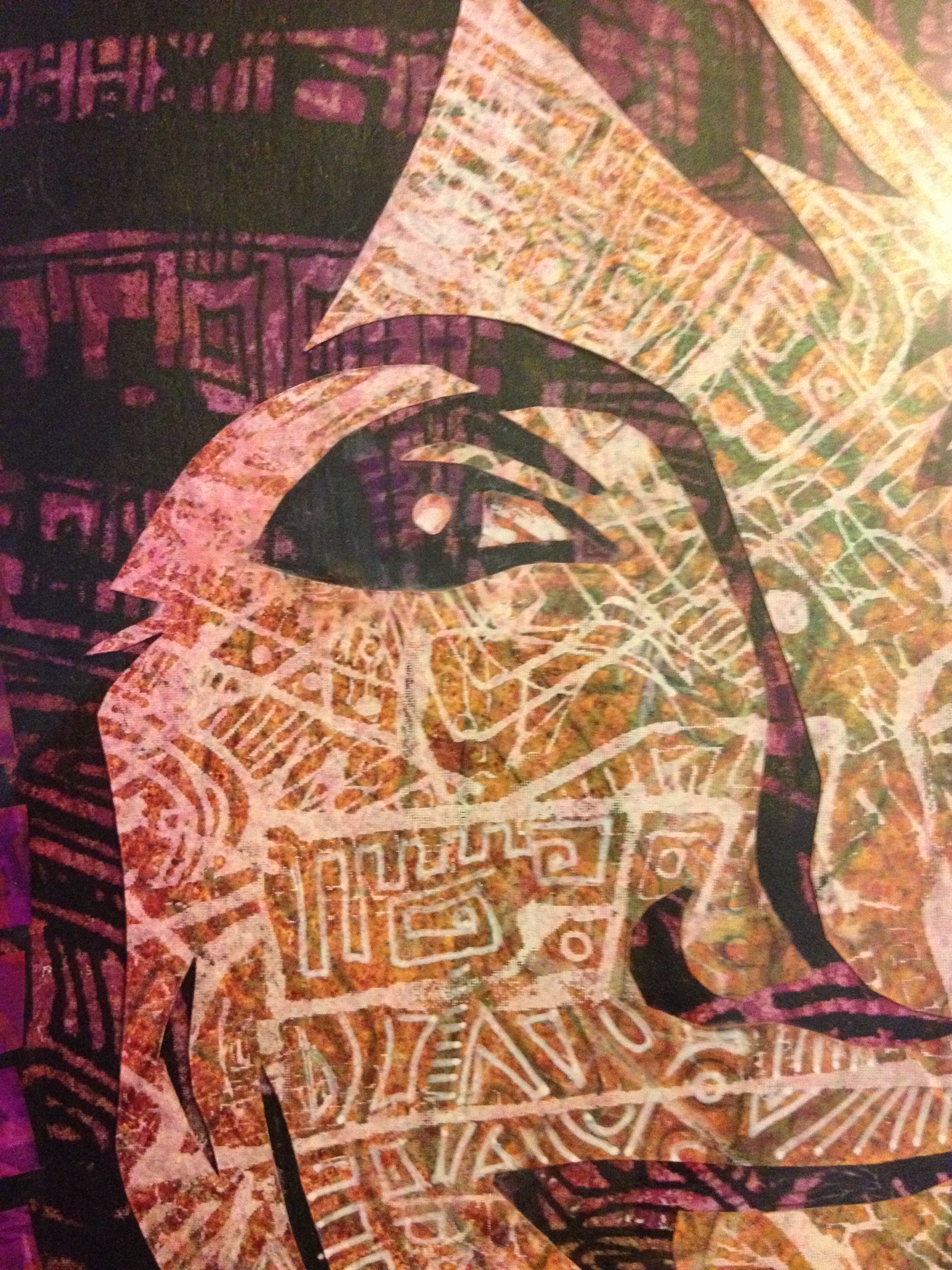
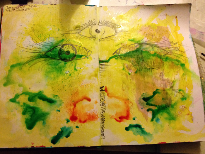
This piece was always going to be heavy on the metaphor. It’s to be displayed in the reception area of the National Spinal Injury Centre at Stoke Mandeville hospital, so it will be seen by hospital staff, the patients, their families, friends and dear ones. It’ll become part of the back drop to a range of emotion – shock, fear, interminable waiting, hope, intensity, perseverance, dedication, and so much more. Purpose-wise, top level: it’s bright, colourful, and a visual distraction. Close up their road-map qualities show up and the faces almost disappear. They might be a place to get lost in for a while.

But the meaning goes deeper than that.

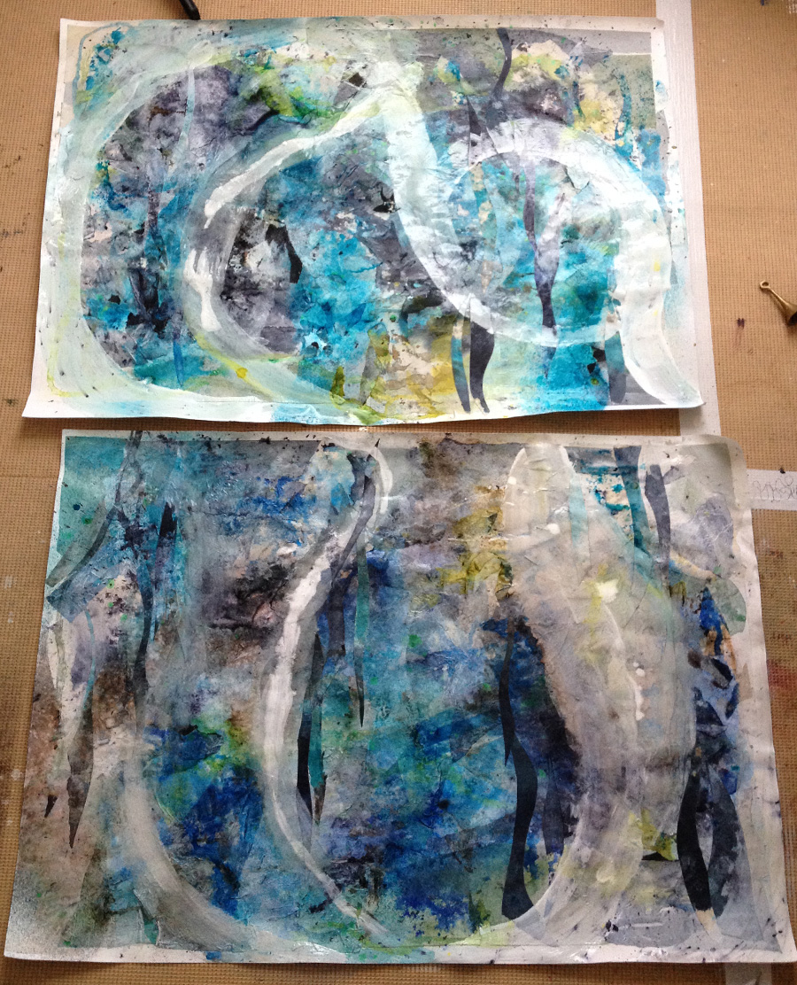
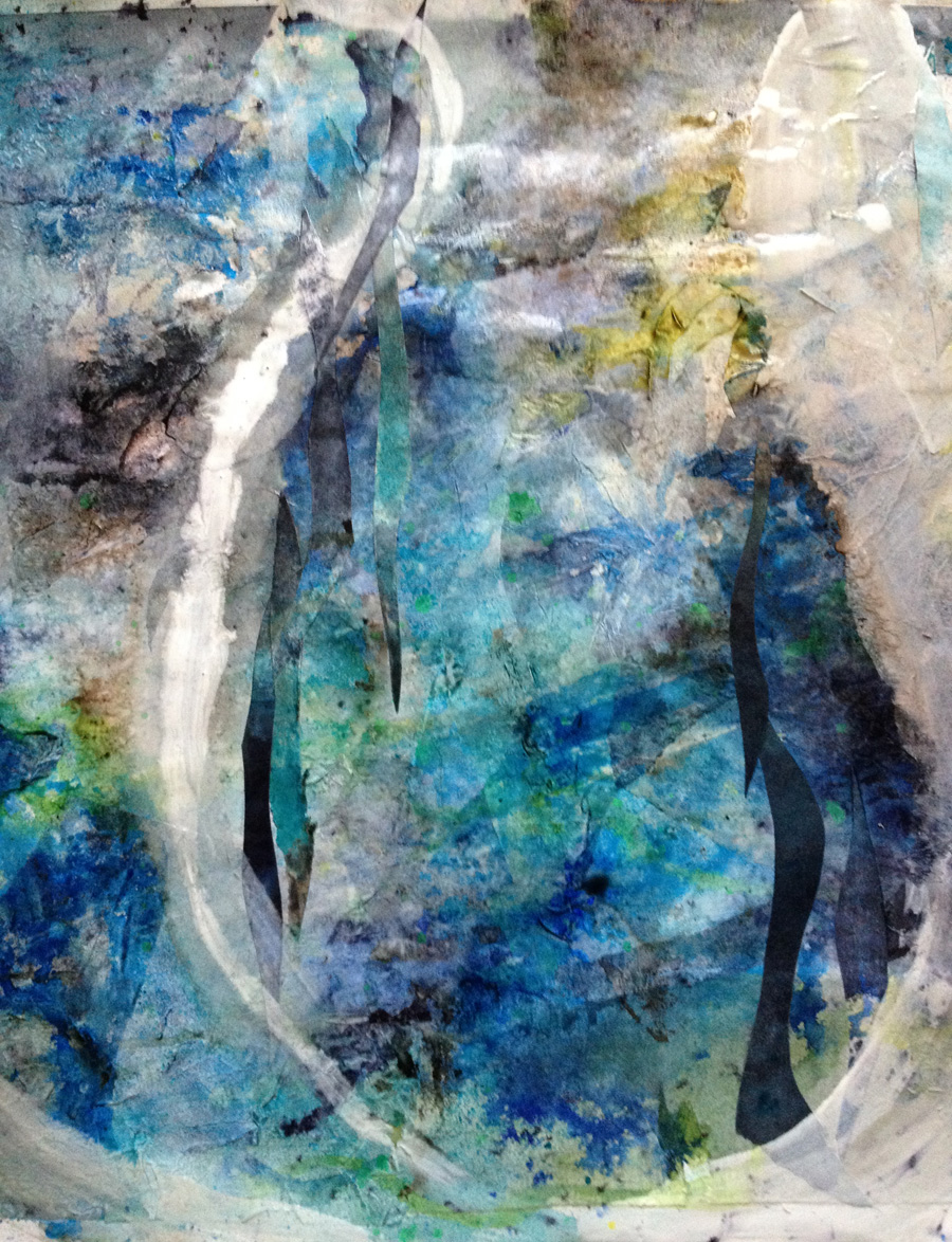
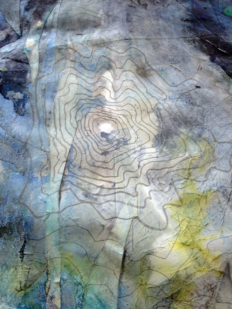
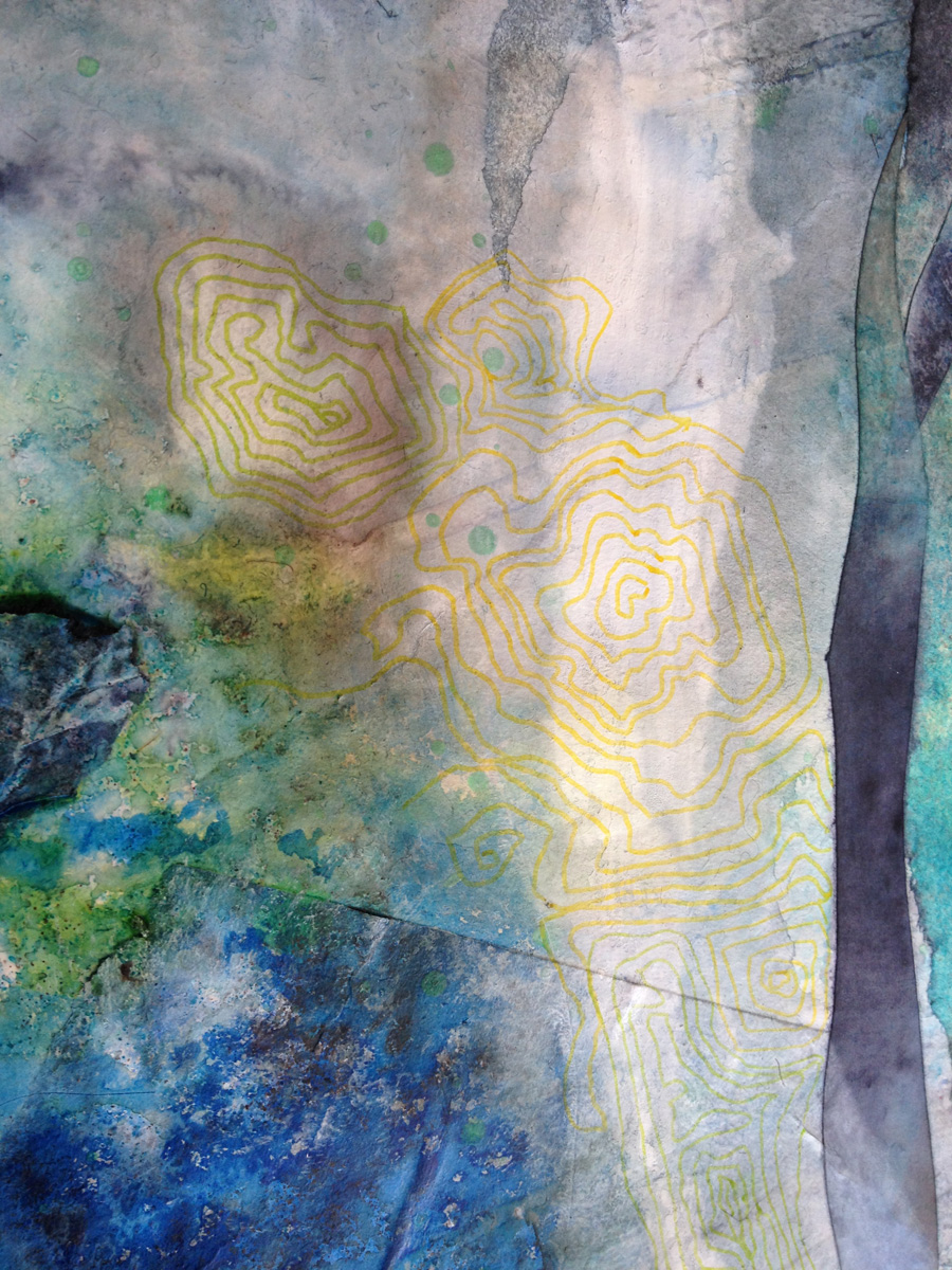
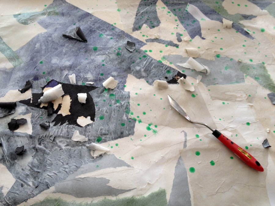
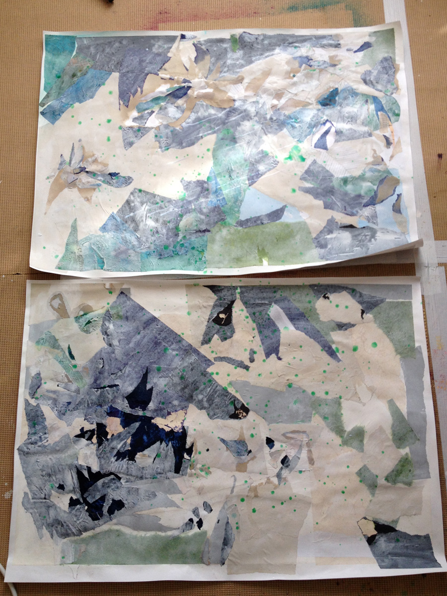
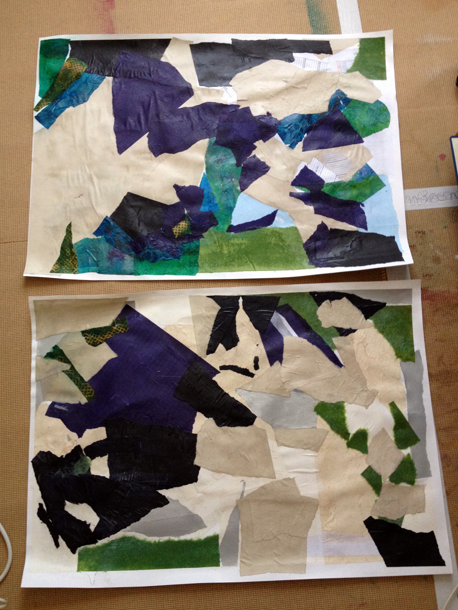
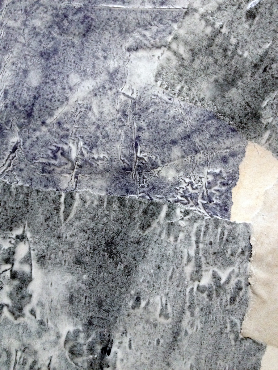
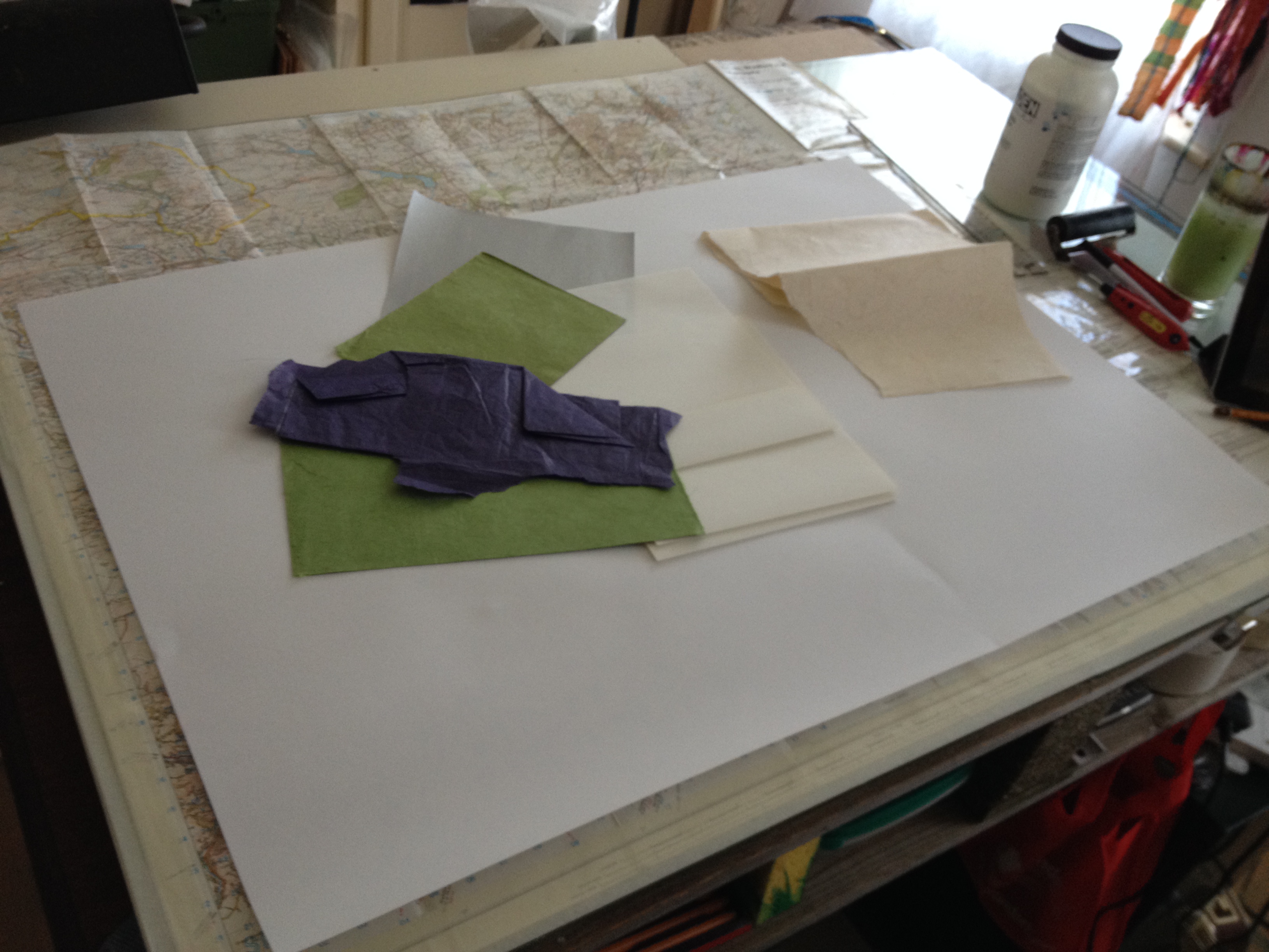
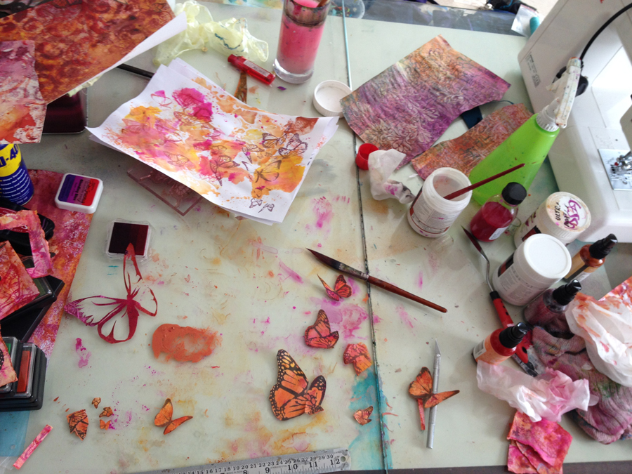
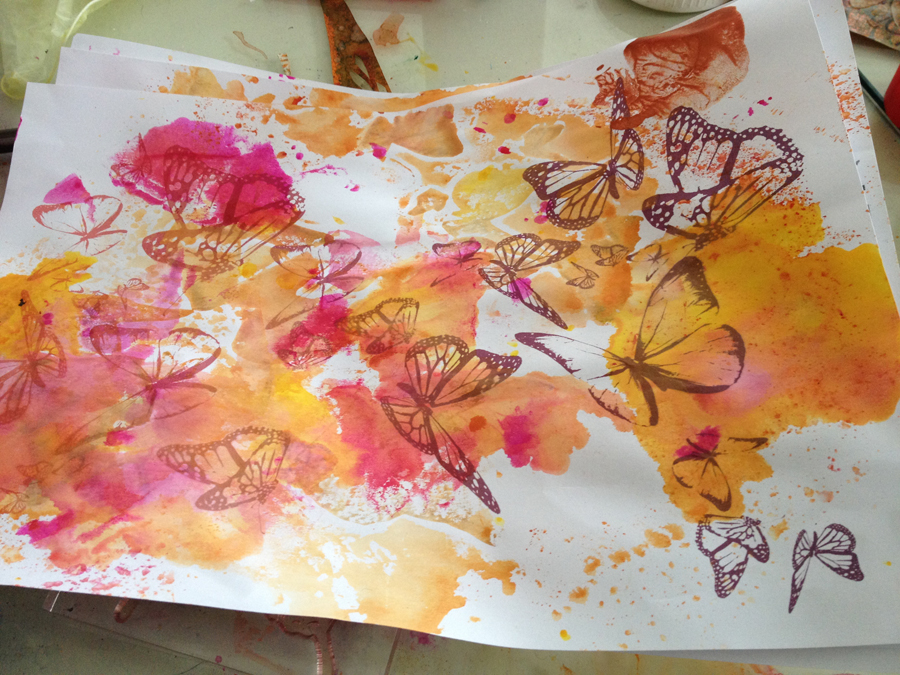
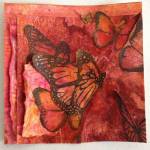
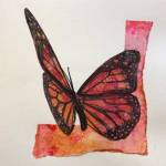
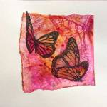
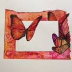
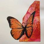
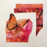
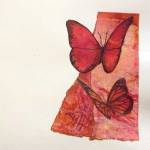
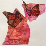
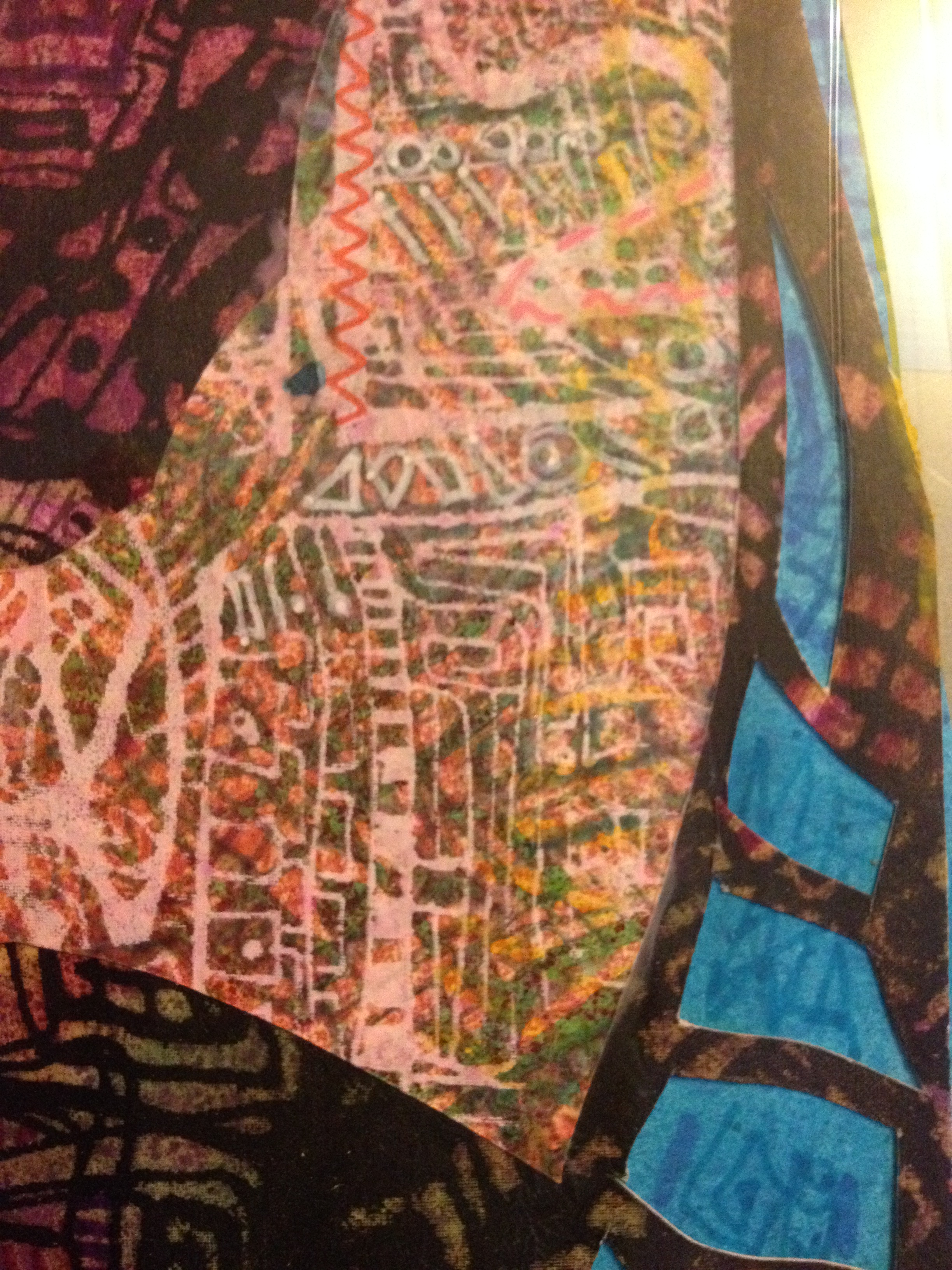
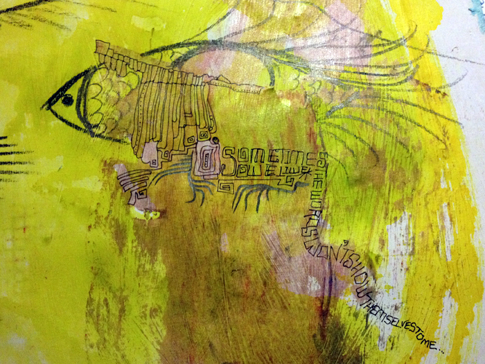
As you know, the collages are made from intricate screen print/drawings which was the first of the metaphors – the repeating patterns, the tiny detail – the repeated exercises of physio and occupation therapies, the gradual steps toward more independence. The incredible patience and strength of character this demands from all involved. Layer on layer of print and drawing – day after week after month of incremental progress in recovery.

The metaphor that shows up in the process: How life is so contradictory sometimes.

Wouldn’t you think you’d see something better close up. You would, though, wouldn’t you?
IMG_3713IMG_3715IMG_3716IMG_3714

….apart from when looking too closely at something makes it vanish. From a distance: there it is. No doubt. Get closer and it fades out of sight. WTF? Really? Yes. Something like not being able to see the wood for the trees… perhaps.

These are some of the metaphors. Tomorrow I’ll show you the completed work, and describe the rest of the message.

Color and Eye-Fish 2/52

My weeks now begin (as this year did) on a Thursday. I like this! It breaks up the week/weekend pattern in a refreshing fashion and in a way seems to make time stretch. I’m a busy person, this is enormously helpful! Week 2 of this year started out on a drainy-grainy grey day and I really needed to counteract that, so I did in the only way I know how: with colors.

I began with a wash over white gesso with Pebeo Colorex chartreuse ink I LOVE this color! This is my happy color! although it gets covered over through the week, little bits are still shining through.

IMG_3631

The page already had a smeary something (acrylic paint? I forget already) on the right page which discolored to a nasty beige with the ink smears. But no matter, it’ll be obscured with stuff before long. To begin with, the same three strange eye-fish as last week. I can’t really explain them yet, I’ll come back to them later.
IMG_3634
Swimming through the inks.

IMG_3633

Slipping behind the doodled-on beige paint slick. The eye-fish do their thing…
IMG_3636
Then it got some washes and splashes in Adirondack Stream. Close and open the book for a bitova Rorschach style ink spreading manoeuvre.

IMG_3648
That puddly wet ink was just crying out for something a bit more lively and vibrant, so on with the Derwent Inktense
IMG_3647

I love the variety of marks you can get scribbling on splashed paper, the wet and dry work well for doodling into with a fine paintbrush and water.

So that’s where my week began, It’s progressing a bit more each day so check back soon to see the next transitions 🙂

Design a site like this with WordPress.com
Get started