Odoodem

odoodem_pd2A project I began working on as college brief in September 2013 finally came to fruition recently. The task was to design a site specific artwork for the National Spinal Injury Centre.

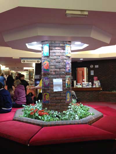
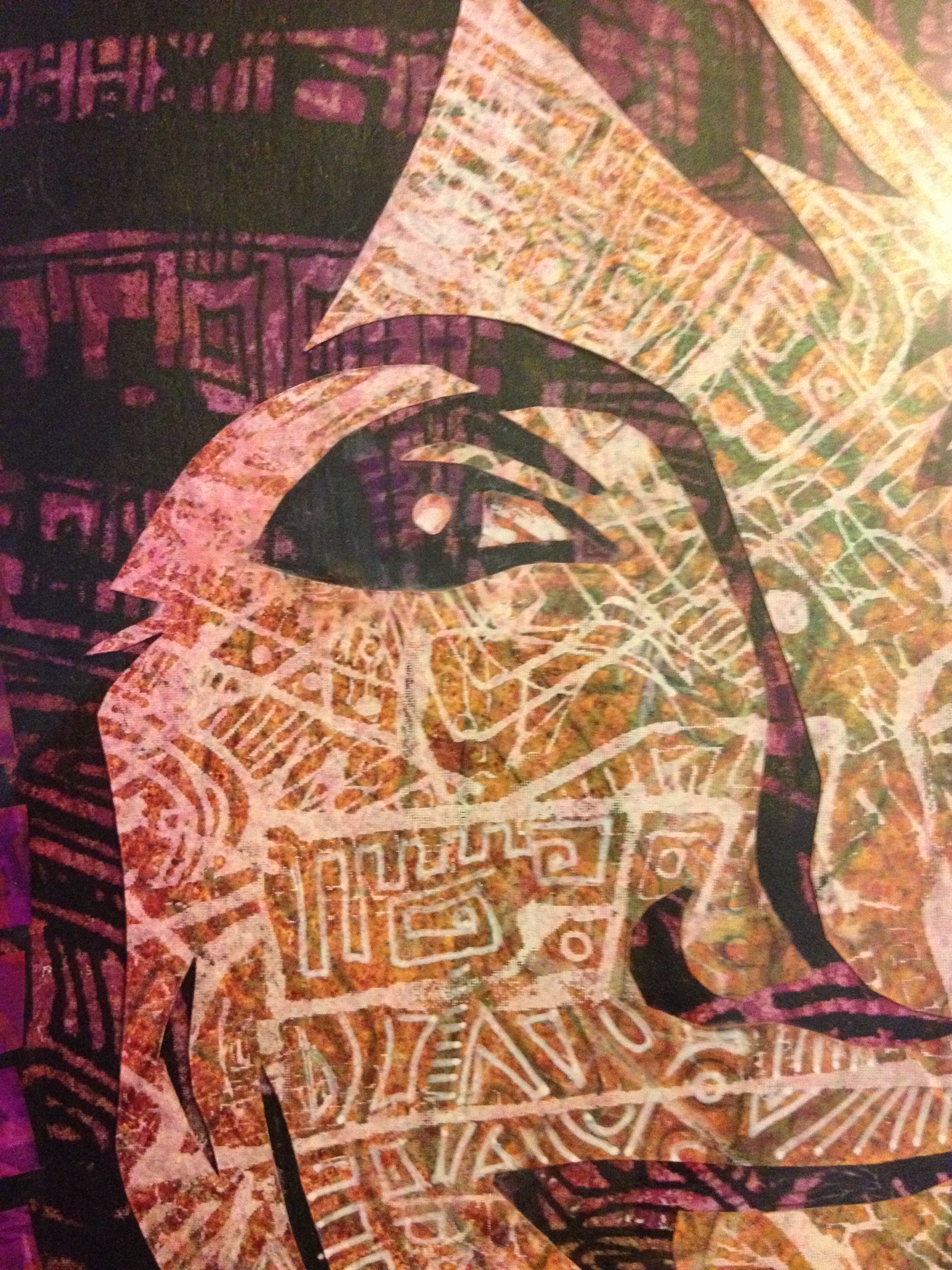
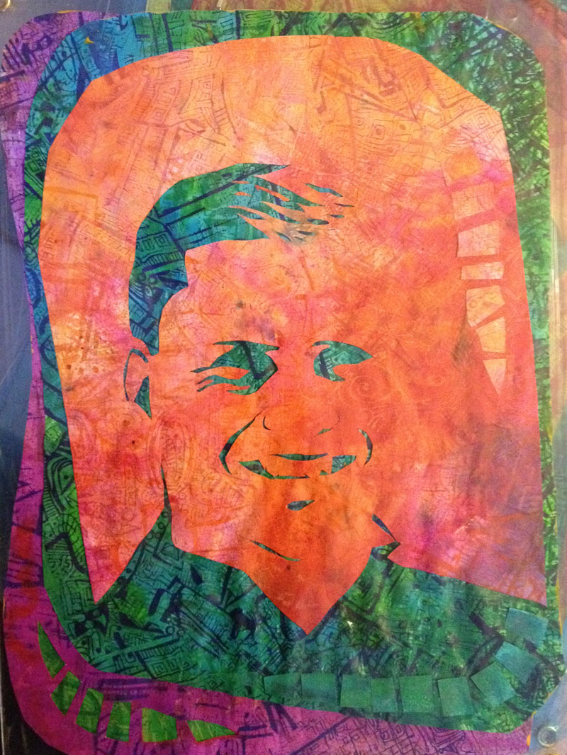
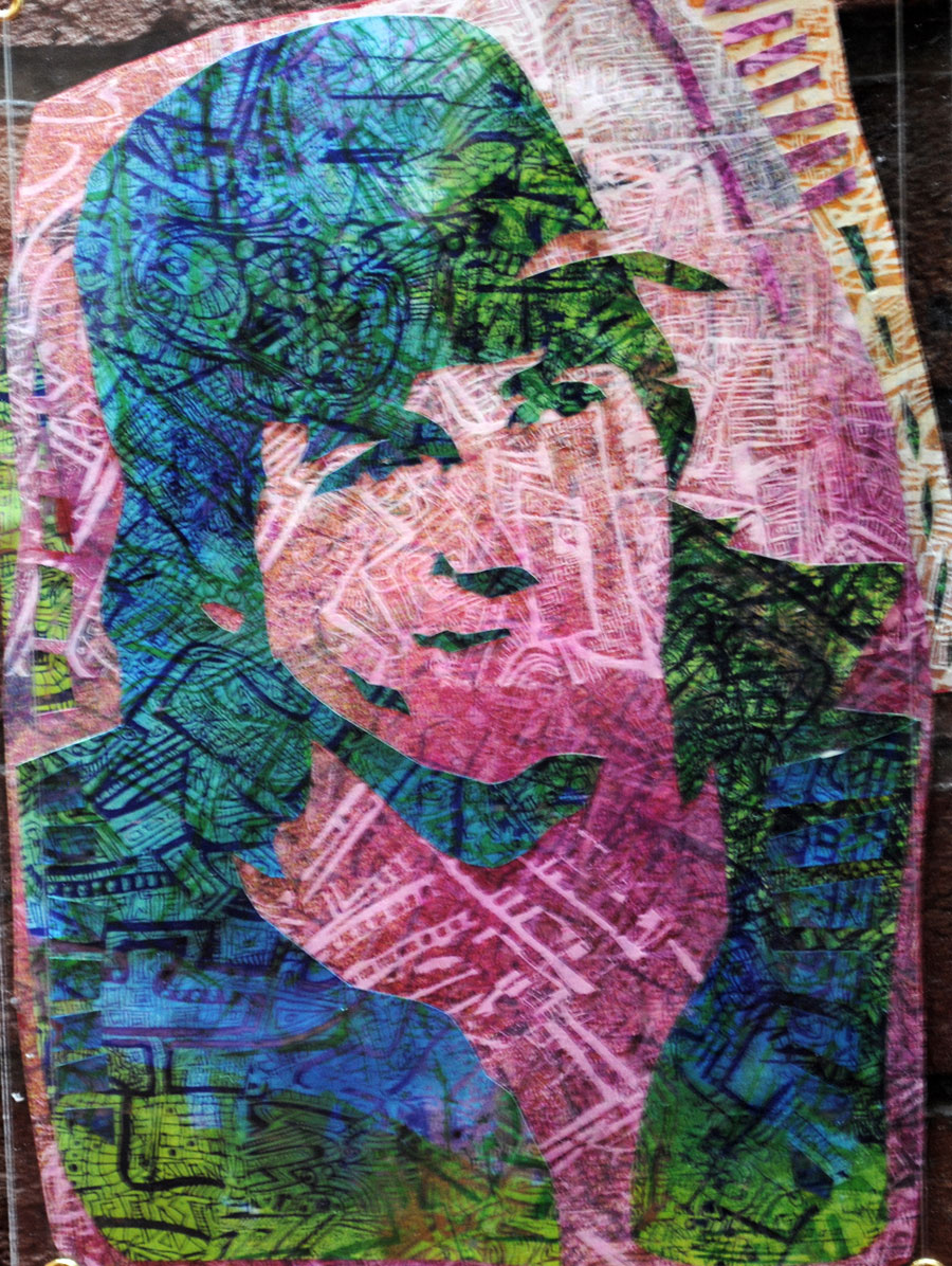
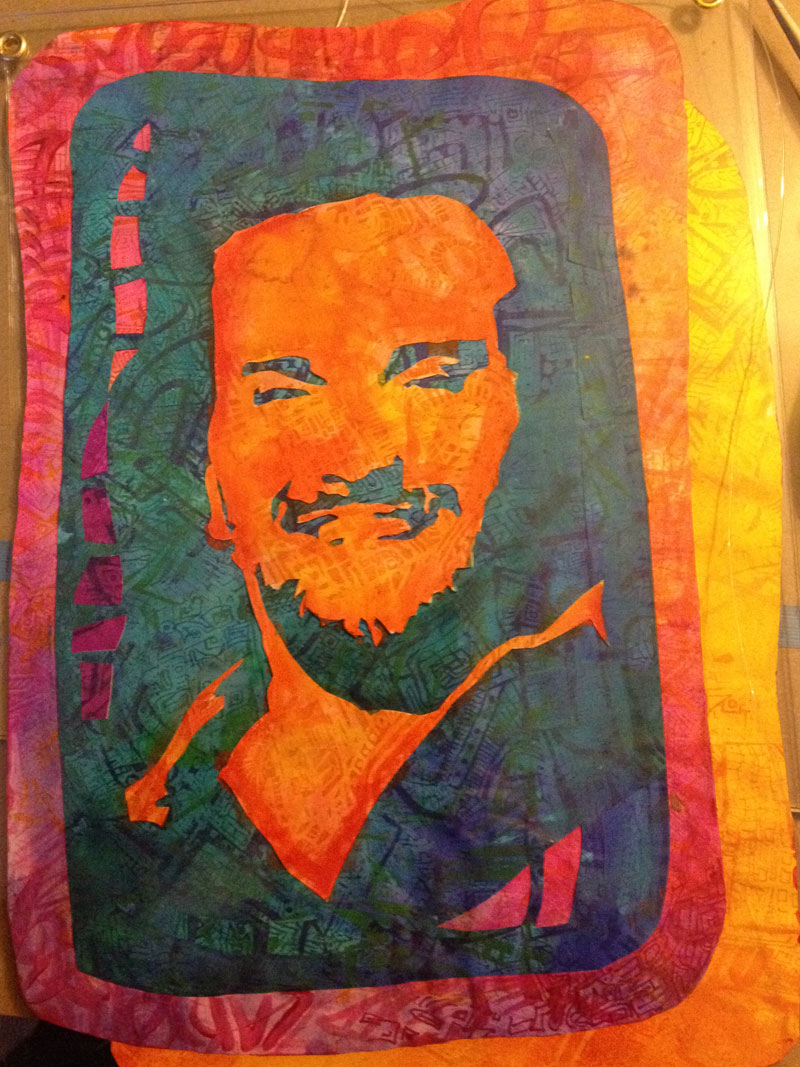
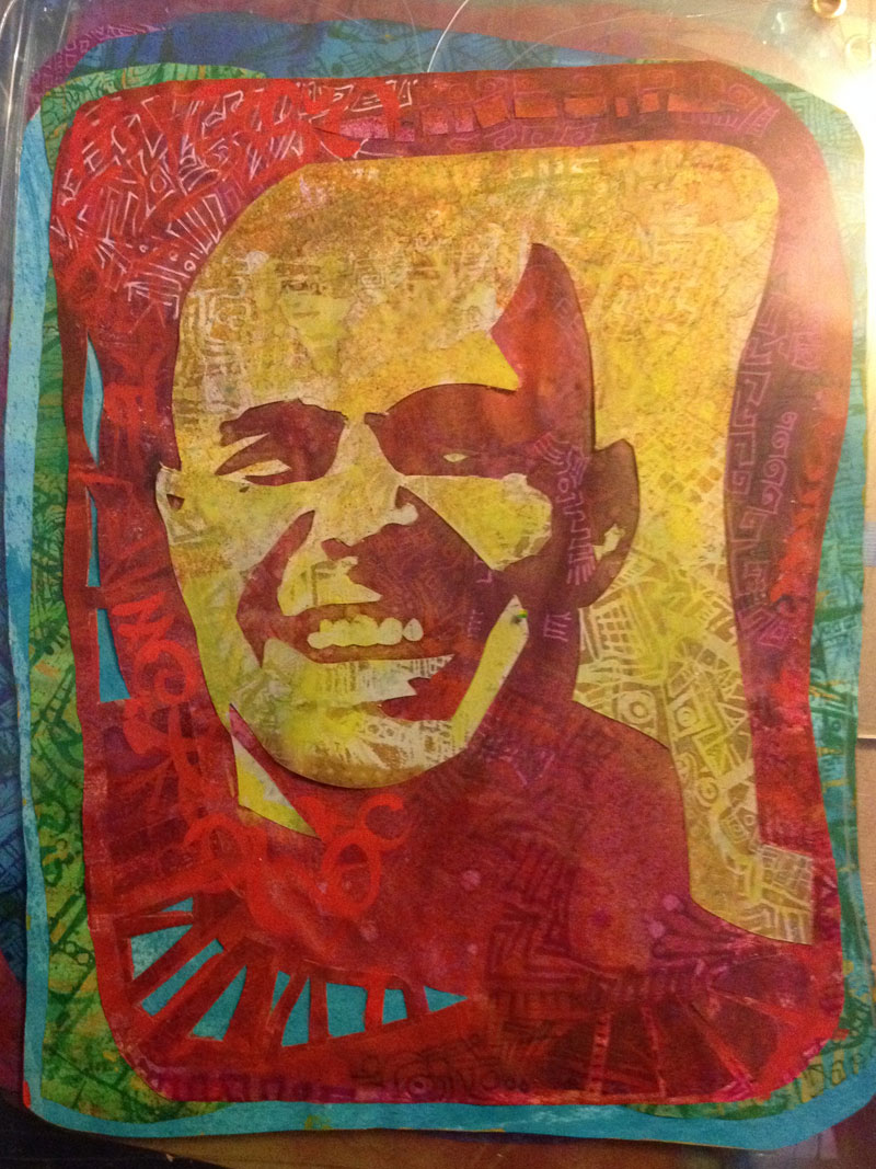
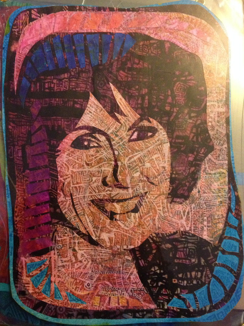
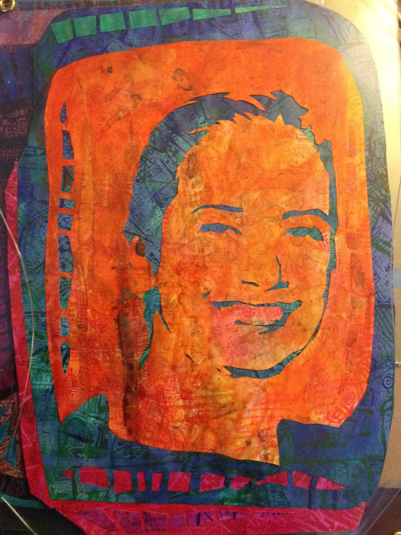
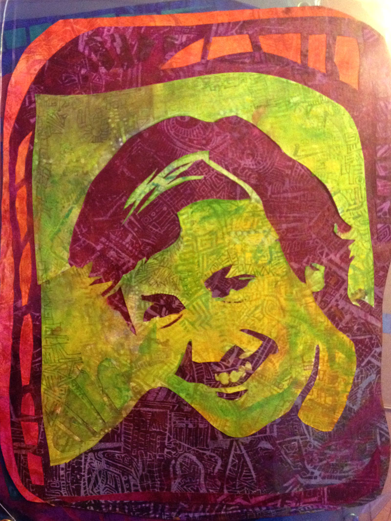
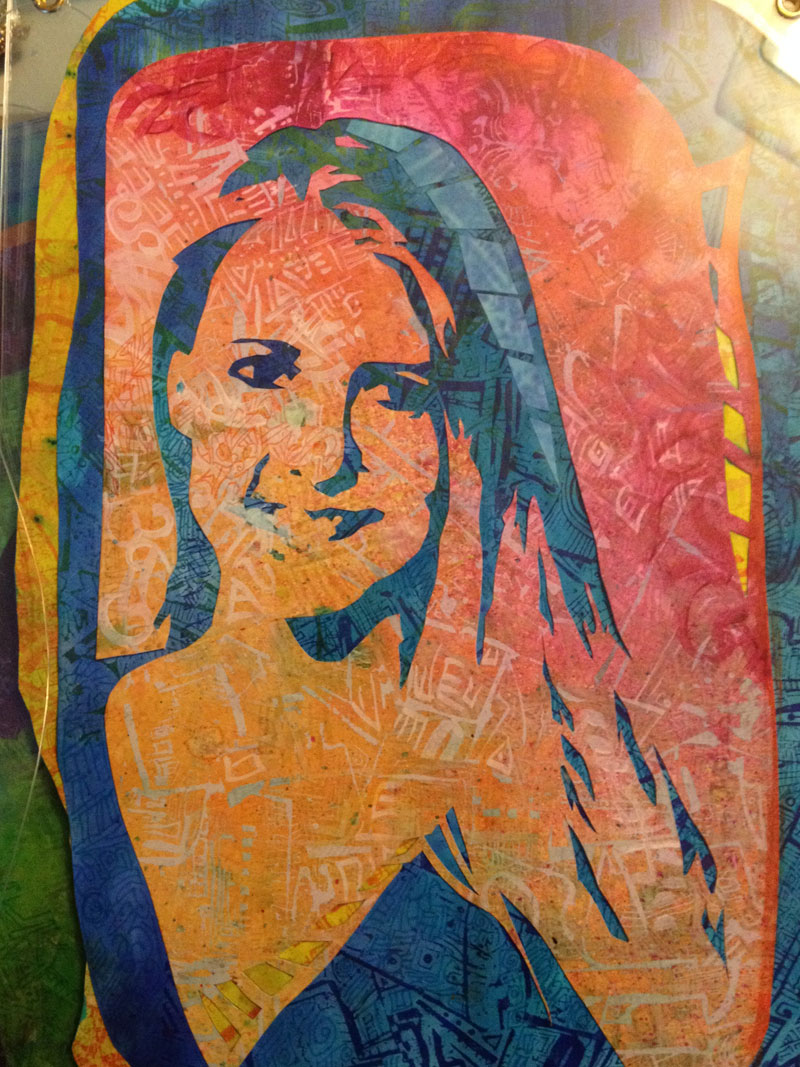
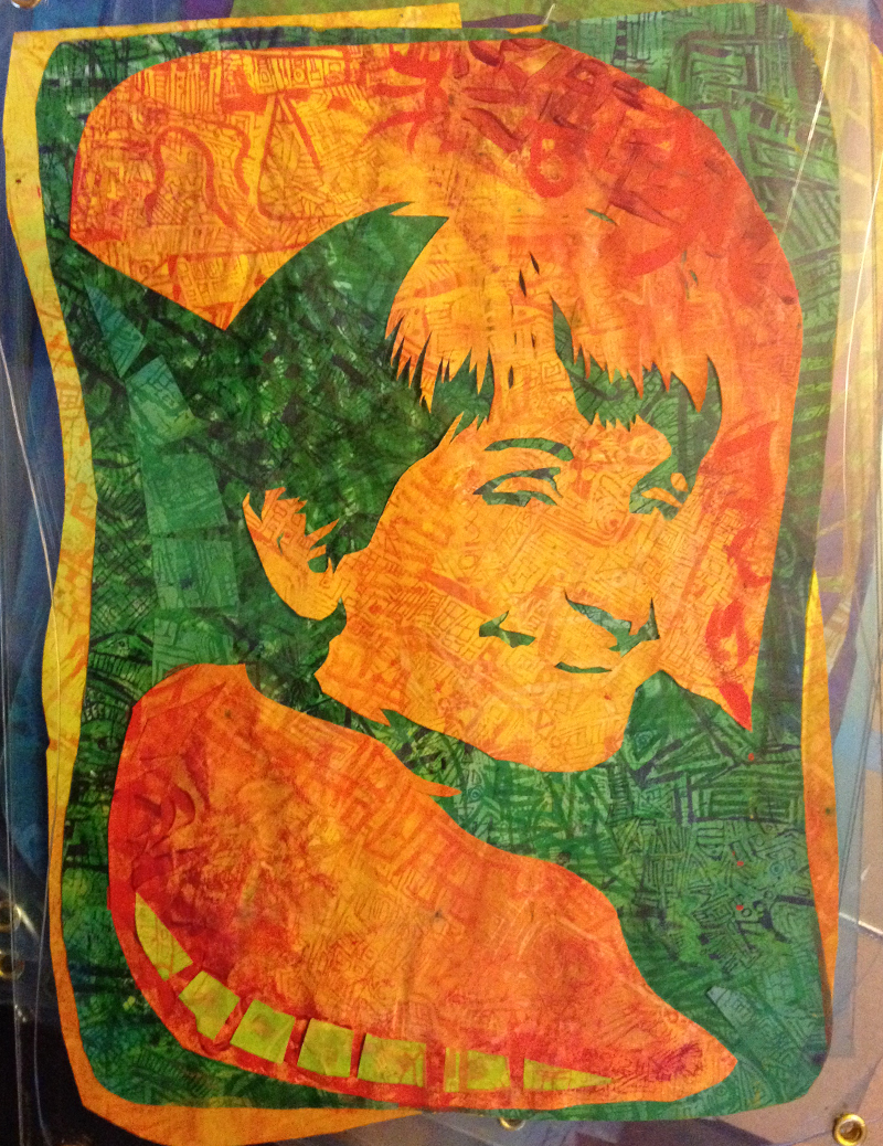
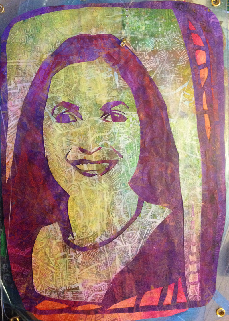
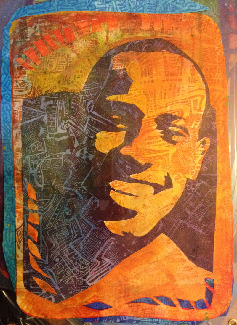
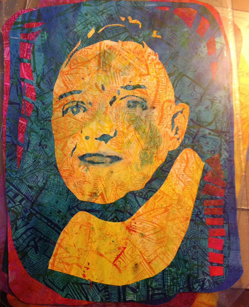
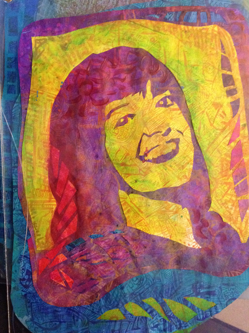
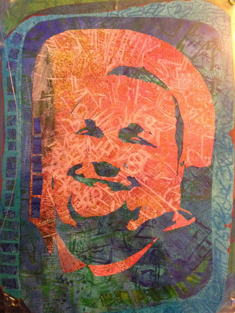
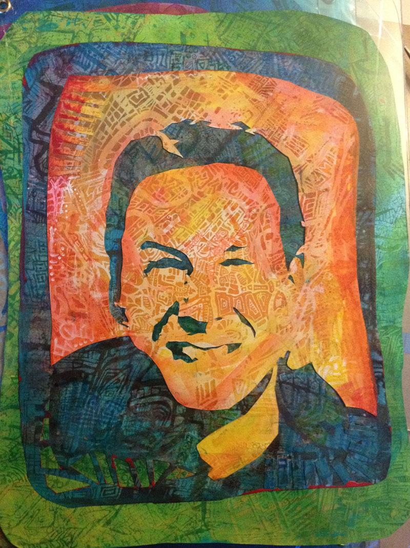
I described earlier my design of a ‘Totem’ honouring and celebrating the spirit of the Spinal unit, the great work that is done there and the kinship that develops between patients, the therapists and staff, the patients’ friends and families – the community.

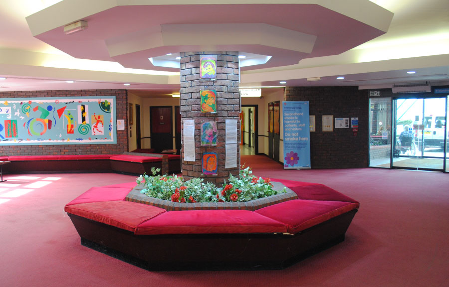
The perfect location turned out to be an eight-sided brick pillar in the centre of reception: the spine of the unit, and conveniently totem-esque in shape; so defining the design, and informing the scale.

odoodem_bw1 odoodem_pd1 odoodem_dg1 odoodem_sc1

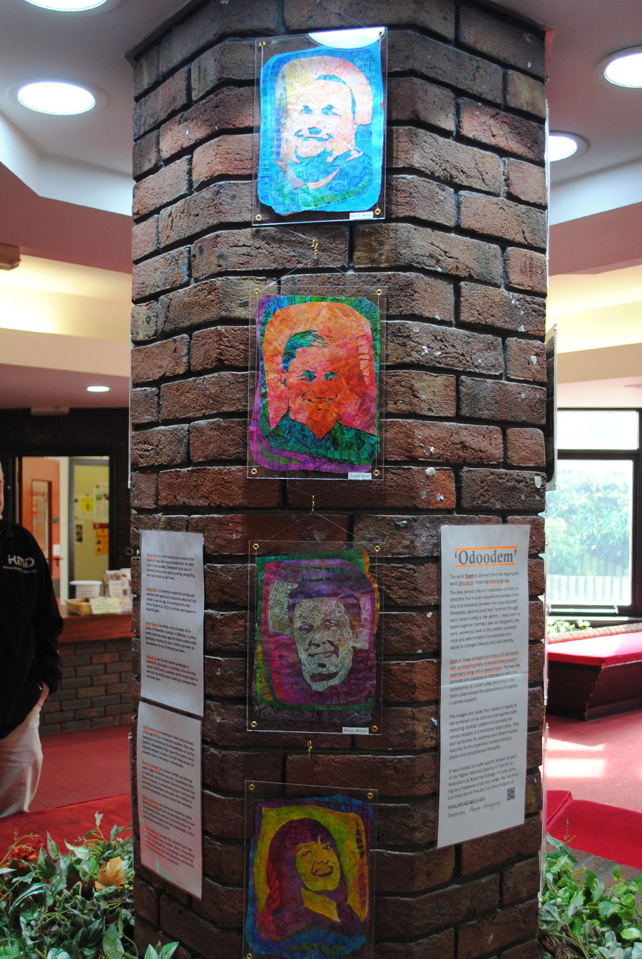
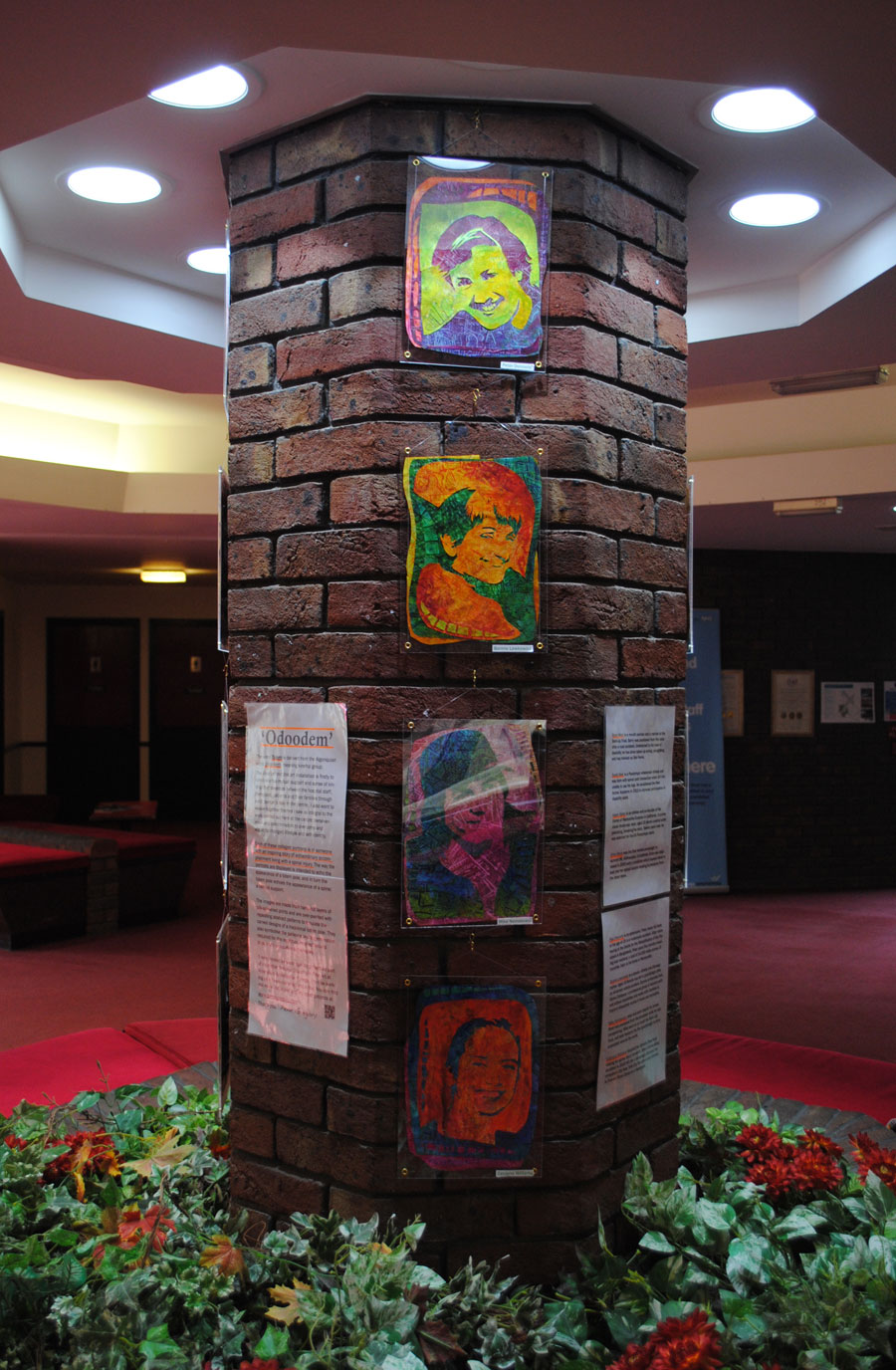
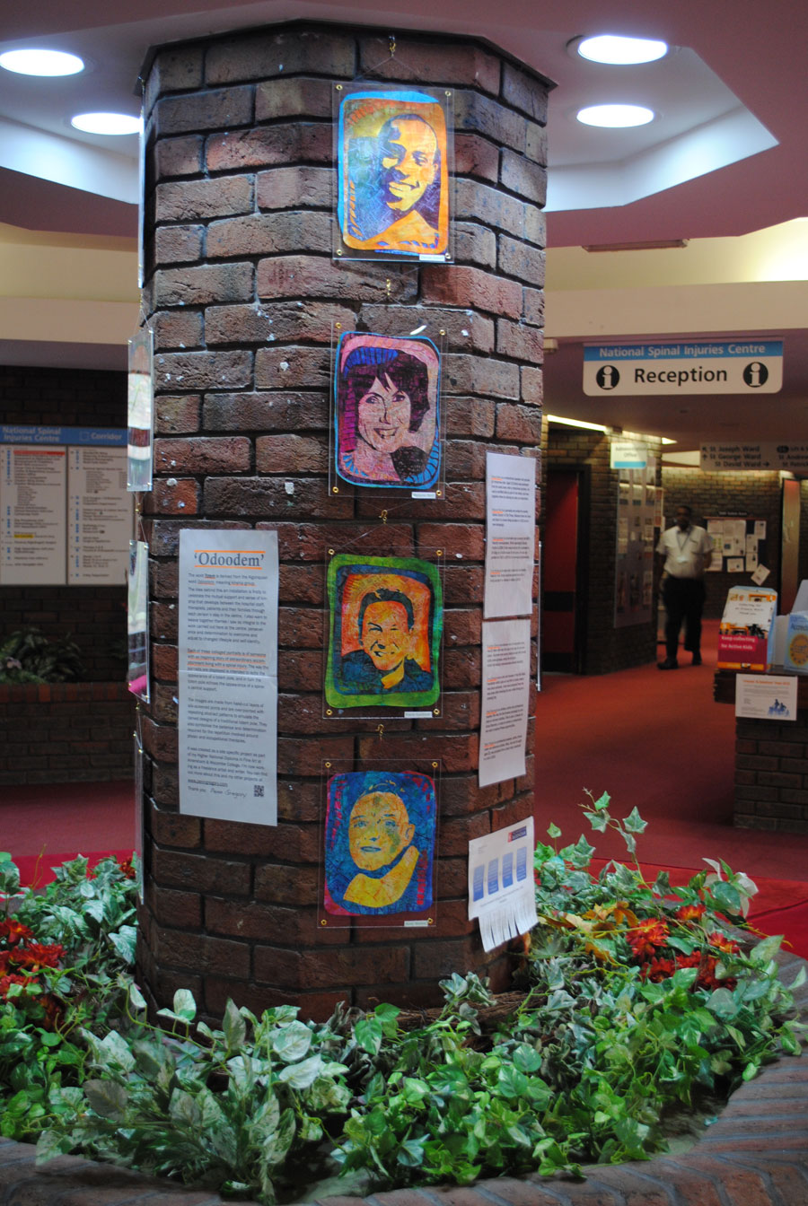
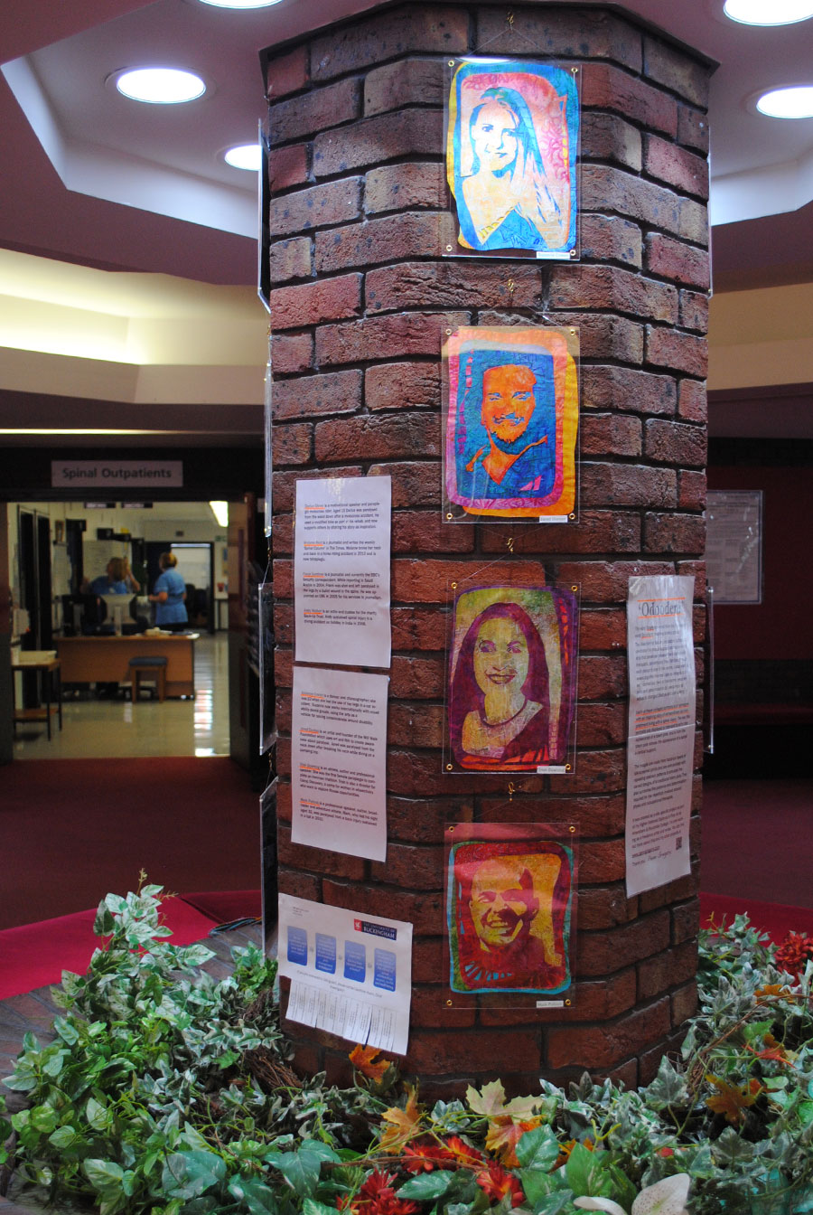
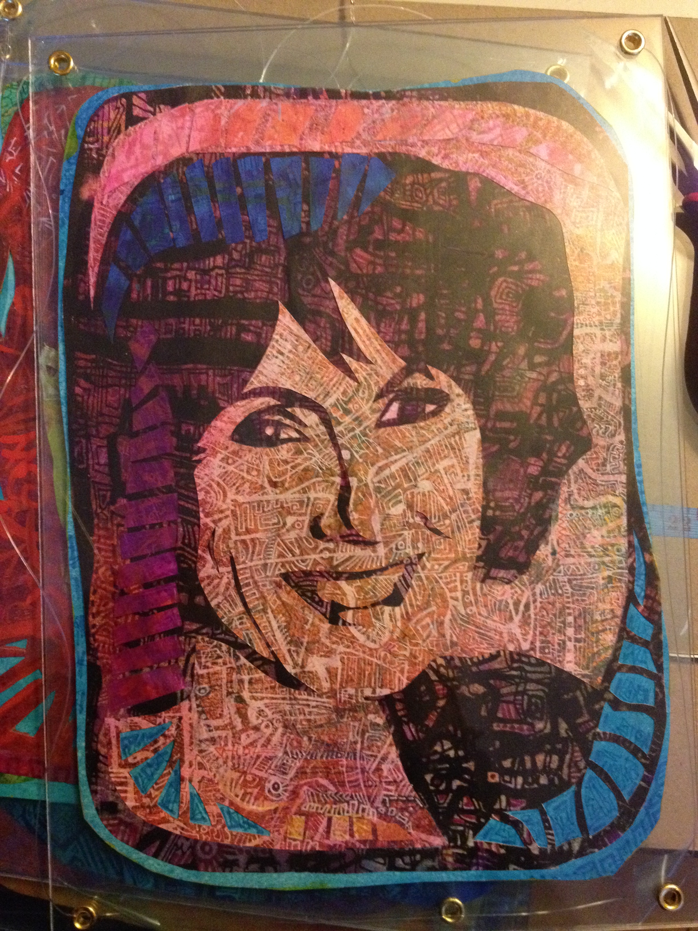
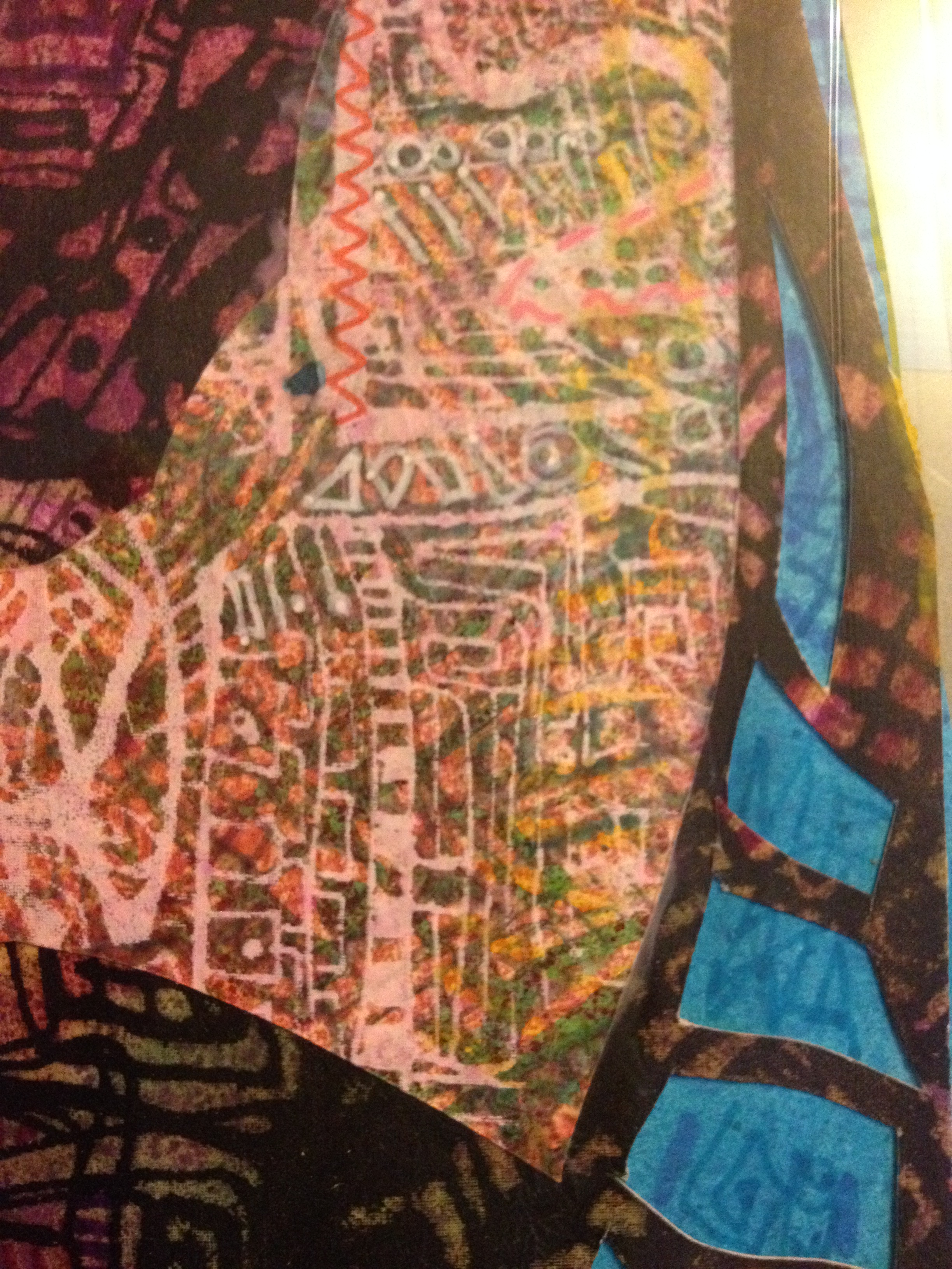
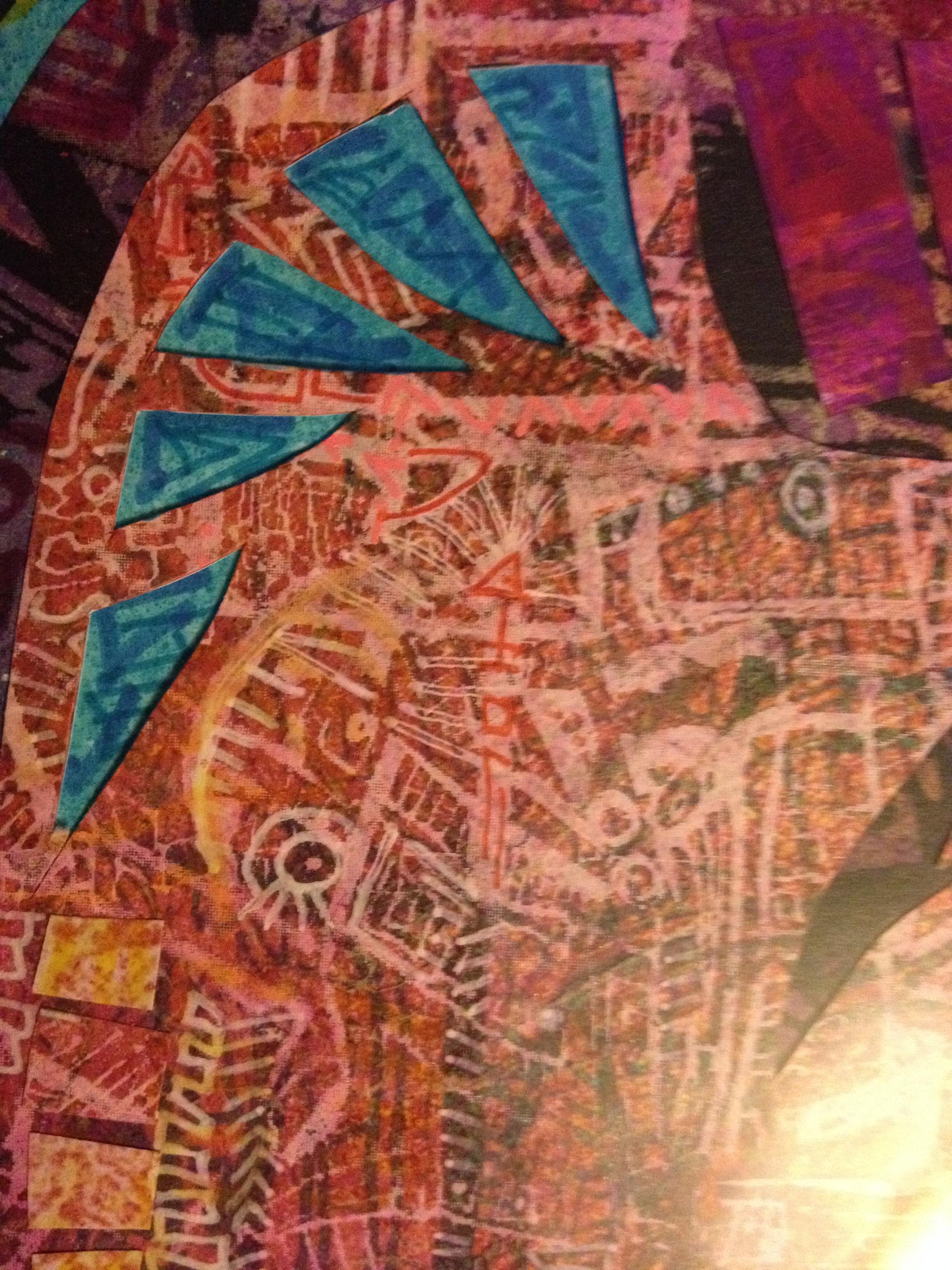
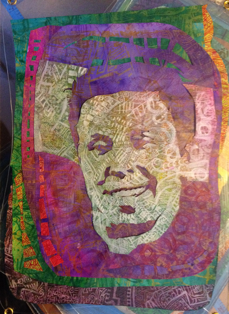
I decided early on that the artwork would consist of a series of portraits of people who have shown a level of determination and spirit that can inspire others. The stories I read in the course of researching who to include were often beyond awe-inspiring. Testament to the strength of character that comes to the fore in times of crisis, and a need to share that sense of possibility with others.

A really strong sense of people are amazing. I’ve also had some really wonderful feedback from the folks whose portraits I used. Absolutely heartwarming, I’ve so loved this project.

I’d like to thank everyone involved in the project:

aaron davidWeir MikeNemesvary jaredDuntan markPollock melanieReed catrionaWilliams peteDonnely ericaDavis  bonnie tricia darius andyWalker suzanneCowan barryWest frankGardner

Aaron Baker, David Weir, Mike Nemesvary, Jared Duntan,
Mark Pollock, Melanie Reid, Catriona Williams, Pete Donnelly,
Erica Davis, Bonnie Lewkowicz, Trish Downing, Darius Glover,
Andy Walker, Suzanne Cowan, Barry West & Frank Gardner.

Some More Metaphors

‘Odoodem’

Totem to the Artist 1925-30 by Leon Underwood 1890-1975The idea for the final design was really concreted by a trip to the Tate Britain where I saw Leon Underwood’s Totem to the Artist. The word Totem is derived from the Algonquian word Odoodem, meaning kinship group.

The idea behind this art installation is to celebrate the mutual support and sense of kinship that develops in the National Spinal Injury Centre, between the hospital staff, therapists, patients and their families through each person’s stay in the unit.

I also want to weave together themes that are integral to the work carried out here at the centre: perseverance and determination to overcome and adjust to changed lifestyle and self-identity.

In the main foyer/waiting area there’s this brickwork column, the central support, the ‘spine’ of the building, this is where the 16 portraits will hang. Each of the collaged portraits is of someone with an inspiring story of extraordinary accomplishment living with a spinal injury. The way the portraits are displayed is intended to echo the appearance of a totem pole, which in turn echoes the appearance of a spine, a central support. And a seamlessly circular metaphor. (I like that kind best).

IMG_3749_400The images are made from hand-cut layers of silk screen prints which in turn were over-painted with repeating abstract patterns to emulate the carved designs of a traditional totem pole, and also symbolise the patience and determination required for the repetition involved physio and occupational therapies.

more photos to follow…

The Sum of Its Metaphors

Following on from the More Than The Sum posts. Y’know what? this week I finally completed the project! 18 months since the initial brief, the planning, the researching, the thinking and playing began. 16 collaged portraits which will be hanging in their final home tomorrow.

Almost all art has at least one metaphor. Sometimes it’s a visual message, daft or clever, subtle or blatant. And often times it’s something that shows itself in the creative process.

This piece was always going to be heavy on the metaphor. It’s to be displayed in the reception area of the National Spinal Injury Centre at Stoke Mandeville hospital, so it will be seen by hospital staff, the patients, their families, friends and dear ones. It’ll become part of the back drop to a range of emotion – shock, fear, interminable waiting, hope, intensity, perseverance, dedication, and so much more. Purpose-wise, top level: it’s bright, colourful, and a visual distraction. Close up their road-map qualities show up and the faces almost disappear. They might be a place to get lost in for a while.

But the meaning goes deeper than that.

As you know, the collages are made from intricate screen print/drawings which was the first of the metaphors – the repeating patterns, the tiny detail – the repeated exercises of physio and occupation therapies, the gradual steps toward more independence. The incredible patience and strength of character this demands from all involved. Layer on layer of print and drawing – day after week after month of incremental progress in recovery.

The metaphor that shows up in the process: How life is so contradictory sometimes.

Wouldn’t you think you’d see something better close up. You would, though, wouldn’t you?
IMG_3713IMG_3715IMG_3716IMG_3714

….apart from when looking too closely at something makes it vanish. From a distance: there it is. No doubt. Get closer and it fades out of sight. WTF? Really? Yes. Something like not being able to see the wood for the trees… perhaps.

These are some of the metaphors. Tomorrow I’ll show you the completed work, and describe the rest of the message.

%d bloggers like this: