Sometimes I’ll notice a thing, it’s been there all along, just hiding from my awareness.
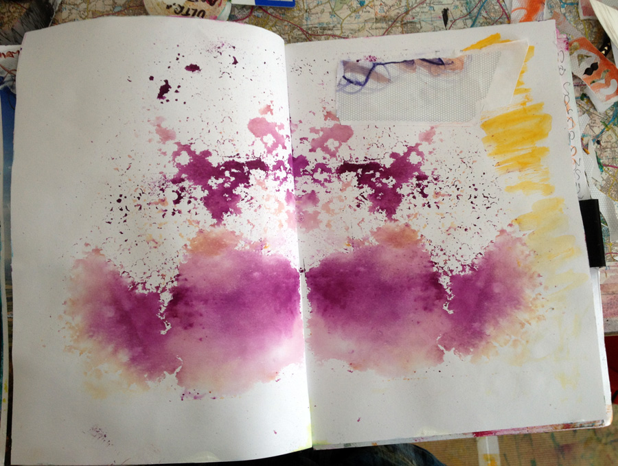
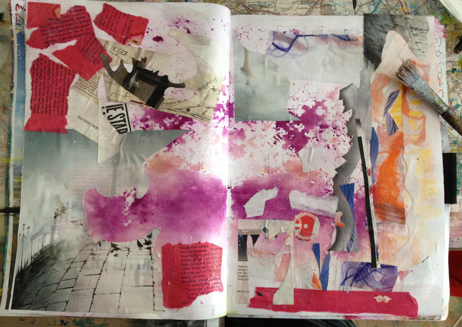
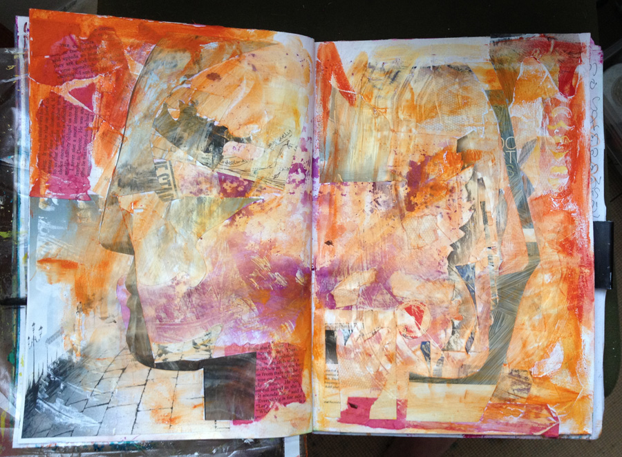
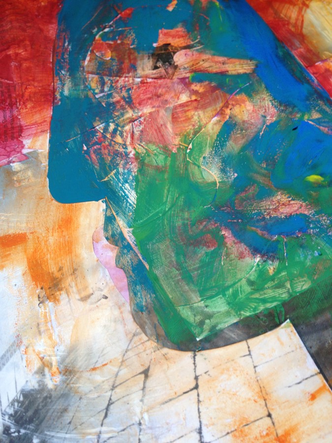
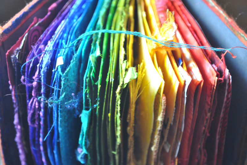
Case in point: I ran a year long project a few years ago, where each month was dedicated to a colour.
Conveniently there are 12 months and if you use the Primary, Secondary, Tertiary groups there are 12 colours. I called it ‘12 in 12‘, beginning January with Red-Purple cycling through Purple, Blue-Purple, Blue…etc. finishing up in Red.
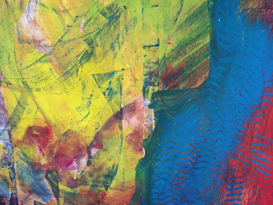
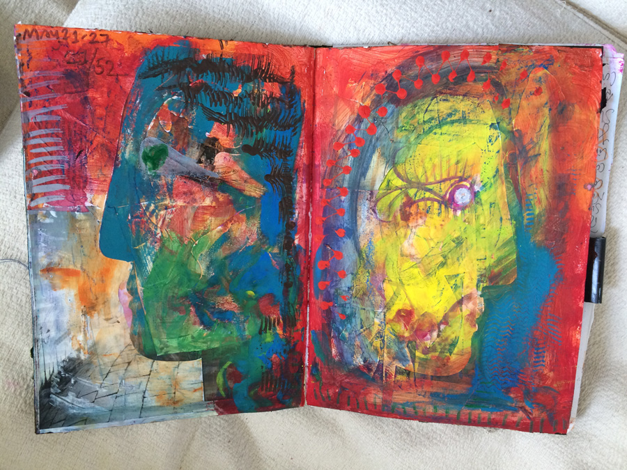
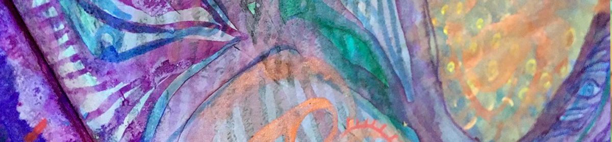
For the whole month I filled a few pages in this book. I feasted on the colour and resisted straying into another month’s territory (not easy for a colour glutton). I was strict and disciplined and it meant all the other colours exploded into my art outside this book with a new found gusto.
The year produced a lush rich rainbow of mixed media and collage.
I’d thought of doing this many times before, but for some reason I hadn’t gotten around to starting it. It wasn’t until around 3 colour/months in when it dawned on me… the year was 2012…so this was 12 in 12 in 12!
I bring this up now – not just as I love a bit of subconscious synchronicity – and this one still makes me smile years later – but because this project has inspired new ideas too.
I’ll be reviving this idea later in the year, and this time you can join in too! Watch this space, I’ll tell you more about it in the summer.